Graphic
Well Fed 2 Droplet
-
Pou Auaha / Creative Director
Celeste Perez
-
Ringatoi Matua / Design Director
Lou Wright
-
Ngā Kaimahi / Team Members
Talia Jafarkhani, Adrienne Borlongan -
Kaitautoko / Contributors
Bárbara Malagoli, Mithi Studio, Charm Torres, Max Milla -
Client
Droplet


Description:
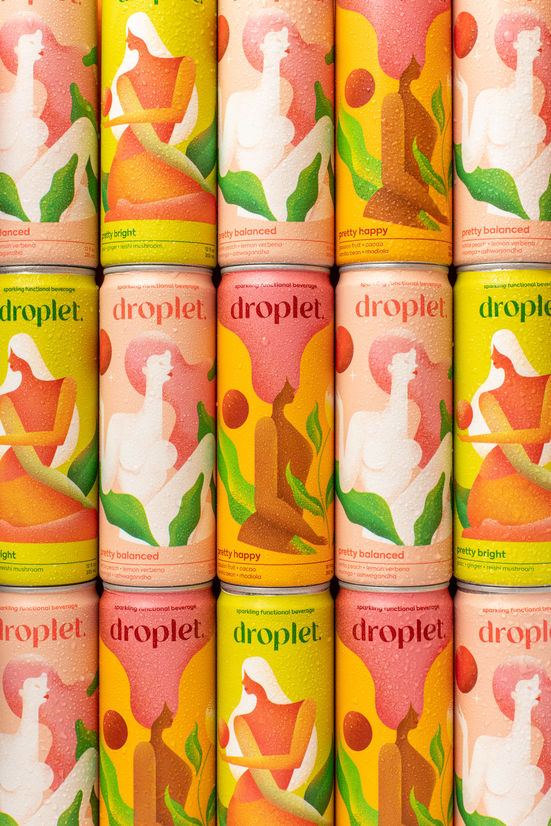
Droplet is a stress-balancing, sparkling beverage with organic adaptogens, whole fruit purées, and aromatherapeutic superfoods. Designed with the modern woman in mind, Droplet seeks to provide self-care in every sip.
Droplets founders are both Filipino-American, and, in Filipino folklore, the morning dewdrops were thought to be the tears of the health goddess, Dalikamata. If you drank them, you'd be healed— which aligned with the concept of Droplet.
Our goal was to create a modern beverage aesthetic and brand identity that spoke to the “real woman” amongst a sea of granola naturals and male-centric energy drinks. With an all-female design and food science team, the choice was made to “bring the inside out,” by having the outer packaging reflect the formula and key ingredients.
Inspired by each flavour, original artwork was created by artist Bàrbara Malagoli. If the key ingredient was yuzu lemon, then artwork reflected the fruit’s colors, textures, and essence. Each illustration celebrates the female form in body-positive and inclusive illustrations, with each character in close contact with the moon, a time-honored symbol of femininity. This celestial theme is then followed through on the bottom of the can, where you’ll find the moon phase at the time of canning, printed in small detail.
Droplet was born "out of pocket"— so all packaging had to produced within very humble budgets. With so little room for error and revision, Droplet's brand identity needed to connect beyond ‘safe’ packaging choices, and quickly. This was achieved through the tone of voice, colour, illustration, and naming conventions.
With flavours named "Pretty Balanced," "Pretty Bright", and "Pretty Happy", the branding team took cues from Droplet's food scientists and flavor chemists' formulations, and translated them into resonant and aspirational terms for the modern woman. The term “pretty” encompasses the beauty-boosting antioxidants and phytonutrients in the beverage, and the secondary term, i.e. “balanced”, is a feeling-based descriptor that references the primary function of each flavour's active ingredient.
Whether it's on shelf at a shop or online via direct to consumer, Droplet's art-forward packaging has been engineered to create an immediate, emotional response, with the trust that the modern wellness consumer does not need overt cues about ingredients or benefits. All typography on the packaging was rendered in lower case to provide a sense of calm, with a spot gloss to stand out against a matte cover.
As COVID-19 began to shut down retail, grocery, and supply chains, Droplet owned its positioning as a digital-first beverage brand and began shipping Wellness Kits. Packaged in tuck-top mailers, Droplet customers received one can of each flavour, cushioned by cardboard separators, with a wellness guide and product-driven booklet.
Droplet also strives to be as sustainable as possible— unused ingredients are repurposed into ice cream with a signature flavor at Wanderlust Creamery, and all outer packaging is made out of paper and fully recyclable. The cans themselves are also reusable, and have been up-cycled into vases, pencil cups, and planters by Droplet customers.