Graphic
Trilogy 2 Packaging Refresh
-
Pou Auaha / Creative Director
Bevan Tonks
-
Ngā Kaimahi / Team Members
Bevan Tonks, Erica Andersen, Lorraine Kamffer, Teryl Mckenzie, Susie Middlebrook, Amisha Jeram, Helen Tan, Carol Taylor, Sable Heath, Sue Hogan -
Kaitautoko / Contributors
Forbes Packagaing, Rapid Labels, Toaki Okano -
Client
Trilogy
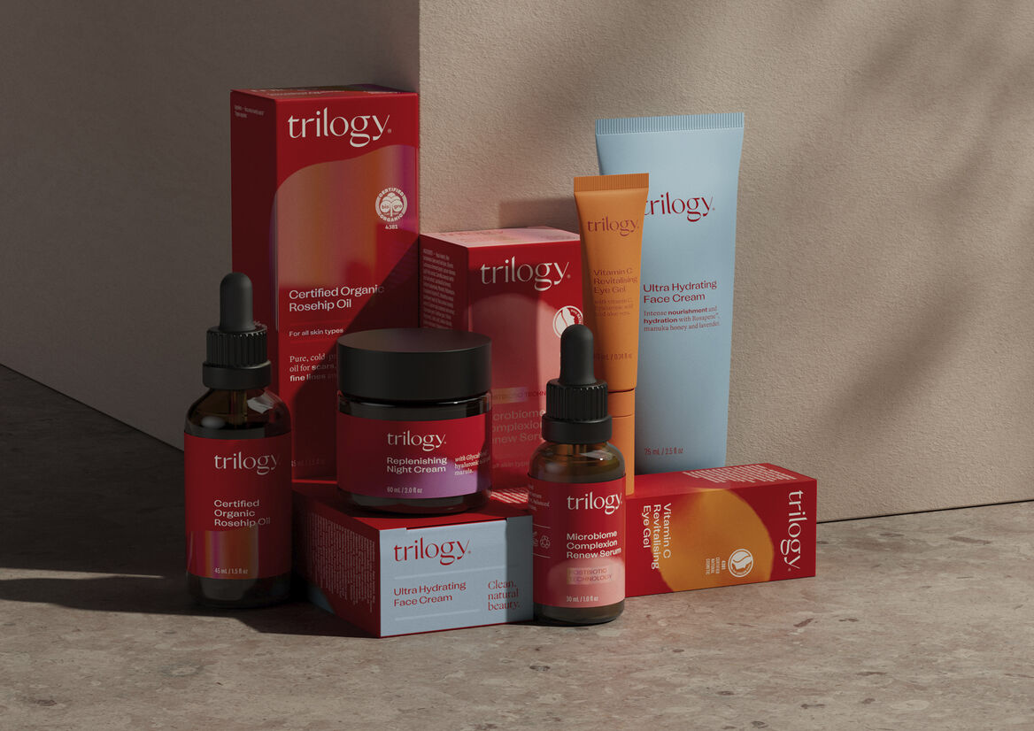
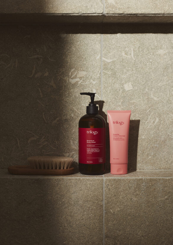
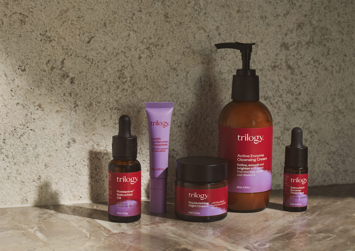
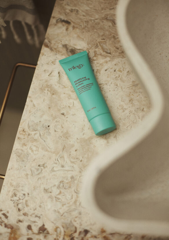
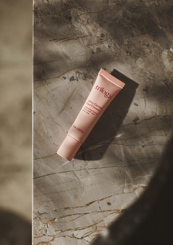
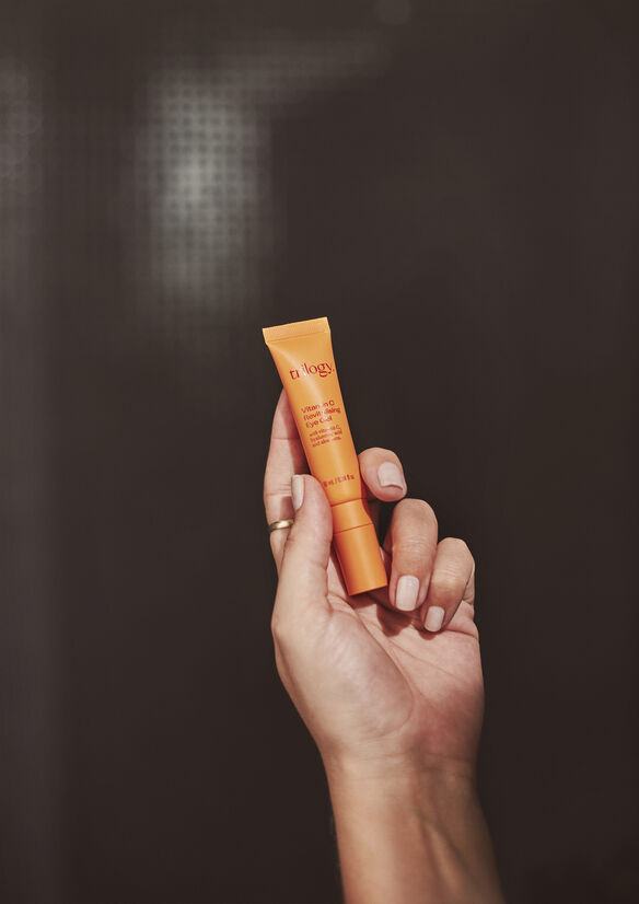
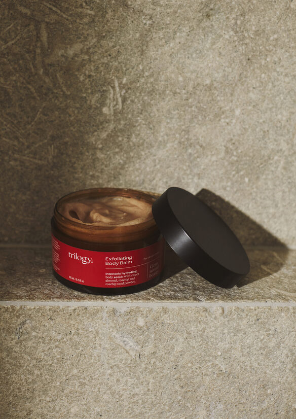
Description:
When it launched in 2002, Trilogy introduced Australasia (and the world) to clean, natural beauty. To gain market share as a self-select natural skincare brand back then, was to visually compete with the incumbents. 20 years later the category is awash with white and has resulted in the consumer being snow-blinded by options with few examples of brands that present a collective proposition of multi products.
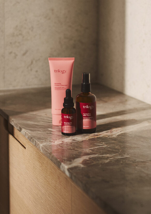
Trilogy was no exception, apart from the cult classic ‘red’ rosehip oil packaging, all other product lines were white and faded in to the fold. The scope of Trilogy’s offering was often missed and consumers couldn’t translate the equity held by the rosehip products over the to more current and innovative ones.
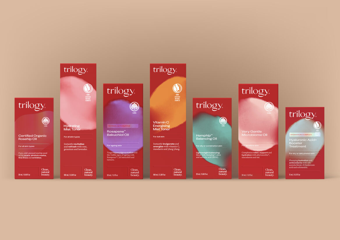
The strategy for the packaging refresh, which lead the full brand overhaul, was to own what we were recognised for—red—across the entire product family. We updated the red to be a warmer, brighter, contemporary hue and developed a secondary palette that meshed with it in order for the brand to clearly project product streams. The brand marque, entire graphic system and brand language was rebuilt from the ground up to create an entirely new lexicon.
The resulting colour blends, aesthetically derived from the way skincare is massaged in to the skin, are attributed to different skin types and clearly present the brand as a multi-choice offering. Mixing serif and sans-serif typography allowed us to depart from bullet points to conversations. Front of pack identifies the concern (consumers first point of entry), san serif type shifts present key ingredients within the conversation, in a way acting much like bullets, highlighting the consumer triggers. On the reverse this is flipped where the sans serif calls out benefits so at a glance reassurance can be given to the consumer that product aligns with their concerns.
Back of pack also features product photography, which came out of the fact that we were embarking on this refresh just as COVID-19 swept the world. To us then, testers and tactile experiences of the brand may never return to retail so we had to ensure that the product could be purchased with complete assurance that the customer new what they were getting. Extended by a new icon system that also described what kind of vessel and applicator was used.
By the time the carton is opened, the selling is done and so a little bit of humanity appears through inner lid moments that express the brands personality and reinforces the conversational tone of the packaging. A light relief and a gentle assurance of a choice well made.