Graphic
Redfire Design 5 Lords + Angels Power Hydration Ampoules
-
Pou Auaha / Creative Director
Colin Downing
-
Ngā Kaimahi / Team Members
Lans Jiang, Donna Downing -
Kaitautoko / Contributors
Bryce Carleton (Photography), Klim Type Foundry ( Typography) -
Client
New Zealand Care Skin Co. Ltd
Description:
Lords + Angels is a premium unisex skincare brand combining clinical research, scientific insights and natural botanicals.
Our goal was to design premium packaging that provided a sensory experience and delight when opened.
Our brief for this start-up included developing the brand strategy, positioning, naming, brand identity and packaging design. We pretty much had a free hand to create the brand, with our only directive - to incorporate science-backed research and develop a unisex brand name.
We positioned Lords + Angels as an Alchemist archetype, blending science and spiritual empowerment. We drew inspiration from the Notre-Dame and an architectural concept for rebuilding the old cathedral after the fire in 2019. This blend of old and new was a catalyst for our overarching brand identity and design.
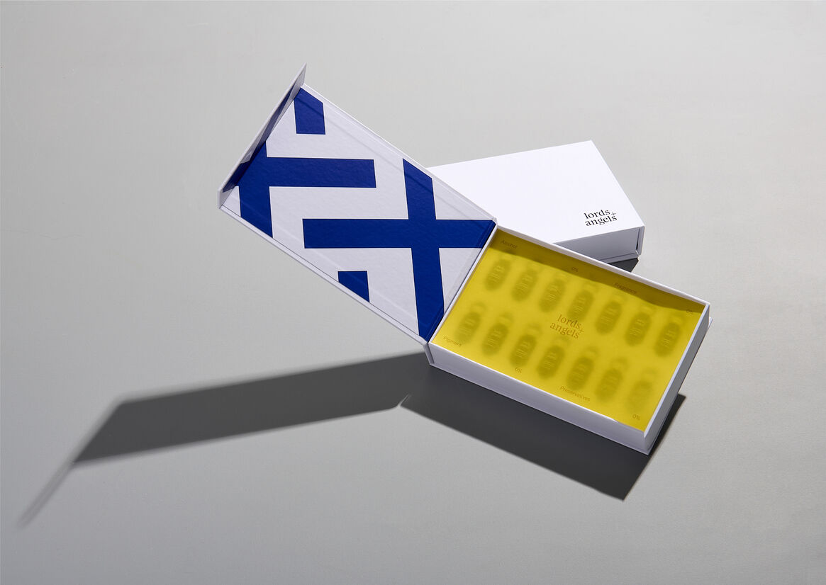
True to an Alchemist archetype, The Lords + Angels brand identity blends old-style Feijoa typography, with sans-serif Söhne ( by Klim Type Foundry) representing science. The crosshatch pattern derived from the + in the identity and bold colour system inspired by stained glass windows is used across all brand touchpoints.
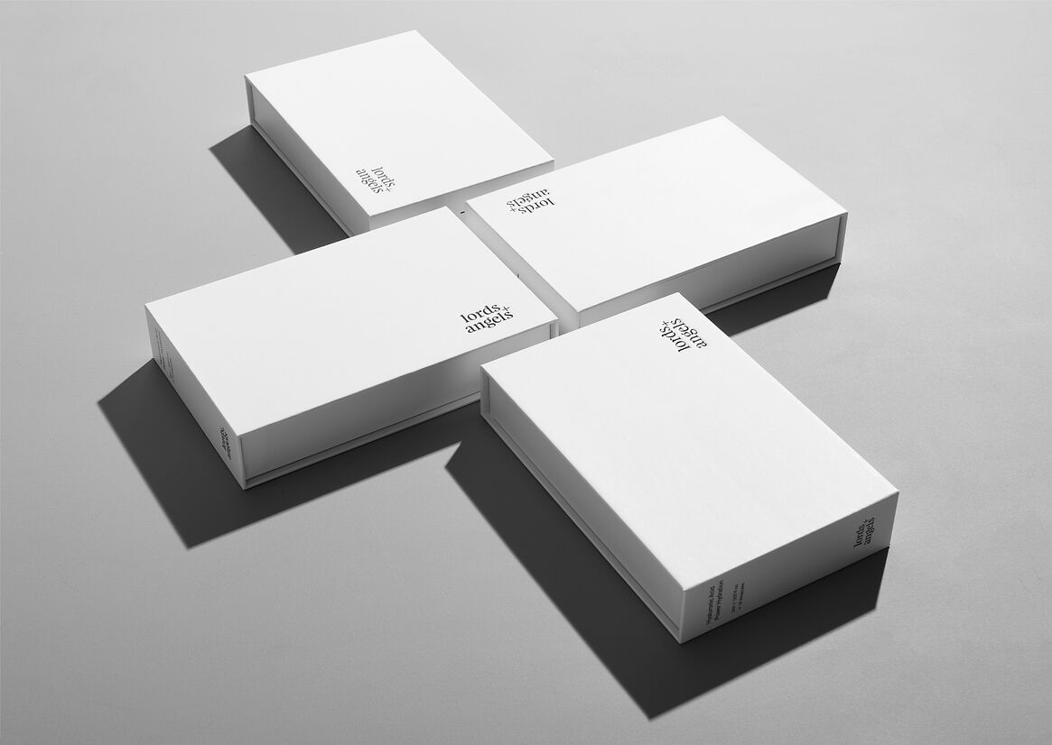
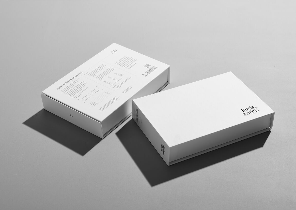
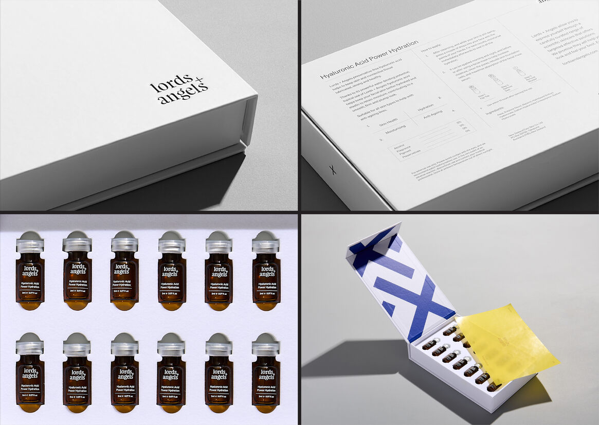
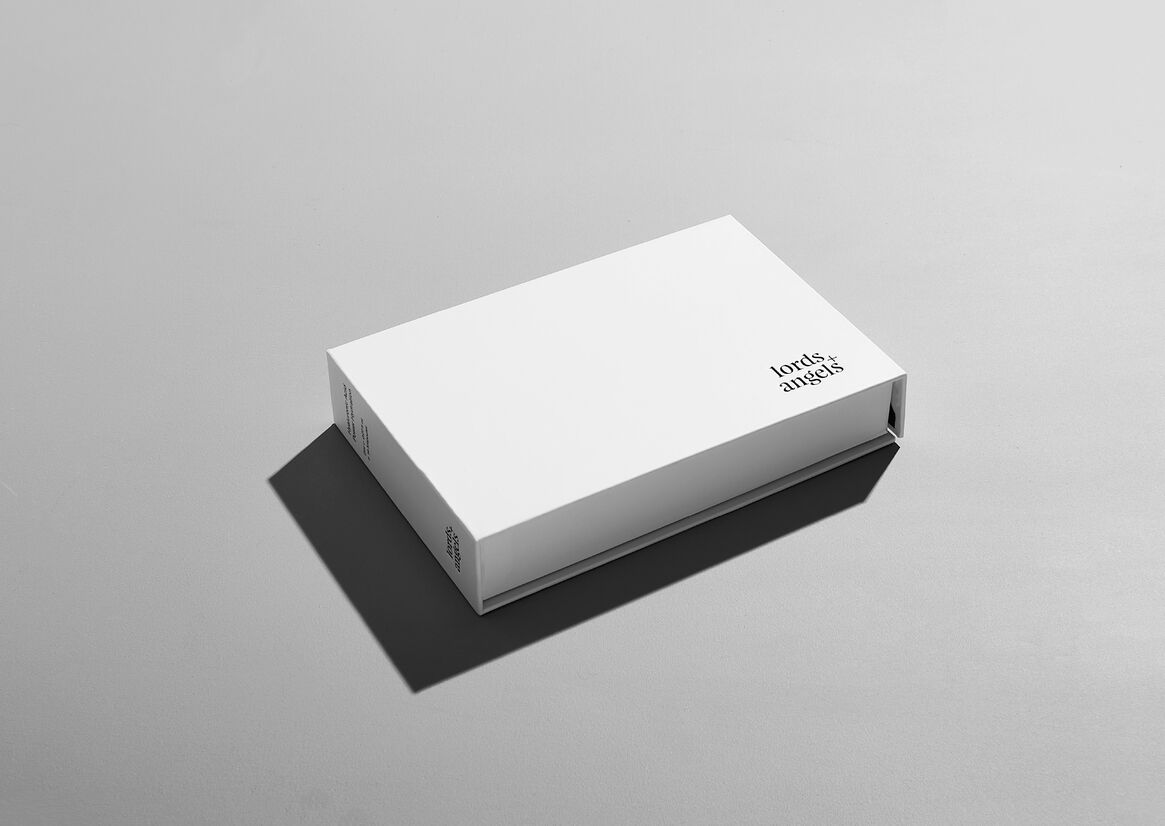
Sleek clinical white packaging and narrative convey Lords + Angels focus on science-backed ingredients and function, with a premium look and feel.
The scientific narrative is delivered conversationally with confidence and sincerity.
This outer packaging is finished with a matt laminate providing a velvet touch, debossed and foiled brand mark.
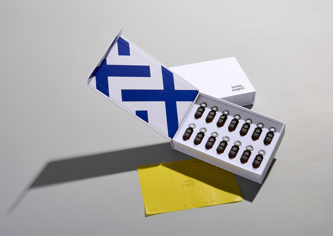
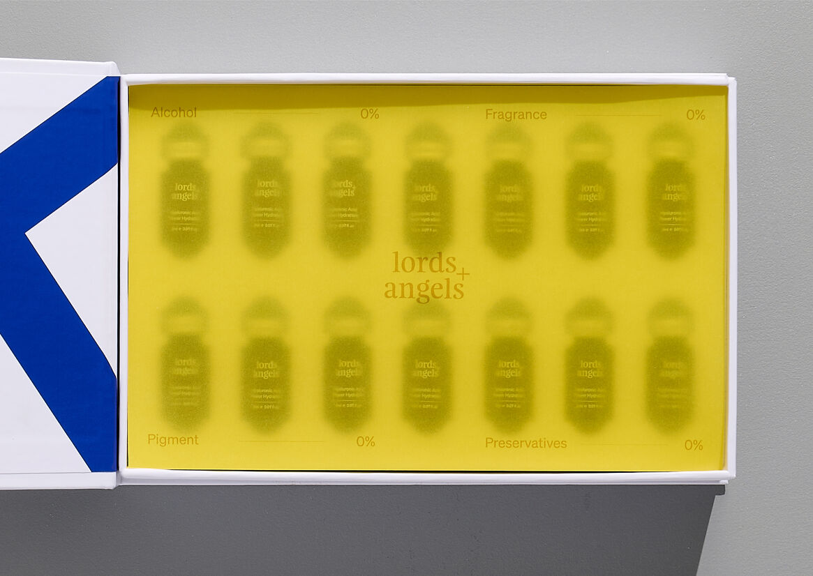
The inner pack brings surprise through bursts of colour and represents the inner beauty within us all. It is finished with a transparent tissue overlay; this element has a dual purpose of protecting the ampoules from rubbing and reinforcing the sensory experience.
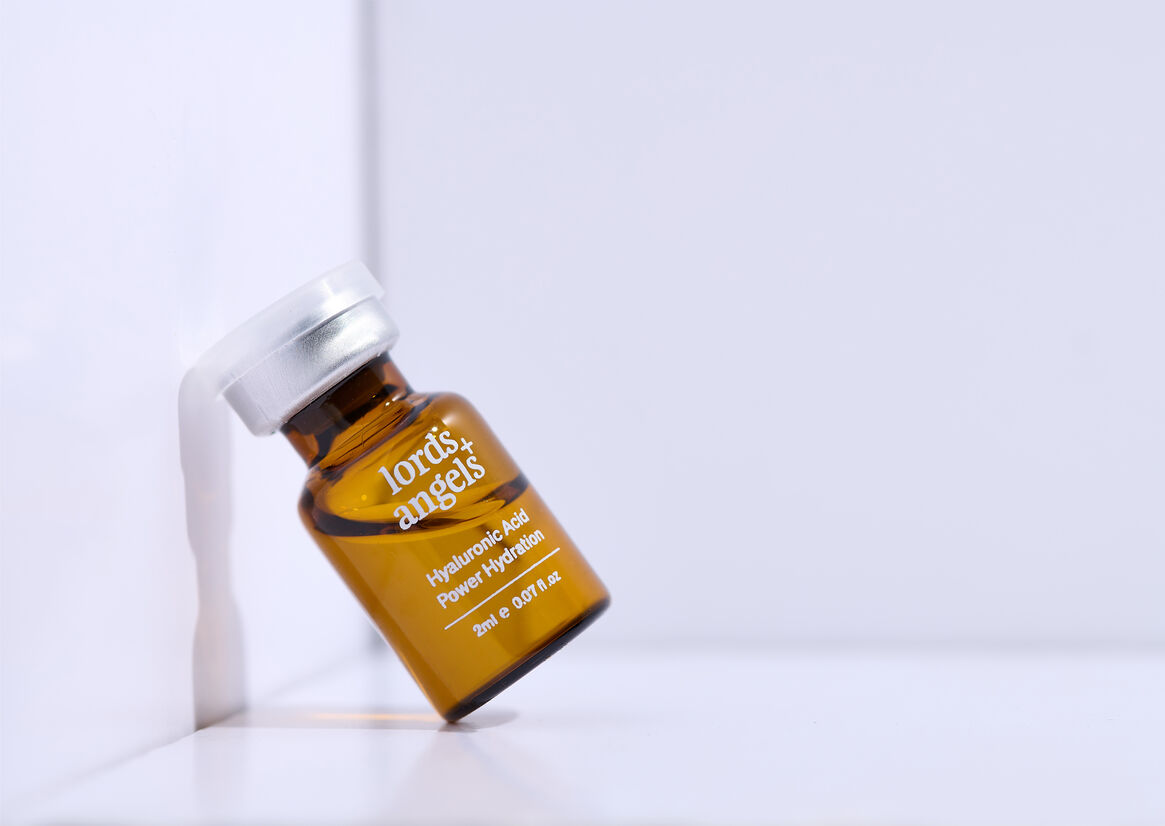
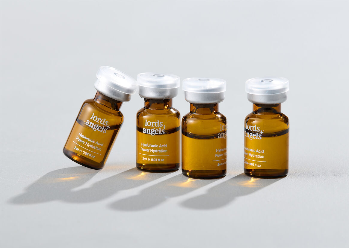
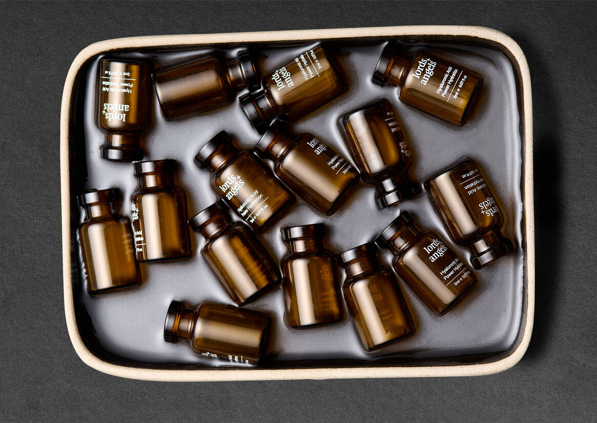
The amber glass ampoules are designed to look medicinal yet serve a functional purpose to protect the hyaluronic acid from light.
Charisma and personality shine through the minimalism design, and colour creates an enjoyable brand experience with style, personality and purpose.