Graphic
Redfire Design 5 Home Essentials
-
Pou Auaha / Creative Director
Colin Downing -
Pou Rautaki / Strategic Lead
Colin Downing
-
Ringatoi Matua / Design Director
Lans Jiang
-
Ngā Kaimahi / Team Members
Sophie Blazey, Donna Downing -
Kaitautoko / Contributors
Bryce Carleton (Photography), Klim Type Foundry (Typography) -
Client
Brand Collective


Description:
Home Essentials offers a diverse array of affordable, multi-purpose products, including skincare, body care, essential oils, and household cleaning ingredients sold through pharmacies. Whether used individually or combined to create homemade remedies, their offerings provide the flexibility that customers crave. Our design challenge wasn't just about the products themselves; it was about empowering individuals to take control of their well-being and create their own personalised solutions.
In a world bustling with crowded store shelves and endless choices, the brand believes in the power of simplicity. Home Essentials, a name that resonates with generations, embarked on a journey to refresh its brand and packaging design. The goal was clear: to captivate the existing audience, appeal to a new generation of shoppers, and stand out from the competition by reviving the tired look and feel that had lingered for decades.
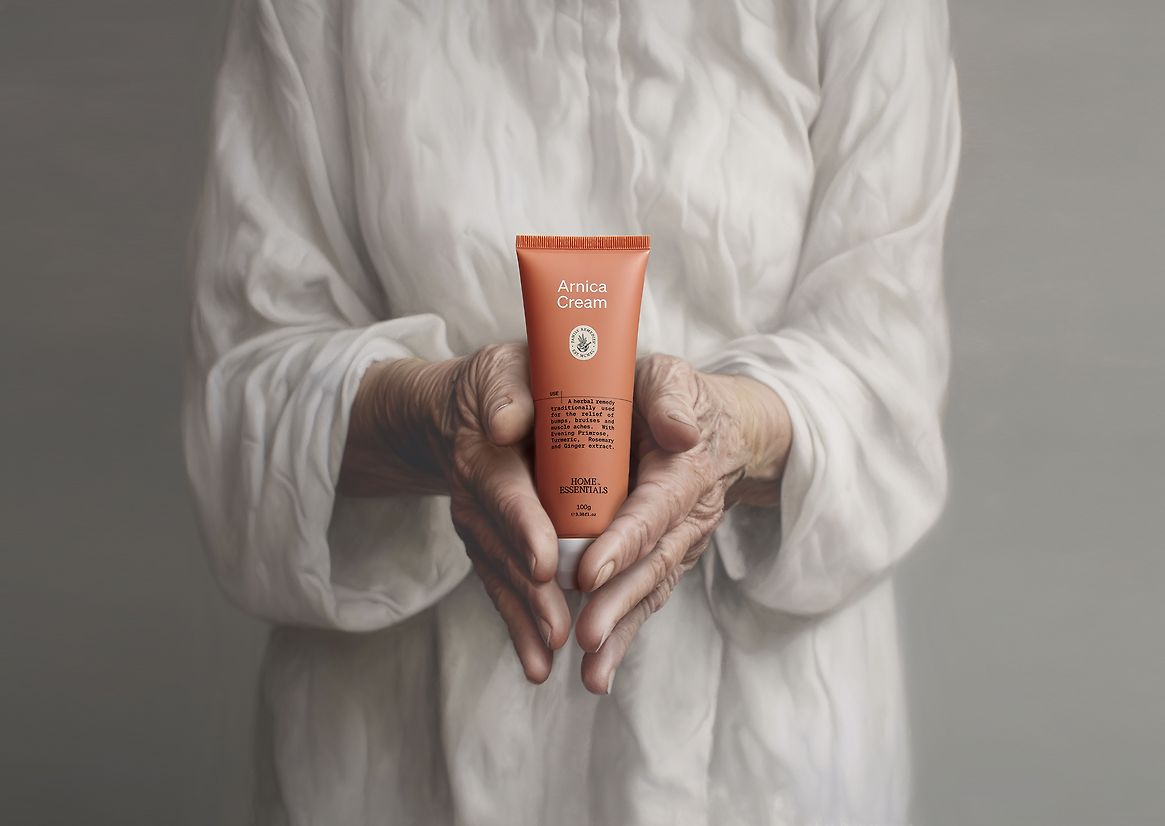
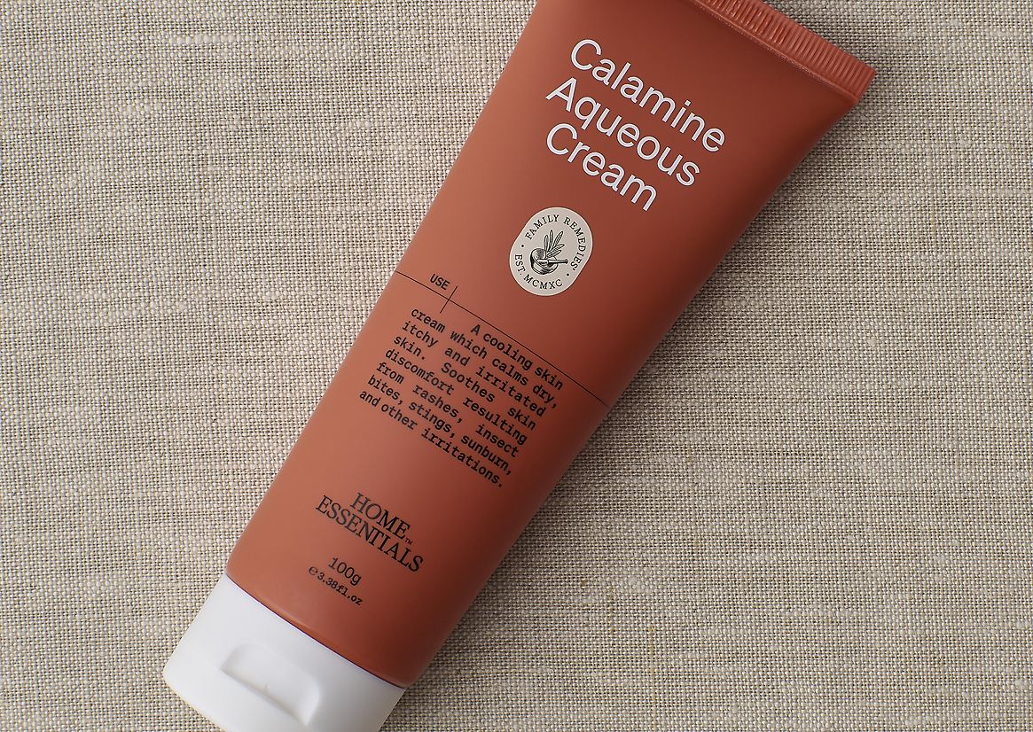
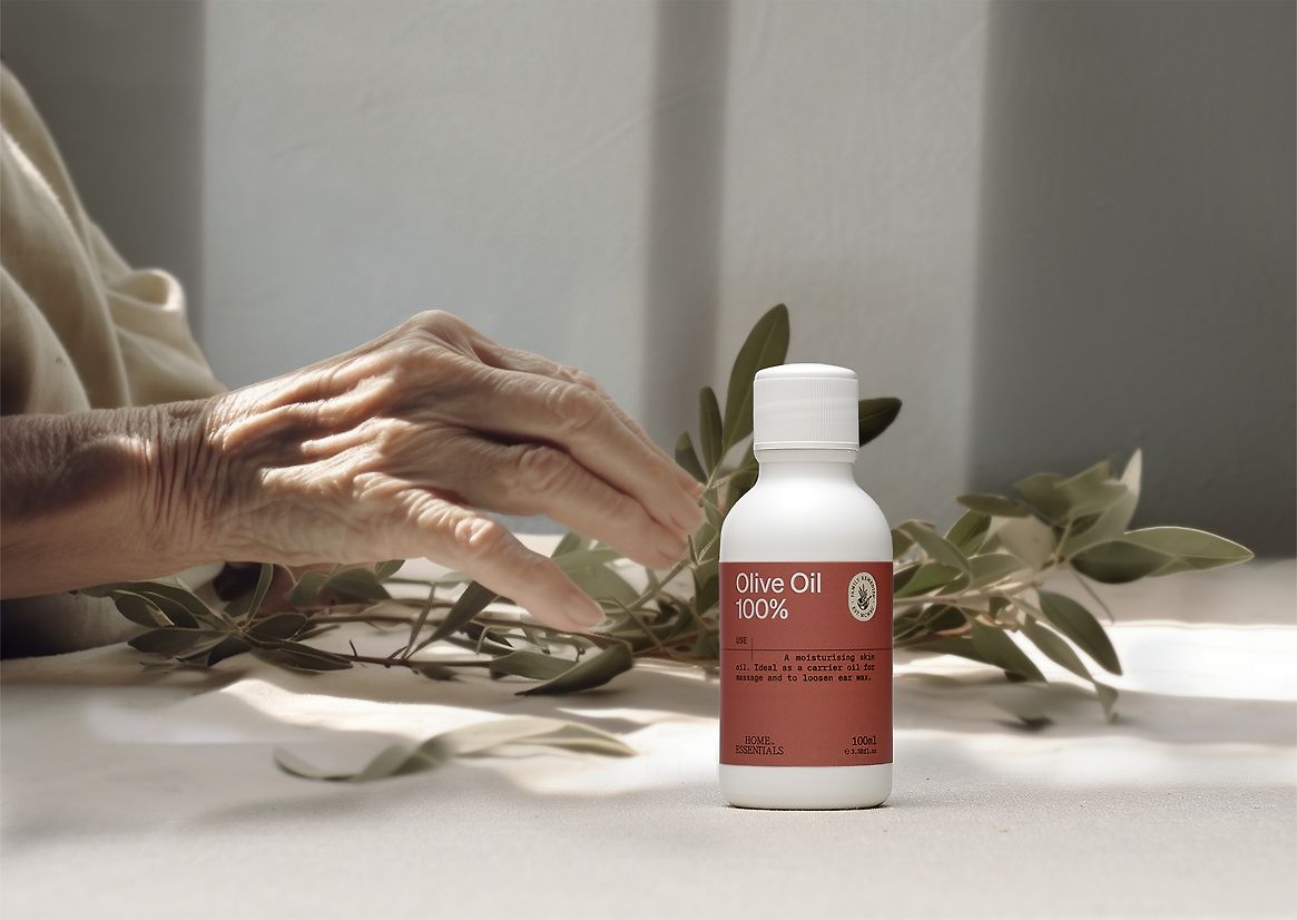
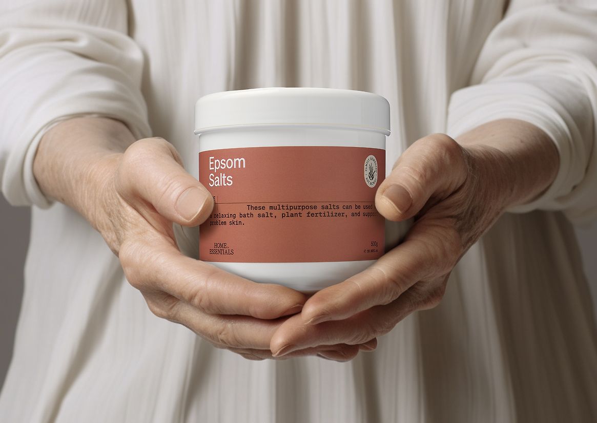
The brand had faced many challenges in-store. The range was never displayed as a family, and as such, the multi-coloured packaging used originally as a segmentation tool actually worked against the brand. Another key challenge was the hand-script brand mark, which was lost and not legible due to its application on many small pack formats.
Guided by extensive market research, the brand refresh became a beacon of inspiration for the redesign. Home Essentials had a rich history, one that held familiarity but lacked on-shelf recognition. To address this, we simplified the brand mark, and the colour system was streamlined, transitioning from a multitude of shades to a singular, impactful hue. The choice of natural, earthy terracotta tones combined with cream and black became the brand's signature colours—an aesthetic that was uniquely theirs, creating a visual identity that was own-able.
The new packaging design breathes life into Home Essentials, exuding a sense of simplicity and confidence. The clever use of colour blocking allows the products to command attention on the shelves, instantly drawing the eye. As shoppers peruse the aisles, the terracotta hues stand out, beckoning them to explore further. It was a beacon of owning the visual landscape and making Home Essentials instantly recognisable.
But it isn't just the colour that catches the eye. The design layout itself is a work of art, mirroring the familiarity of a medical script. The new on-pack hierarchy tells a story—each product description is followed by concise guidelines for use. This resonated deeply with Home Essentials' range, which included not only everyday essentials but also remedies that provide relief for a variety of ailments. The typography used in the design reinforced the brand's commitment to providing solutions, subtly reminding customers of the trusted medical heritage that Home Essentials had built over 30 years.