Graphic
Onfire Design Ltd 19 Rolling Meadow
-
Pou Auaha / Creative Director
Matt Grantham
-
Ringatoi Matua / Design Directors
Sam Allan, Natasha Alimova
-
Ngā Kaimahi / Team Members
Natasha Alimova, Lisa Capel -
Kaitautoko / Contributors
James Stewart, Maja Szarmach -
Client
Maja Szarmach

Description:
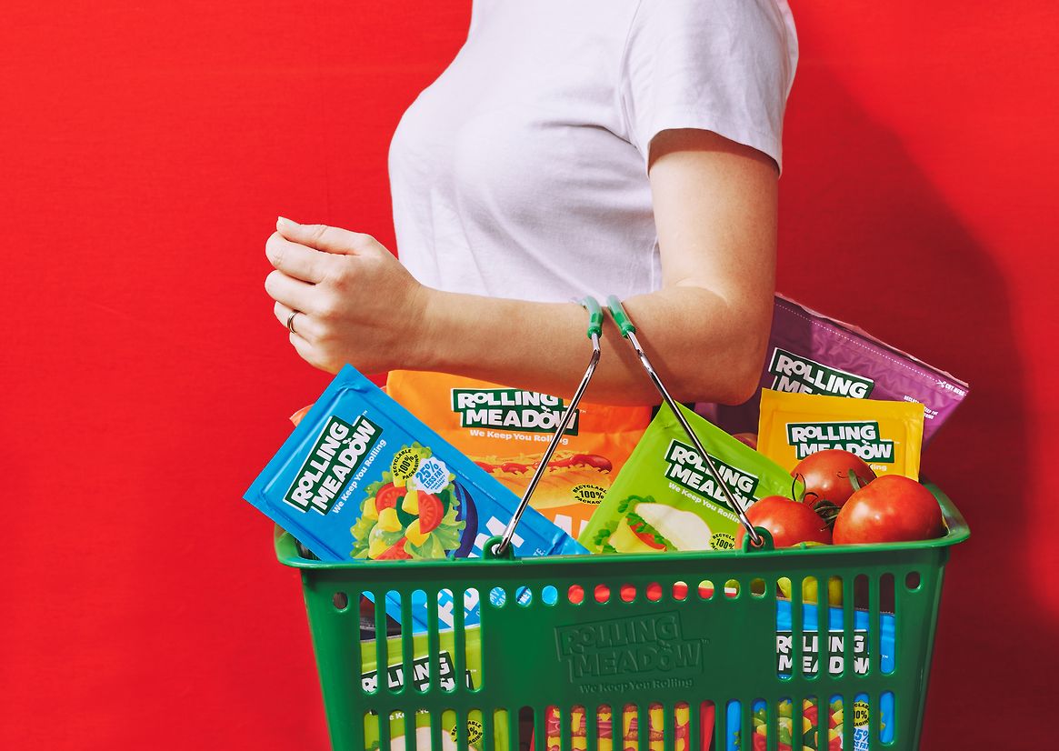
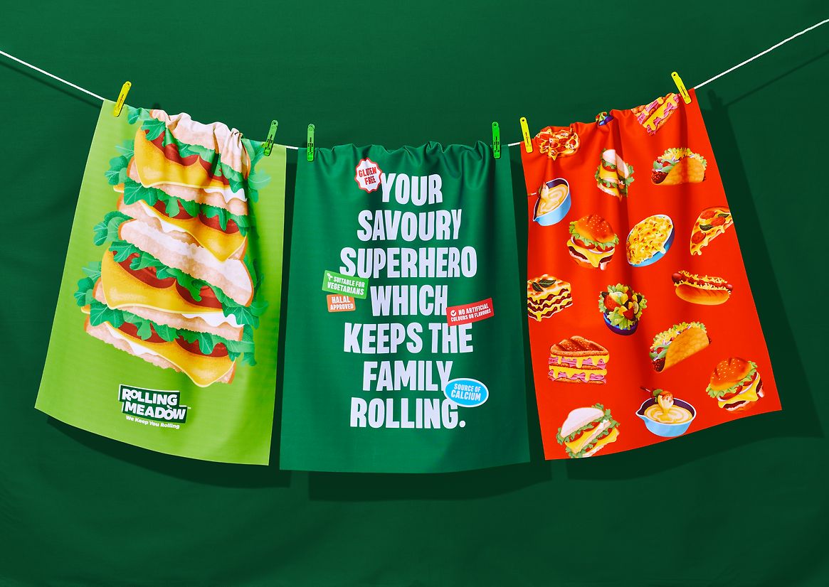
Rolling Meadow is a mainstream cheese range offering grated and block cheeses. Retail had challenged the brand owners regarding the brand's role in the category. Outside of (accessible) price, it was challenging to demonstrate the brand's role in a consumer's daily life. While the brand lacked impact in-store and a compelling brand asset and tone of voice, the owners knew it held equity simply through its share of the cheese category (32% volume and 28% dollar value). There was also a noticeable increase in 'family' shoppers, with an expected sales growth of 26% by 2043. So brand recall was low, with shoppers simply buying on variant, size, (category) colour and price.
Creating a new brand and packaging livery would help articulate Rolling Meadow's role in a consumer's life and its relevant position in supermarket chiller aisles.
Understanding this role in a family's daily life was essential. It is both the fuel that powers their busy lives (a great source of protein and calcium) and the heart of favourite food moments—taste, versatility, and nourishing. This insight led to the brand truth of 'Rolling Meadow adds fuel and fun to New Zealand families'.
The gap in the market was real (and great tasting) cheese for New Zealand families. Cheese is the perfect food and ingredient for them. Aligning with the brand name, the core brand idea became 'We keep you Rolling.' This created a new personality with a big heart, energy, relentless positivity, and straight-talking.
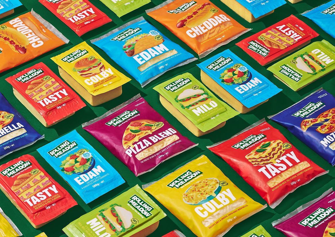
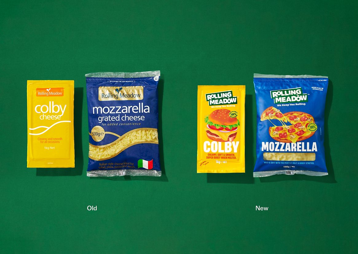
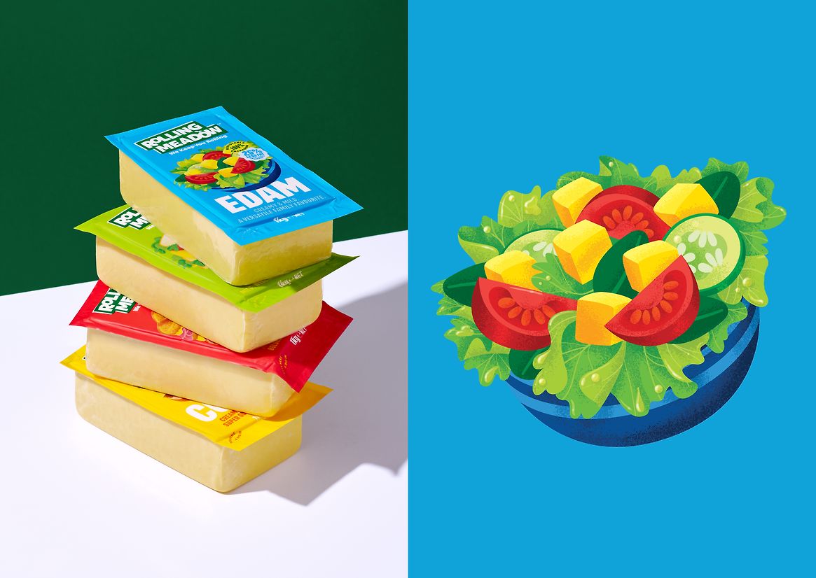
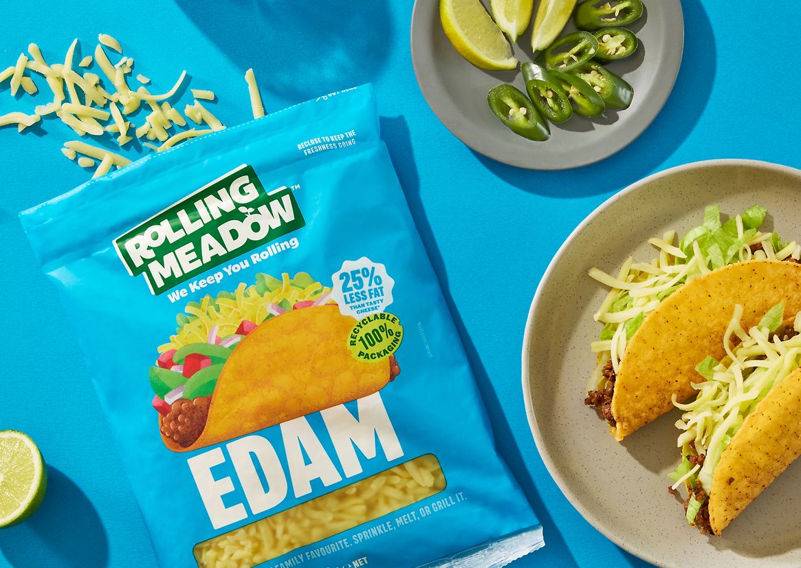
Guided by the new positioning and driving ideas of big energy, healthy fuel and versatility, the existing livery was revolutionised—any brand recognition and equity issues were not important due to poor brand recall. In its place, a new language based on fuel, versatility, and an essential ingredient in family meals was created.
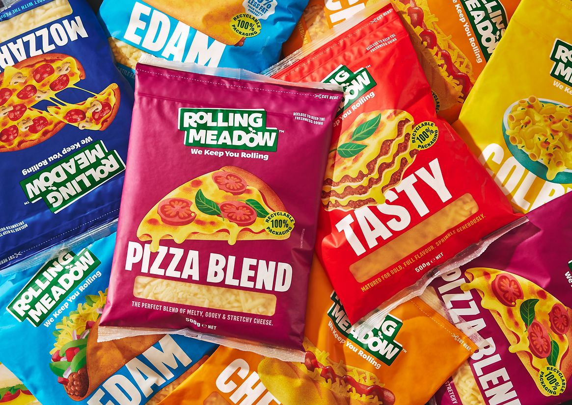
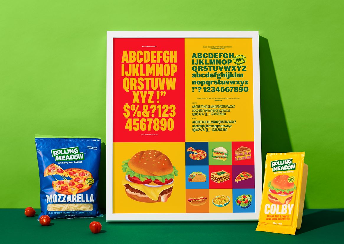
All new distinctive brand assets were created while adhering to category colour coding, which is 'baked-in' for the cheese consumer. The new hero for the brand are food illustrations. Highly stylised, colourful, and textured, this new suite of assets showcases the various foods that can be created with each cheese variant (block, grated, and flavours). The graphic style of illustration was created to make each one distorted, with playful angles and dimensions, which enabled the cheese and other colourful ingredients to be heroes while allowing each one to fit the space of each pack.
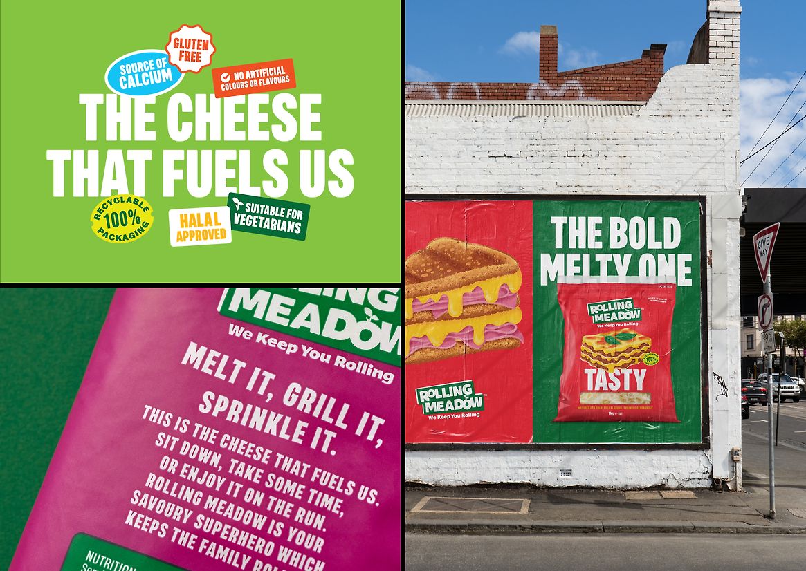
The brand logo typography is loud and proud. Bold, rounded typography is playful and energetic, adding relevance to the proposition and the meadow 'sprout' - previously an abstract drop device. The holding device is based on a sticker-like application, representing the idea of 'good everyday value'. This language is then used for on-pack product and health messages. The new typography is big and bold, acting as a balance to the illustrations.
The result is a brand that understands its role for today's consumer, is bold, energetic always on hand to make epic dairy-powered food.