Graphic
Onfire Design Ltd 15 Old Country Food
-
Pou Auaha / Creative Director
Matt Grantham
-
Kaituhi Matua / Copywriter Lead
Bronwyn Williams
-
Ngā Kaimahi / Team Members
Matt Grantham, Vijay Patel, Michael Nichols, Lisa Capel -
Kaitautoko / Contributors
Yuki Sato, Shaun Cato-Symonds -
Client
Ruth Lees


Description:
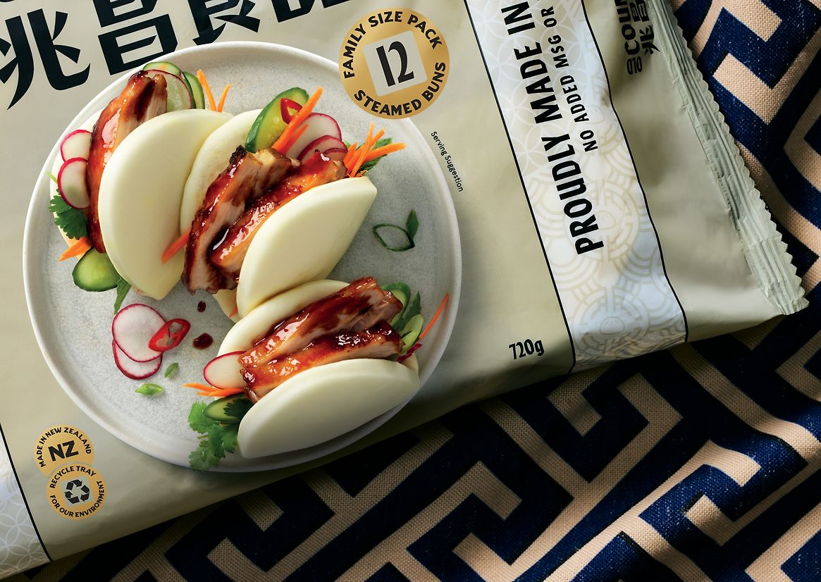
Established for over 30 years, Old Country Food is a two-generation Asian family-run business based in Auckland. The proposition is simple - deliver a wide range of premium frozen dumplings, steamed buns and bao that are made to exact traditional Chinese recipes and methods while using fresh, locally sourced New Zealand ingredients. A fusion of two cultures. This was their point of difference from category competitors - delivering this style of food in a way that ethnic consumers would fondly remember from growing up in China (taste, texture and tone) while being unique and distinct for the Kiwi consumer.
They had built a hugely loyal following among ethnic and second-generation Asian families through the small network of Asian supermarkets in Auckland. Their future growth strategy required the brand to enter the broader NZ retail market and widen its consumer group to include all New Zealanders.
The existing packaging was doing the brand no favours. Lacking in brand presence, difficulty to navigate range and no yum factor. Our design strategy focused on 'delicious traditions' through which the unique flavours, styles and quality could be showcased. A dual language messaging system was embraced early - contrasting to the other Kiwi-made products, this new system proudly fuses both languages and acknowledges the Chinese consumers that know and love the range while speaking to the modern Kiwi foodie consumer.
The wordmark is bold and oversized, with flexibility to be used horizontally on pack and vertical on off-pack communications. This sits proudly on packs, linked directly to the new prepared food photography that clearly shows the shapes, textures and colours. Inspired by Chinese tapestries, the packs are graphically segmented with white banners with flavour and secondary messaging. Gold roundels with square centres mimic ancient Chinese currency. Drawing inspiration from ancient Asian artworks through to modern-day neon-tinged streets, the colour palette is bright and rich. We also had the opportunity to shift the packaging formats to soft-plastic outers and, more importantly, recyclable trays rather than the previous plastic.
For the relaunch, the brand also collaborated with Auckland-based 'The Hangi Master', Rewi Spraggon, to create a steamed bun with Hangi meat. This product is the true reflection of the two culture fusion while selling out extremely fast!
Since its relaunch, the brand has been accepted into numerous retail outlets throughout New Zealand.