Graphic
Onfire Design Ltd 19 Fakieh Poultry
-
Pou Auaha / Creative Director
Matt Grantham -
Pou Taketake / Cultural Leads
Tuba Terekli, Shadi Bogari
-
Ringatoi Matua / Design Director
Sam Allan
-
Ngā Kaimahi / Team Members
Natasha Alimova, Jamie Turnbull, Jade Sullivan, Simon Burton -
Kaitautoko / Contributors
Yuki Sato, Clare Buchanan, Shaun Cato-Symonds, Melanie Jenkins -
Client
Tuba Terekli


Description:
As one of the largest poultry manufacturers in Saudi Arabia, Fakieh is considered a heritage brand. Started in 1960, Fakieh was. The brand made chicken produce accessible to the mainstream consumer, having previously been a premium-priced option.
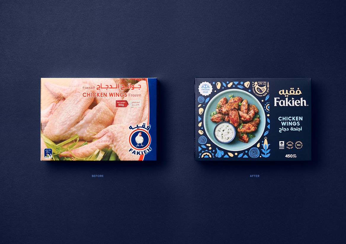
The chilled and frozen chicken category in Saudi is vast. As the meat of choice for family dining, various local brands and international options are vying for the consumer. The category is equally unmatured; the lack of investment in brand, packaging and promotions is visceral, especially compared to the mature and competitive NZ poultry market. As a brand, Fakieh had remained virtually untouched for several years, looking more like a 'manufacturer' rather than a 'heritage brand'. Saudi businesses are also working towards 'Vision 2030', a countrywide strategic initiative established by the government to help grow and diversify the economy, strengthen Islamic national identity and offer a fulfilling and healthy life. This was the perfect opportunity for Fakieh to rebrand, modernise and create excitement around its products to become a leader in the community for family dinner times and health.
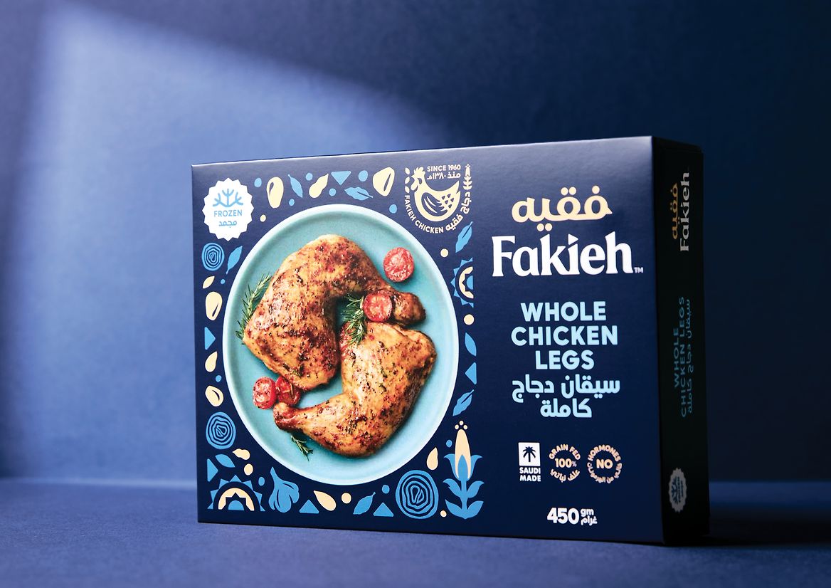
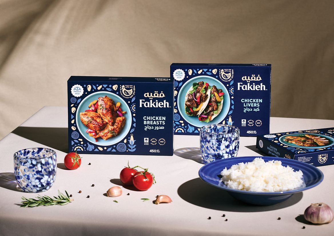
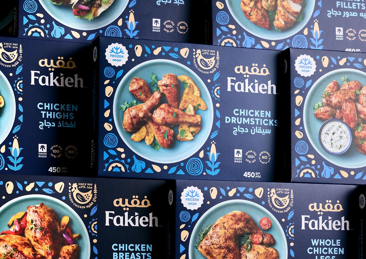
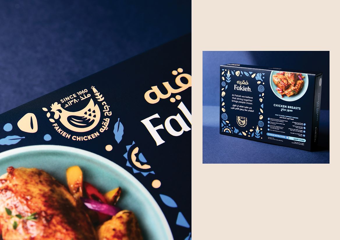
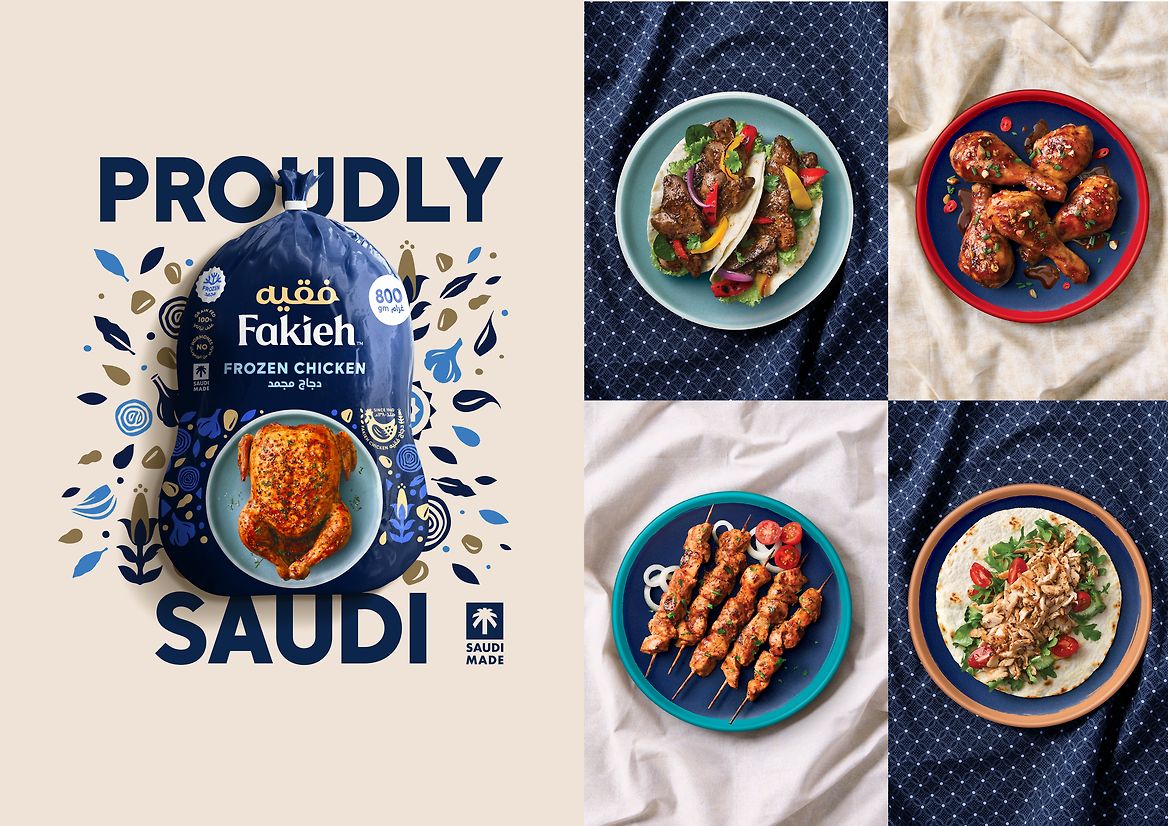
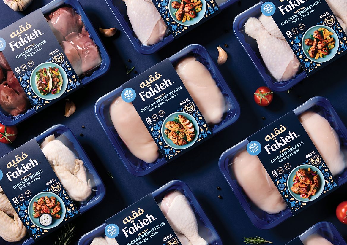
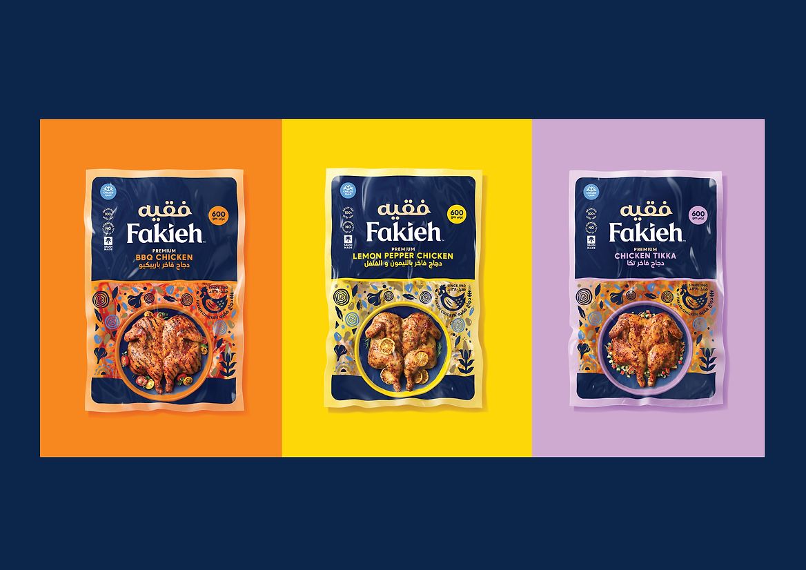
We saw Fakieh as a well-loved heritage brand with a product range for the modern Saudi family. A genuine 'modern traditional' brand. We drew inspiration for the rebrand from the country's rich and iconic cultural arts and crafts movements. The brand wordmark was radically redesigned - working with two typographers to develop a bespoke lockup. A traditional, soft serif reflects the pride, trust, empathy and compassion that a consumer sees in the brand. The Arabic translation position and colour intended to be a 'crown' device on top of the wordmark. Moving away from the cold and impersonal white livery, a rich dark blue inspired by historical paintings and a favoured architectural colour for doors and window framing unifies the brand across all formats. A unique pattern was created using intricate patterns found on mats and rugs rather than geometric patterns. The grain to feed the chickens and food ingredients make up the pattern used in various ways to frame food and messaging. Taking pride of place within this pattern is the Fakieh heritage device. Flexibility was built into all new brand elements to allow for ease of use across various packaging and communication touchpoints.
The colour palette is equally Saudi proud. Secondary to the Fakieh blue is a range of lighter colours that nod to historical and provenance ideas. New food photography was developed and shot in Auckland. Minimal in style to hero the chicken in each dish, shows the various meal inspirations to feed the Saudi family of today.
The result is a brand inspired by its heritage while looking to modern Saudi families' future health and diets.