Graphic
Milk 68 Resolv
-
Pou Auaha / Creative Director
Sarah Melrose
-
Ringatoi Matua / Design Director
Anthony Hos
-
Ngā Kaimahi / Team Members
Ben Reid, Kate Forsythe, Eden Harris, Gemma Scott, Natasha Vermuelen, Adeline Chua -
Kaitautoko / Contributors
Tom Crampin, Michael Crampin -
Client
Sims Consumer Brands
Description:
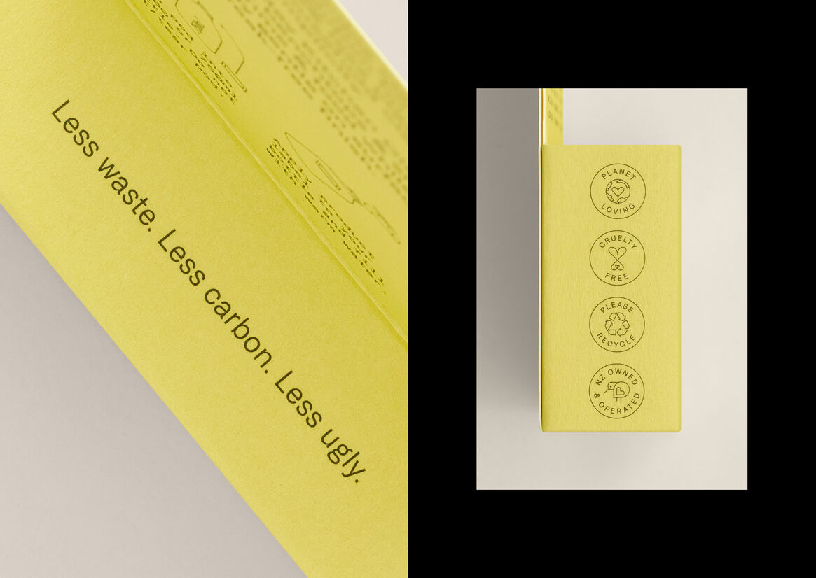
When it comes to single use plastic, the answer is simple – less is best (or none if you can). This is a problem that the home cleaning aisle has, and one that isn’t so clean.
Our client Sims Consumer Brands had an idea for small, concentrated, soluble cleaning ‘pods’ that could address these environmental problems. They asked us to help bring it to life, but we knew introducing a completely new format and educating consumers on what it is and how to use it is no small feat, especially when the pods are tiny and they’re used to buying bottles.
We started with the enemy: dirty. Dirty design, dirty behaviours, dirty actions. In an industry that’s supposed to be about cleaning up, there was a clear opportunity to be a real disruptor to all this ‘dirtiness’.
The answer was all about bringing a brighter outlook through beautiful simplicity and genuine positivity. Bringing a sense of care, innovation and a touch of performance.
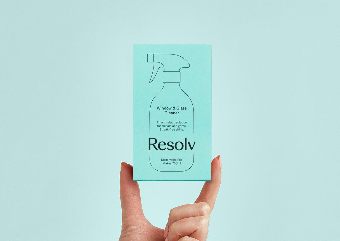
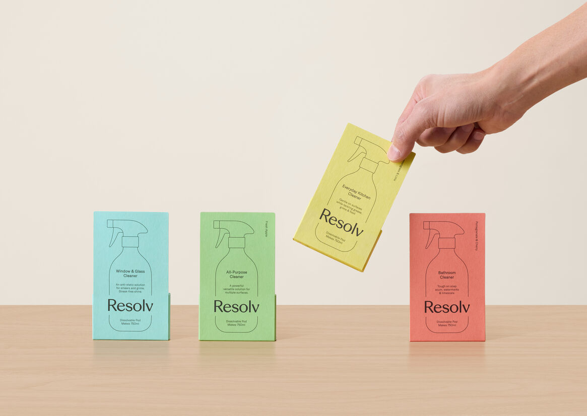
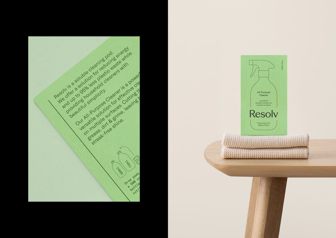
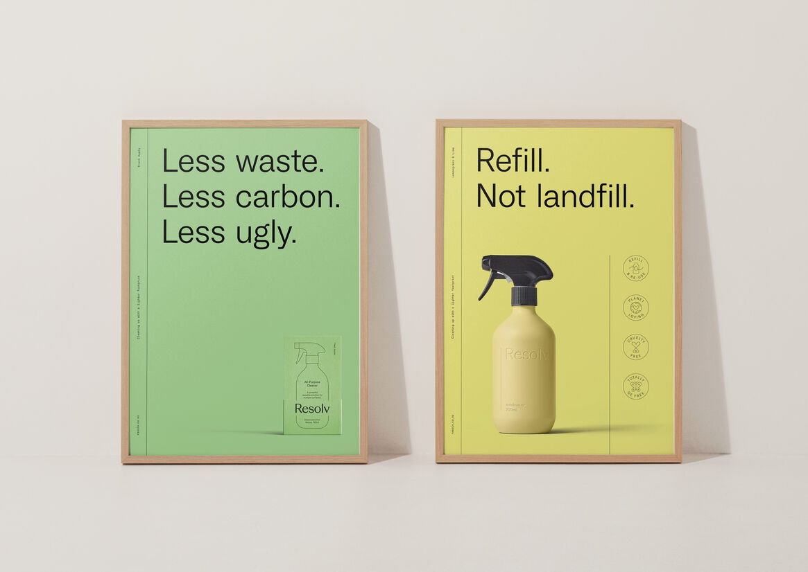
The packaging features a progressive modern colour palette that reinforces our positive outlook and helps the product stand out on shelf. Signifying innovation, efficacy and performance. The idea of a ‘lighter footprint’ influenced the keyline bottle shape, keyline iconography, the off-pack keyline design system and the custom typeface.
The wordmark is modern and contemporary, representing efficacy, credibility and authenticity with its built in angular cuts and forms. Subtle thick and thin stroke variations give it beauty, elegance and elevate the everyday.
Acute Grotesk, the custom typeface was purpose built to keep it clean, light, bright and circular, just like our footprint. Purposefully designed with a sharpness and a modern mindset, it’s the perfect vehicle to help encourage people to refill, not add to landfill.
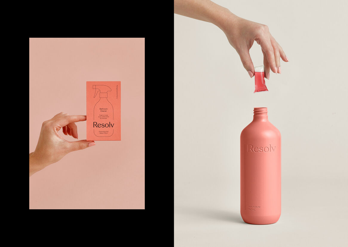
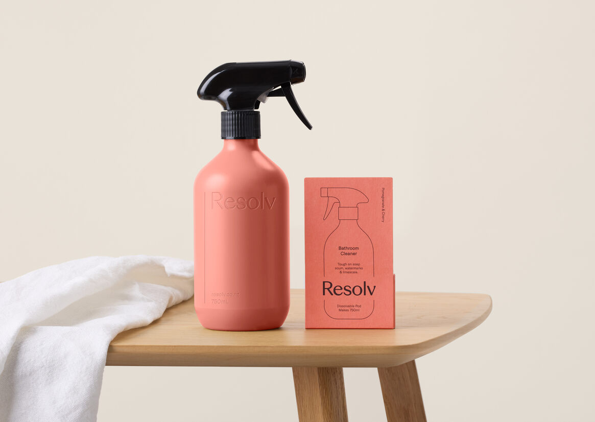
As the ‘pod’ itself is small, we needed to ensure it had real shelf presence. Our research showed us that consumers associate bottles with cleaning products, so we incorporated the outline of a bottle on the front of pack. Showing consumers that this was just like a bottle of cleaning product – only better for you, your home and the environment.
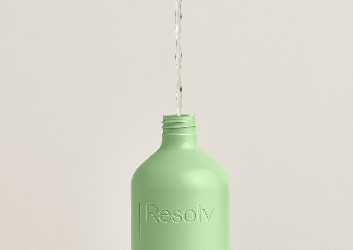
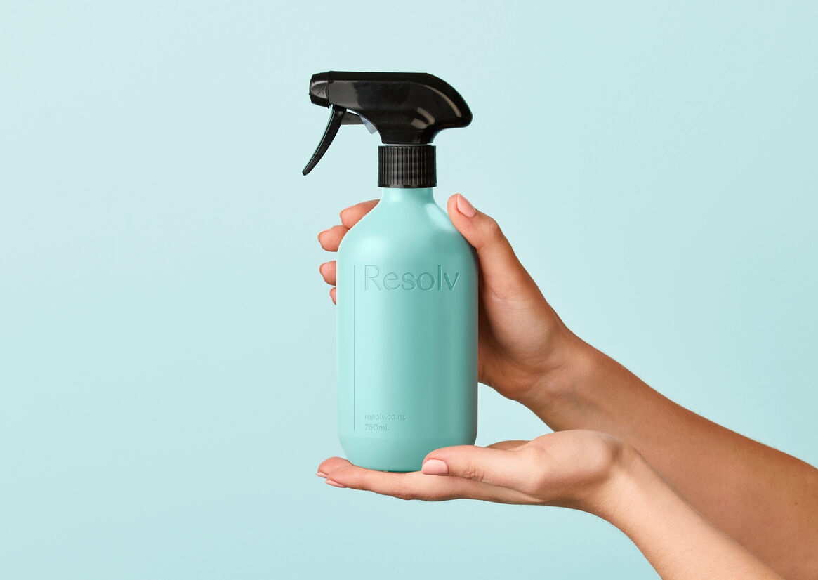
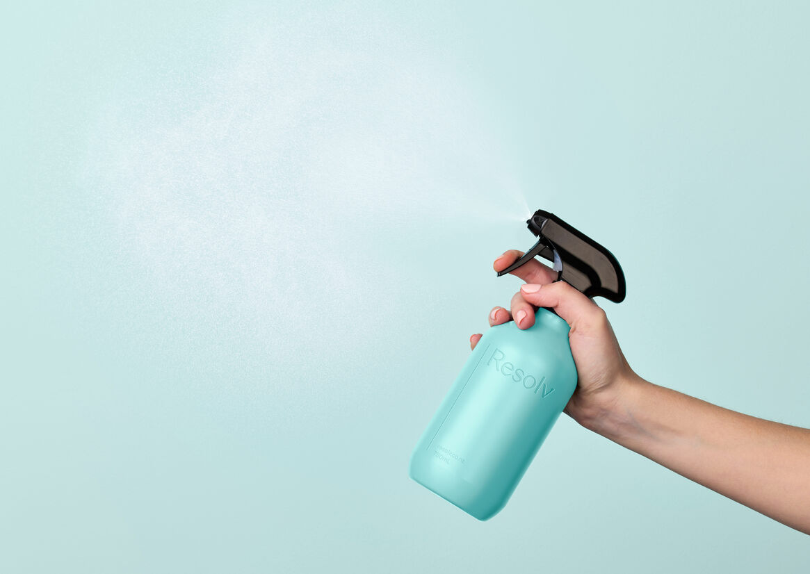
Another critical piece of packaging to the reusable Resolv proposition was a new set of reusable bottles. We designed these sympathetic to the home environment. They needed to be lightweight, beautiful, and functional. So we kept them refined and simple with a reductive blind embossed logo that sits proudly, but respectfully in the laundry, bathroom or kitchen.
The result is a system and a packaging suite that gives a true sense that brighter is finally here. Where everything is guilt free, waste free, harm free - and a little bit more beautiful. Where everything works better and is simply clever.