Graphic
Milk 75 Honeysticks
-
Pou Auaha / Creative Directors
Anthony Hos, Sarah Melrose -
Pou Rautaki / Strategic Leads
Sarah Melrose, Ben Reid
-
Ringatoi Matua / Design Director
Ethan Lowe -
Kaituhi Matua / Copywriter Leads
Judah Finnigan, Bronwyn Williams
-
Ngā Kaimahi / Team Members
Harriet Campbell, Alyssa Miller, Jemima Christie-Limbrick, Gemma Scott, Josh Daly, Adeline Chua, Jacinta Conza -
Client
Honeysticks
Description:
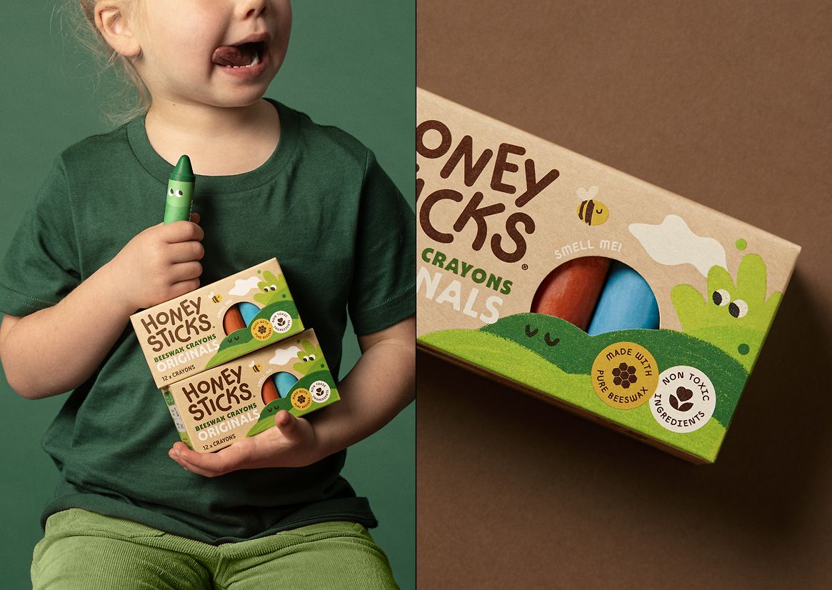
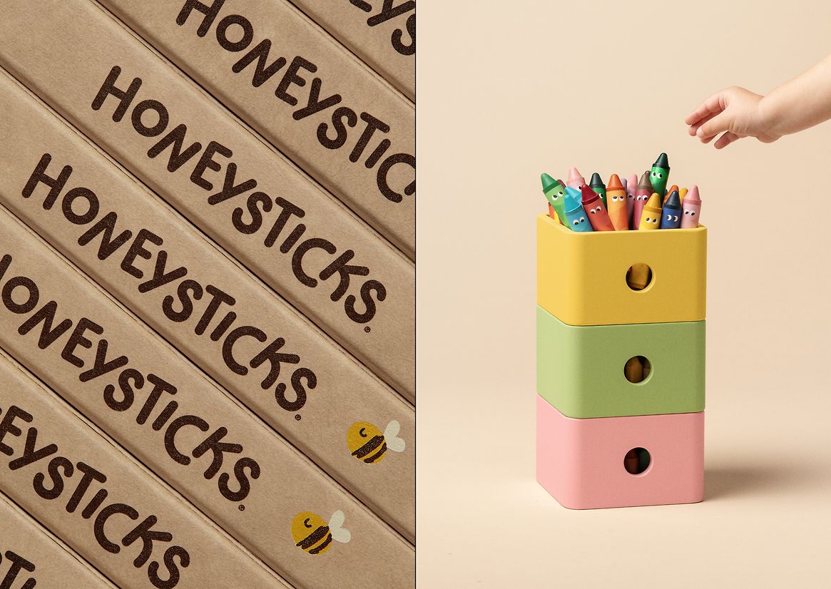
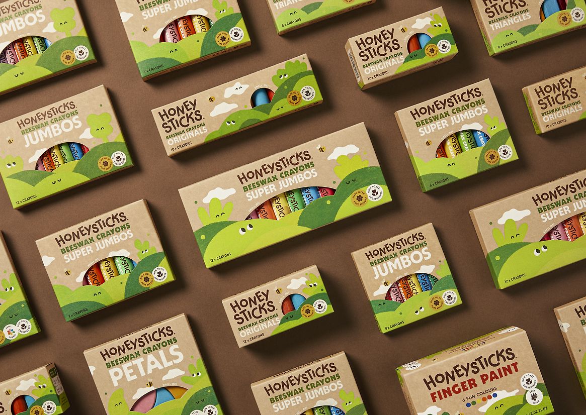
Honeysticks began in Aotearoa New Zealand with a simple goal: to make safer, sustainable crayons for kids, using nothing but the purest ingredients. Backed by NZTE, they’ve since become the #2 crayon brand in the world, second only to petroleum-based giant Crayola. But as the range expanded (25 SKUs and counting), Honeysticks quickly became aware their packaging needed cohesion. FMCG is a tough category to break ground in; with limited real-estate on the pack, it can be tricky to ensure that all the busyness doesn’t drown out the brand. Honeysticks needed a system that could scale up, flex out, and unify their range – all with preserving enough playful charm to stand out in-store and online.
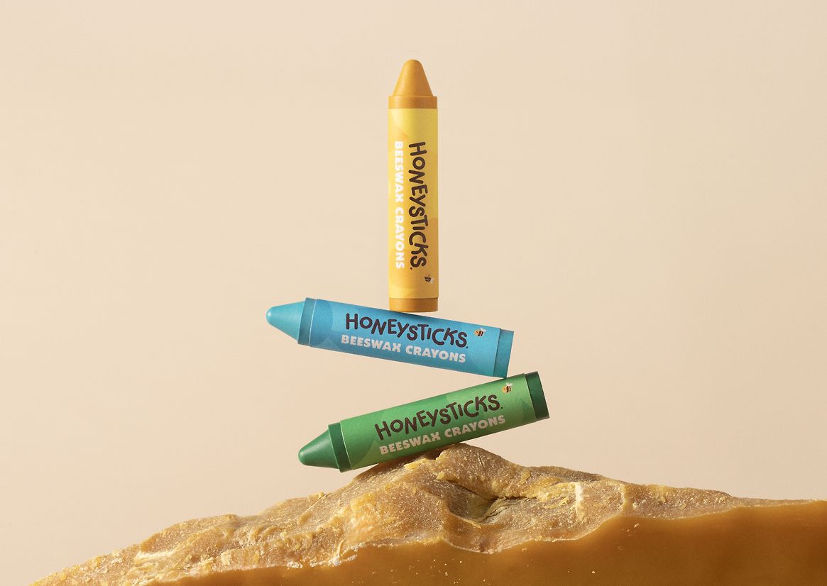
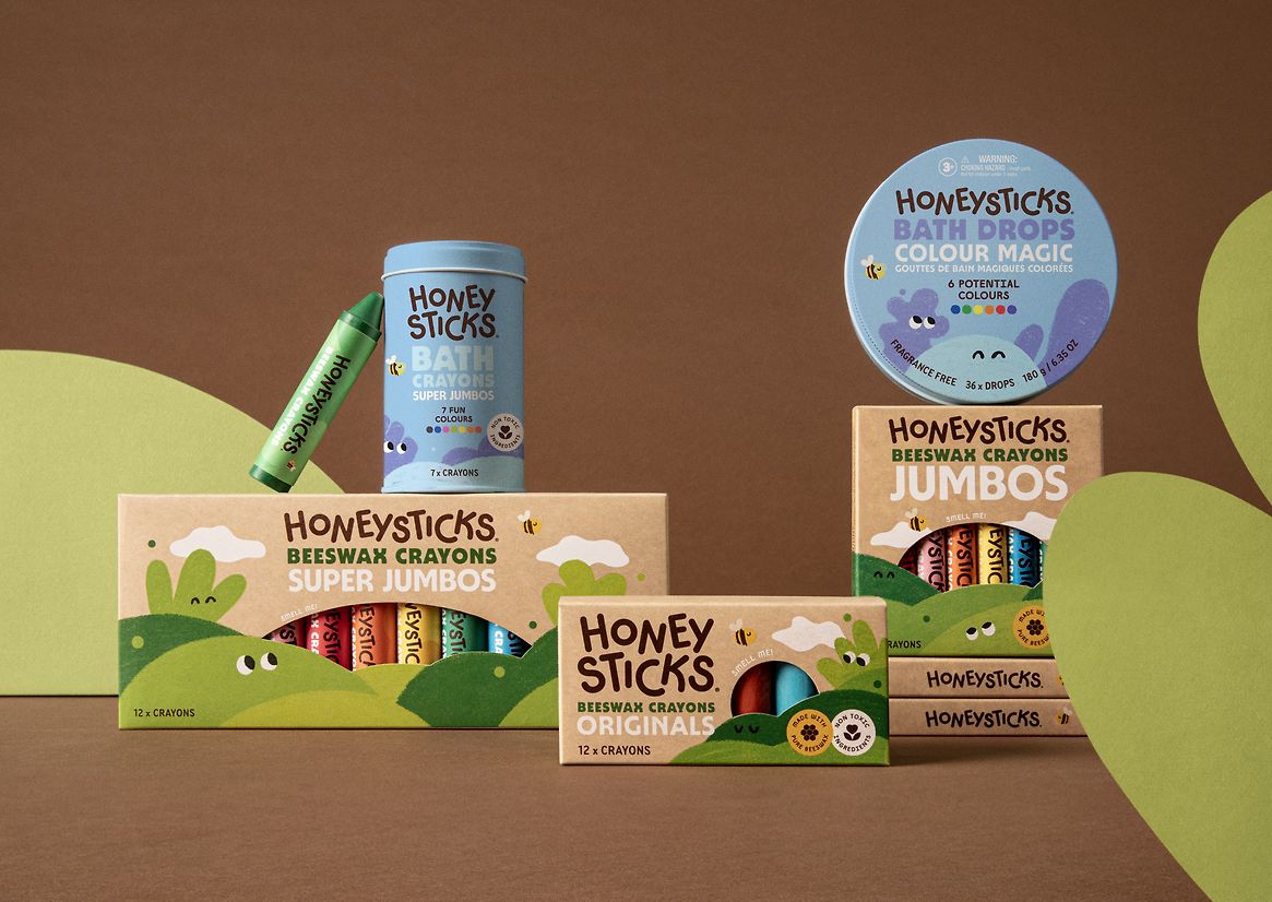
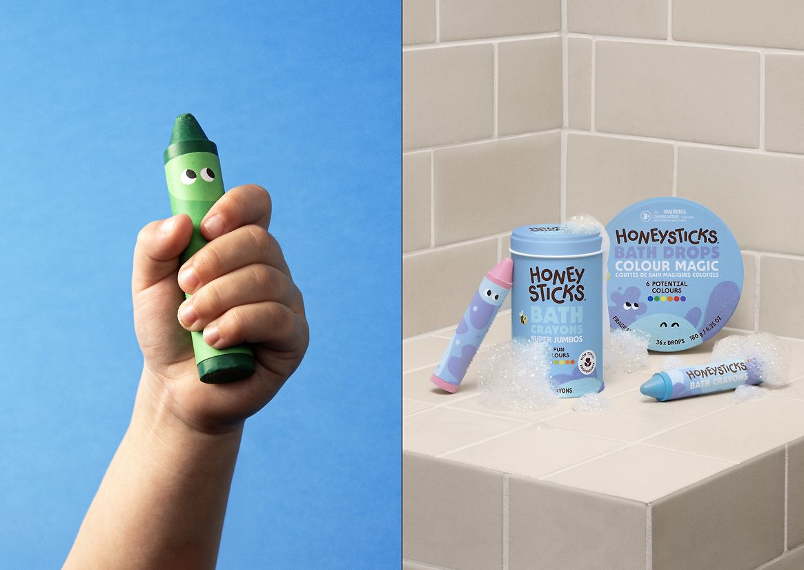
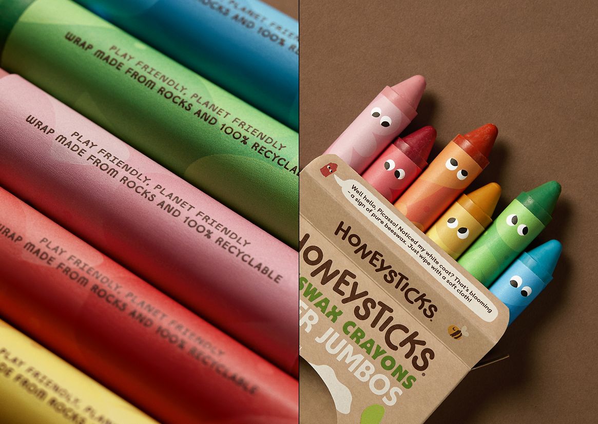
Guided by our overarching brand idea ‘A World of Pure Creation’, every detail of the new packaging embodies Honeystick’s core values. Doubling-down on purity, we worked with sustainable craft stock, food-grade vegetable inks, and biodegradable rock paper for our crayon labels. Bath products were packaged in tins, never plastic. Every pack was designed for minimal waste, all while maintaining the shipping resilience that a global brand demands.
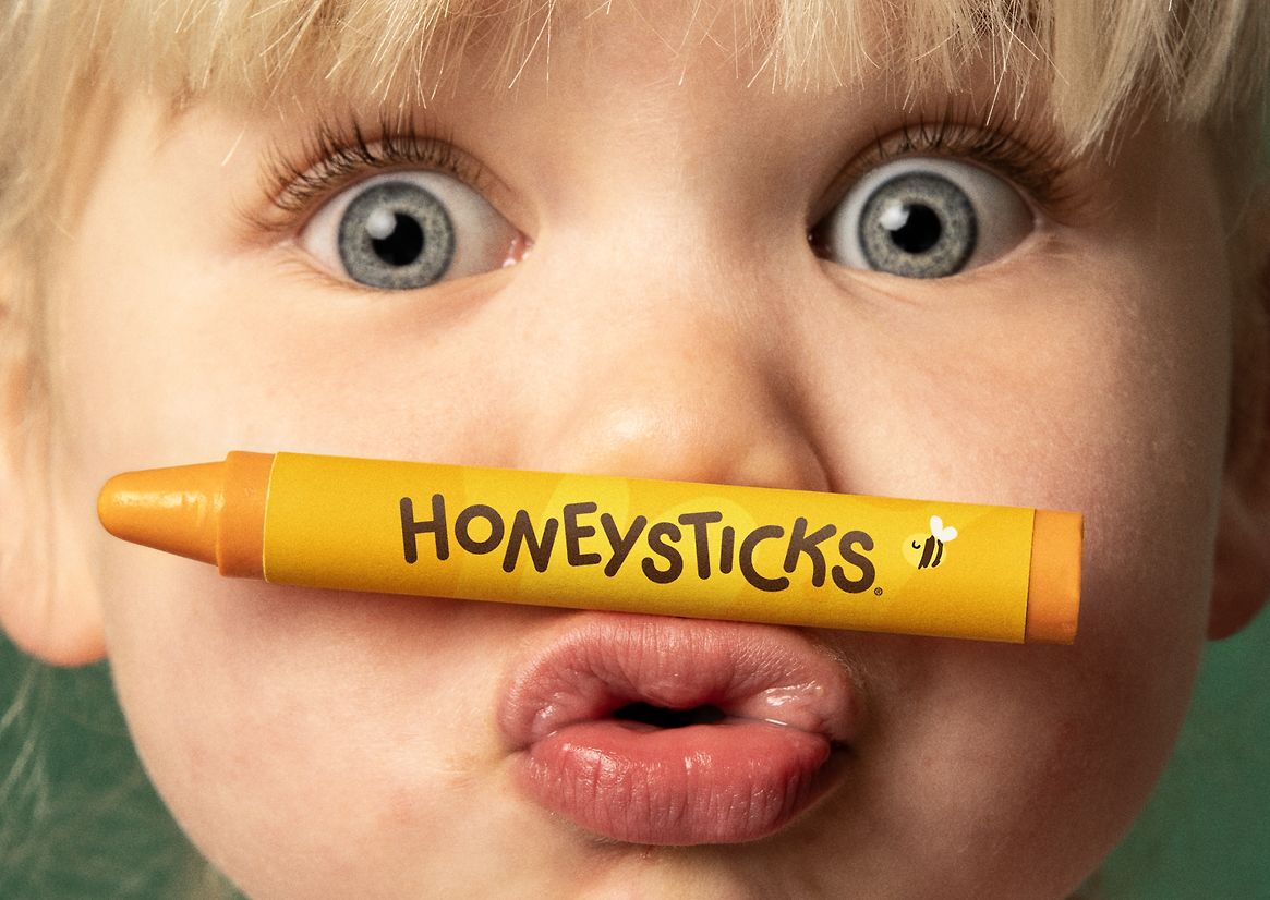
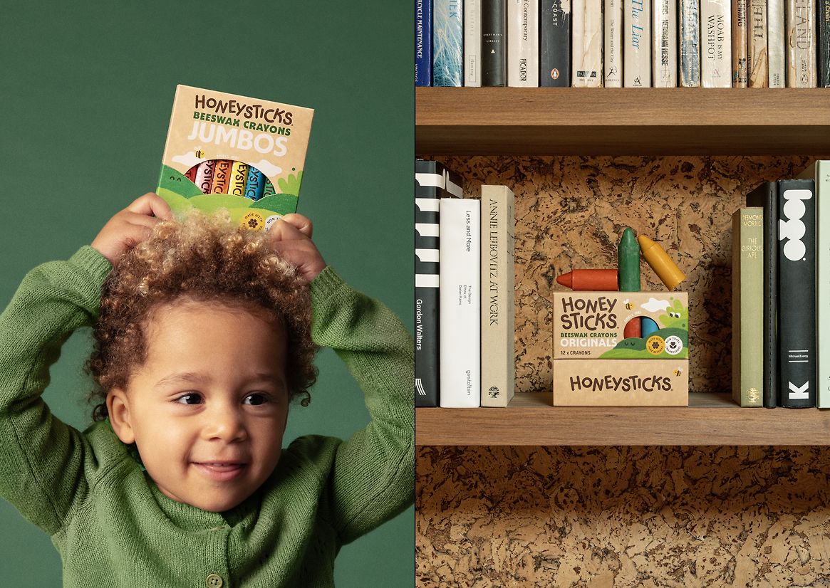
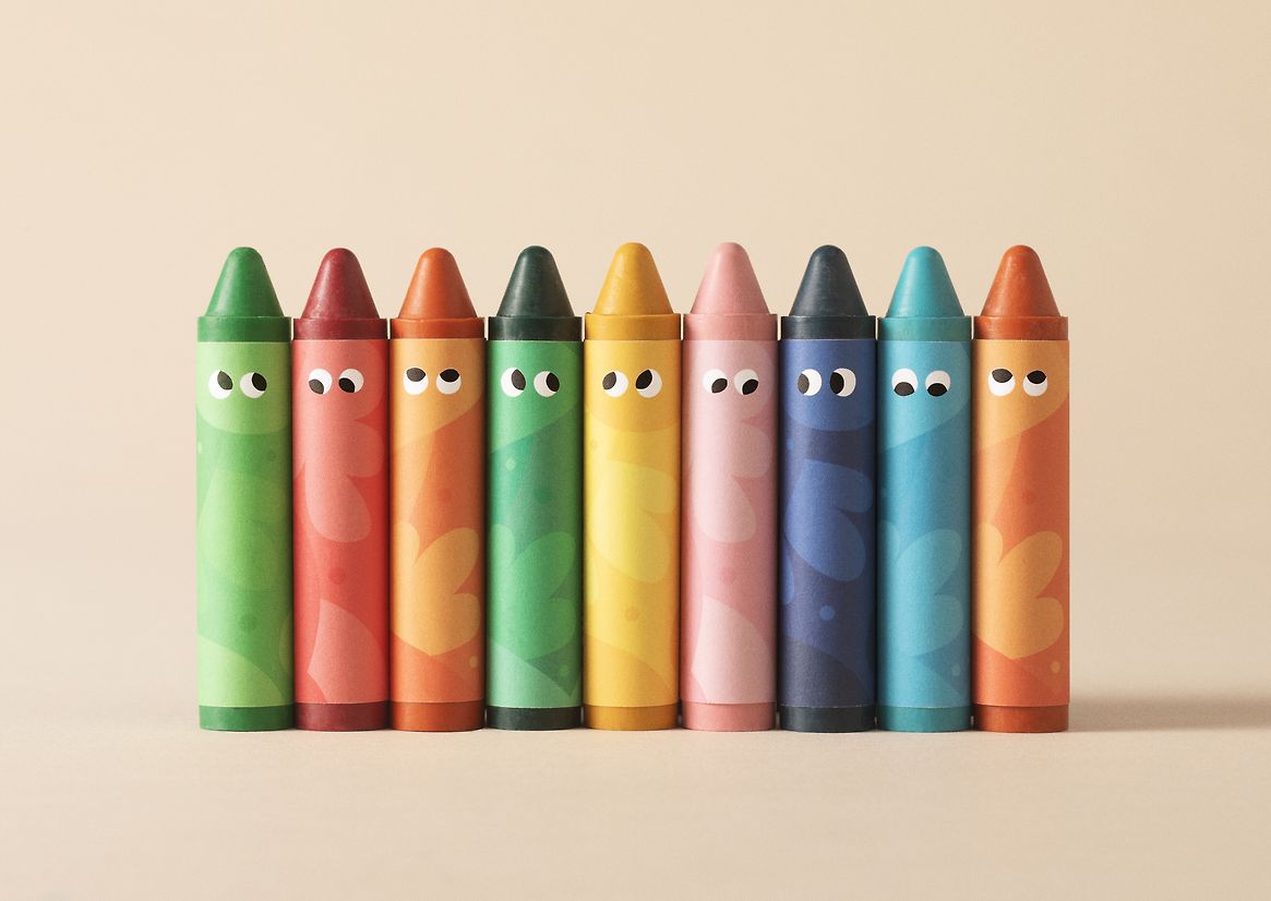
Throughout, we mined every opportunity for creative flourishes. Hidden eyes, cheeky characters, and our mascot Scribble Bee (clad with goggles for the bath) all spark delight and bring the brand to life. A die-cut sun lets kids (and parents) smell the real beeswax inside, turning unboxing into a sensory experience. Across the range, illustrations are anchored in our natural world – forests, trees and land characters for crayons, a vibrant underwater scene for bathtime. With clear differentiation across products, the range is now easy to navigate and difficult to miss.
Driven by global research, we designed a straightforward messaging hierarchy that carefully aligned with customer values and buying needs. Every word on pack works hard, highlighting our unique non-toxic positioning. Credentials are clearly identifiable to the eco-conscious shoppers, along with legibly-sized product numbers, icons and claims.
With a flexible system designed to grow along with the brand, our packaging balances a wide range of demands – communicating quality, sustainability and safety, without ever sacrificing the playful spirit Honeysticks is known for. Creative and caring, Honeysticks packaging makes it easy to love the planet.