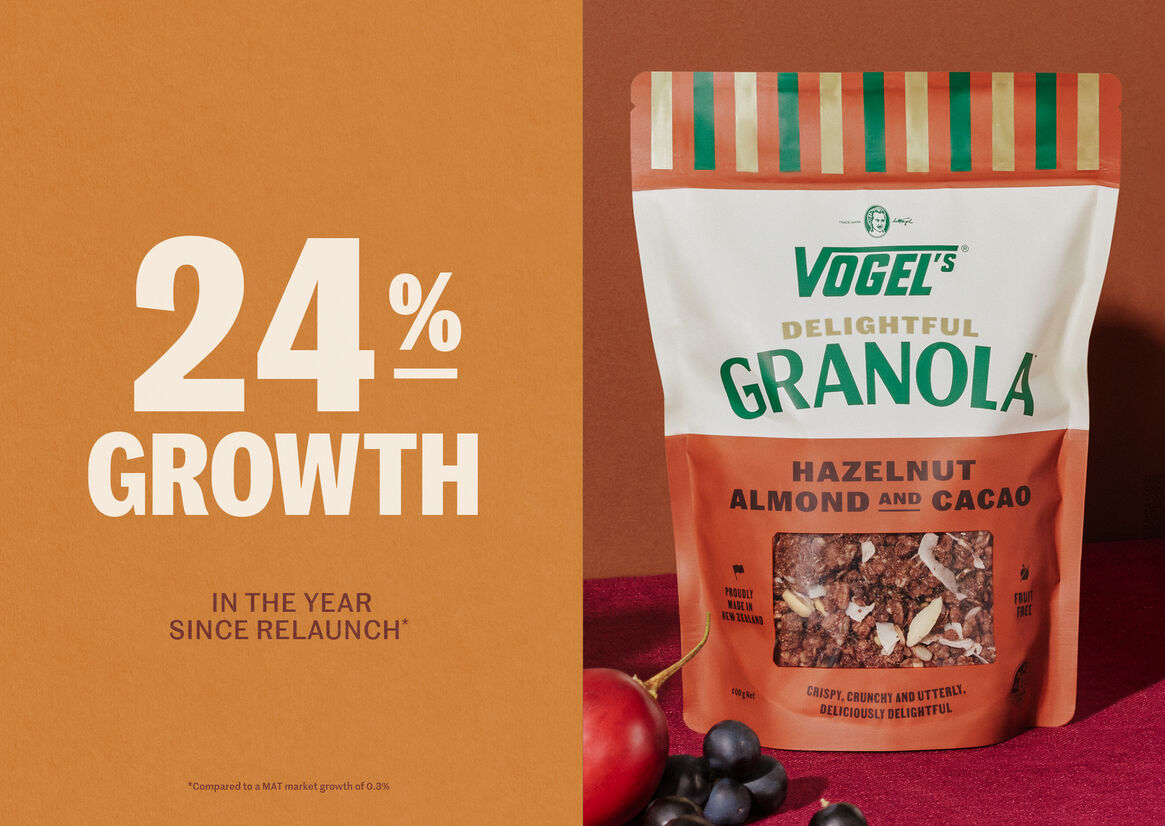
Despite having good ranging in mainstream supermarkets, Vogel’s Delightful Granola, along with the rest of the Vogel’s range, had become dated and out of touch with modern consumers. We were charged with its resurrection.
Vogel’s Delightful Granola sits in the ‘everyday premium’ category in major supermarkets throughout New Zealand, with an intended audience of mostly female household shoppers across all generations. It’s a highly competitive category with constant product innovation and strong brand loyalty. To turn the fortunes of the brand around, the challenge for Vogel’s was to get noticed and find a unique, credible voice in a large crowd of loud and dynamic brands.
Understanding the special place the Vogel’s brand has in New Zealanders’ hearts, we sought to leverage the credibility and nostalgia established by the bread range, whilst extending it into a premium contemporary space.
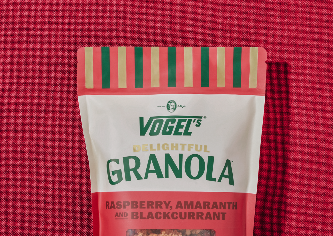
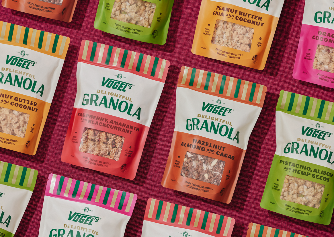
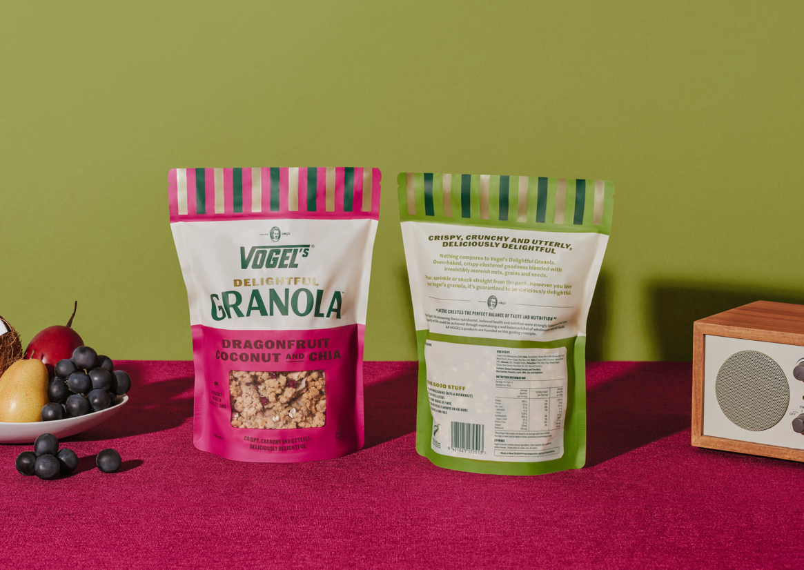
Firstly, we gave Vogel’s back its stripes - the most distinctive brand asset established by the breads. To find a new space for the brand, we looked back to heritage NZ grocery packaging to inform design; with type set in woodblock-style lettering, a bespoke ‘granola’ typeface and overprinting, and modernised the aesthetic for today’s audience.
We sought the contrast of bright colours (which convey taste), with the warm cream and rich green owned by Vogel’s, giving the range great standout and presence on shelf.
Description:
Despite having good ranging in mainstream supermarkets, Vogel’s Delightful Granola, along with the rest of the Vogel’s range, had become dated and out of touch with modern consumers. We were charged with its resurrection.
Vogel’s Delightful Granola sits in the ‘everyday premium’ category in major supermarkets throughout New Zealand, with an intended audience of mostly female household shoppers across all generations. It’s a highly competitive category with constant product innovation and strong brand loyalty. To turn the fortunes of the brand around, the challenge for Vogel’s was to get noticed and find a unique, credible voice in a large crowd of loud and dynamic brands.
Understanding the special place the Vogel’s brand has in New Zealanders’ hearts, we sought to leverage the credibility and nostalgia established by the bread range, whilst extending it into a premium contemporary space.
Firstly, we gave Vogel’s back its stripes - the most distinctive brand asset established by the breads. To find a new space for the brand, we looked back to heritage NZ grocery packaging to inform design; with type set in woodblock-style lettering, a bespoke ‘granola’ typeface and overprinting, and modernised the aesthetic for today’s audience.
We sought the contrast of bright colours (which convey taste), with the warm cream and rich green owned by Vogel’s, giving the range great standout and presence on shelf.