Graphic
Marx Design 73 Departed Spirits Limited Edition
-
Pou Auaha / Creative Director
Ryan Marx
-
Ringatoi Matua / Design Director
Manuel Payan -
Kaituhi Matua / Copywriter Leads
James Bruce, Ryan Marx
-
Ngā Kaimahi / Team Members
Hannah Jensen, Salem McKay, Rachel Dredge, Michaela Spratt, Georgia Billman, Nicola Kearns -
Kaitautoko / Contributors
Yuki Sato, Thomas Asche, Drew Robertson -
Client
Departed Spirits Limited
Description:
Departed Spirits was already shaking up the spirits category with its anti-precious positioning, top-shelf spirits for bottom-shelf people. But in a world of fleeting trends and novelty for novelty’s sake, the core range alone wasn’t enough to keep attention. The brand needed momentum, relevance, and something new to say. The Limited Release Series was the answer: a bold, fast-moving platform that kept Departed Spirits socially shareable and creatively unignorable. This wasn’t just about flavour - it was about brand evolution, creative agility, and global ambition. The series opened doors to Japan and the USA, sold through rapidly, and helped cement the brand’s cult status.
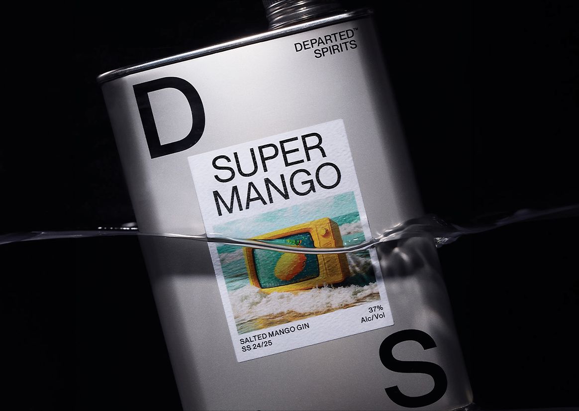
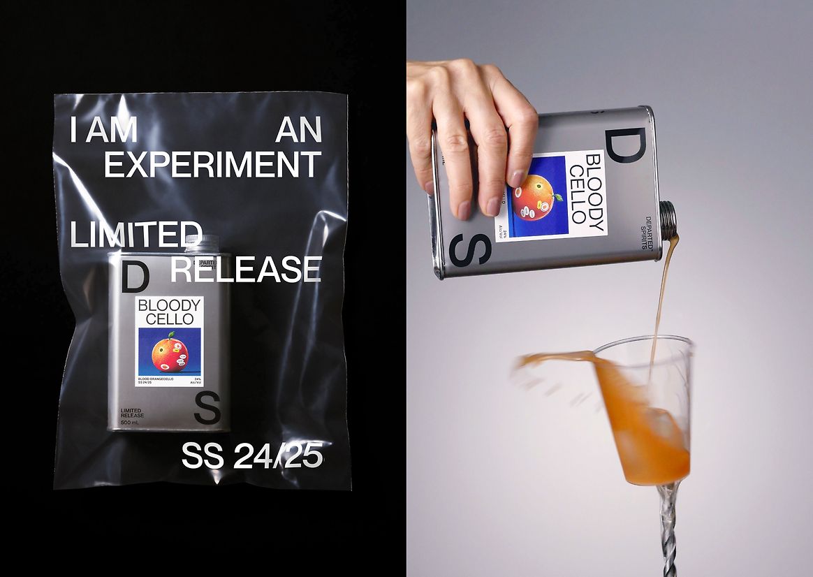
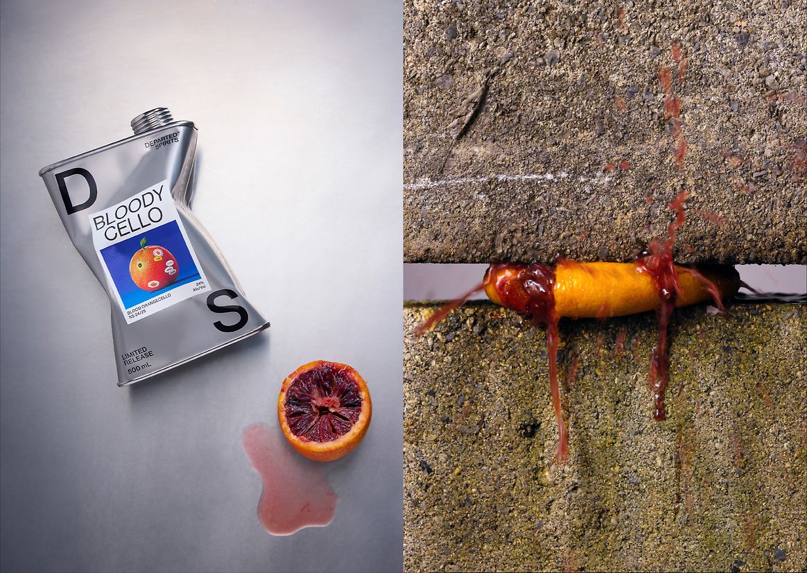
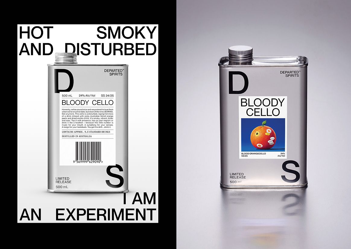
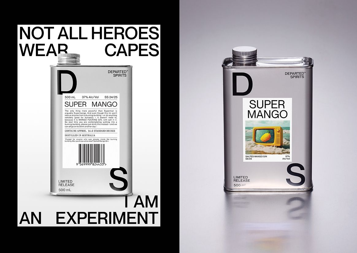
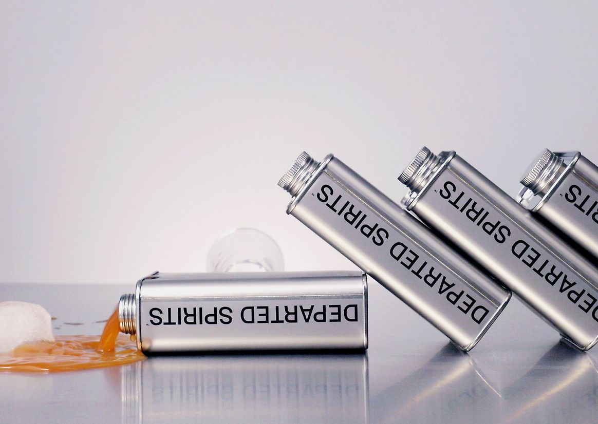
The concept was simple: “I am an experiment.” A space to embrace risk, celebrate imperfection, and lean into the unknown. Each small-batch release was a provocation, not just a product. Think salted mango gin (“Super Mango”) and blood orange with ancho chilli (“Bloody Cello”) flavours that demanded equally bold visual storytelling. The aim was to create something people wouldn’t just drink, but talk about.
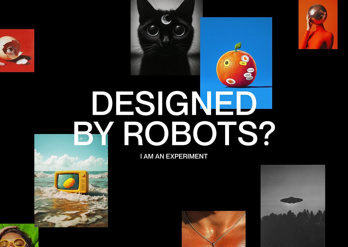
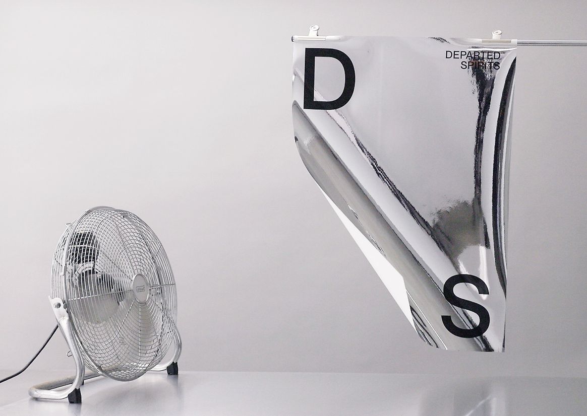
The series blurred the line between human creativity and machine influence, challenging assumptions around authorship and technology. The answer? 98% human-made, by choice. Designed to look uncertain. Built to start a conversation.
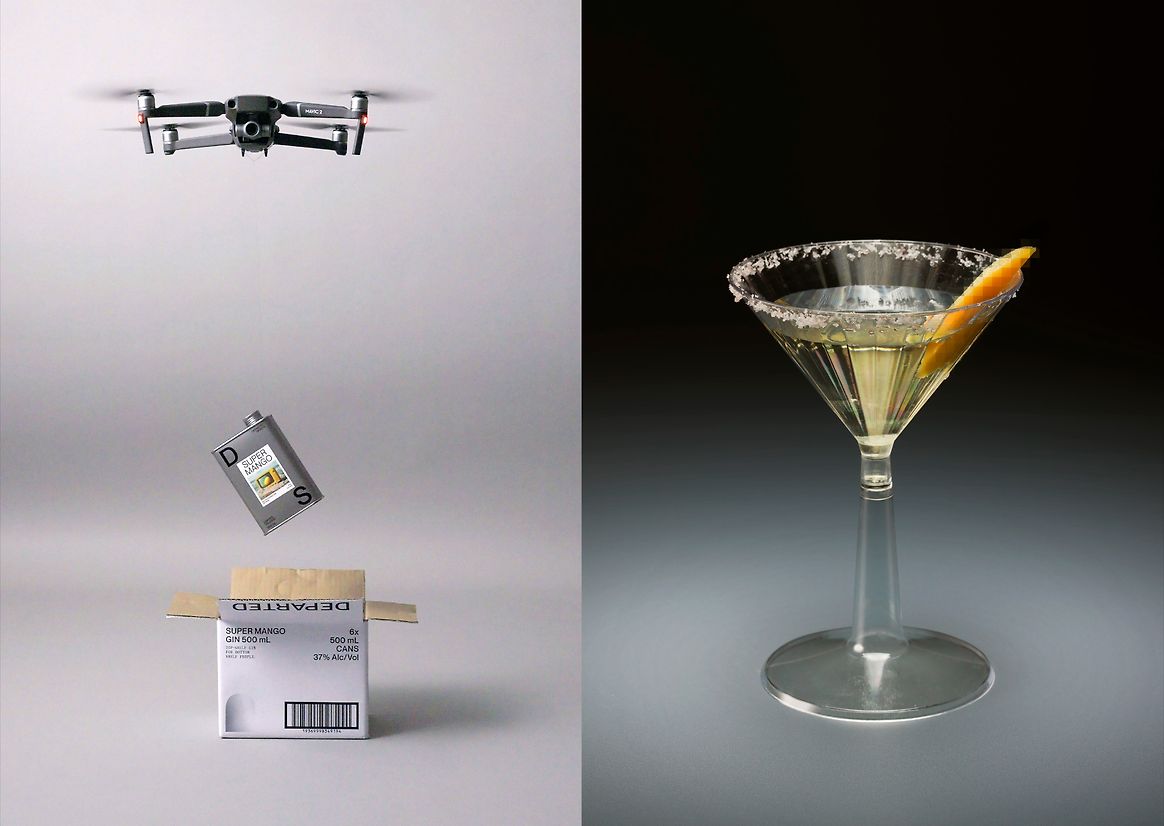
Each tin was designed to disrupt on shelf. Haunting, surreal artwork - crafted by human designers but framed to feel part-machine, pushed the limits of visual expectation. This wasn’t AI-generated, but intentionally made to evoke the ambiguity of it. The packaging rejected spirits clichés: no glass bottles, no faux heritage, no pastel palettes. Just sleek, smash-proof, infinitely recyclable aluminium tins; brutalist Swiss typography; and copy that rewards the curious. The design expression is unapologetically modern - equal parts attitude, utility, and edge.
This wasn’t design for design’s sake. The Limited Release Series offered a new model for how brands can act fast, create sustainably, and still provoke cultural conversation. The aluminium packaging wasn't just distinctive - it supported more sustainable, circular packaging outcomes. The human-led design, cloaked in AI ambiguity, created a cultural talking point without defaulting to gimmicky. Every decision challenged a tired, tradition-bound category while staying true to the brand’s ethos. All attitude, technically progressive, and unmistakably shareable, this is spirits with a spirit of rebellion.
The Limited Release Series was a clear commercial success - selling out rapidly upon launch and directly contributing to increased retailer interest and expanded distribution. The design-led storytelling captured attention in a saturated category, resulting in confirmed export deals into Japan and the USA. Its visual and verbal distinctiveness became a pull factor for new markets and a proof point that disruptive design drives both sales and brand desirability.
Judge's comments:
Breaks the category and straddles the line between boutique and FMCG quality. Premium, humorous, modern and utilitarian.