Georgia Billman, Simon Burton, Annie Dow, Haidee Wallace, Rebecca Hamer
Client
Bad Baker
Description:
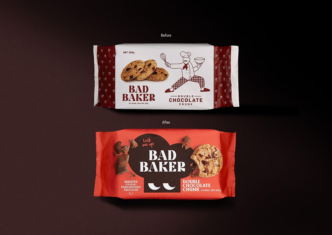
Bad Baker had the right idea, saying no to mean measures like margarine and compound chocolate. And instead saying yes to cookies that double down on real chocolate and are never a stinge with the ginge(r). But their brand and packaging weren’t aligning, with no new growth being generated.
The brand lacked emotional connection. We identified the need for a stronger brand story, something captivating that people will fall in love with.
We needed to take advantage of their playful intent with their brand name, and build their brand and packaging to be more considered and intentional with a strong brand presence and taste appeal that attracts consumers.
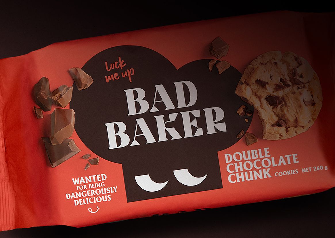
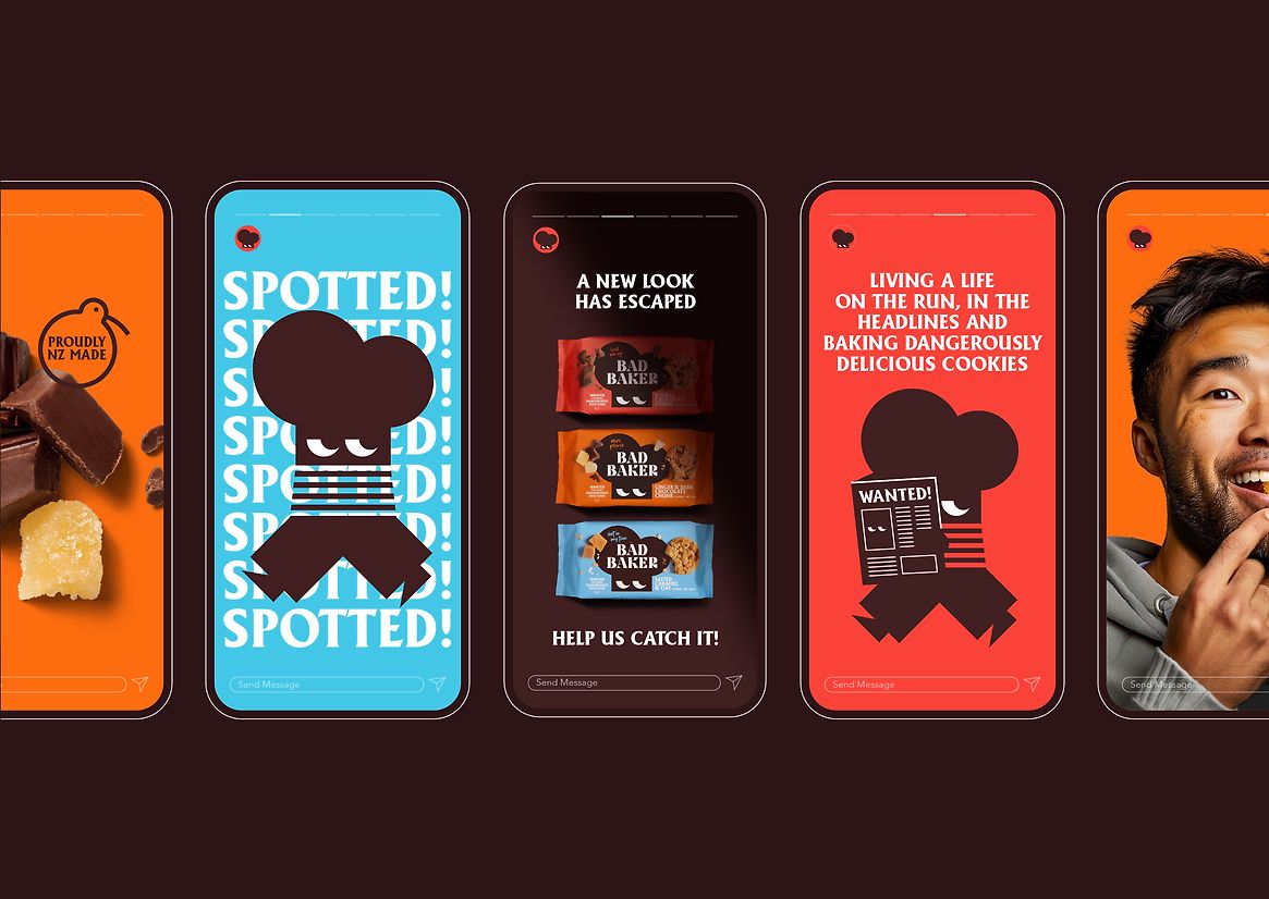
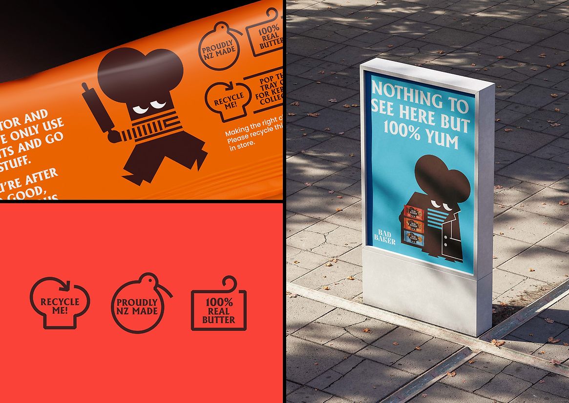
The idea of ‘wanted for being dangerously delicious’ grew from Bad Baker itself. Playing with the characterful name and their flavourful current (and future) product offerings, the concept developed into an identity and tone of voice full of mischief, adding personality to supermarket shelves.
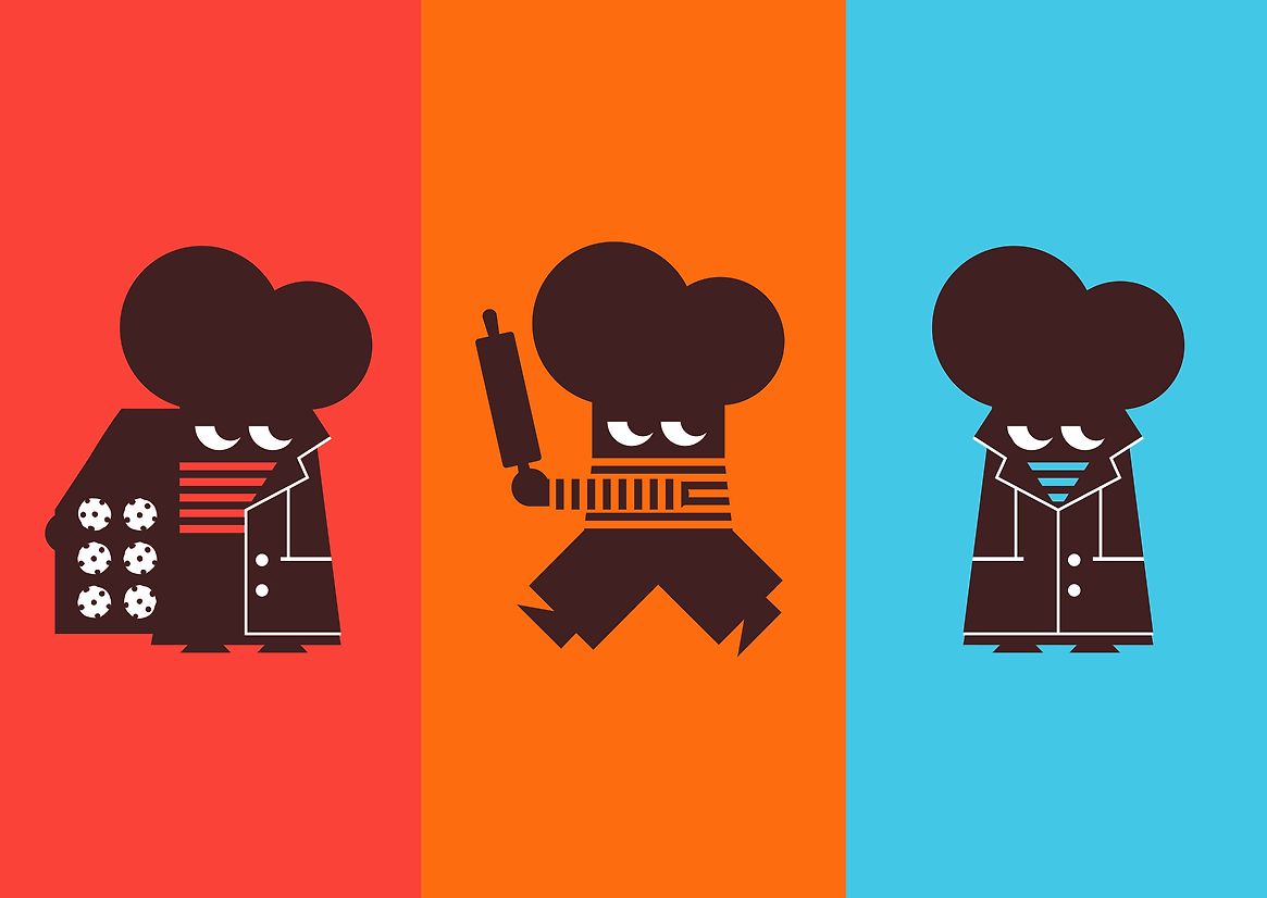
Working with the existing brand name and logo, we designed a new brand symbol, a baker's hat, which allows the brand to become recognisable on any touchpoint as the client looks to expand into other product categories. The symbol, minimally designed, aims to effortlessly speak to the audience with a fun and cheeky manner.
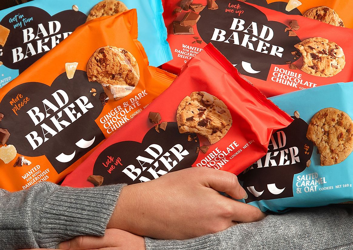
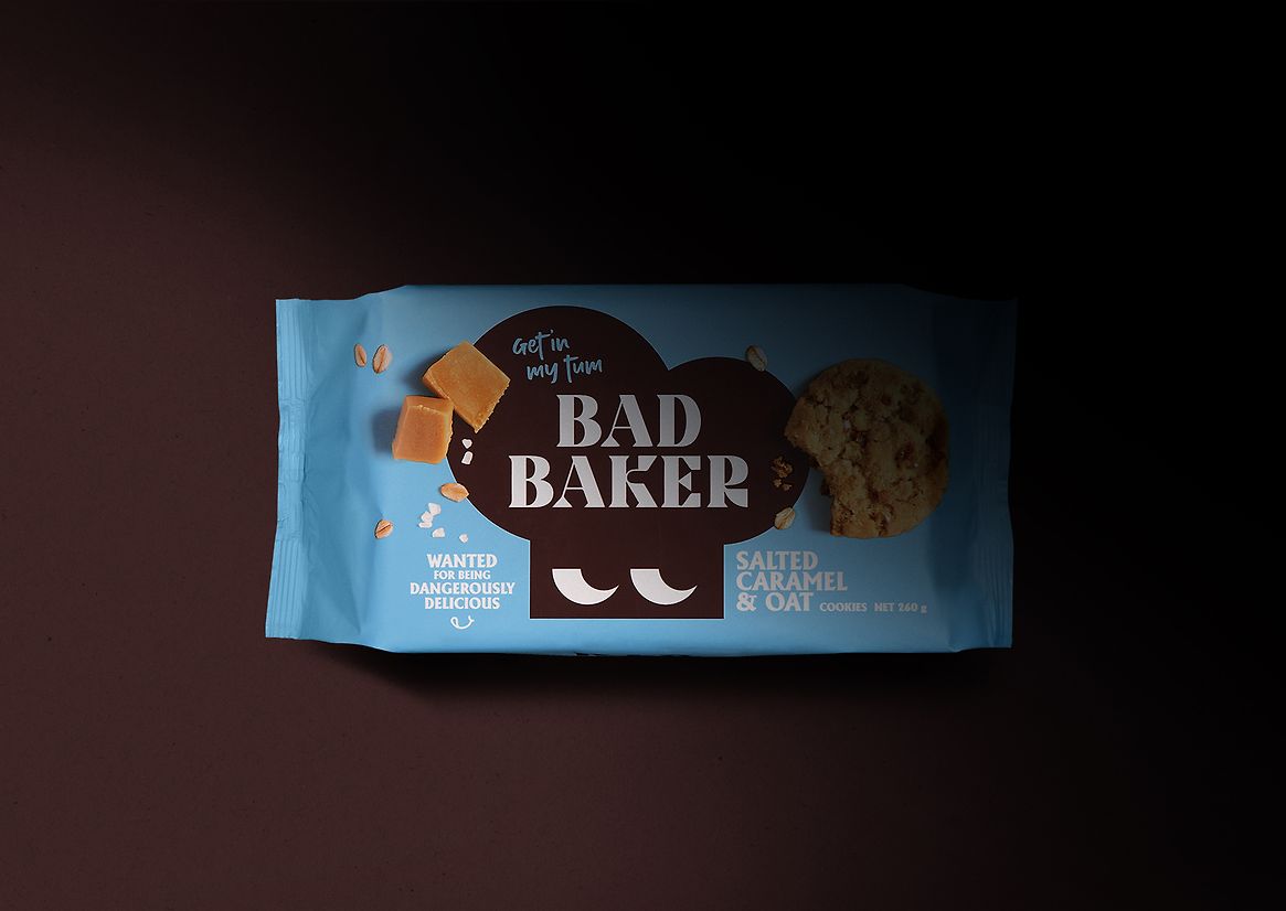
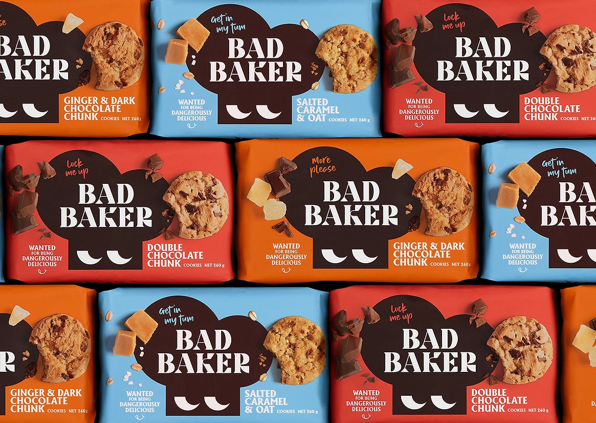
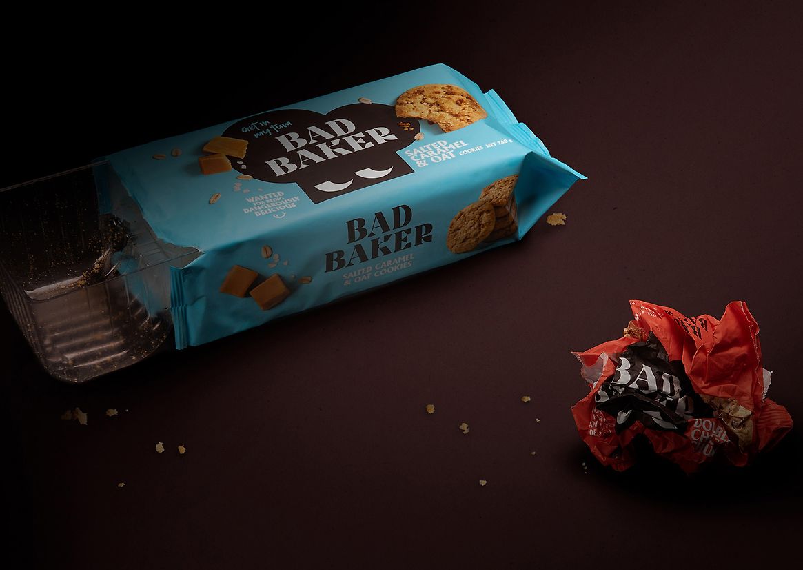
With product standout at the forefront, we designed packaging that stands out on shelf, highlights the tasty products within and most importantly tells the Bad Baker story while building an emotional connection between the brand and the consumer. We balanced taste appeal and brand recognition through a bold and clean design, using vibrant flavour-led colours and an indulgent brand brown to ignite the taste buds.
As a family-owned and operated business using premium New Zealand ingredients, being transparent with consumers was important. By photographing new ingredient and cookie imagery, we provided consumers with realistic expectations of what they are buying. There's no need to hide anything when they look and taste this good - homemade without the homemade part.
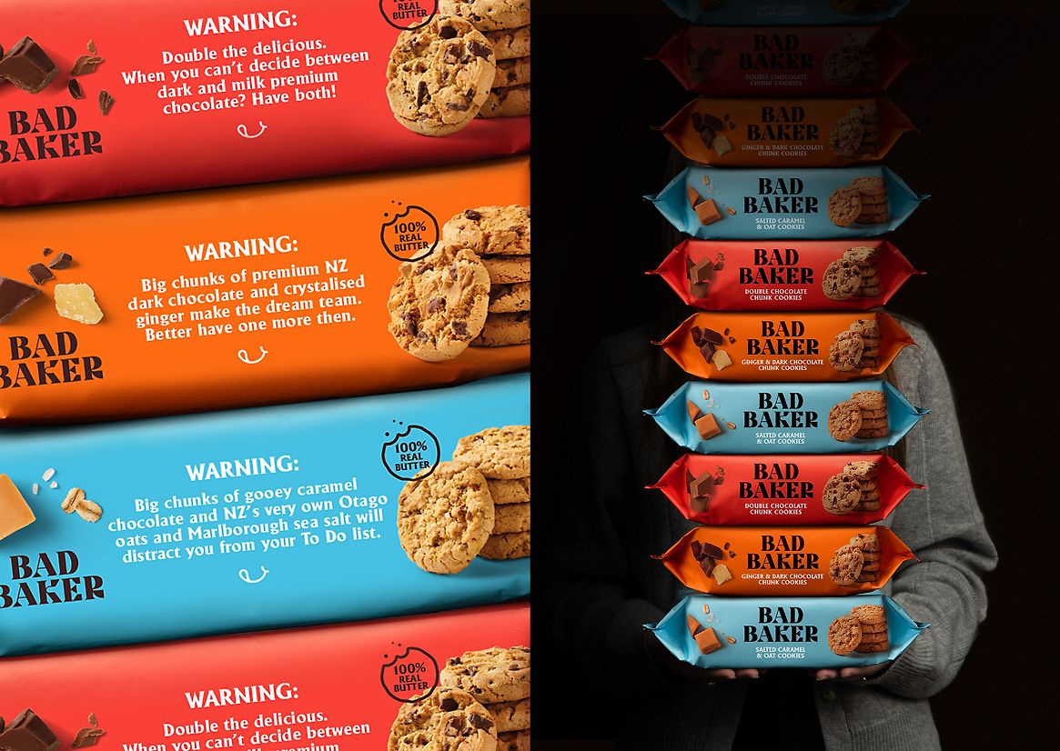
Typography and messaging further communicate the brand's story by creating conversation about the addictive qualities of their chocolate chunk cookies. This brings Bad Baker's playful voice to the forefront for consumer emotional connection.
The Bad Baker symbol was brought to life with a new mascot. Full-time baker, part-time bandit. Bad Baker is constantly on the run hiding from the paps, rule-makers, and their mobs of fans (baddies). The character development adds to the cheekiness of the identity and is adaptable for future product range extensions.
The new packaging system allows the brand to easily adapt to any format or product offering while still maintaining clear brand recognition.
Bad Baker has become a brand that is loveable, memorable, and playful. It is now a product that stands out on shelf, communicates taste and brand and puts a smile on shoppers’ faces. You can’t help but feel Bad Baker's glare as you walk down the supermarket aisles, making you feel even more enticed to grab another pack or two.
Description:
Bad Baker had the right idea, saying no to mean measures like margarine and compound chocolate. And instead saying yes to cookies that double down on real chocolate and are never a stinge with the ginge(r). But their brand and packaging weren’t aligning, with no new growth being generated.
The brand lacked emotional connection. We identified the need for a stronger brand story, something captivating that people will fall in love with.
We needed to take advantage of their playful intent with their brand name, and build their brand and packaging to be more considered and intentional with a strong brand presence and taste appeal that attracts consumers.
The idea of ‘wanted for being dangerously delicious’ grew from Bad Baker itself. Playing with the characterful name and their flavourful current (and future) product offerings, the concept developed into an identity and tone of voice full of mischief, adding personality to supermarket shelves.
Working with the existing brand name and logo, we designed a new brand symbol, a baker's hat, which allows the brand to become recognisable on any touchpoint as the client looks to expand into other product categories. The symbol, minimally designed, aims to effortlessly speak to the audience with a fun and cheeky manner.
With product standout at the forefront, we designed packaging that stands out on shelf, highlights the tasty products within and most importantly tells the Bad Baker story while building an emotional connection between the brand and the consumer. We balanced taste appeal and brand recognition through a bold and clean design, using vibrant flavour-led colours and an indulgent brand brown to ignite the taste buds.
As a family-owned and operated business using premium New Zealand ingredients, being transparent with consumers was important. By photographing new ingredient and cookie imagery, we provided consumers with realistic expectations of what they are buying. There's no need to hide anything when they look and taste this good - homemade without the homemade part.
Typography and messaging further communicate the brand's story by creating conversation about the addictive qualities of their chocolate chunk cookies. This brings Bad Baker's playful voice to the forefront for consumer emotional connection.
The Bad Baker symbol was brought to life with a new mascot. Full-time baker, part-time bandit. Bad Baker is constantly on the run hiding from the paps, rule-makers, and their mobs of fans (baddies). The character development adds to the cheekiness of the identity and is adaptable for future product range extensions.
The new packaging system allows the brand to easily adapt to any format or product offering while still maintaining clear brand recognition.
Bad Baker has become a brand that is loveable, memorable, and playful. It is now a product that stands out on shelf, communicates taste and brand and puts a smile on shoppers’ faces. You can’t help but feel Bad Baker's glare as you walk down the supermarket aisles, making you feel even more enticed to grab another pack or two.