Despite having a great product and a strong community following, the brand wasn’t effectively communicated through its packaging. Folk are passionate about fostering a community around their coffee and wanted the brand to embody this sense of connection and presence.
The primary objective was to codify and visually represent the brand that Folk was already embodying through their strong story and community presence. The project aimed to honour the roles of everyone involved in the coffee process, from farmers to consumers, and to create a visual identity that highlighted this connection.
The Idea
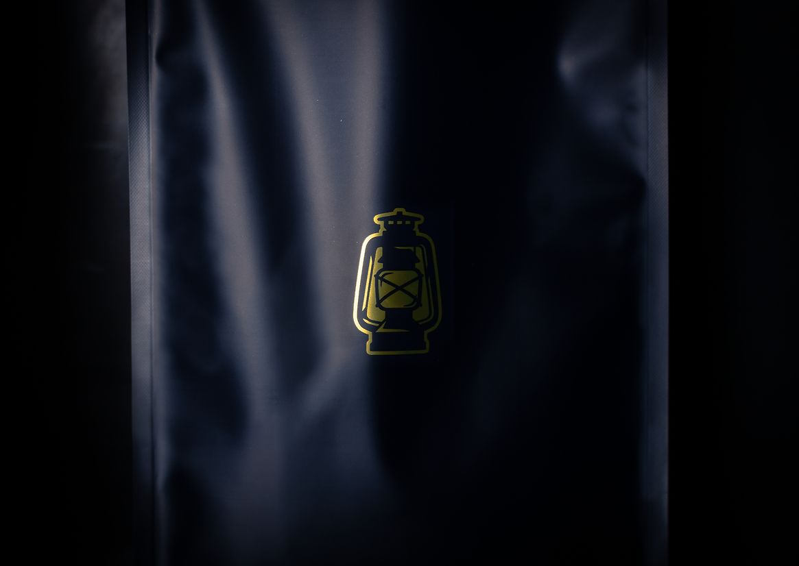
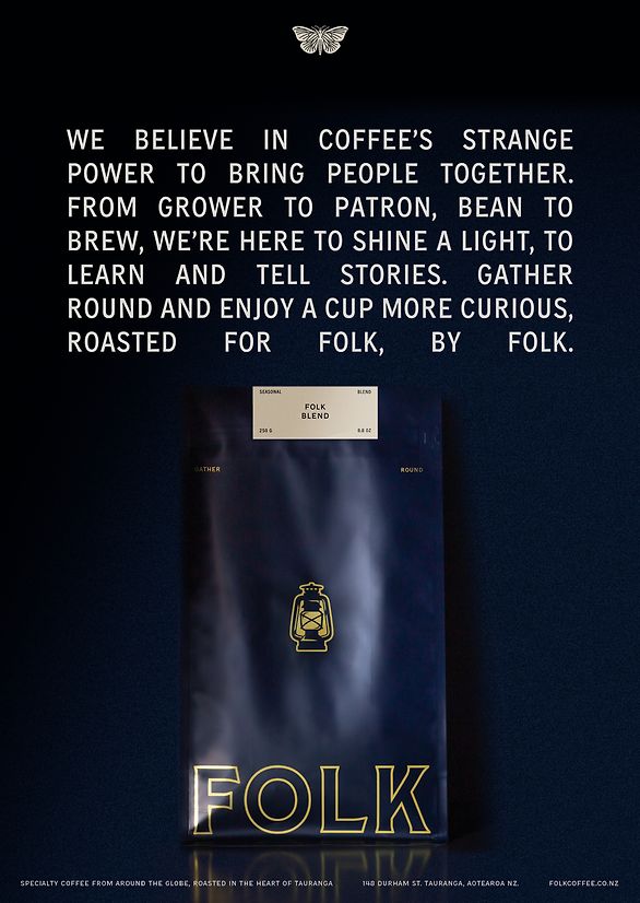
The strategy for Folk Coffee was straightforward. It involved translating the existing strong brand and community focus into a visual identity. The concept revolved around the metaphor of the lantern, symbolising attraction, connection, and the warmth of community, resonating with our client's love for being fully present in the moment and environment, like being around a campfire. The idea was to depict coffee as a connection point between people, fostering relationships and community. Good coffee, according to Folk, should be accessible and educational, empowering the community. The brand needed to embody these values, making the strategy clear and easy to implement.
The Design
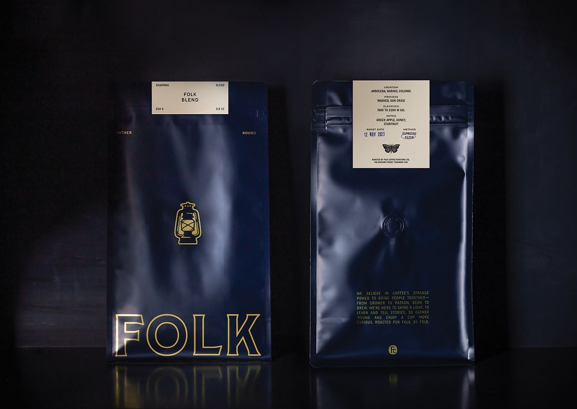
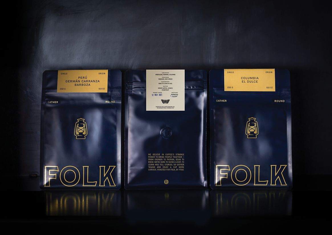
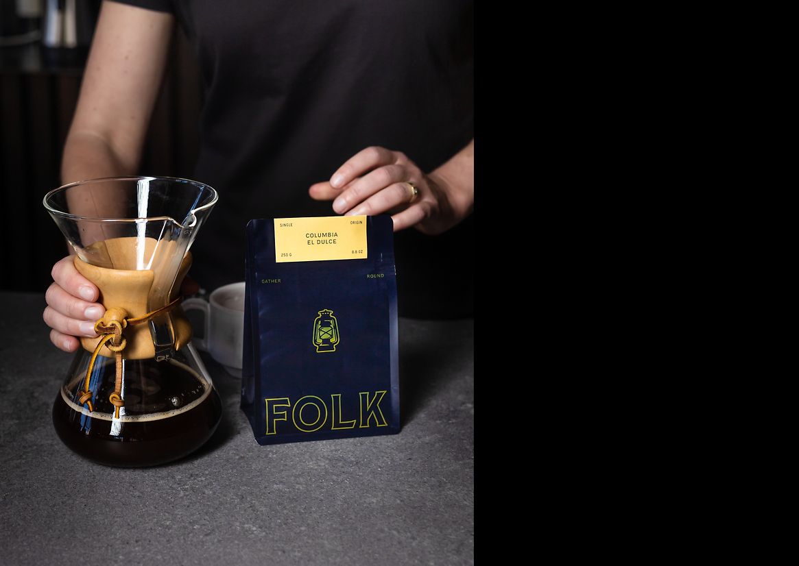
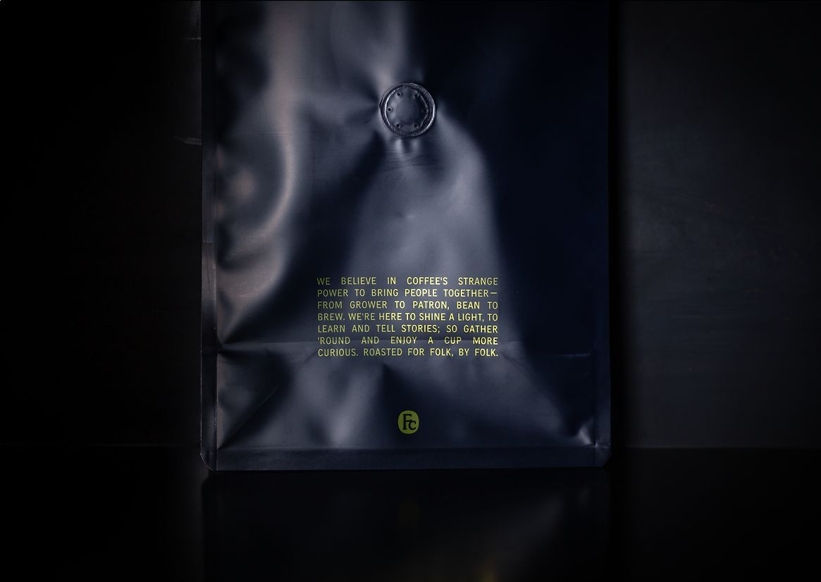
The design for Folk Coffee features a glowing gold lantern, surrounded and contrasted by a moody blue tone to evoke the idea of a beacon in the night - something to be drawn to, to find community and connection.
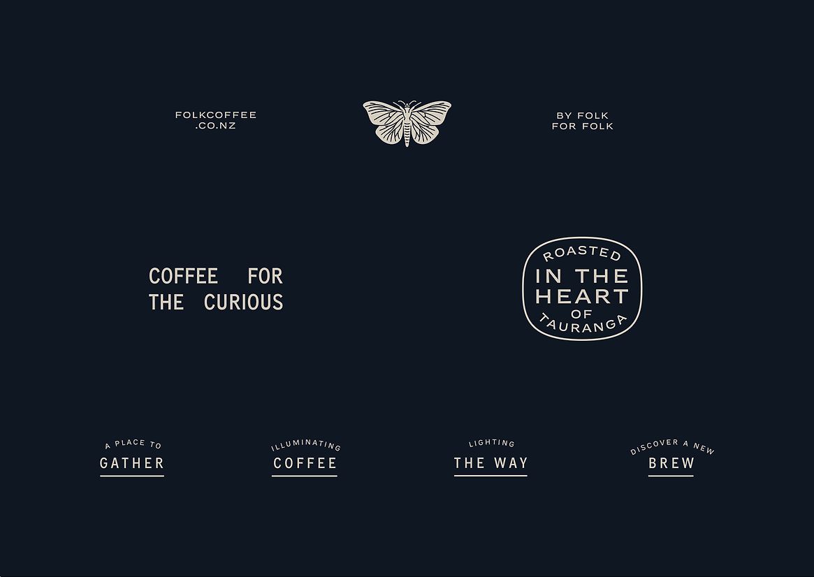
The type styles chosen are heritage in nature, as we wanted to feel like Folk has always been here, long term and familiar as that’s how the community perceives it, to maintain it’s feeling like a core part of the culture.
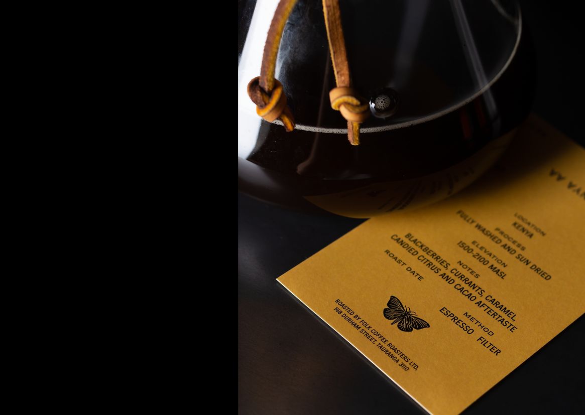
We’ve kept the overall approach minimal, to keep the product the hero, but with reinforcement.The packaging doesn’t need to shout from the rooftops - you can only purchase from the shop or online directly.
Balancing a premium feel with affordability was a challenge, so the existing bag format was retained to avoid passing on costs to the customer. The bag’s finish was carefully chosen to be durable and travel well, featuring a fresh-maintaining foil lining and a valve. This ensured the quality of the coffee remained forefront.
What Elevates the Work
The new packaging and branding of Folk Coffee has given the community an identity to rally around, one that represents not just Folk and their customers, but everyone involved in the process.
The intentional design choices, from the heritage typestyles to the durable packaging, have elevated the brand’s perception without compromising affordability. The new visual identity has strengthened the community connection, making Folk Coffee not just a product, but a symbol of community and quality.
Description:
The Why
Despite having a great product and a strong community following, the brand wasn’t effectively communicated through its packaging. Folk are passionate about fostering a community around their coffee and wanted the brand to embody this sense of connection and presence.
The primary objective was to codify and visually represent the brand that Folk was already embodying through their strong story and community presence. The project aimed to honour the roles of everyone involved in the coffee process, from farmers to consumers, and to create a visual identity that highlighted this connection.
The Idea
The strategy for Folk Coffee was straightforward. It involved translating the existing strong brand and community focus into a visual identity. The concept revolved around the metaphor of the lantern, symbolising attraction, connection, and the warmth of community, resonating with our client's love for being fully present in the moment and environment, like being around a campfire. The idea was to depict coffee as a connection point between people, fostering relationships and community. Good coffee, according to Folk, should be accessible and educational, empowering the community. The brand needed to embody these values, making the strategy clear and easy to implement.
The Design
The design for Folk Coffee features a glowing gold lantern, surrounded and contrasted by a moody blue tone to evoke the idea of a beacon in the night - something to be drawn to, to find community and connection.
The type styles chosen are heritage in nature, as we wanted to feel like Folk has always been here, long term and familiar as that’s how the community perceives it, to maintain it’s feeling like a core part of the culture.
We’ve kept the overall approach minimal, to keep the product the hero, but with reinforcement.The packaging doesn’t need to shout from the rooftops - you can only purchase from the shop or online directly.
Balancing a premium feel with affordability was a challenge, so the existing bag format was retained to avoid passing on costs to the customer. The bag’s finish was carefully chosen to be durable and travel well, featuring a fresh-maintaining foil lining and a valve. This ensured the quality of the coffee remained forefront.
What Elevates the Work
The new packaging and branding of Folk Coffee has given the community an identity to rally around, one that represents not just Folk and their customers, but everyone involved in the process.
The intentional design choices, from the heritage typestyles to the durable packaging, have elevated the brand’s perception without compromising affordability. The new visual identity has strengthened the community connection, making Folk Coffee not just a product, but a symbol of community and quality.