Rich storytelling through New Age motifs and a focus on education bring the Divine Farmer brand to life. Born amidst the post-pandemic age of self-care, this Californian wellness company sought a name and identity that could combine its roots in traditional Chinese medicine, and ambition to build deeper understanding and trust in alternative remedies. With mental health symptoms surging during the COVID-19 pandemic, nurturing mental and physical wellness had never been more important. Divine Farmer sought to address this by taking a broader view of wellbeing – addressing issues like anxiety, depression and insomnia.
It was during the pandemic lockdown that Polina Bowler—an acupuncturist and herbalist who runs LA based holistic wellness center 'East Meets West'—stuck upon the idea for the brand. Whilst restricted to counseling patients over Zoom, she had developed a blend of Chinese herbs and Nano-Emulsified Water-Soluble CBD to help those suffering from symptoms of anxiety. The feedback was so overwhelmingly positive that she decided to open her new formula up to a wider audience – and with that her first product was born.
Naming this new venture required delving into the rich history of traditional Chinese medicine and mythology – it was through this process that we came upon the story of the Divine Farmer, an ancient mythological ruler who is fabled to have taught humans which plants could be used for medicinal purposes. The notion of a spiritual teacher perfectly mirrored Polina’s desire to provide education about alternative medicines and healing, whilst also encapsulating the only-natural nature of her ingredients. Ethereal, trustworthy, and natural: Divine Farmer encapsulated it perfectly.
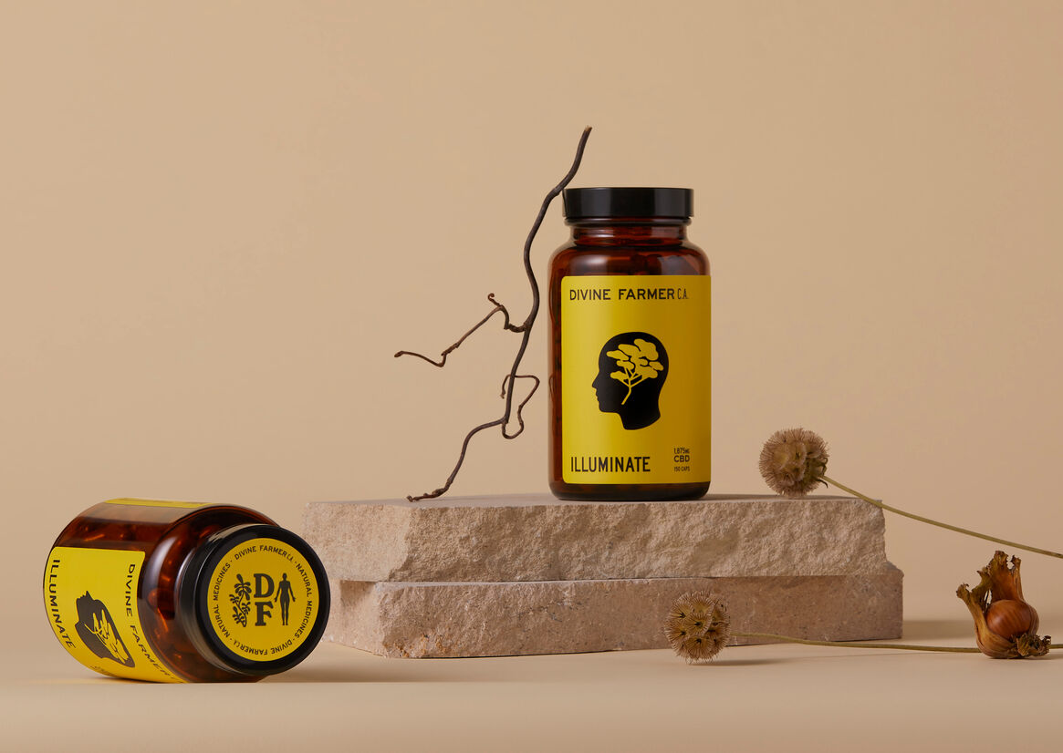
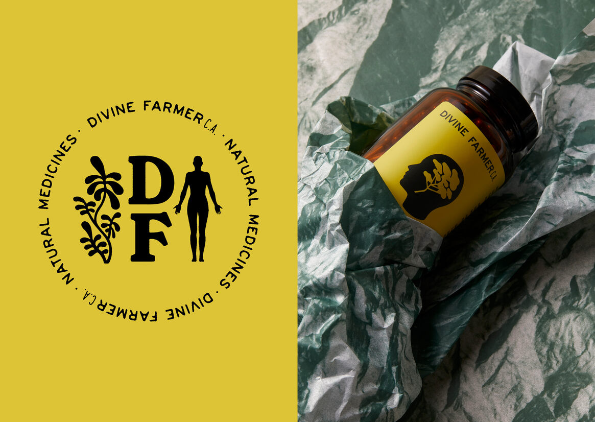
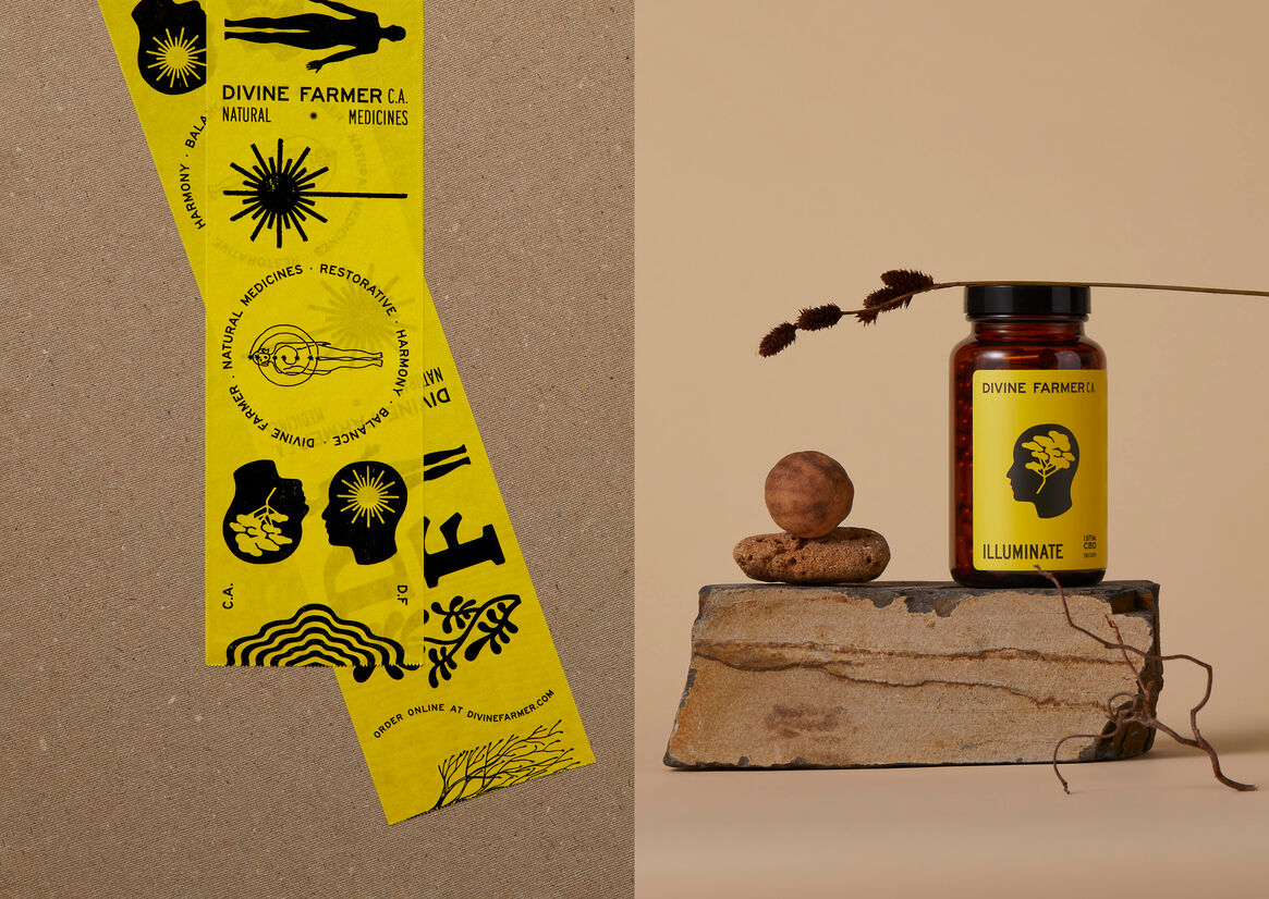
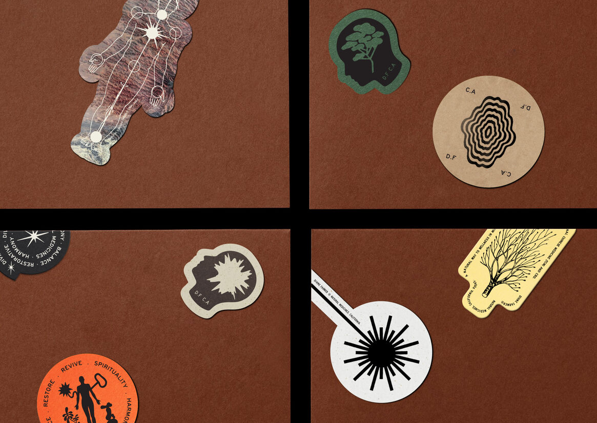
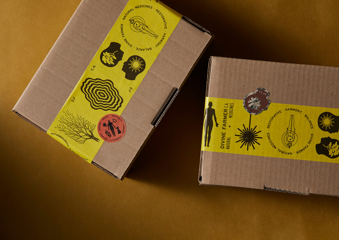
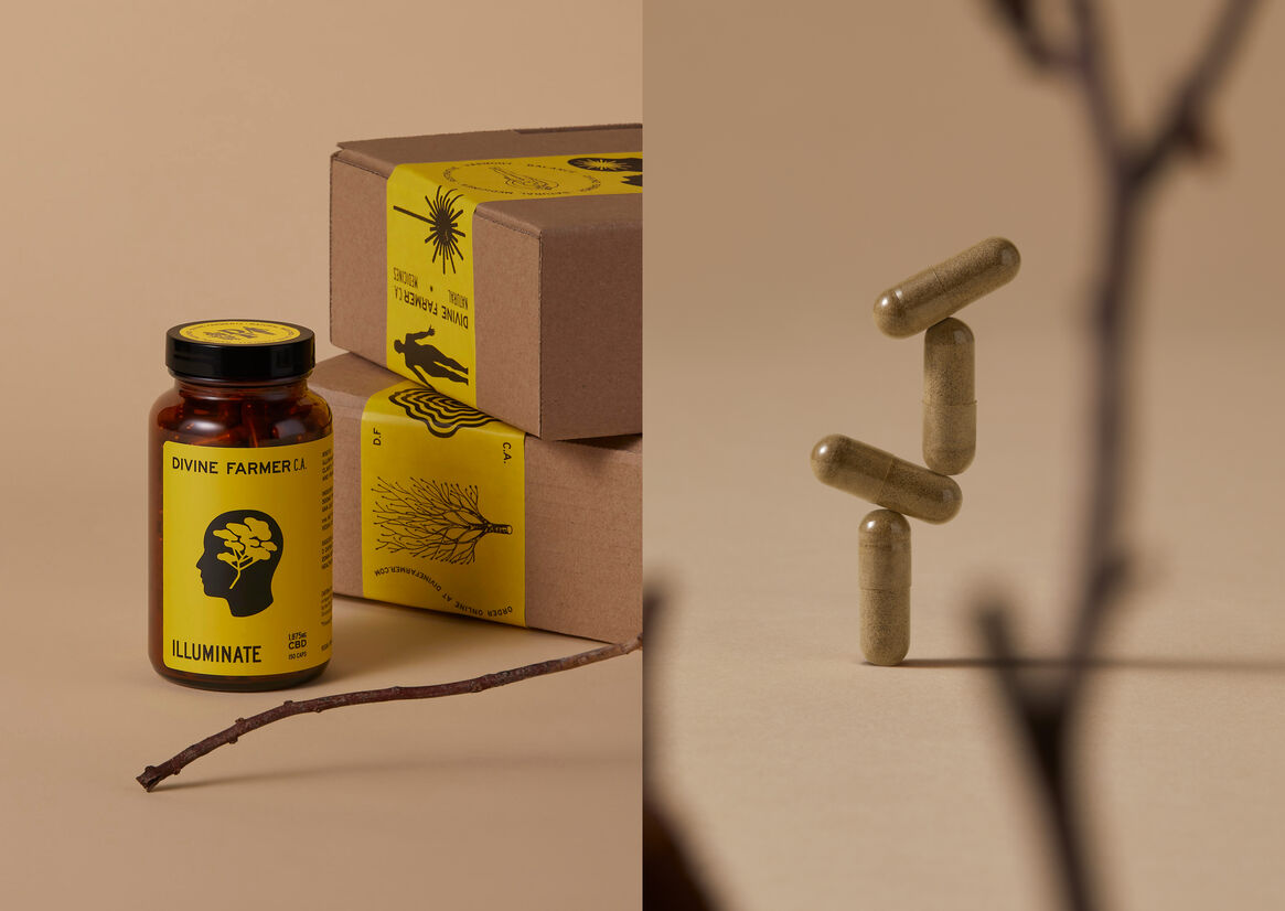
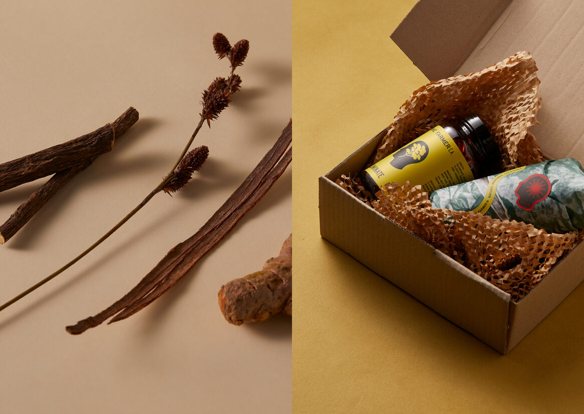
Building on the name, we embraced a contemporary New Age spirit for her visual identity; utilizing symbols inspired by mythological and natural references to tell stories of harmony, vitality, and earthly connection. Paired with a 1970s California-esqe palette of earthy hues, and an eye-catching luminescent yellow, the resulting brand packaging provides a fun and cathartic unboxing experience.
With multiple new products under development, the world of Divine Farmer is constantly expanding. So check out the website to dive deeper into the Divine Farmer’s world of wellness and self-care.
Description:
Rich storytelling through New Age motifs and a focus on education bring the Divine Farmer brand to life. Born amidst the post-pandemic age of self-care, this Californian wellness company sought a name and identity that could combine its roots in traditional Chinese medicine, and ambition to build deeper understanding and trust in alternative remedies. With mental health symptoms surging during the COVID-19 pandemic, nurturing mental and physical wellness had never been more important. Divine Farmer sought to address this by taking a broader view of wellbeing – addressing issues like anxiety, depression and insomnia.
It was during the pandemic lockdown that Polina Bowler—an acupuncturist and herbalist who runs LA based holistic wellness center 'East Meets West'—stuck upon the idea for the brand. Whilst restricted to counseling patients over Zoom, she had developed a blend of Chinese herbs and Nano-Emulsified Water-Soluble CBD to help those suffering from symptoms of anxiety. The feedback was so overwhelmingly positive that she decided to open her new formula up to a wider audience – and with that her first product was born.
Naming this new venture required delving into the rich history of traditional Chinese medicine and mythology – it was through this process that we came upon the story of the Divine Farmer, an ancient mythological ruler who is fabled to have taught humans which plants could be used for medicinal purposes. The notion of a spiritual teacher perfectly mirrored Polina’s desire to provide education about alternative medicines and healing, whilst also encapsulating the only-natural nature of her ingredients. Ethereal, trustworthy, and natural: Divine Farmer encapsulated it perfectly.
Building on the name, we embraced a contemporary New Age spirit for her visual identity; utilizing symbols inspired by mythological and natural references to tell stories of harmony, vitality, and earthly connection. Paired with a 1970s California-esqe palette of earthy hues, and an eye-catching luminescent yellow, the resulting brand packaging provides a fun and cathartic unboxing experience.
With multiple new products under development, the world of Divine Farmer is constantly expanding. So check out the website to dive deeper into the Divine Farmer’s world of wellness and self-care.