Graphic
WEAVE 8 Niscioo Wine Labels
-
Pou Auaha / Creative Directors
Daniel Cookson, Darren Song -
Pou Rautaki / Strategic Lead
Amber Groves
-
Ngā Kaimahi / Team Members
Erica Lee, Fushia Saulwick, Matt Bowman, Marijana Simunovic -
Kaitautoko / Contributors
Visual State, Marco Wagner -
Client
NISCIOO
Description:
Niscioo is a family-owned winery in San Vittore, Switzerland—officially founded in 2015, but shaped by generations of agrarian tradition. As trained oenologists, Ettore and Lisa had grown production from a small business into a serious boutique operation, scaling up to 35,000 bottles per year, yet their brand had not kept pace with their product. With no existing brand strategy, brand identity, or label consistency—combined with a logo based on a historical tower with no personal relevance—they recognised the need for a meaningful, modern brand system that could encourage business growth and connect with a younger audience while still resonating with their loyal local base.
The brand idea emerged from the name itself. Niscioo translates to hazelnut in the local San Vittore dialect, and refers to the hazelnut trees that surrounded the original Merlot vines planted by Ettore’s grandfather. This symbol and story became the emotional anchor for the new identity, becoming a metaphor for both the region and land and of slow growth, patience, and generational care.
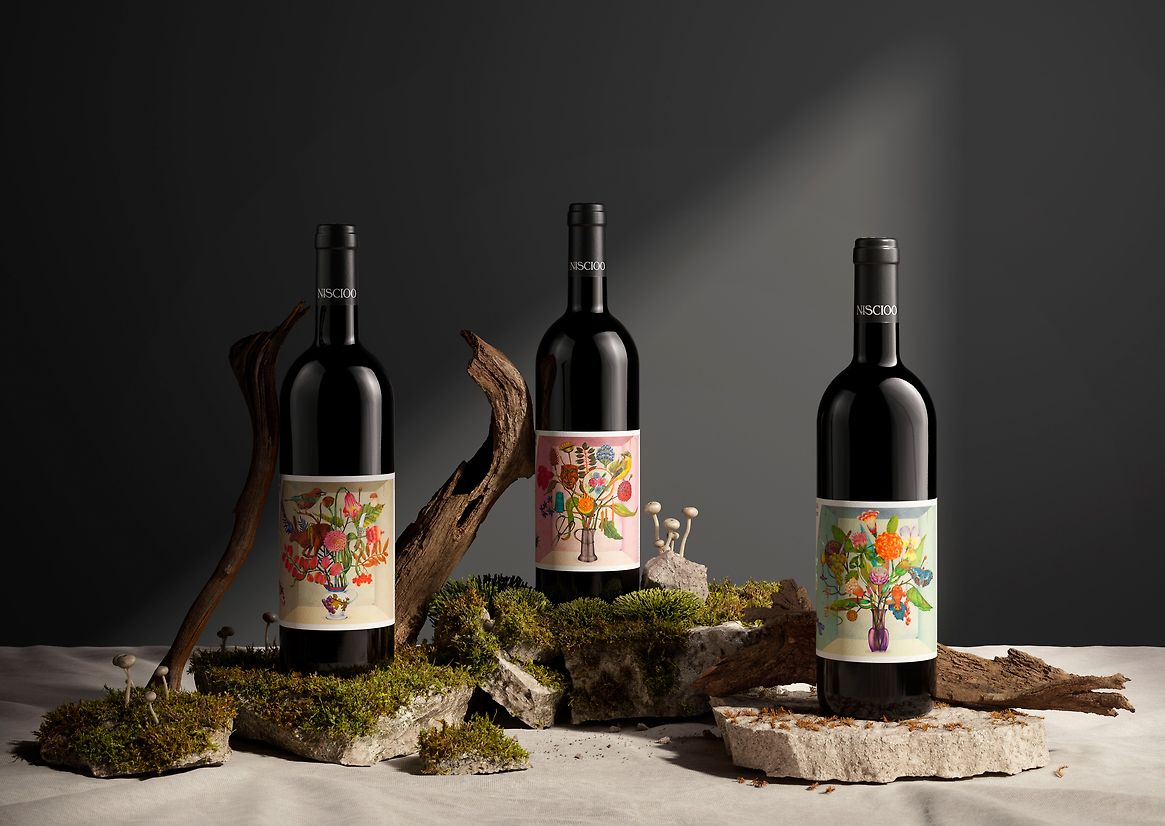
From this, we developed a brand strategy grounded in agrarian heritage, family storytelling, and terroir—celebrating the distinctive character—and characters—of San Vittore. Each varietal represented a branch of the family, with stories told through objects, textures, dialect, and native flora. This approach formed a unifying system across the brand identity and packaging, providing both emotional resonance and commercial clarity.
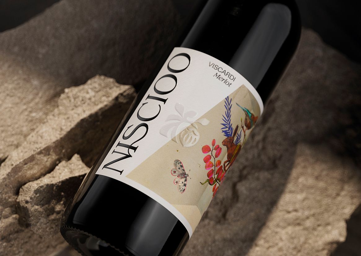
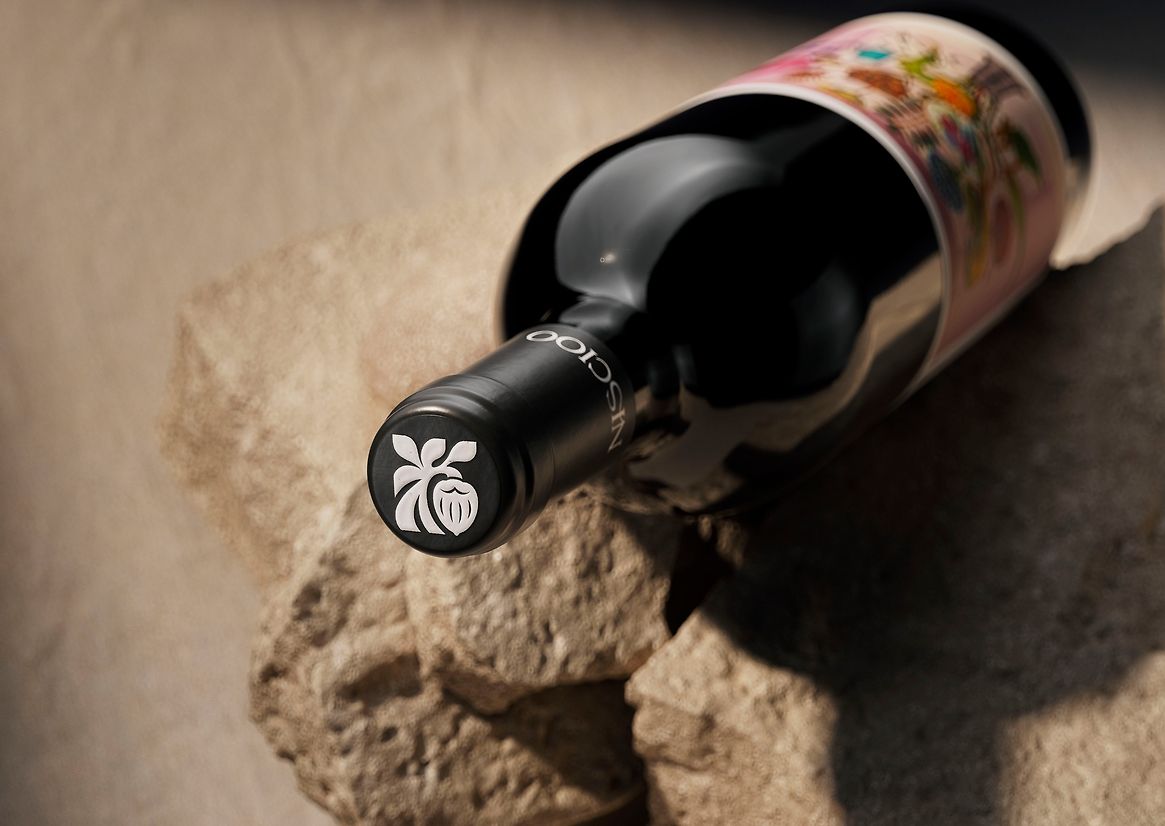
A new brand icon was crafted to resemble a hazelnut hanging from a tree—simple, symbolic, and distinct. The wordmark was custom drawn, featuring a ligature connecting the ‘S’ to the ‘N’, evoking the roots of a tree—and the connection with family. An earthy, mineral-toned palette was drawn from the surrounding landscape, anchoring the brand in its place of origin.
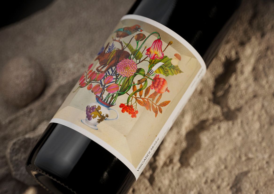
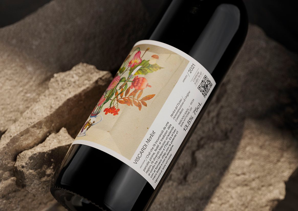
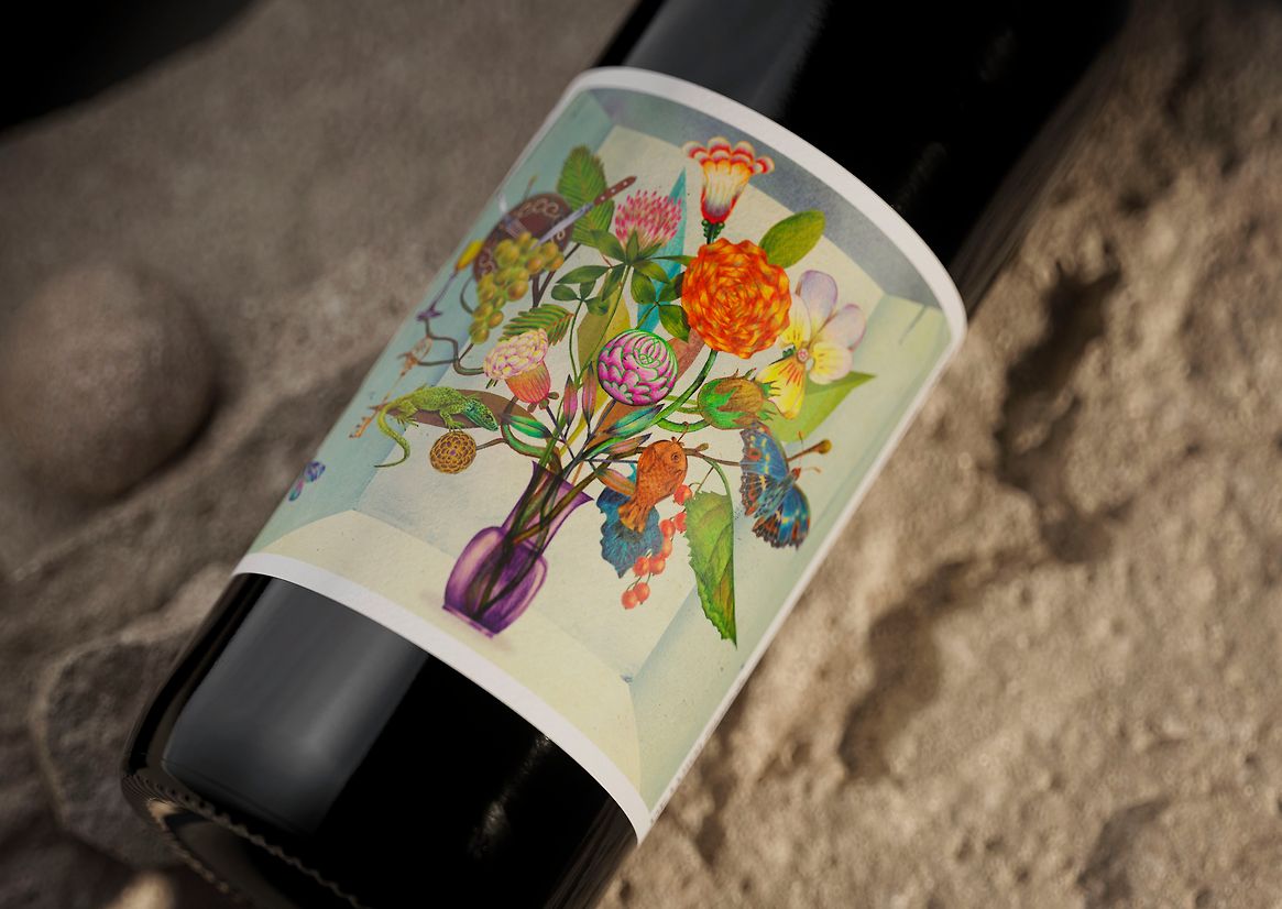
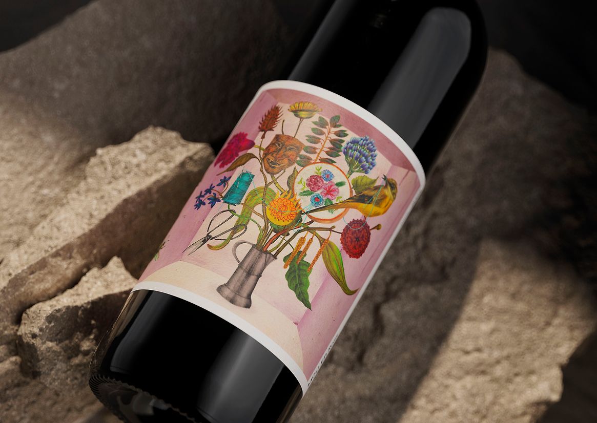
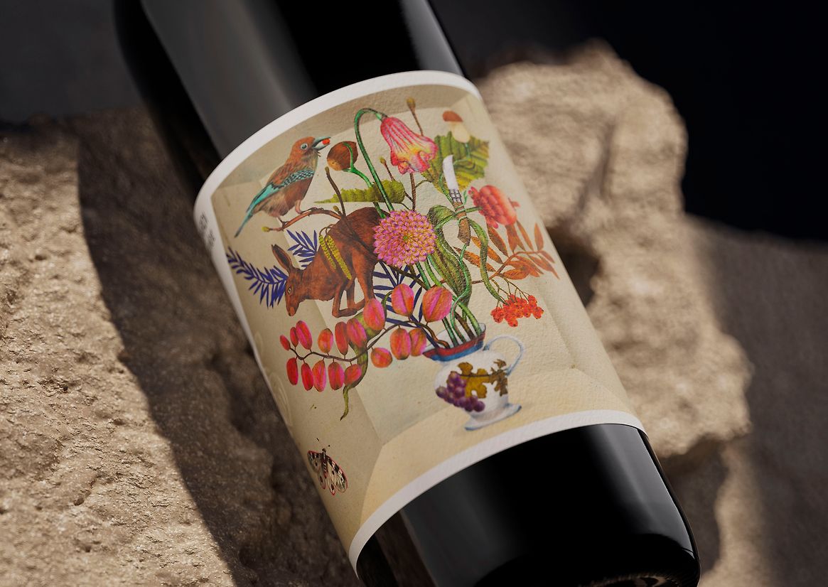
The diagonal line, cut at 25°, was introduced as a system-wide design device—referencing the angle of the vineyard slopes and functioning as a housing structure for imagery. For packaging, each label became a tribute to a family member, illustrated in collaboration with Marco Wagner using hand-cut and collaged motifs: traditional vessels, heirlooms, and native flora arranged into intricate blossoms—bringing both family stories and emotional richness and dimensionality to the bottle.
In an increasingly globalised wine industry—where mass production, international varietals, and generic branding dominate—the Niscioo rebrand feels like an act of resistance. Rather than conform to the slick sameness of the global wine shelf, this project leans into being hyper-local: preserving its dialect, unearthing family stories, and celebrating a rich and interesting part of the world that most have never heard of.
Through elevated storytelling, carefully crafted design, and an unwavering link to place, this work deepens both cultural understanding and commercial opportunity—enabling Niscioo to grow without losing its roots.