Graphic
WOODS Agency 29 QE Health
-
Pou Auaha / Creative Directors
Phil Harris, Reuben Woods -
Pou Rautaki / Strategic Lead
Stephen Finnegan -
Pou Taketake / Cultural Lead
Rawiri Waru
-
Ringatoi Matua / Design Director
Sara Keranen-Gramner
-
Ngā Kaimahi / Team Members
Danelle Bourgeois, Amelia Walters, Jenny Ford, Luke Thompson -
Kaitautoko / Contributor
Graeme Murray -
Client
QE Health
Description:
The Wellness Destination
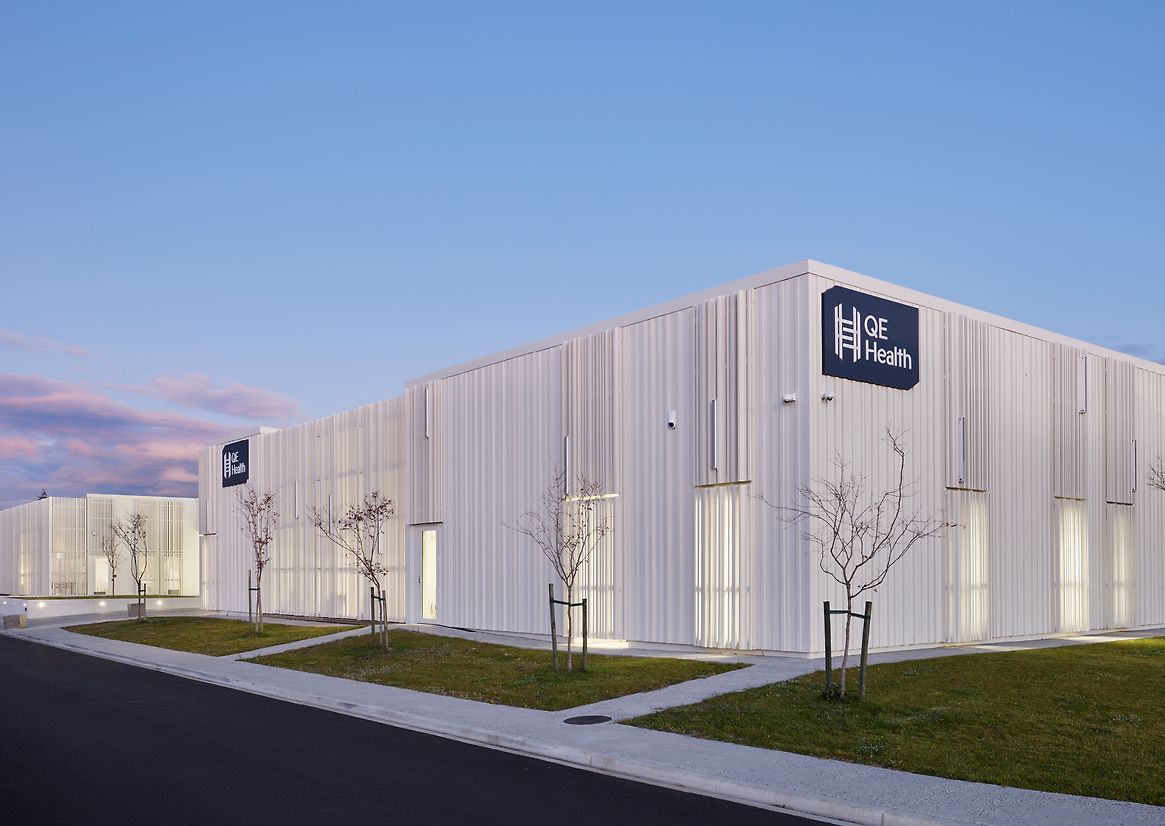
For eight decades, QE Health in Rotorua has been an iconic destination for wellness. In 2023, QE unveiled a state-of-the-art facility along Rotorua's scenic lakefront. Our mission? Develop a brand that establishes QE as a world-class health and wellness destination before they cut the ribbon.
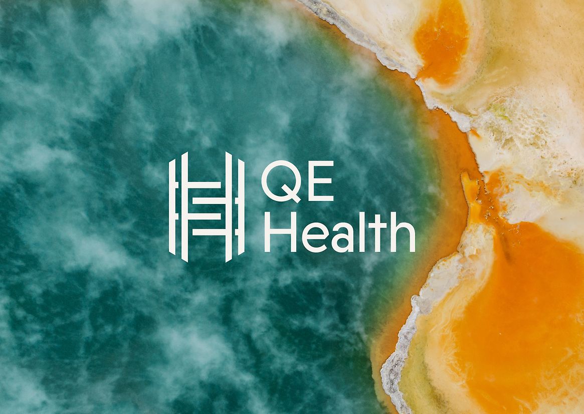
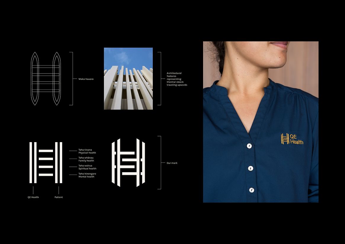
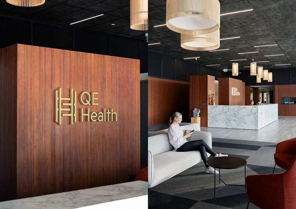
Our new logo represents a guiding waka through life's turbulent waters, inspired by the Arawa tribe's harrowing voyage through the whirlpool ‘The Throat of Te Parata’. The logo, based on the waka's structure, symbolises the patient’s journey toward wellness and an active, fulfilling life, with each component reliant on the others.
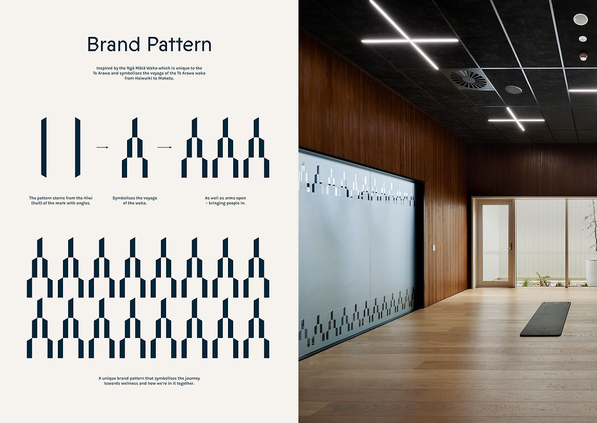
Drawing from the Māori model of wellbeing, Te Whare Tapa Wha, the balance within the waka in our logo represents the four cornerstones of health: physical, mental, family, and spiritual. This concept of balance is further reflected in our main brand pattern. When viewed as a single element, it represents the hull of the waka; when used as a pattern, it symbolises open arms and a warm welcome.
The distinctive hiwi device, inspired by the waka’s hull, frames images and headlines throughout the brand. This pattern, along with our supporting brand design inspired by Ngā Mātā Waka, tells the story of Te Arawa waka’s voyage from Hawaiki to Maketu. It’s about journeys, heritage, and the strength to navigate life's challenges.
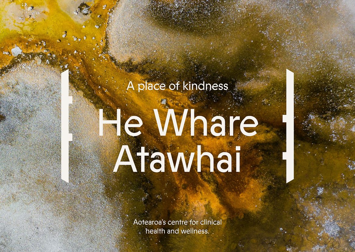
Typography is as much a part of the brand’s identity as its story. Our custom font, Prophet, takes inspiration from Joseph Churchward's Georgina. It blends warm calligraphic curves with a clean, machine-like feel, perfectly capturing the harmony of science and nature we aimed to create.
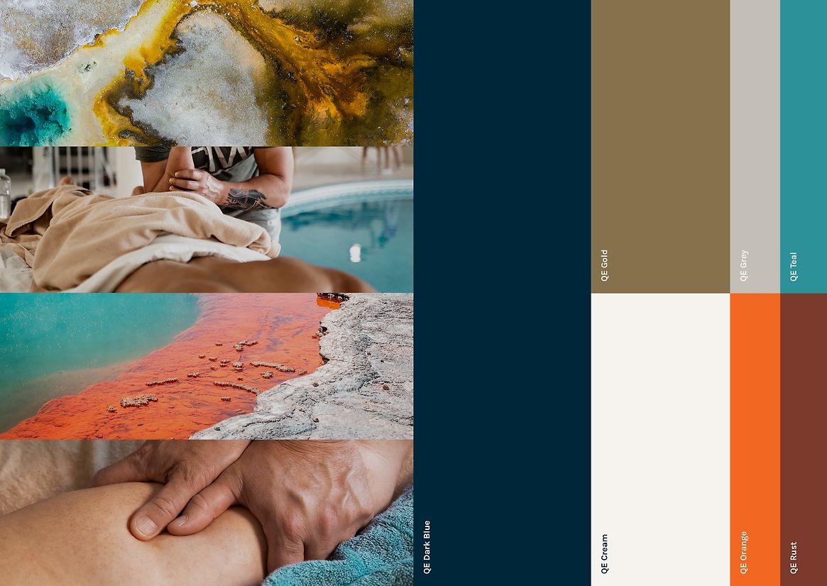
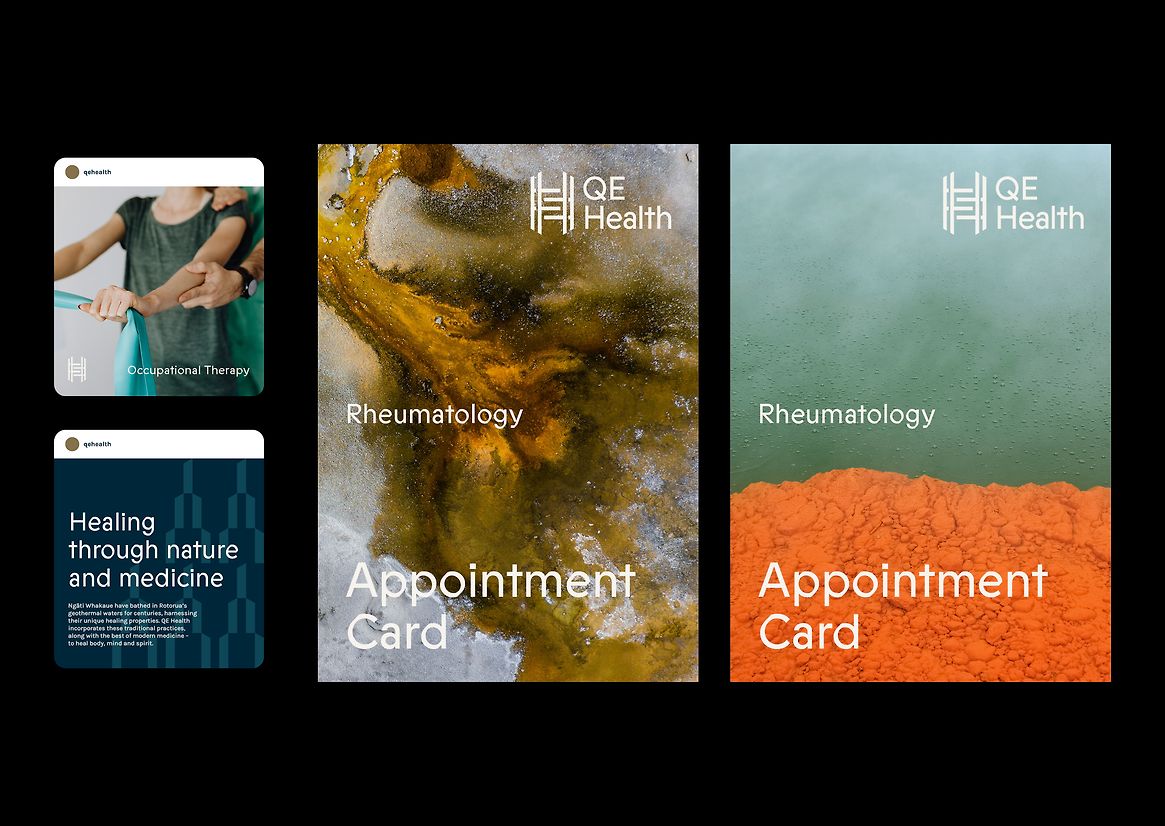
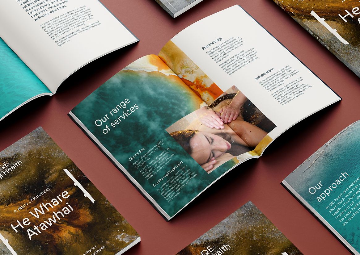
QE’s new colour palette draws from nature. Deep blue hues of water and the vivid rust tones of Rotorua’s geothermal lakes harmonise with the facility's wood elements, creating an inviting and serene environment.
Imagery highlights the textures of nature, the geothermal landscape, the guiding stars, and the turbulent waters of Te Korokoro O Te Parata. Every image supports QE’s mission of guiding patients toward wellness through a harmonious blend of science and nature.
QE Health's rebranding captures a deep connection to cultural heritage, a commitment to patient wellbeing, and an innovative design approach. It establishes QE as a premier wellness destination, offering an experience that’s as enriching as it is healing.