Graphic
Werk 2 Willis Lane
-
Pou Auaha / Creative Director
Benjamin Johnson
-
Ringatoi Matua / Design Director
Andy Hockey -
Kaituhi Matua / Copywriter Leads
Hayden Maskell, Katherine Dewar
-
Ngā Kaimahi / Team Members
Jack Bublitz, Ashley Graham -
Client
Precinct Properties
Description:
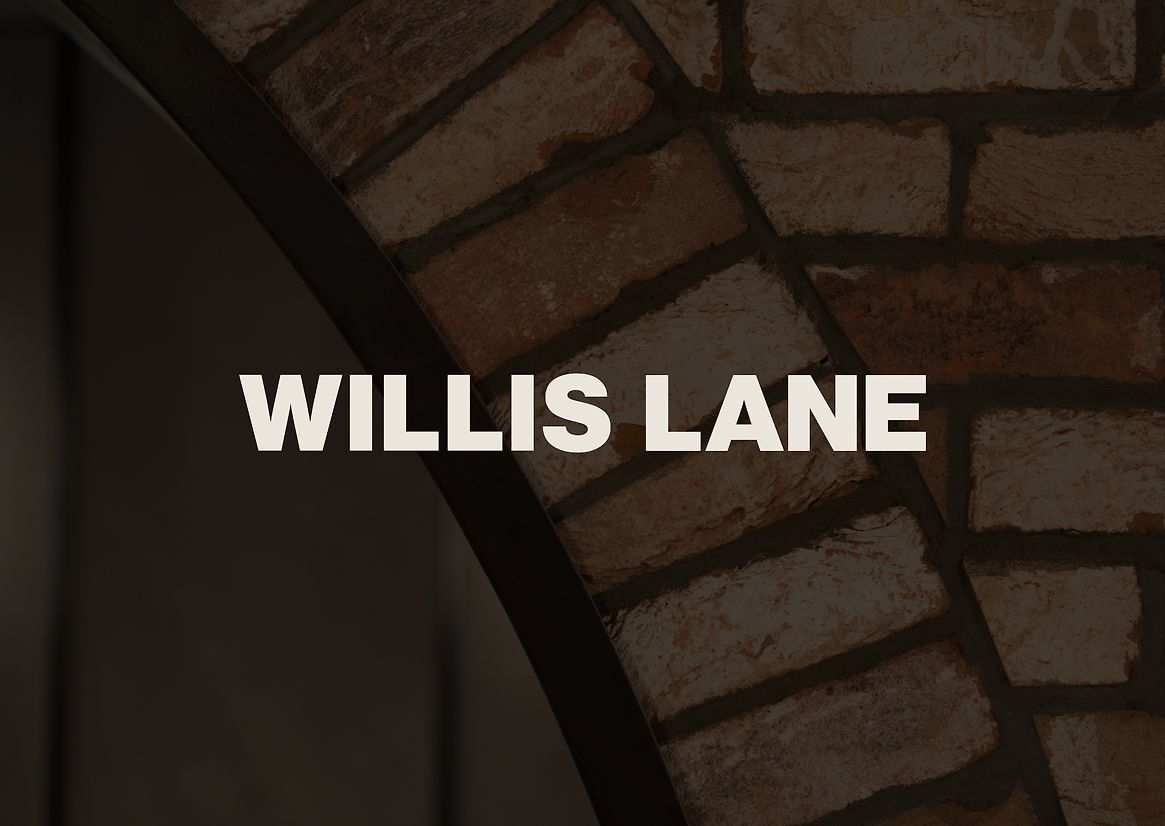
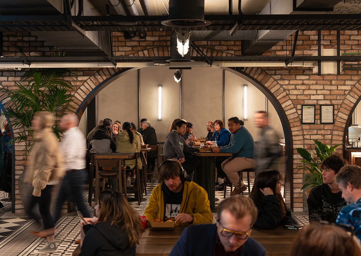
Willis Lane reimagines Wellington’s historic underground walkways into a subterranean epicentre of late-night revelry. In partnership with Precinct Properties (of Commercial Bay fame), Willis Lane breathes new life into Wellington’s hospitality scene. Taking inspiration from the railway stations and repurposed industrial buildings of New York, the space is a series of weaving tunnels and vaulted brick archways, filled with eclectic food vendors, open dining spaces and thrilling entertainment. Willis Lane is something unlike anything Wellington has seen before, creating a space that is worn in, tactile and human, with unmatched attention to design detail.
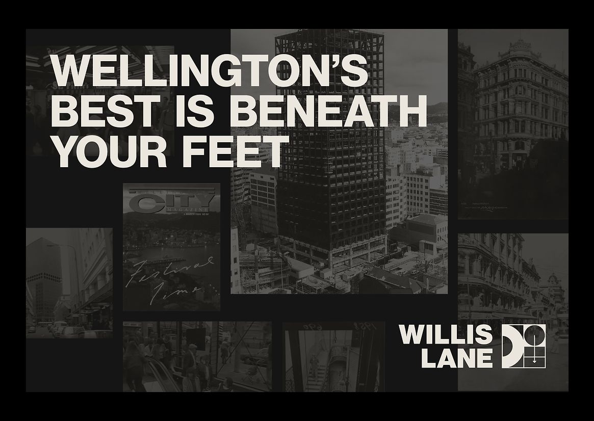
We chose to apply an architectural timescale and gravitas to this brand identity. The vision was for something with substance and longevity; timeless, concrete — as though Willis Lane had always been there. We decided to develop a design language that was rooted in place, drawing on the history of the site and its surroundings, with overt nods to Willis Lane’s unique under-street location and its continued use as a hospitality and entertainment venue.
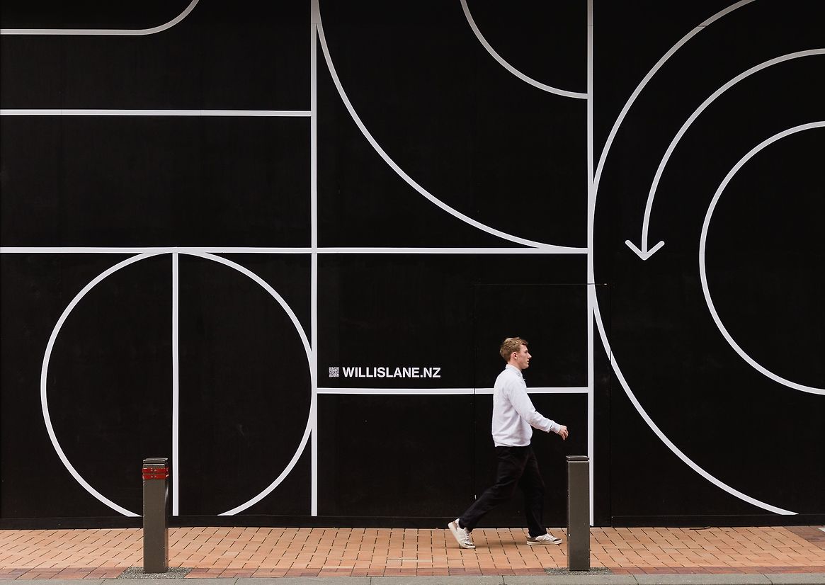
Taking insights from global examples of public design like London’s Barbican Centre and New York’s subway system, we approached the brand identity as a piece of placemaking, choosing simplicity, legibility and utility as core creative drivers. We needed to create an identity that didn’t visually overpower the vendor brands within, but carve space for them.
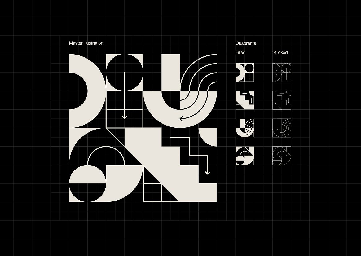
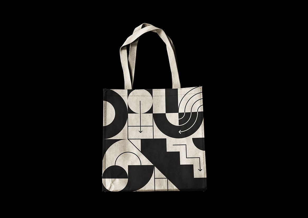
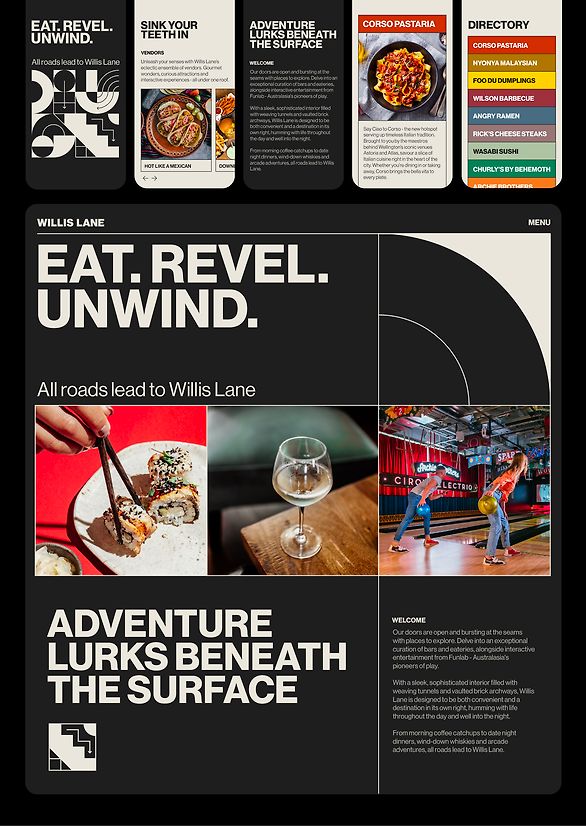
The centrepiece of the visual identity is a geometric illustration, taking cues from the site’s architectural past and present. The bounding grid mimics the repetitive orthogonal lines expressed in the modernist tower above. Motifs of a subterranean landscape interact with those of hospitality and play; steps, curving tunnels, directional arrows and dinner plates, filling the static grid with life and movement.
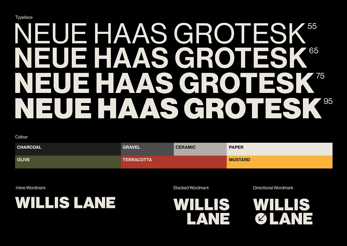
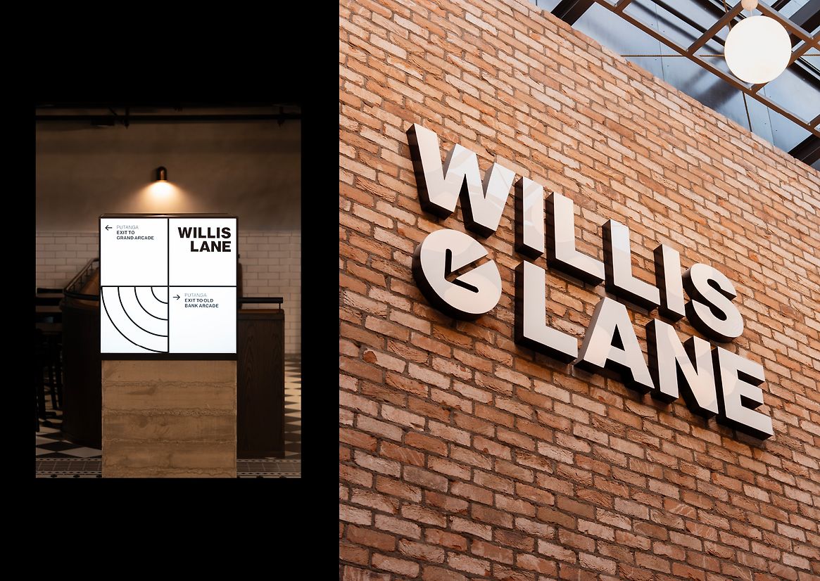
Urban public transit design systems served as the inspiration for our typography and wayfinding — modern, legible and utilitarian in execution. We wanted to subtly signal that the space, although tucked out of sight, belongs to Wellingtonians as a public one.
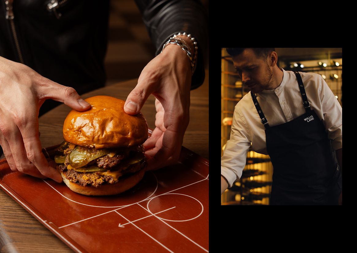
The identity was applied across a broad range of physical and digital outcomes. From construction hoardings with intriguing messaging, a lit signage and wayfinding system, billboard adverts, customised aprons, food trays and merchandise — to digital displays, a custom web experience, and social media content. The versatility of the design system meant that every possible scale of placement was a potential canvas for the brand.
Willis Lane is much more than a branding project – it is a harbinger of urban revitalisation. The exhaustive brand system celebrates a series of transformative works at the heart of Wellington’s Golden Mile, bringing to life the vital intersection of Willis Street and Lambton Quay. What was once a tired, faceless food court is now a thriving destination for superior hospitality and entertainment – as Willis Lane has fast built a national profile and become a must-go destination when visiting the capital.