Graphic
ThoughtFull 13 ThoughtFull 13 Kiwibank Rebrand
-
Pou Auaha / Creative Director
Geoff Suvalko
-
Ringatoi Matua / Design Directors
Zac Suvalko, Aaron Richardson, Garrick Sutherland, Johnson Mckay
-
Ngā Kaimahi / Team Members
Ira, DNA Design, Retail Dimension, Special Group, Kiwibank, Jodi Williams, Simon Hofman, Erica Beagley -
Kaitautoko / Contributor
Tristan Marler -
Client
Kiwibank


Description:
Kiwibank is the largest New Zealand owned bank. The brief was to reposition the bank to attract and retain a new progressive type of customer. The repositioning was to spearhead a transformation across culture, product and technology – ensuring the bank would be future fit for the next 20 years.
Before designing anything we evaluated the current brand identity and competitive set, engaged Māori to understand what ‘thriving’ meant to Tangata Whenua, and engaged with customers to understand perceived relevance and ensure we recognised existing and distinctive brand equity that should be carried forward. The challenge was to balance what customers both recognised and valued with the bank with a clear signal the bank was taking a new direction forward.
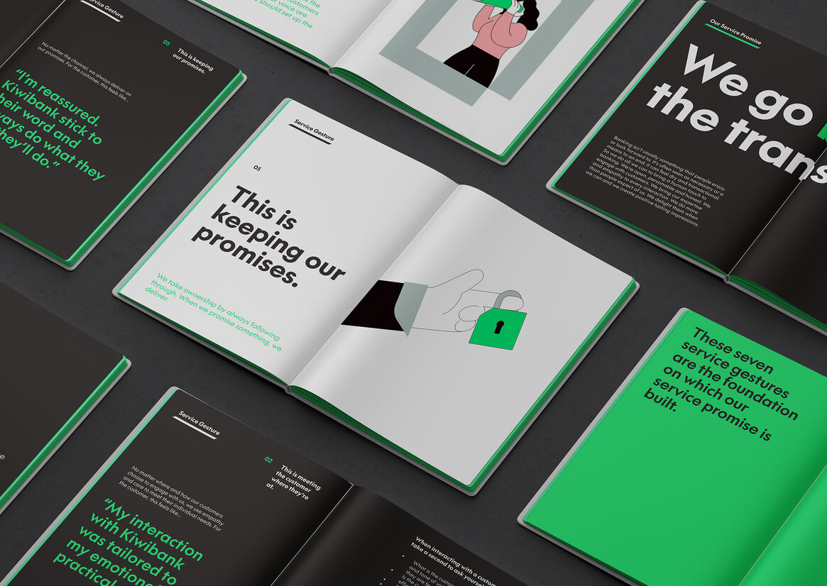
The design challenge was to powerfully and authentically express the new brand vision of ‘enabling Kiwi to thrive’ along with brand attributes defined as Be Bold, Know How and Show Heart. To do this in away that authentically honors and reflects the organisation's commitment made through it's Rautaki Māori.
We identified a relevant cultural metaphor - the native Harekeke (flax) Plant, as in Te Ao Maori, the Harekeke symbolises a thriving community. The centre shoots are the growing generation. The surrounding leaves are the nurturing parents and grandparents.
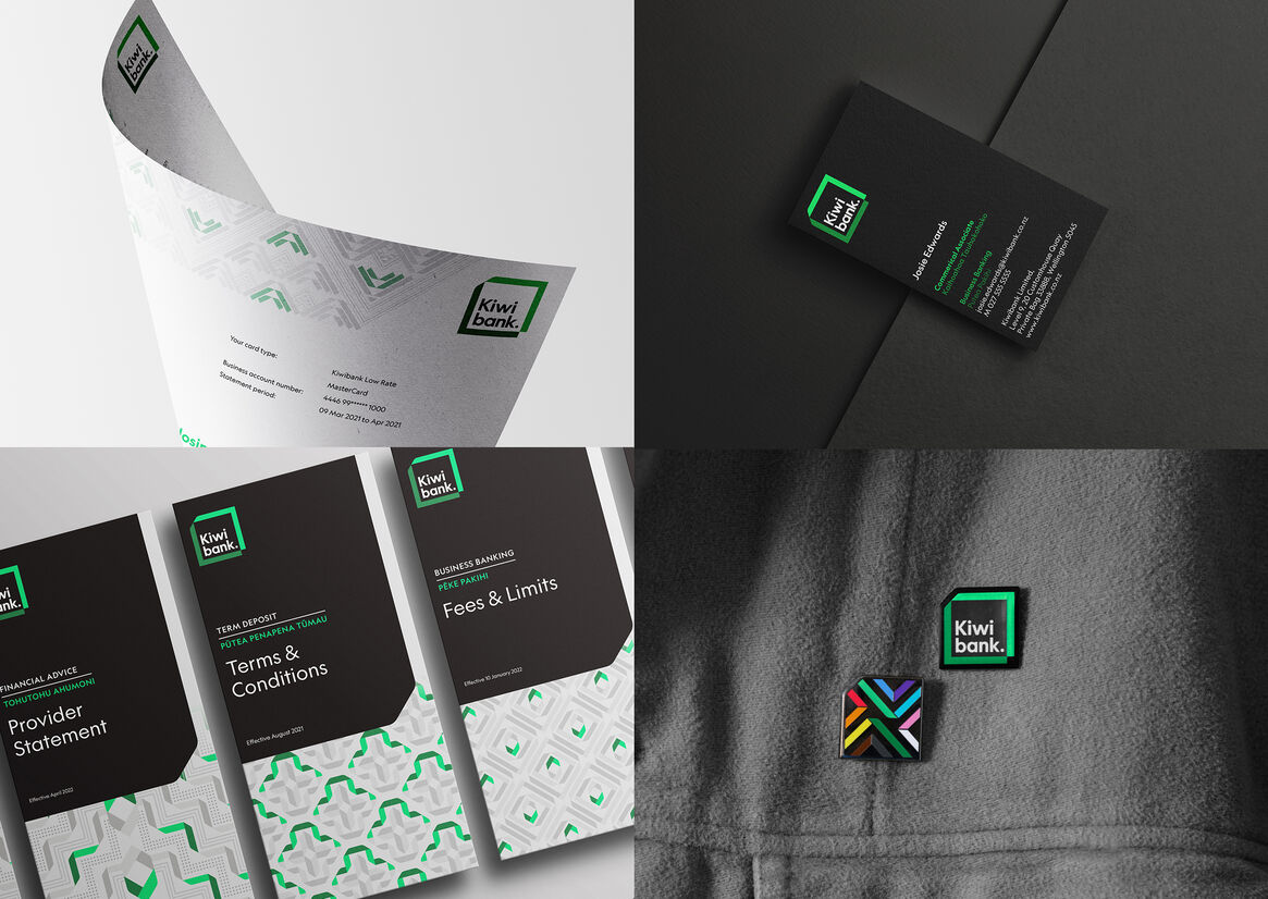
We expressed the metaphor through a digital-first identity formed from a two-coloured abstract Harkeke leaf that folds its way around to frame the wordmark. An active and living form that can transform into a broader visual language. The combination of dark and light green to express knowledge, future, growth and ambition. The top left ‘fold’ denotes culture whilst the bottom right hand ‘notch’ denotes technology.
To build depth we created three supporting cultural symbols (Tohu) to express the three attributes of a thriving community; Kia Māia - Be Bold, Kia Mārama - Know How and Kia Manaaki - Show Heart. These enabled the development of distinctive patterns across collateral, interfaces and environments.
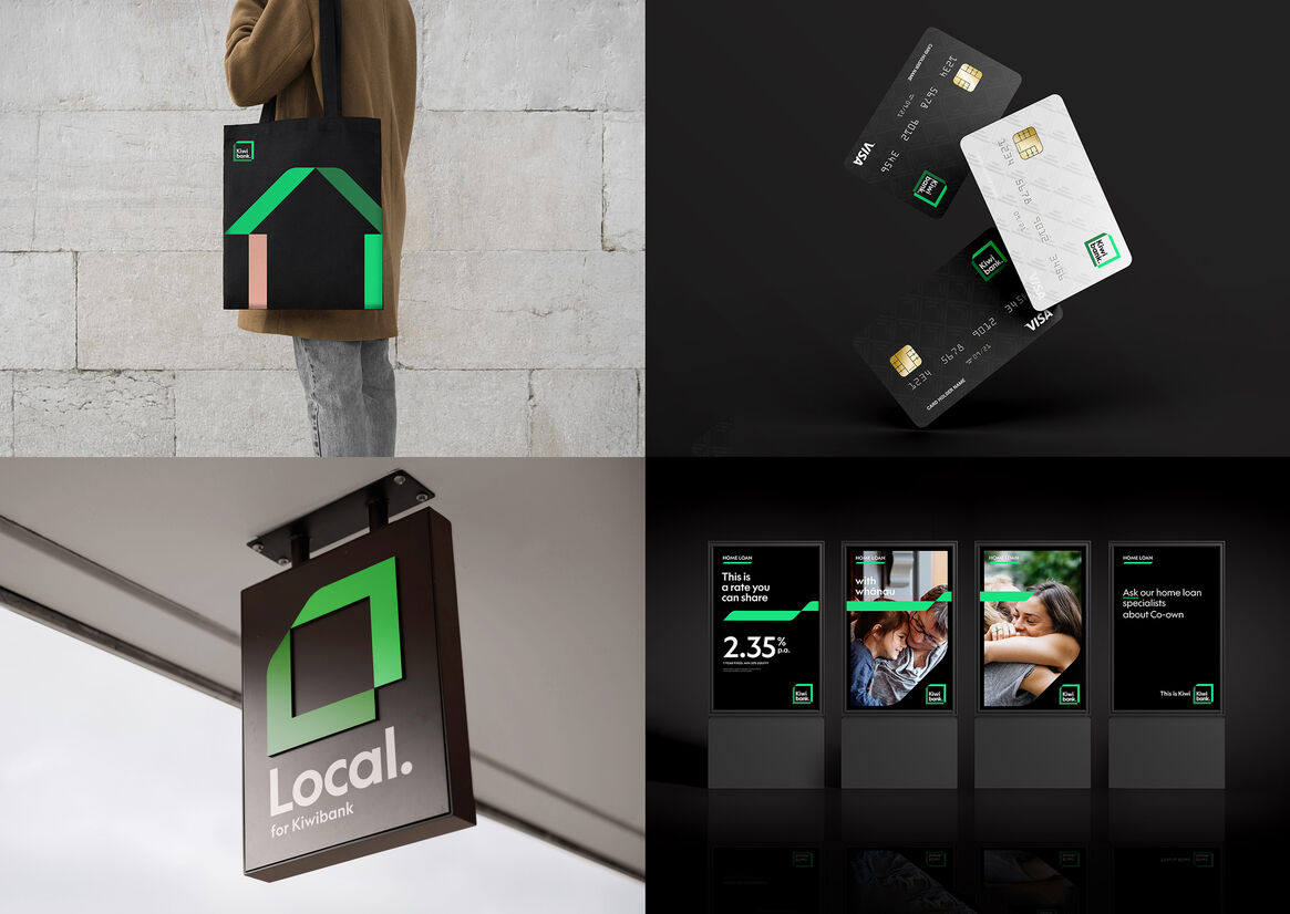
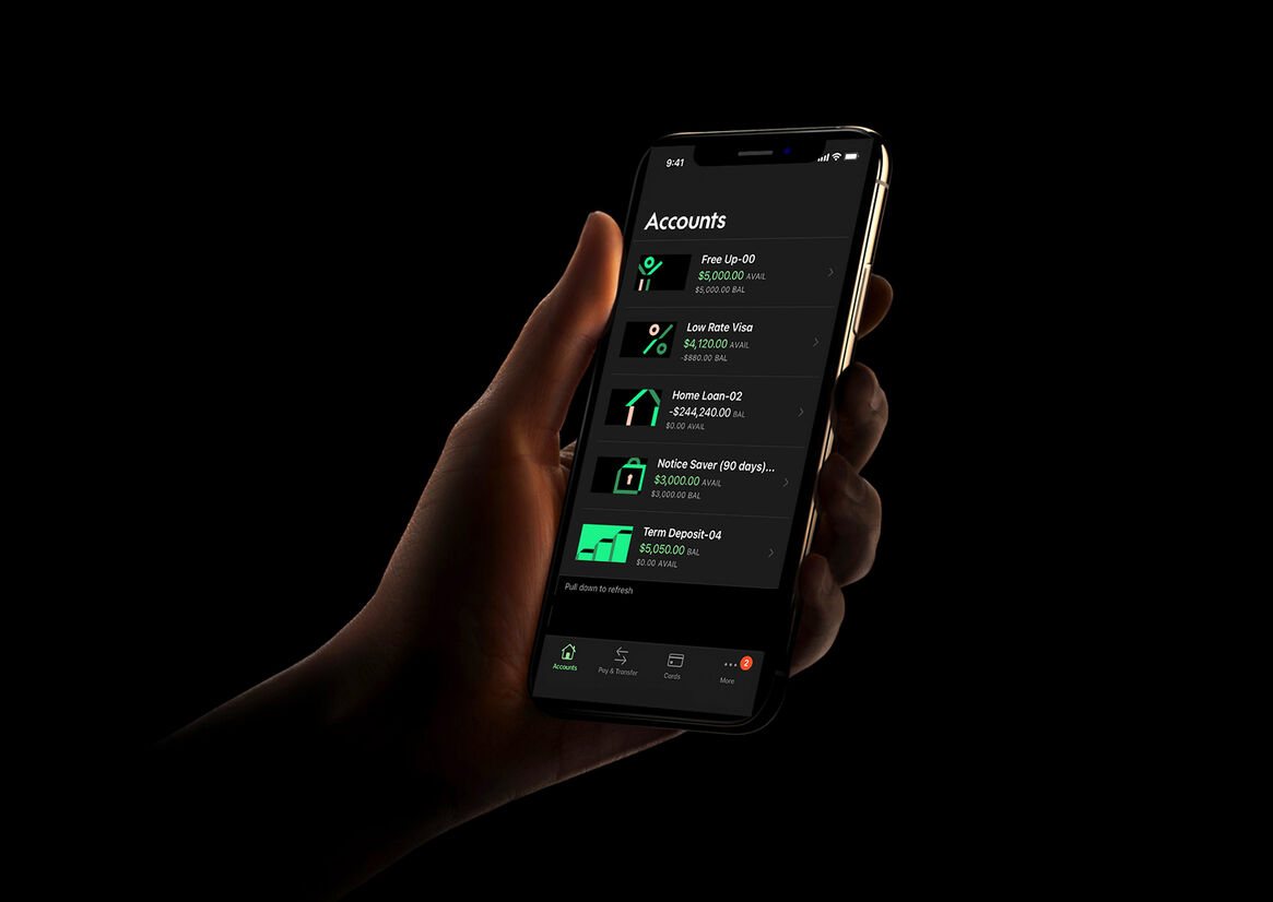
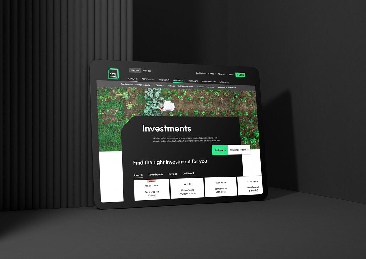
The identity system sets the bank up with a distinctive visual language that not only connects all touchpoints of the bank from physical to digital, but injects a freshness and modernity into each.
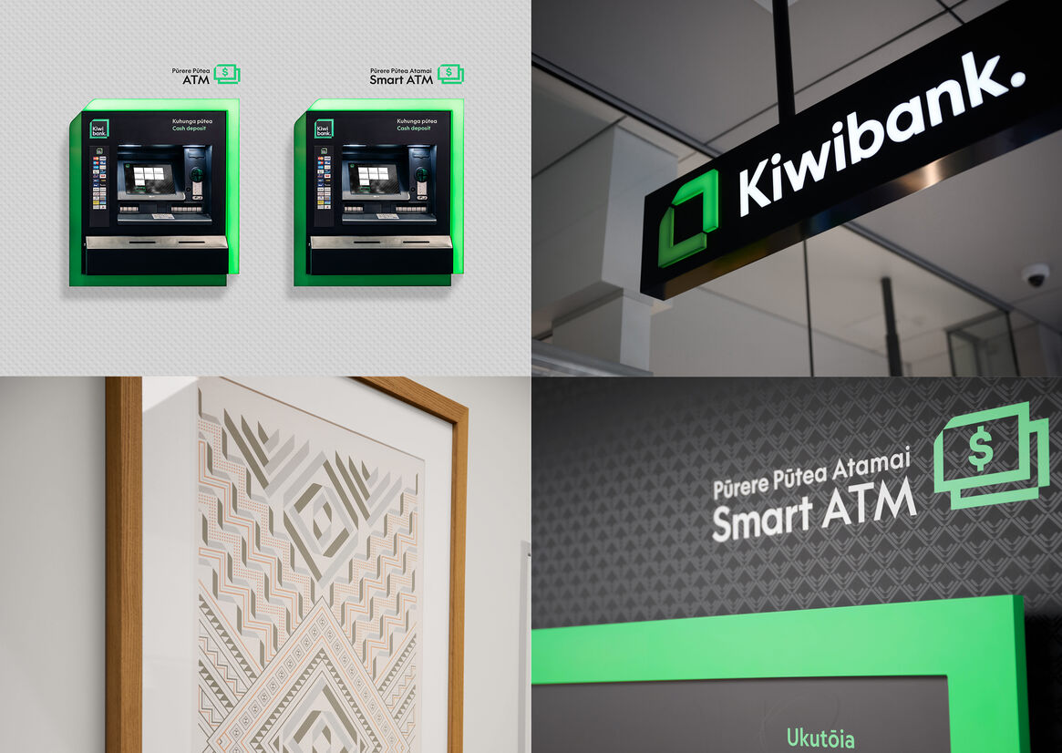
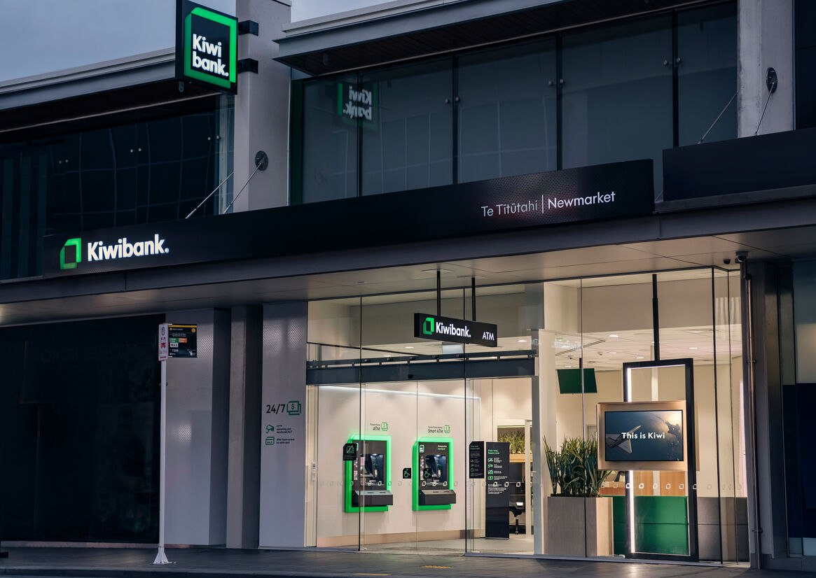
Within physical branch environments, we expressed the Harekeke concept through seating systems such as the two tone sofa system that wraps and folds through the branch space, a digital wall that expresses the Tauira and sense of progress and growth through ambient animation, the colour palette born from the metaphor and the illuminated frame that house the ATMs within and outside of the branch.
A distinctive visual language that connects all touch points with the bank from physical to digital and blends freshness and modernity with cultural authenticity and innovation.