Credits
-
Pou Auaha / Creative Directors
Nick Worthington, Arch MacDonnell, Mikhail Gherman -
Pou Rautaki / Strategic Leads
Nick Worthington, Mikhail Gherman, Graham Ritchie
-
Ringatoi Matua / Design Director
Dave Brady -
Kaituhi Matua / Copywriter Leads
Nick Worthington, Eloise Jack
-
Ngā Kaimahi / Team Members
Matt Oak, Elizabeth Stokes, Billy Worthington, Frith Armstrong, Nigel Sutton -
Kaitautoko / Contributors
Graham Ritchie, Rob Linkhorn, Ching-Ting Fu, Craig P. Burrows, Al Guthrie, Karen Inderbitzen Waller, Delphine Avril Planqueel, Toaki Okano, Lewis Mulatero, Simon Murtagh, Jonathan Mihaljevich, Stefaan Van Leuven, Dave Campbell, Rhys Casley, Dr. Oleksiy Losyev, Brian McCall, Dr. Kannan Subramanian, Inhouse Design, Toby Curnow, Alexandra Turner
-
Client
Mānuka Health New Zealand
Description:
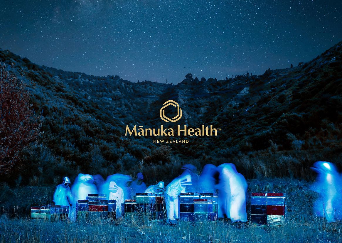
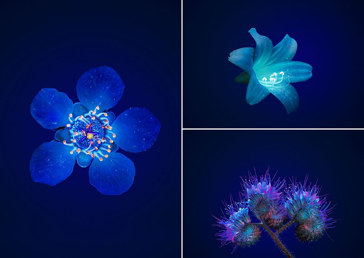
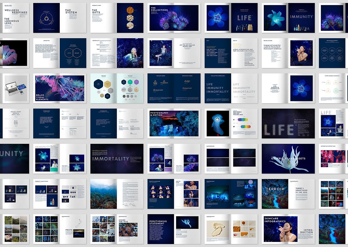
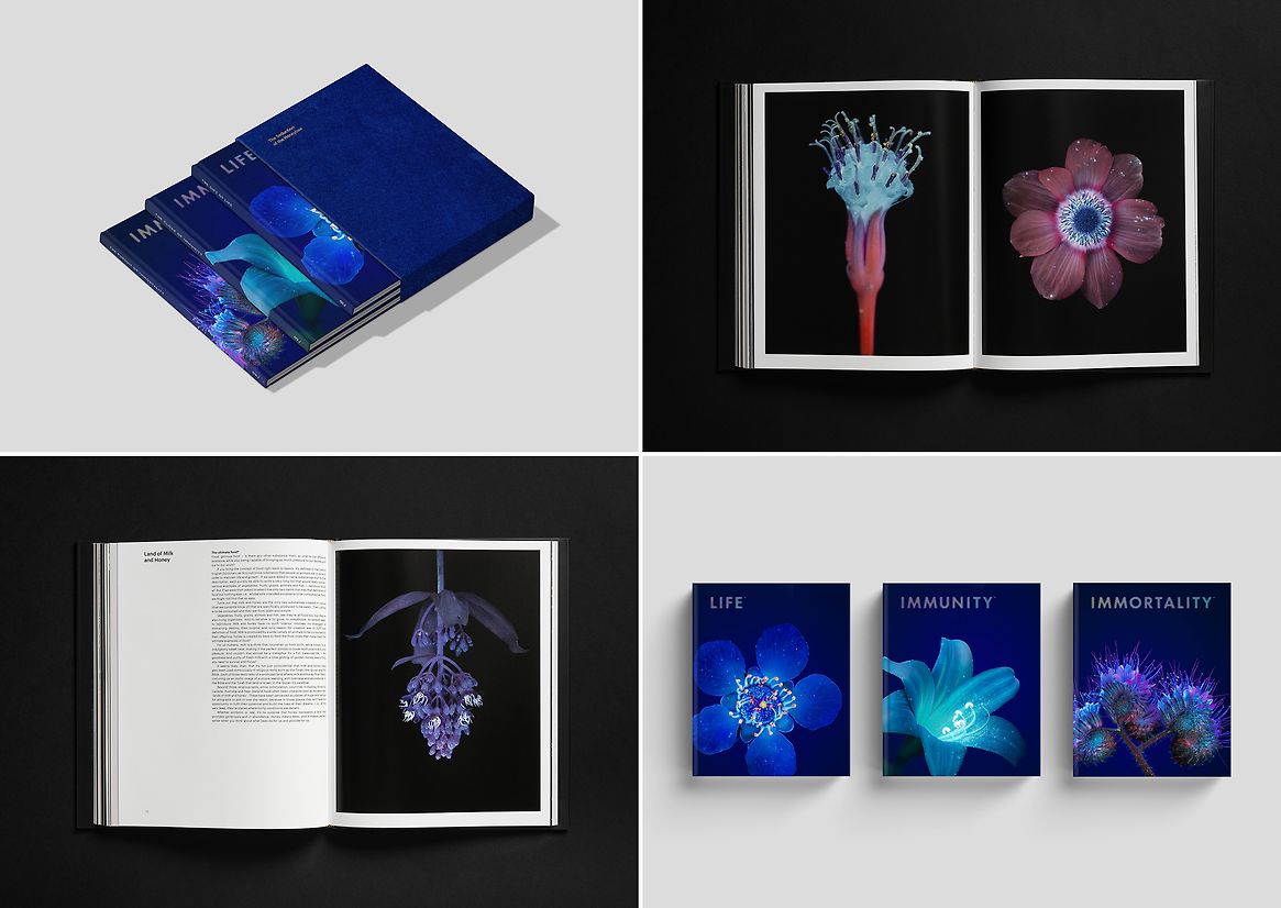
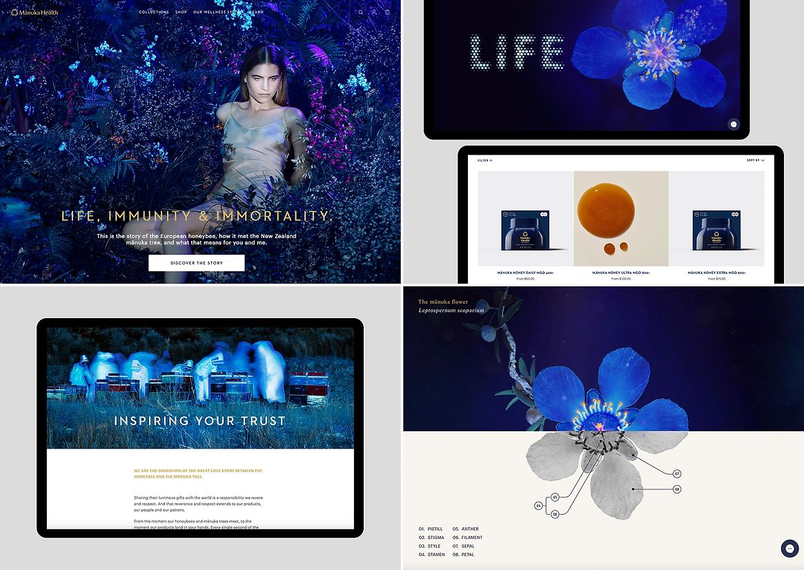
Honeybees see in UV. It was this revelation that provided a unique and distinctive visual language and perspective for the brand.
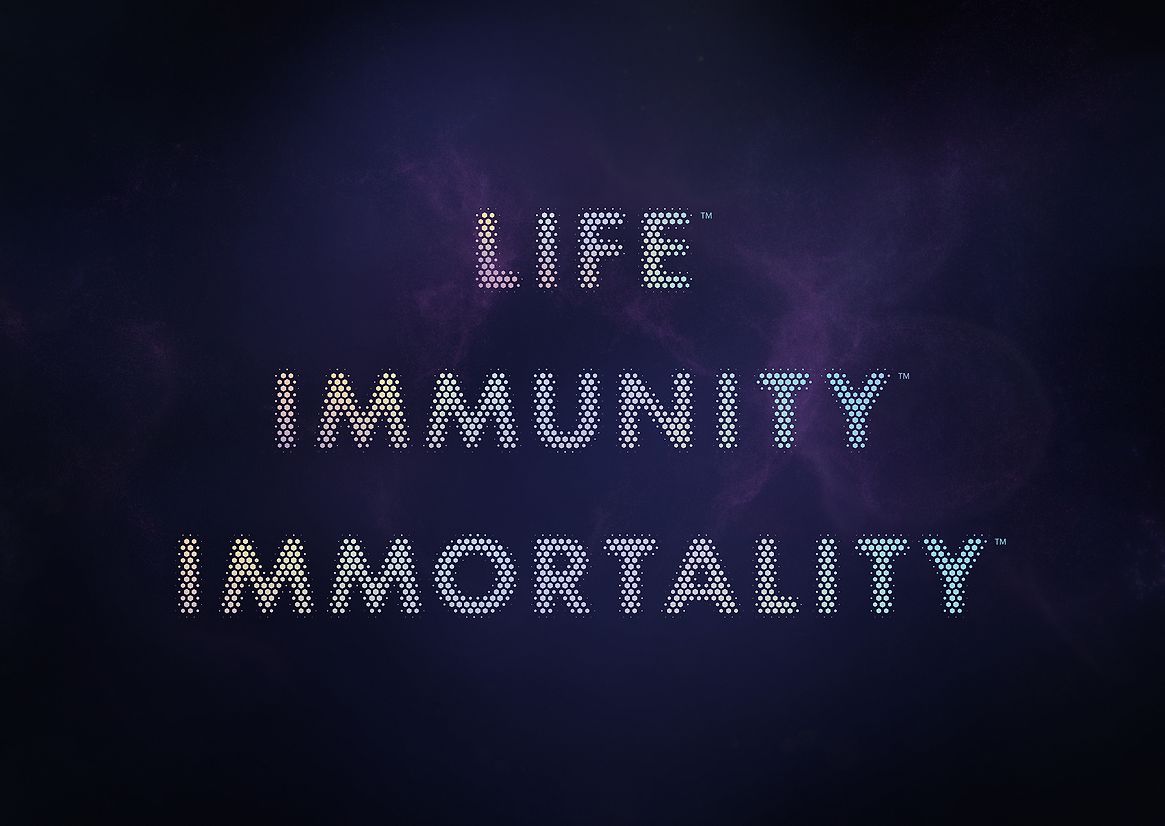
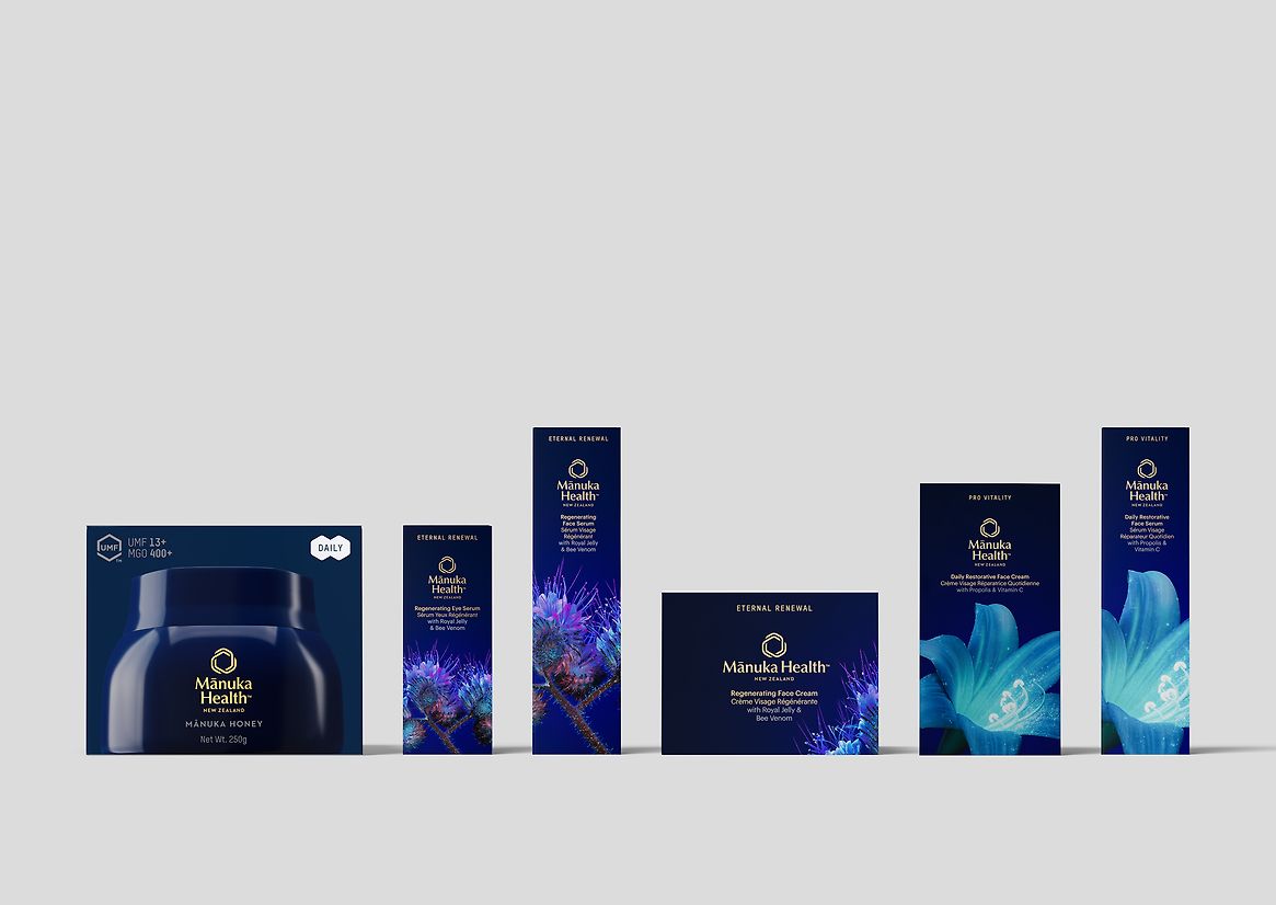
Honeybees don’t just provide us with honey. They have a complete health and wellness system. Honey provides their fuel for life. Propolis (an anti-viral, anti-septic and anti-biotic substance made by bees with saps and pollen) creates their own cloak of immunity, and royal jelly – fed exclusively to queen bees, and credited with increasing their lifespan by forty times that of the worker bee- provides the promise of longevity, renewal and immortality.
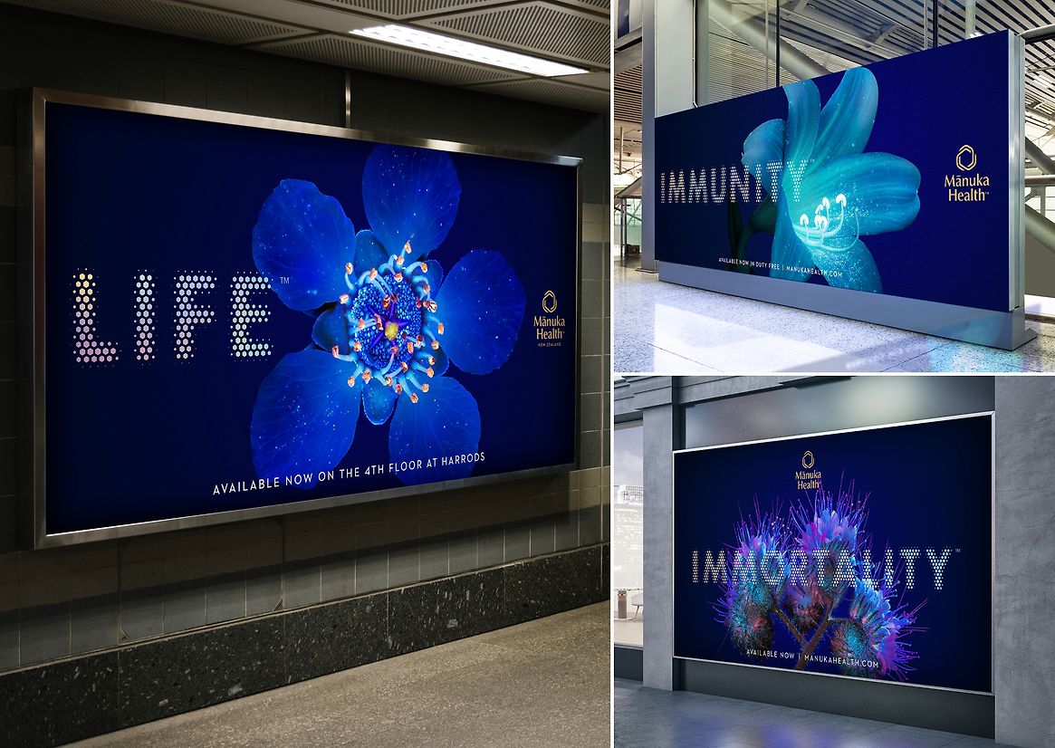
Life, Immunity and Immortality became the three product lines and the new story, and the way bees see the world became our visual identity.
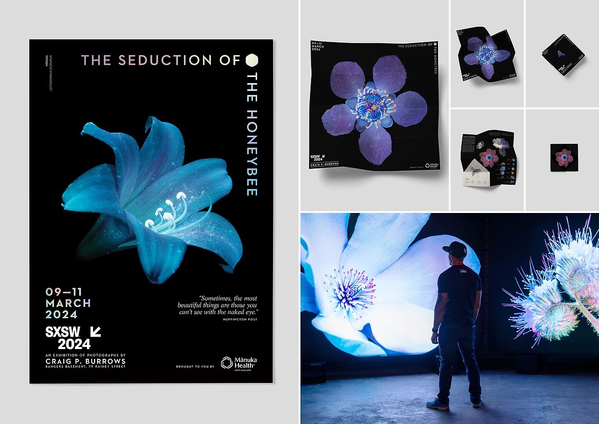
Working with photographer Craig P. Burrows we documented the world of flowers and the Manuka Tree as seen through the eyes of the honeybee – in UV. The unique images became the visual language for the brand, from the packaging to the on-line storytelling, to the web site, social, film and promotional posters along with the launch of a book and an exhibition.
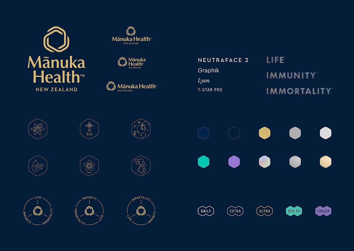
The typographic system was built using the hexagonal design of the honeycomb and the particles of pollen allow the typography its unique narrative as part of the bee’s system and process and becomes a part of the storytelling narrative either in static form or in motion.
The exhibition at SxSW of the photography was described by Forbes as “A Must See” along with the release of the photographic book “The Seduction of the Honeybee” which was described by The New York Times as “Simply Stunning”, by The UK Sunday Times as “Not just a beautiful book, but a call to arms” and Stern as “Mesmerizing and hallucinogenic”, with the book becoming a bestseller on Amazon.
Both the book and the exhibition launched the new visual identity and brand story.