Graphic
SixOneNine Moana Pasifika
-
Pou Auaha / Creative Director
Phila Lagaluga
-
Ngā Kaimahi / Team Members
Sir Bryan Williams, Sir Michael Jones, Pelenato Sakalia, Kevin Senio, Carla Hofler, Taylah Johnson, Robert Rossiterstead, Julie Clausen, Stacey Addenbrooke, Carmen Sutton -
Kaitautoko / Contributors
Jerome Mika, Lisa Tai, Nathan Inivale, Tyler Rackich, Photosport NZ -
Client
Moana Pasifika


Description:
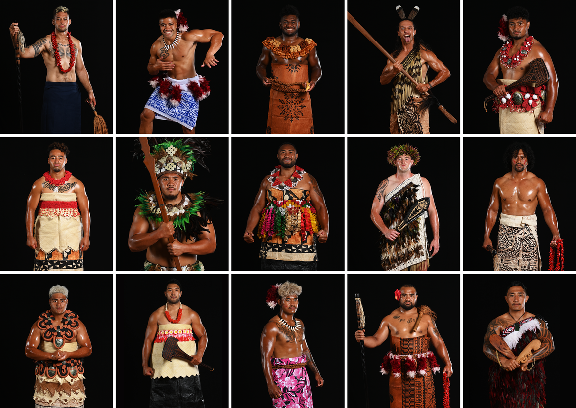
Moana Pasifika: the newest Super Rugby Pacific team, committed to bringing the talent of the pacific into a culturally representative team that showcases our skills, diversity and sameness all at once. For many Pasifika, sport has been the driving force that lifted them up and carried them to success beyond a sporting code, in business, education, social enterprise and new cultural ventures. The vision for Moana Pasifika is to be the rising wave for all Pasifika people - elevating us, pushing us forwards and imprinting our legacy on the game of Rugby.
When we were approached to develop and design the brand identity for Moana Pasifika, the challenge laid down was to create a brand that represented all Pasifika nations.
Initially, we explored the links that connect our Pasifika nations and investigated what commonalities our cultures share. For our first task we conducted interviews with the Moana Pasifika Board and community leaders, to gain their views on what connects our people and what were the cultural boundaries we needed to work within/respect.
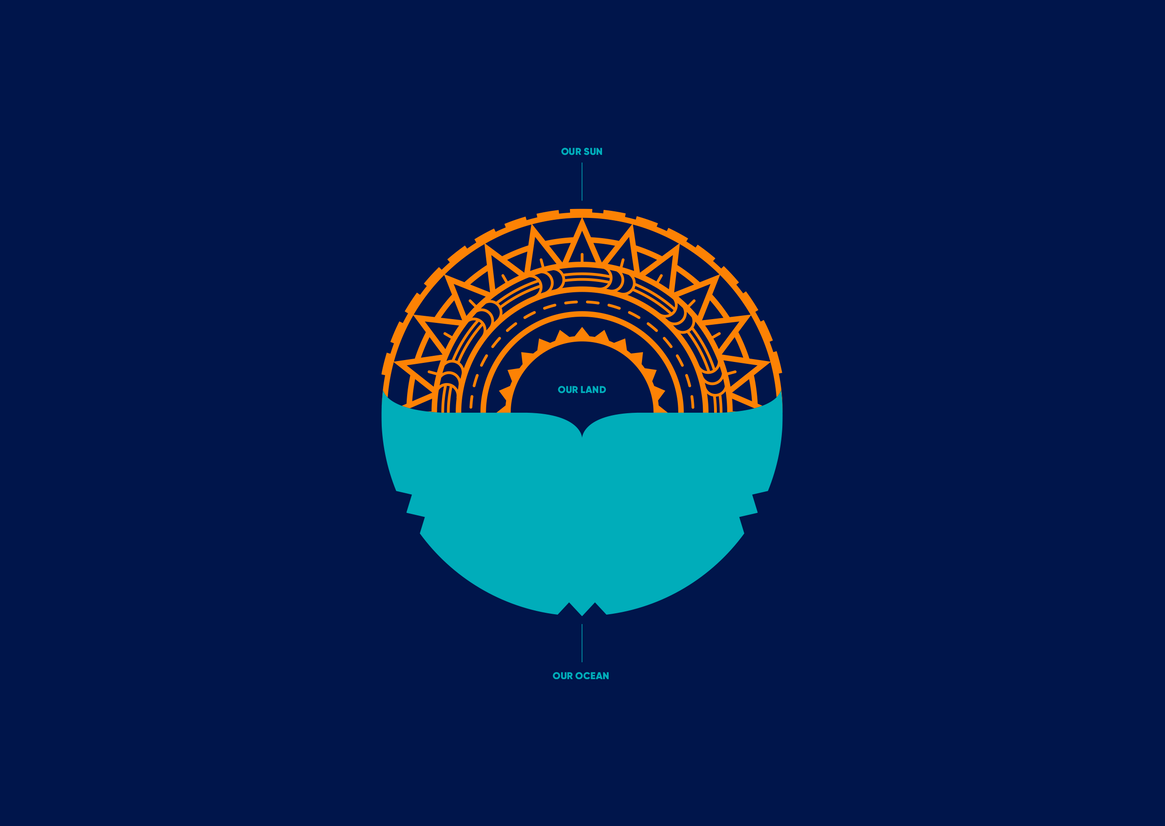
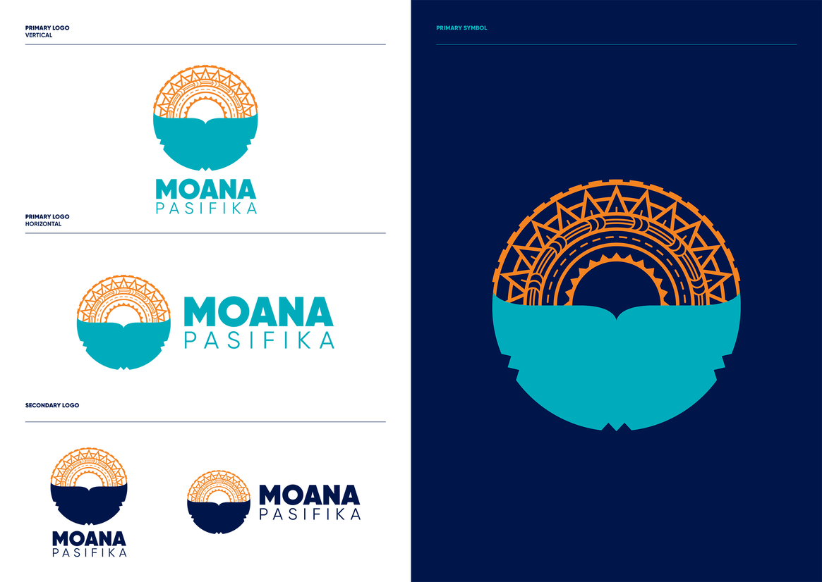
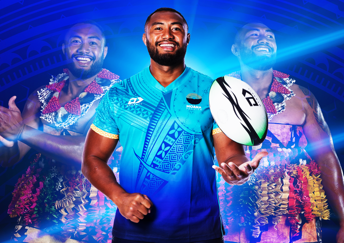
Through our research we were able to extract four key connectors - our ocean, our Sun, our islands and our art. These connectors form the foundation of the Moana Pasifika logo mark.
The ocean is the central idea, the great connector linking our Pasifika nations to each other but also connecting us to the places that Pasifika people have made new homes - Aotearoa, Australia, Japan and the USA. Our ocean has carried us to new lives and new opportunities. But no matter how far we travel, we still hear a call - it speaks to something deep in our DNA. We are Moana Pasifika. Moana Pasifika is us.
The whale’s tail depicts our ocean and represents the swirling power of the sea. The nifo notches talk to the abundance of life found in and around the ocean.
The Sun's design is based on the traditional Niuean cultural art form of Hiapo. It represents life, health and regeneration. At the heart of it all is the negative space between the Sun and the ocean, this represents our island, our land, our home.
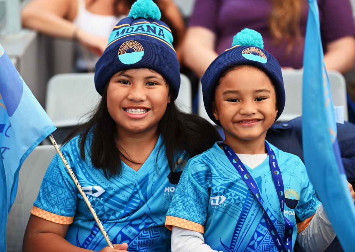
The brand colours reflect the strong ties Tagata Pasifika have to the ocean, with the contrasting pop of orange to show the warmth and natural vibrancy of our Pasifika people.
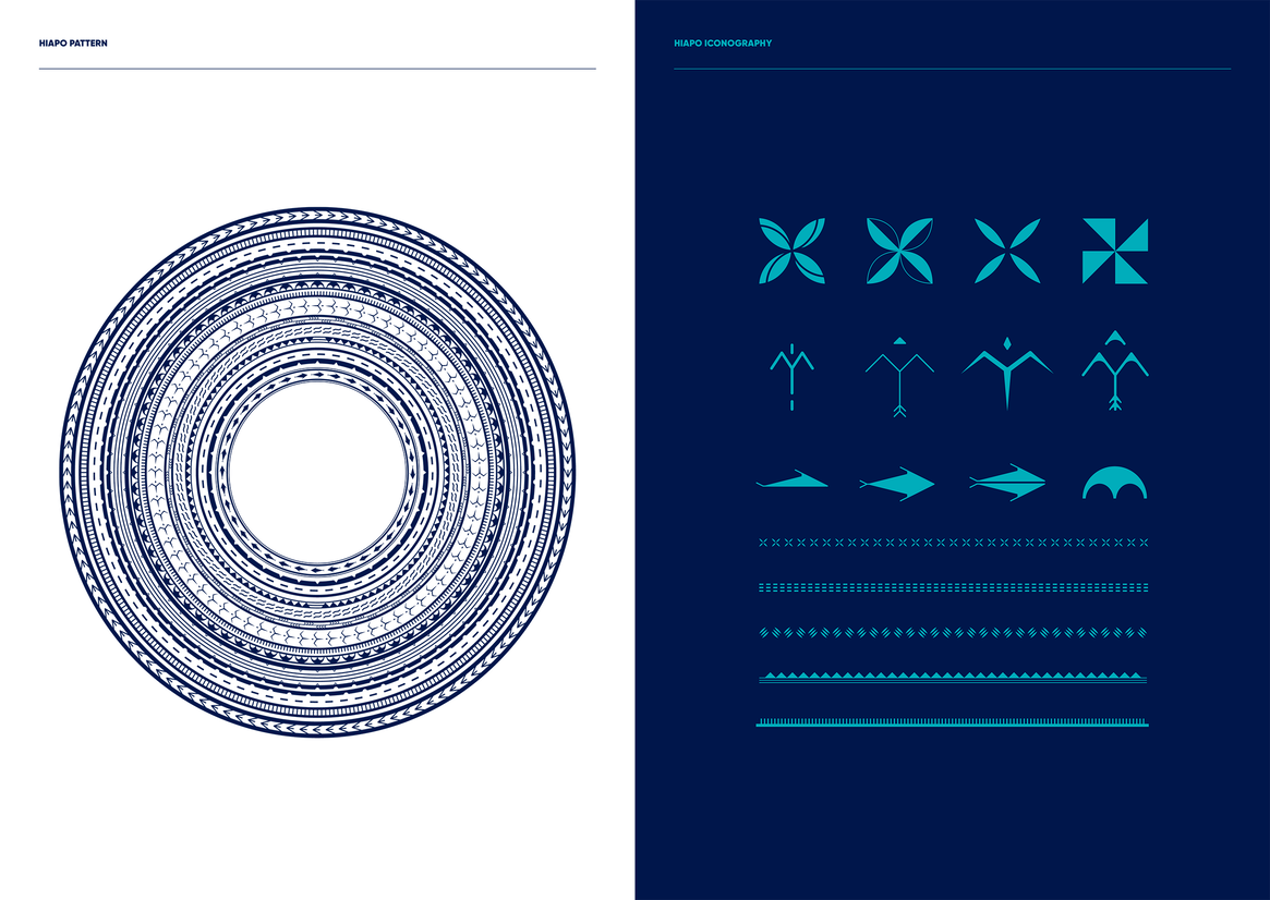
We created a feature pattern and a suite of icons to help amplify the cultural tone and enhance the visual narrative of the brand. These brand assets expand upon the Hiapo design used in the logo. It features a mix of motifs that are found throughout Polynesian artworks such as Siapo, Ngatu, Masi and Tatau. The Moana Pasifika Hiapo pattern is about unity and the coming together of our people to forge a better future for all Pasifika.
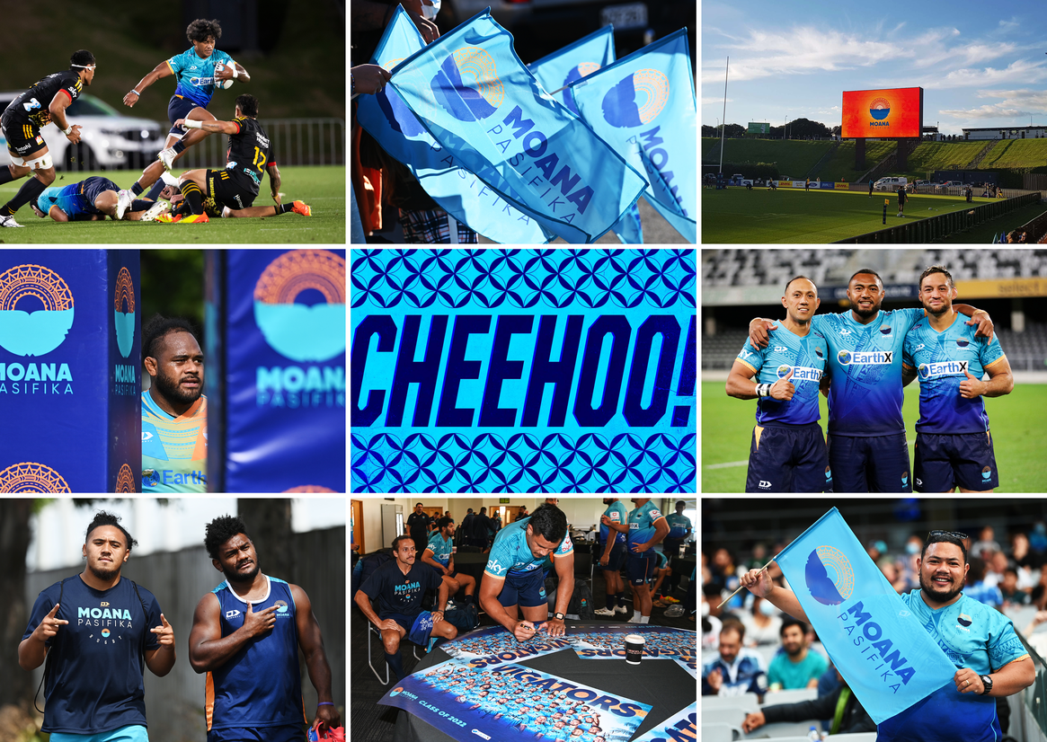
The identity was rolled out across an extensive range of applications including brochures, signage, posters, billboards, flags, ads, apparel, environmental graphics at Mt Smart stadium, vehicle livery, social media assets and big screen graphics.