Graphic
Richards Partners 34 Amaia of Takapuna
-
Ringatoi Matua / Design Director
Caroline Konarkowska
-
Ngā Kaimahi / Team Members
Kyle Ranudo, Tommy Chin, Ro Chen, Brya Taylor, Brian Richards, Scott Wallace -
Kaitautoko / Contributors
Jinki Cambronero, Toaki Okano, Jessica Gernat, Vertigo Motion, Wildlabs, One to One Hundred -
Client
Kingstone Property

Description:
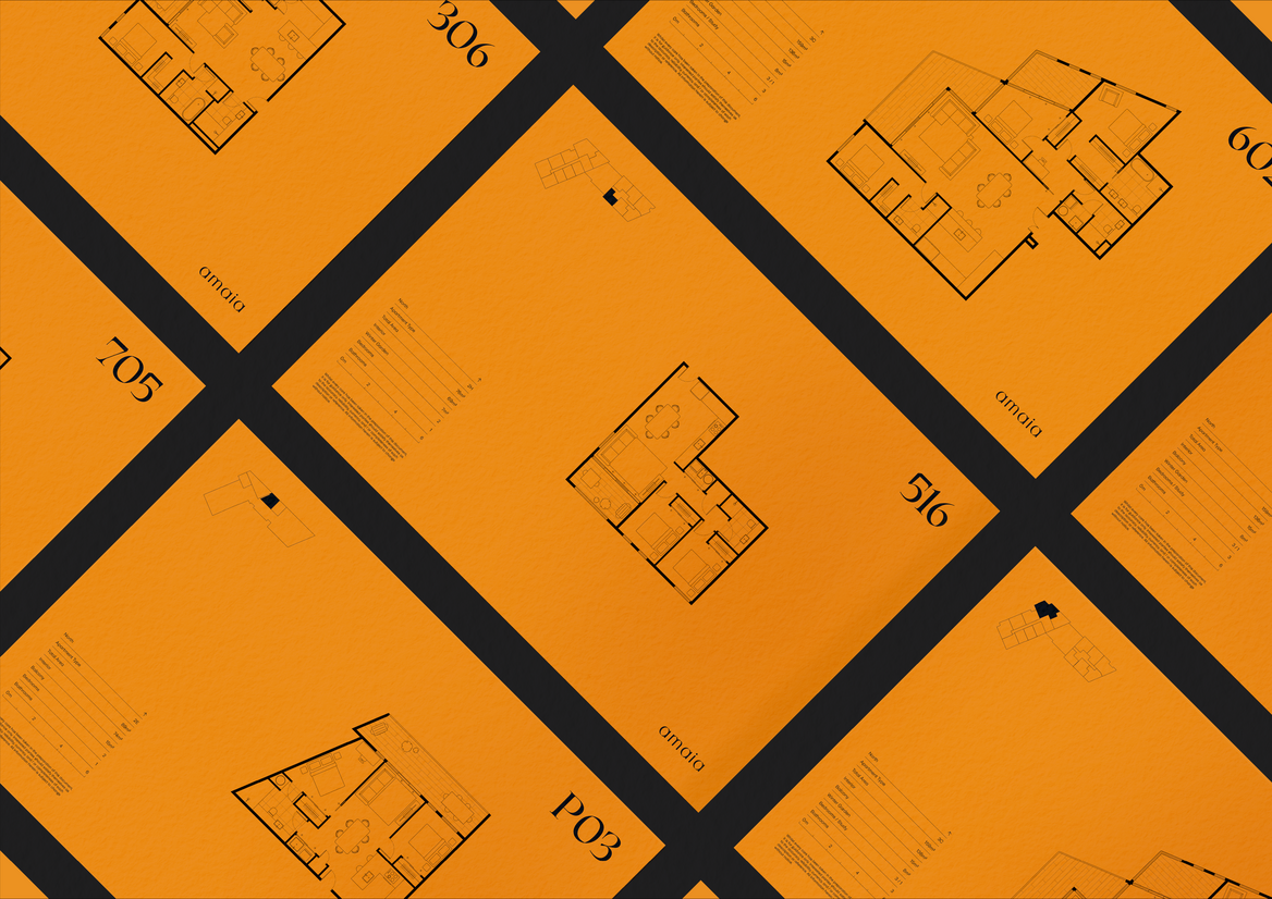
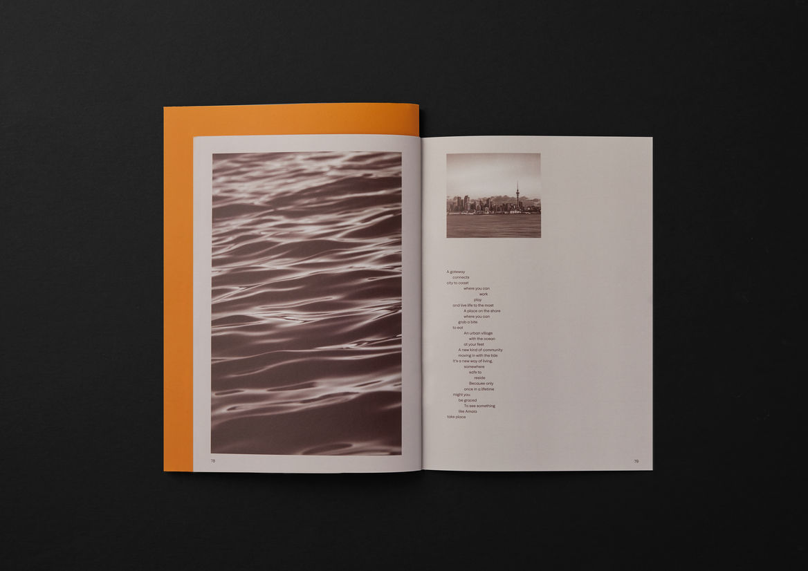
A mixed-use property development with the potential to combine the best of urban, suburban and coastal living, our client challenged us to create an appealing name and brand identity for their new project on 48 Esmonde Road, Takapuna.
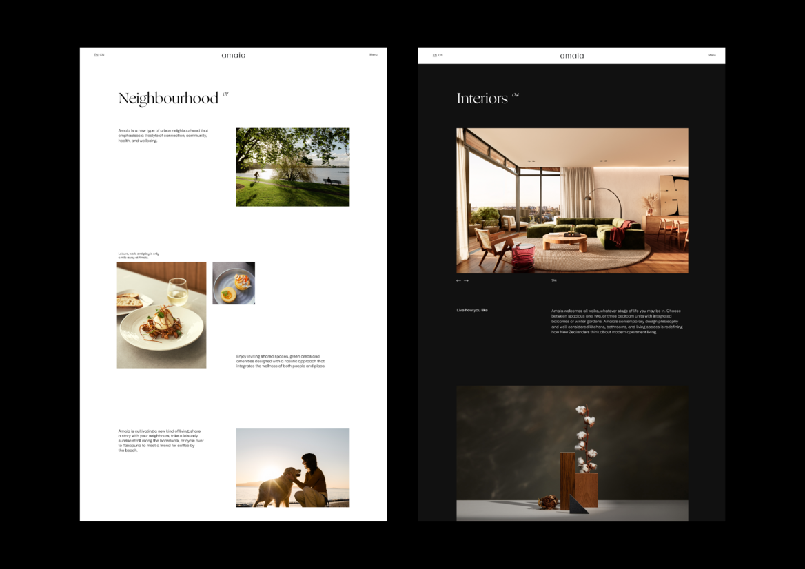
With skyrocketing housing prices and the death of the “quarter acre dream”, New Zealand is a country still adjusting to the idea that not everyone will be able to own a home and a section in the suburbs. Still, we all want to own our own space and all the things that come with it; neighbourhood, community, and a sense of belonging.
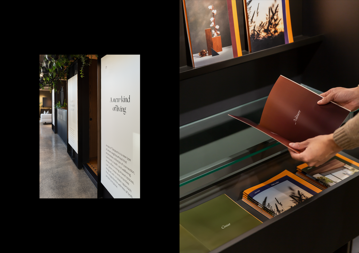
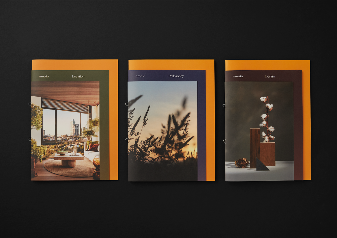
With this in mind, we set out to design an identity that’s more a lifestyle-brand than it is a property-brand. Amaia, which means “lunar rainbow” in Māori, is both a nod to the aspiring interculturalism of Auckland, and the shape of the land on which the development sits. Emphasising warmth, connection, and community, the brand essence we developed, “redefining the urban neighbourhood”, alongside the visual identity, seeks to challenge the perception that apartment developments can’t offer the same quality of living promised by the suburban dream.
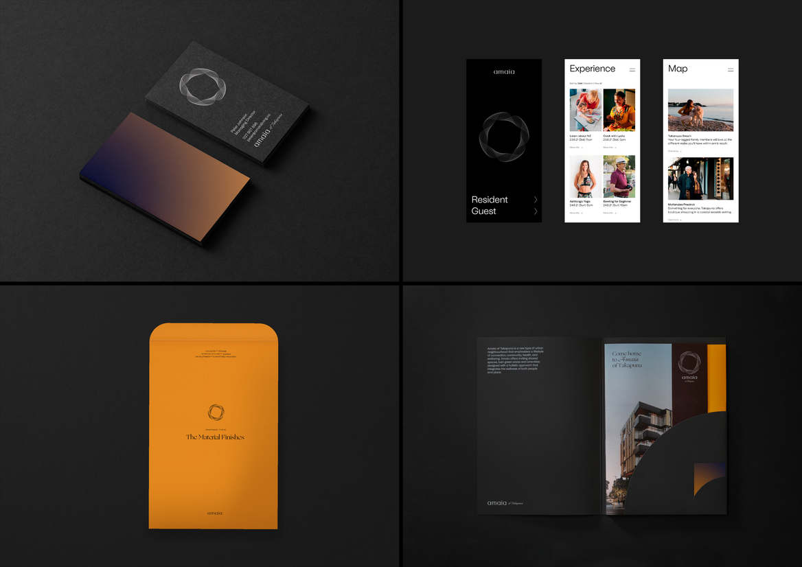
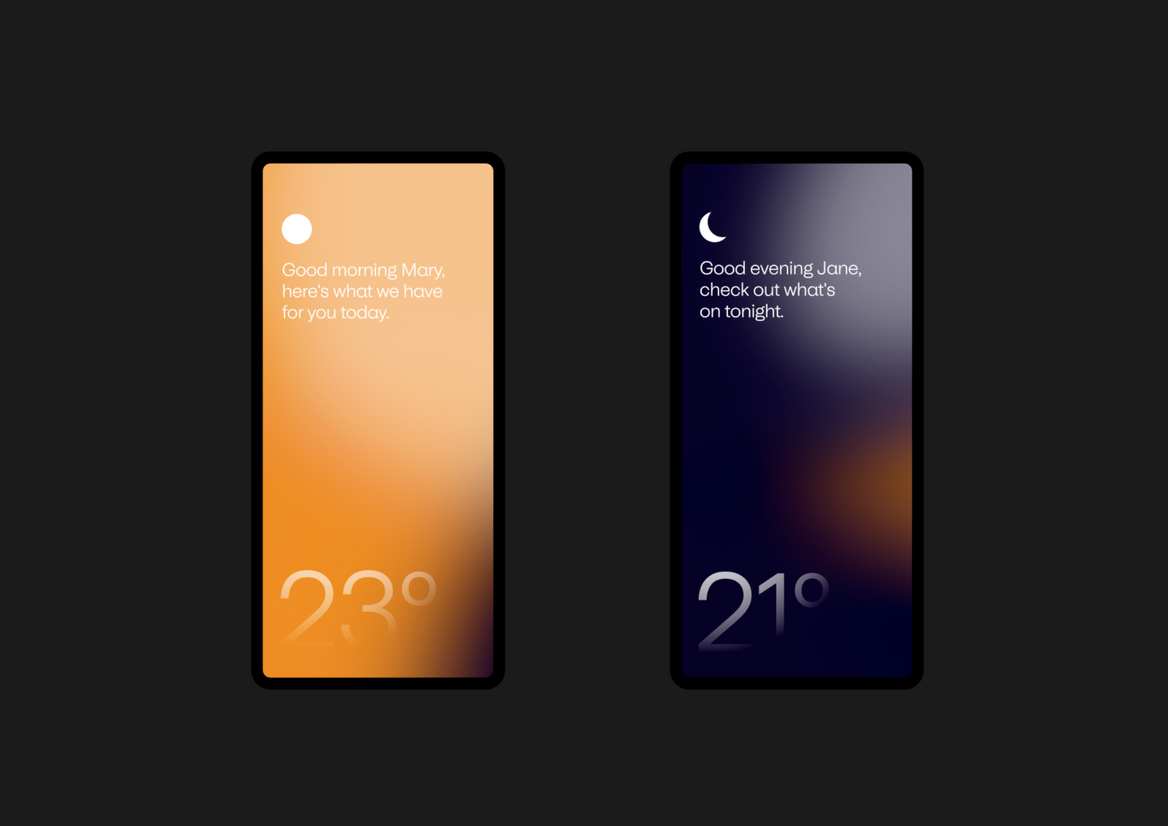
The design of Amaia, like the location of the development itself, plays in the space between city and coast. An urban village with the ocean at its doorstep. A diverse range of brand colours have been selected to represent the concept of Amaia’s eponymous lunar rainbow and evoke the warm feeling of being at sea at sunrise or sunset. Nightfall Black acts as an elegant backdrop to support the gamut of colours, Sunlight Yellow, Moss Green, Pohutukawa Red and Dusk Blue.
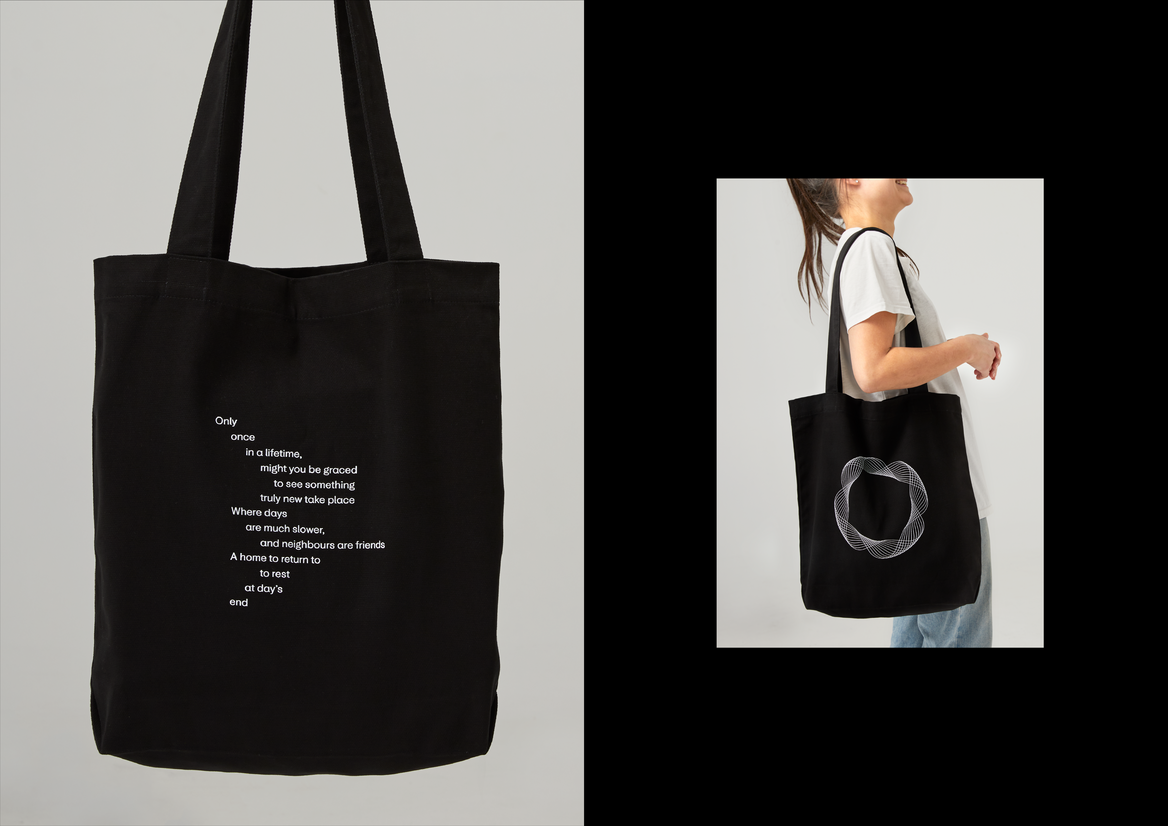
The Amaia brand symbol is also a nod to the lunar rainbow, which forms as a halo around the moon. It was created by hand with a spirograph, fine lines banding and weaving in and out of each other, much like how cultures interact and interweave in a global city like Auckland. The wordmark is also inspired by Amaia’s lunar namesake. Each letter crafted to echo the phases of the moon.
Universal Sans serves as the brand’s primary typeface; friendly and functional, it is a highly-legible sans serif that has been customised for Amaia to include rounded geometric features to echo the brand’s logo. Ogg is Amaia’s display typeface. The flowing, calligraphic characteristics of this typeface brings an elegant warmth to the identity, and echo the script sign painting on the boats that line the harbour.
All these brand elements come together to create a distinctive identity that looks and feels unlike any other property development brand in the market. Where some focus purely on design values with cold precision, Amaia emphasises warmth, connection and the more humanistic aspects of living in a new type of urban neighbourhood.