Sydney Festival is a summer arts festival that has been held since 1977. For the 2022 festival, incoming festival director Olivia Ansell commissioned a rebrand to align with a new 3-year vision. Her brief was for a bold and vibrant festival identity that would signal the coming-out-of-lockdown summer that Sydney deserves, an identity that broke free from convention to express the ‘real’ Sydney.
The truth is that Sydney means something different to everyone. Sydney isn’t just about the scenic harbour, while that’s certainly part of it. That’s not it’s real identity. It’s expressed from the Eastern suburbs right through to the west, different cultures and identities. Multi-cultural and multi-faceted. The festival identity expresses this by bringing the different sides of the city to life.
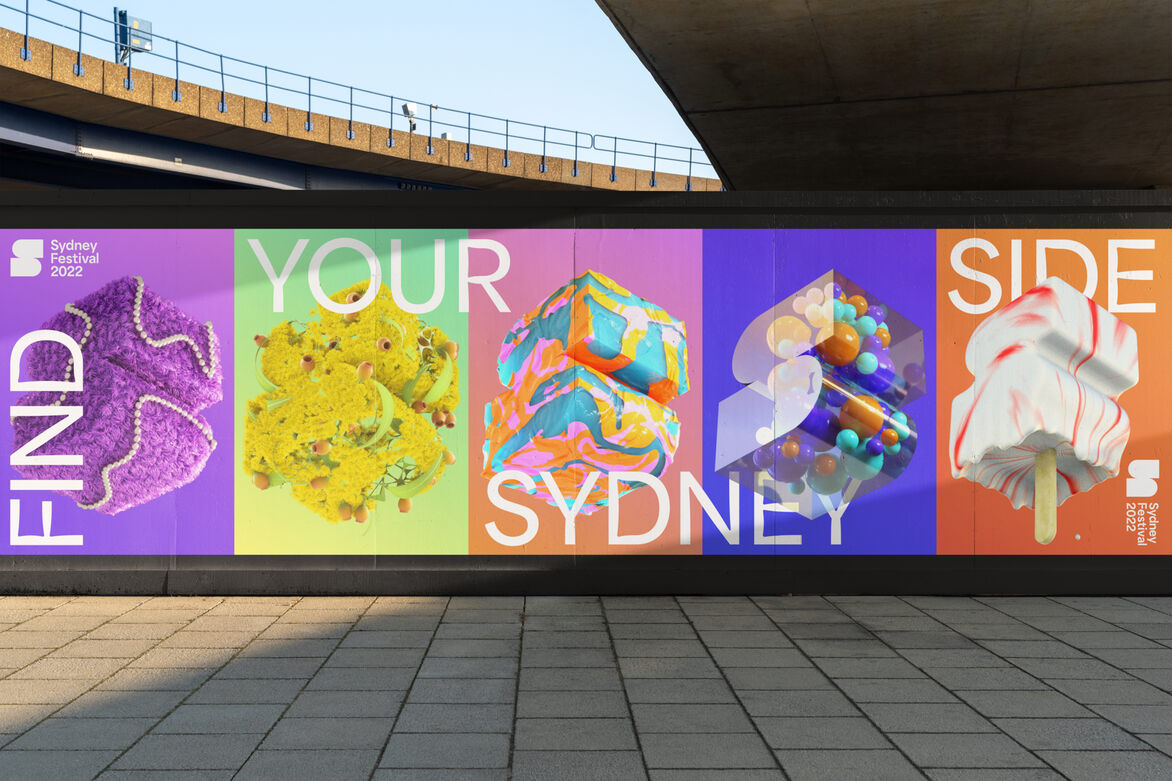
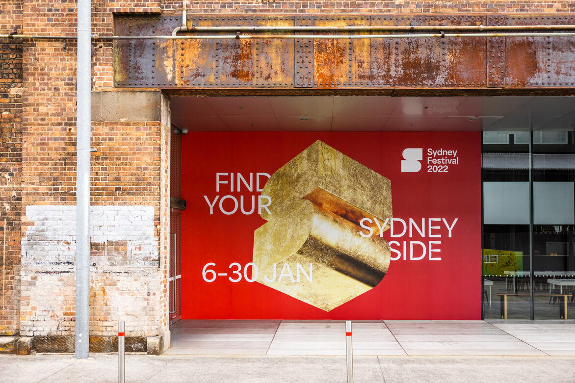
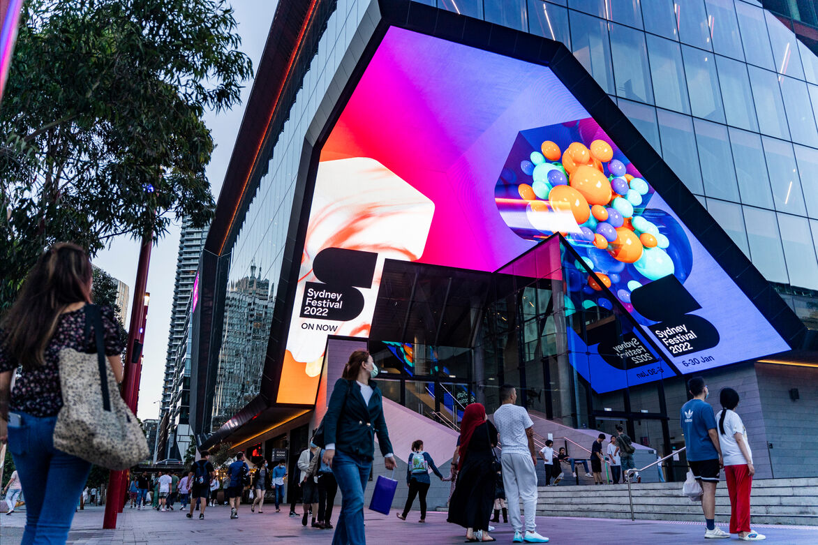
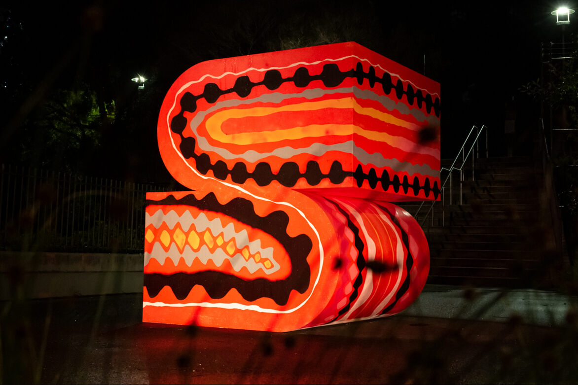
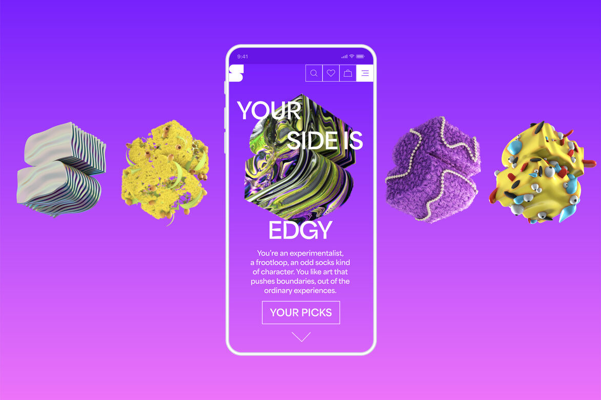
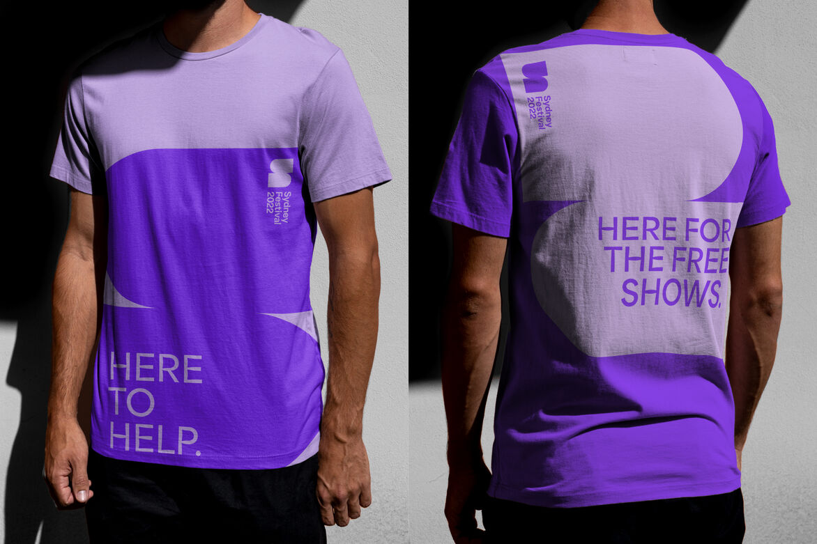
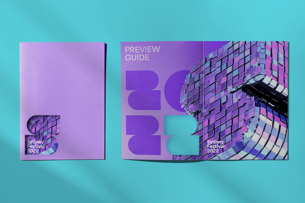
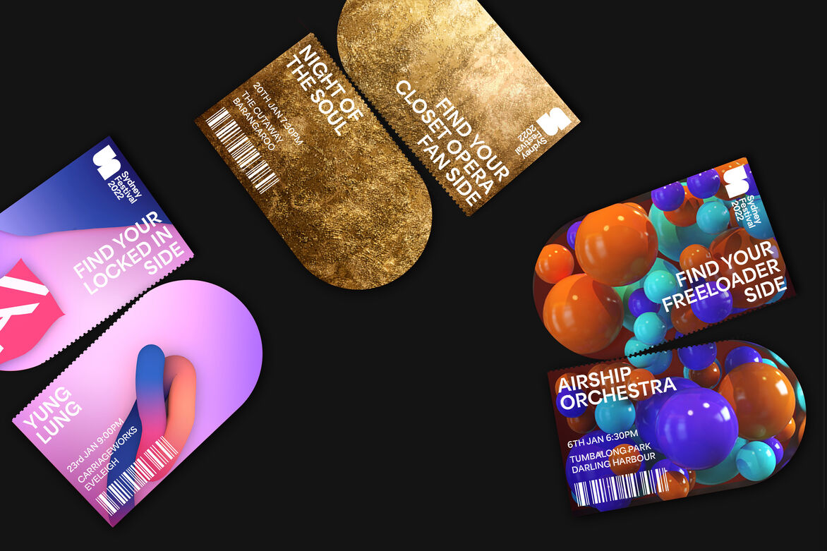
The goal for the new brand logo was to evoke Sydney’s hedonism and vibrancy, as well as its diversity. The basis for the new logo was an iconic ‘S’ shape, formed by two connected arches. The logo formed the basis of the entire brand’s design system. A flexible and hardworking suite of logo marks were developed beyond the primary 2D logo to be adaptive to space and ultimately numerous 3D models were created to bring festival textures to life that represented these different sides of Sydney. Through motion the festival was able to Introduce this dimensionality that created an infinite amount of sides to the logo, again reflecting the infinite sides of Sydney.
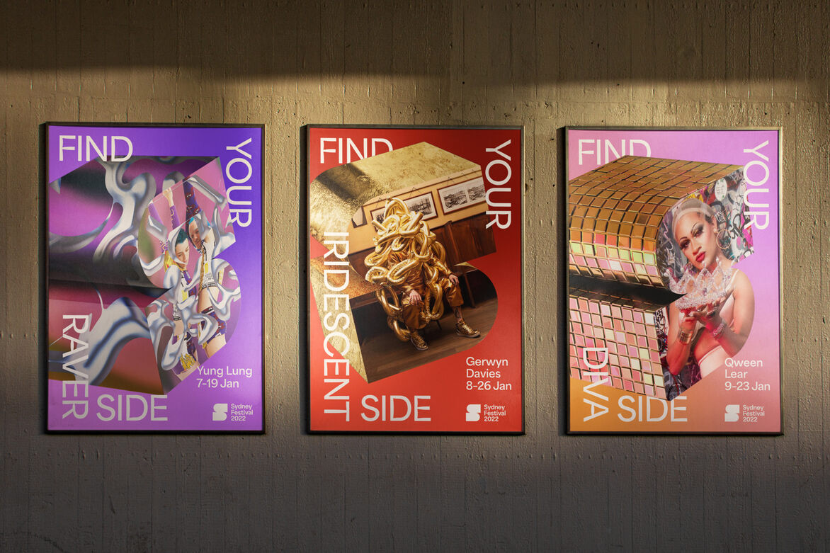
From highbrow to disco, emerging artists to the establishment. The logo’s dimensionality allowed ‘Find your Sydney side’ to shine in the brand identity, with variations of the logo too, being created from iconic Sydney environments and in partnership with local artists. The simple yet expressive design system easily flexes from housing festival content to showcasing the quirks of the city and its people.

Description:
Sydney Festival is a summer arts festival that has been held since 1977. For the 2022 festival, incoming festival director Olivia Ansell commissioned a rebrand to align with a new 3-year vision. Her brief was for a bold and vibrant festival identity that would signal the coming-out-of-lockdown summer that Sydney deserves, an identity that broke free from convention to express the ‘real’ Sydney.
The truth is that Sydney means something different to everyone. Sydney isn’t just about the scenic harbour, while that’s certainly part of it. That’s not it’s real identity. It’s expressed from the Eastern suburbs right through to the west, different cultures and identities. Multi-cultural and multi-faceted. The festival identity expresses this by bringing the different sides of the city to life.
The goal for the new brand logo was to evoke Sydney’s hedonism and vibrancy, as well as its diversity. The basis for the new logo was an iconic ‘S’ shape, formed by two connected arches. The logo formed the basis of the entire brand’s design system. A flexible and hardworking suite of logo marks were developed beyond the primary 2D logo to be adaptive to space and ultimately numerous 3D models were created to bring festival textures to life that represented these different sides of Sydney. Through motion the festival was able to Introduce this dimensionality that created an infinite amount of sides to the logo, again reflecting the infinite sides of Sydney.
From highbrow to disco, emerging artists to the establishment. The logo’s dimensionality allowed ‘Find your Sydney side’ to shine in the brand identity, with variations of the logo too, being created from iconic Sydney environments and in partnership with local artists. The simple yet expressive design system easily flexes from housing festival content to showcasing the quirks of the city and its people.