Graphic
Re 45 All Blacks and Black Ferns
-
Pou Auaha / Creative Directors
Andy Thomas, Marcy Banbury, Shannon Bell -
Pou Rautaki / Strategic Lead
Richard Nordlund
-
Ringatoi Matua / Design Director
Maxine Allen -
Kaituhi Matua / Copywriter Lead
Katherine Fischer
-
Ngā Kaimahi / Team Members
Maddy Merzvinskis, Dante Bernard -
Kaitautoko / Contributors
Kerry McKenzie, Luke Bell-Booth, Ashleigh Johansson -
Client
Kerry McKenzie


Description:
It’s a legacy that speaks for itself: the All Blacks and Black Ferns are two of the most iconic brands in sport.
But these days, teams aren’t just competing with each other — they’re up against other codes, TV, gaming, influencers, and entertainment platforms worldwide.
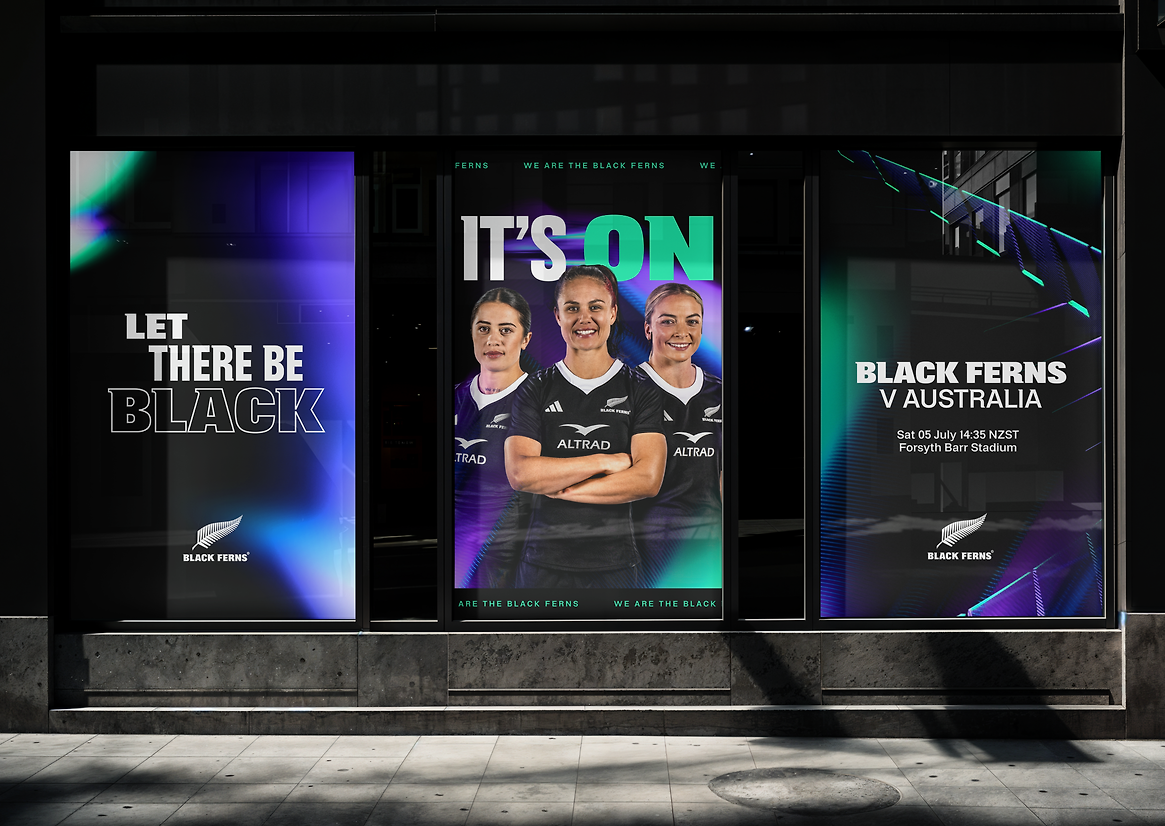
We joined forces with New Zealand Rugby to refresh the brands, aiming to unite the ‘Teams in Black’ while preserving their individuality—and forge deeper connections with fans and players everywhere.
It’s done by embracing the power of black.
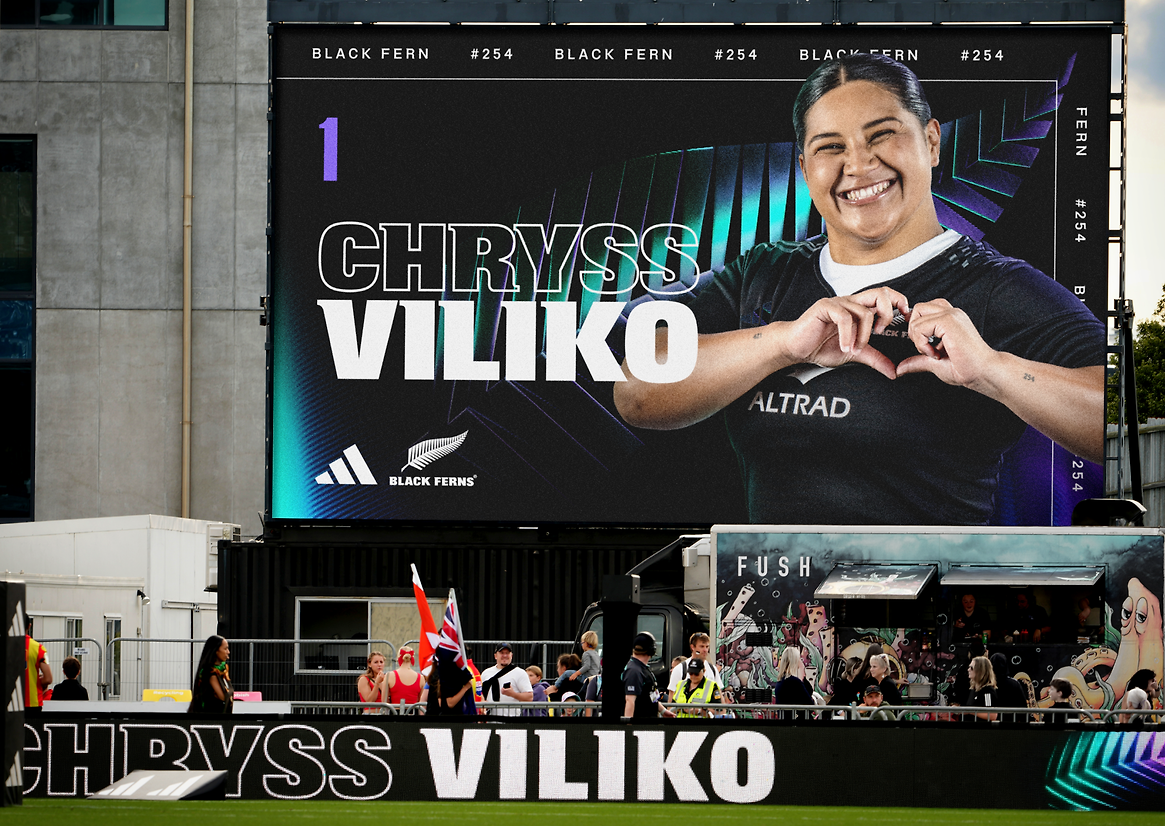
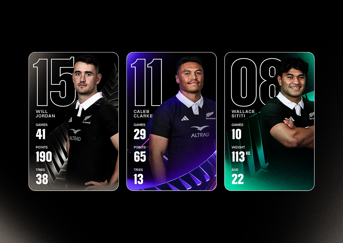
Black is synonymous with New Zealand sport—that was never changing. But for black to have form, there needs to be light. That’s why while keeping black as the core; the stadium-inspired lighting system gives it more depth and impact.
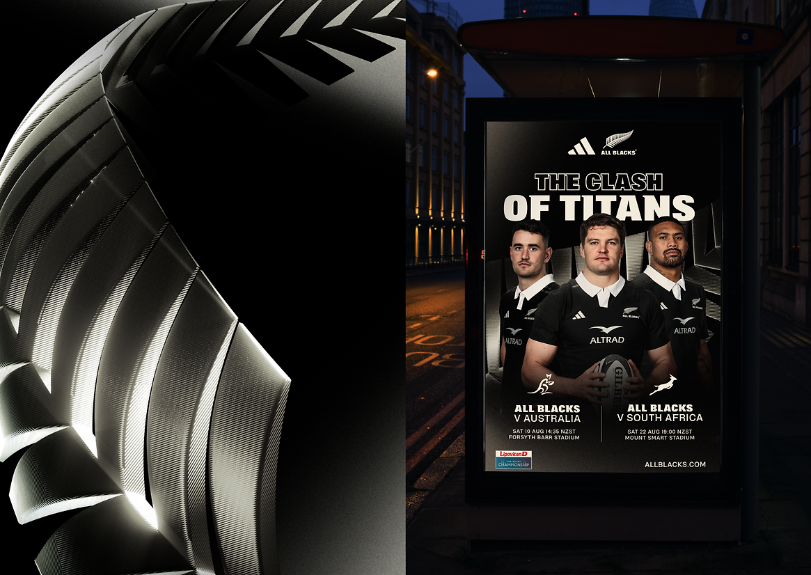
And there’s one emblem that the world recognises as unmistakably Kiwi: New Zealand Rugby’s iconic fern. Now, it’s no longer just a logo, but brought to life in 3D carbon-fibre—strong and light, graceful yet sharp. It catches the light and moves with fluidity.
As one of the teams’ most powerful visual assets, the fern needed to be given the respect and weight it deserves. Rendered in 3D, it becomes a hero element that advances the legacy and stands unmistakably for New Zealand Rugby.
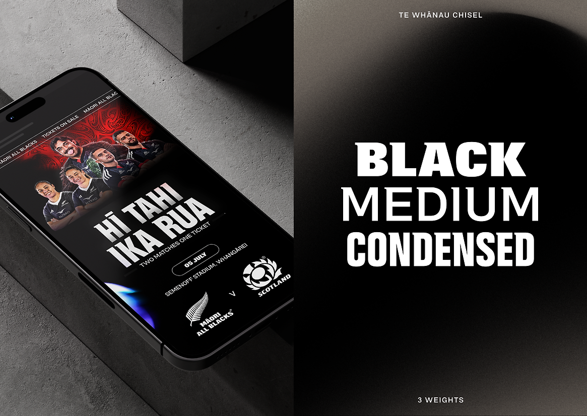
And while the All Blacks and Black Ferns identities were designed to live together, the two brands have distinct personalities—expressing their unique personalities through colour and voice.