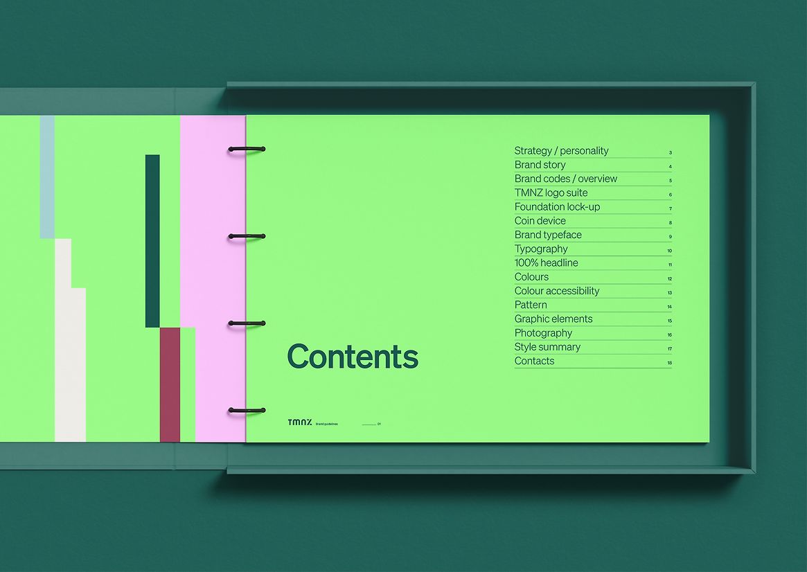
Graphic
Principals 27 TMNZ
-
Pou Auaha / Creative Director
Jodine Bell -
Pou Rautaki / Strategic Lead
Nick Sampson
-
Ringatoi Matua / Design Director
Stephen Kane -
Kaituhi Matua / Copywriter Lead
Nick Ryan
-
Ngā Kaimahi / Team Members
Natalie Fabrin, Etana Zagari, Ben Harrison -
Kaitautoko / Contributors
Rob Byrne, Charlotte Tremewan, Benjamin Brooking, Ryan Ferguson -
Client
Tax Management New Zealand

Description:
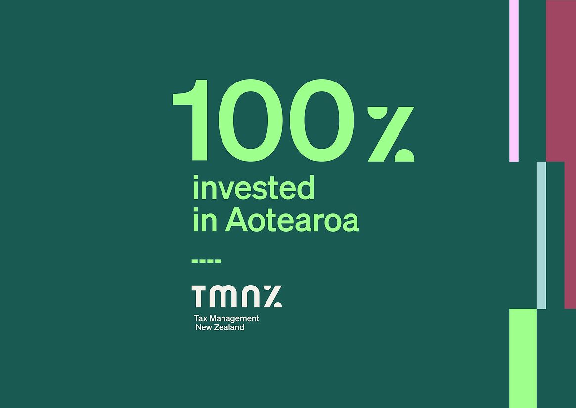
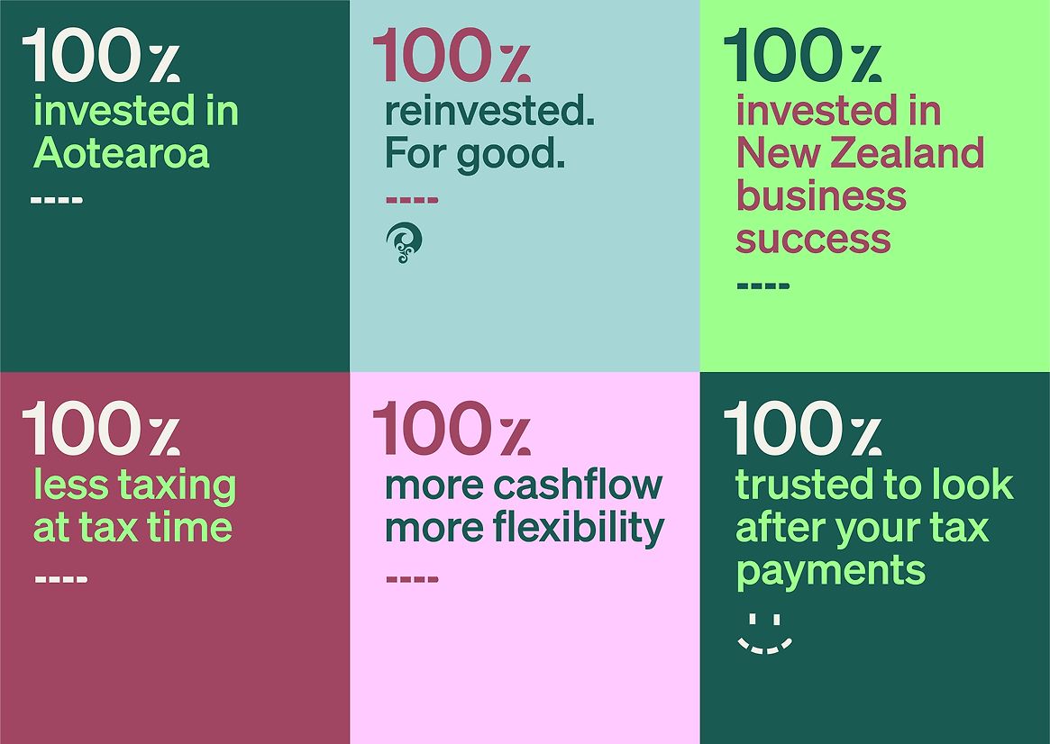
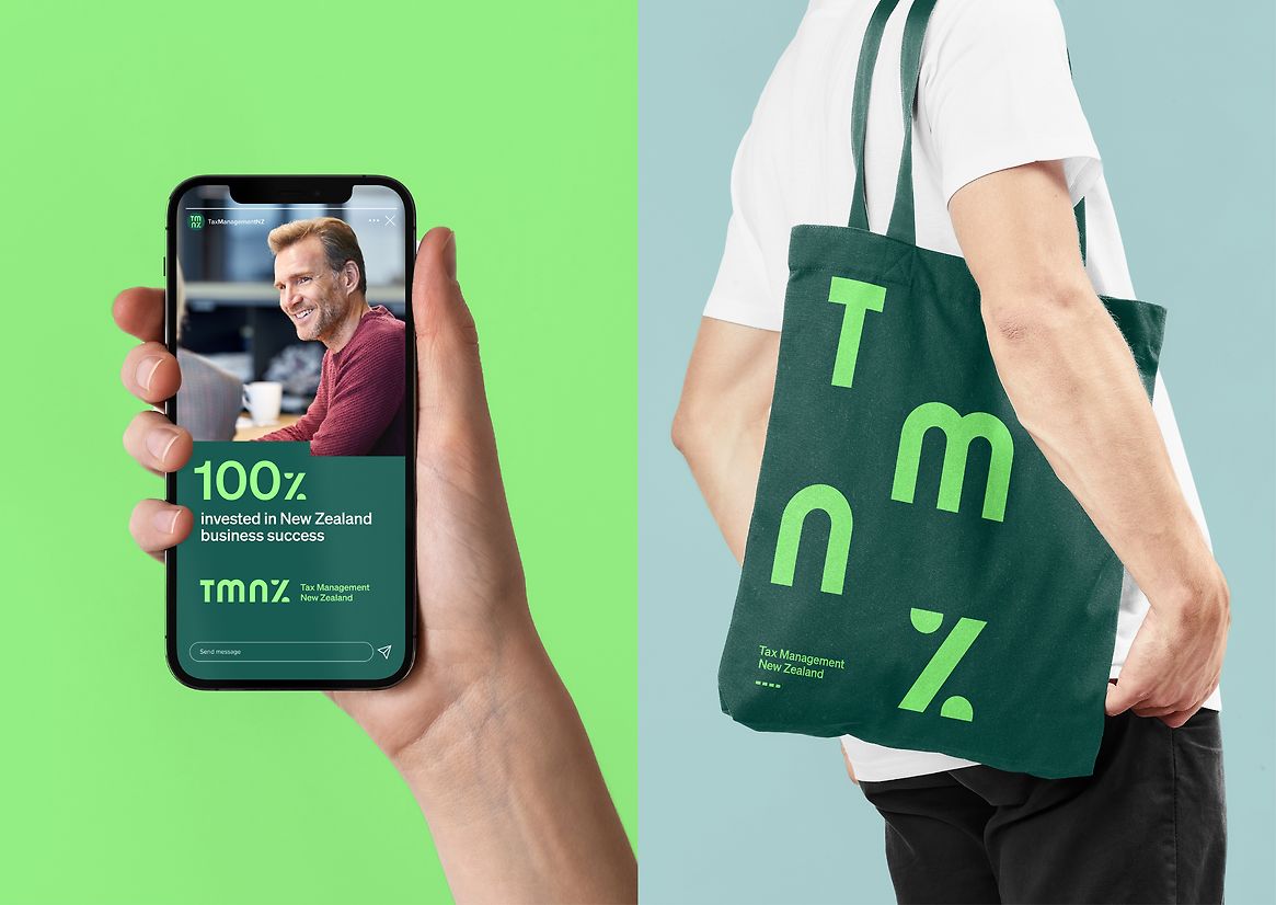
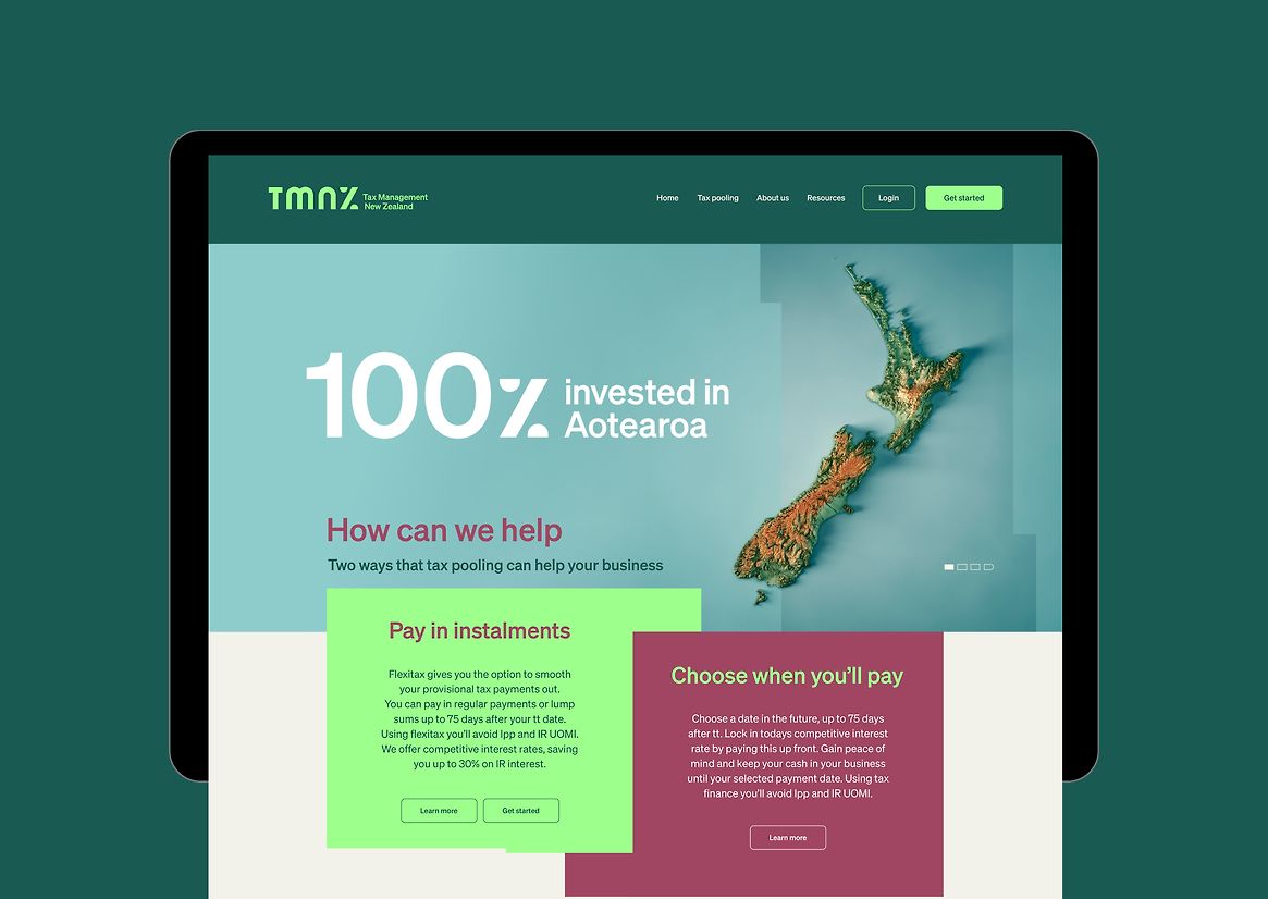
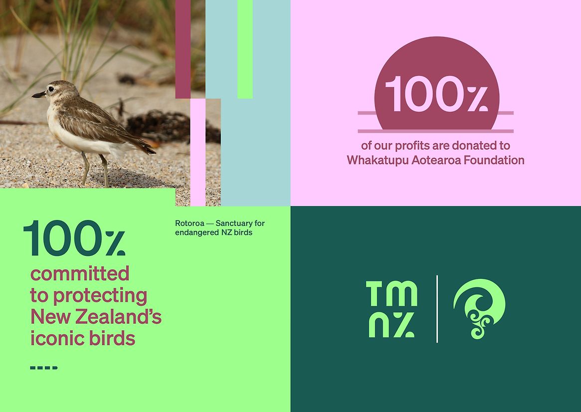
100% invested in Aotearoa
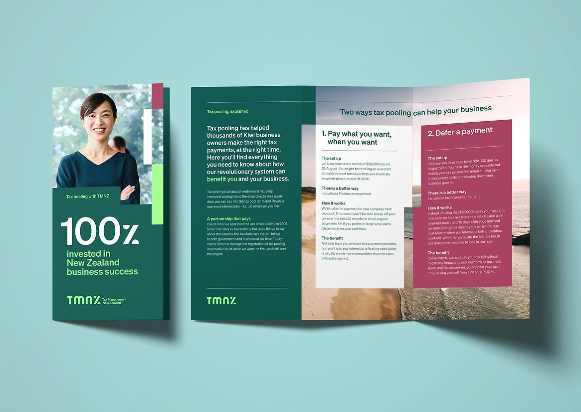
Unique to New Zealand, TMNZ (Tax Management New Zealand) is a tax pooling trail-blazer, working with the Government in 2002 to create a system making tax easier by helping businesses manage cashflow, meet payment obligations and save money.
With the largest tax pool they lead the market, but with more modern, sharper looking businesses appearing, TMNZ started to look more than a little bit boring.
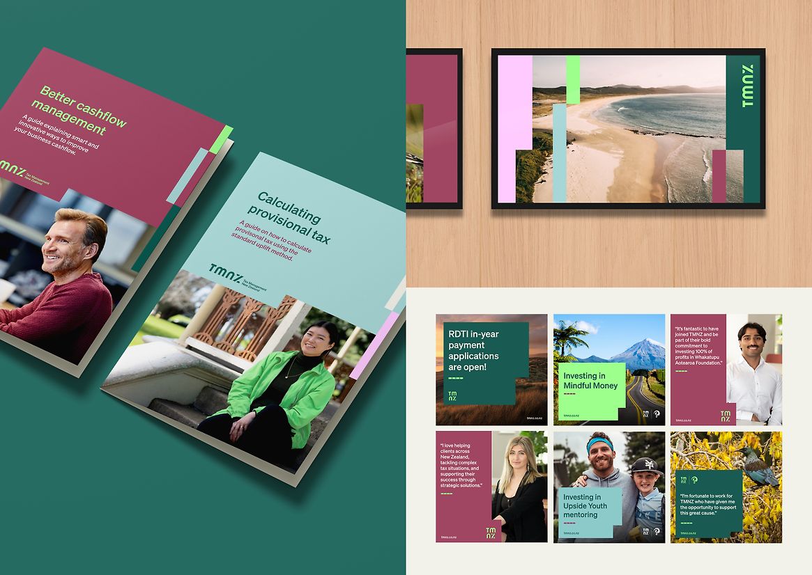
Much less boringly — 100% of the company’s profit is donated to Whakatupu Aotearoa Foundation, funding high impact environmental and social initiatives. With this little-known, yet remarkable philanthropic side-story in the wings, it was time for TMNZ with the help of Principals to revolutionise its brand, spread the word and reclaim the limelight.
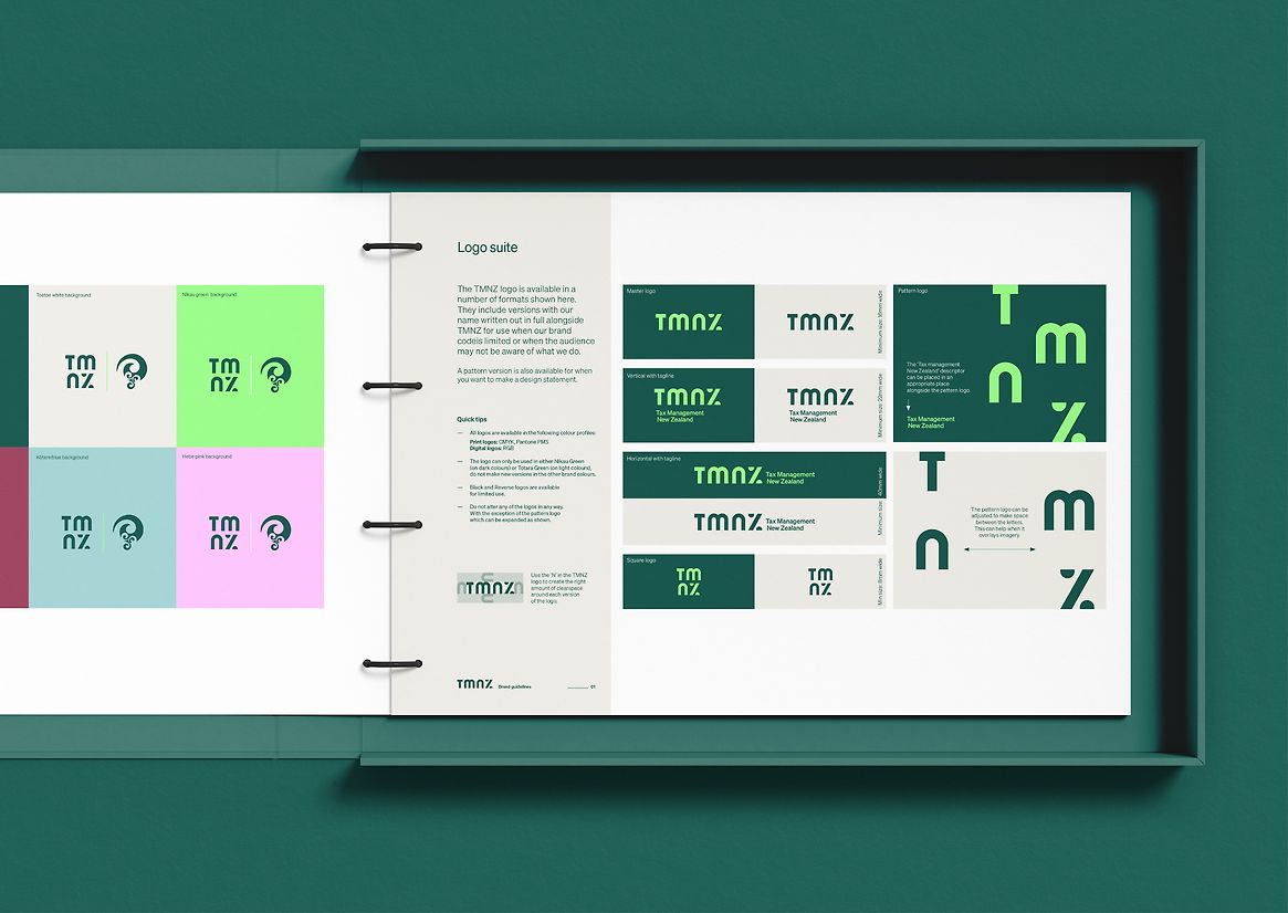
We loved TMNZ’s dedication to making Aotearoa a better place, developing the ‘100% invested in Aotearoa’ brand idea, supporting values and story. 100% became the lead construct for its language and new logo, with the ‘Z’ in TMNZ representing the percentage symbol.
Wanting an intuitively ‘100% invested in Aotearoa’ visual feel, the wordmark’s rounded forms and straight lines echo Aotearoa New Zealand’s unique modernist art, immediately familiar to most Kiwi — pairing beautifully with their existing koru-based Foundation logo. Keeping it energised and structured, a rectangular patterning references financial spreadsheets and bar charts — something all accountants can appreciate. While the colour palette references our native landscapes with calming Tōtara green, Horopito Red and Kōtare Blue, but with a vibrant digital-first pop of Nīkau Green, and an unexpected Hebe Pink.
TMNZ’s rebrand has been a success on all levels with more staff engagement, positive client research, better website and media statistics and an increased growth in new business and increased awareness of the Foundation's initiatives.