Graphic
Principals 28 Solstice Energy
-
Pou Auaha / Creative Director
Rachel Terkelsen -
Pou Rautaki / Strategic Leads
Tim Riches, Charlie Rose, Mary Winter
-
Ringatoi Matua / Design Director
Luke Jenkins -
Kaituhi Matua / Copywriter Lead
Nicholas Ryan
-
Ngā Kaimahi / Team Members
Carly Holland, Min Shim, Sam O'Brien -
Client
Solstice Energy



Description:
For the past 20 years, Tas Gas has operated gas infrastructure and retail services in Tasmania. In 2023 they sought a licence to become an electricity retailer.
To communicate this diversification, a brand rethink was required.
Principals worked closely with the Tas Gas team to establish a fully realised brand identity, strategy, name and voice for Solstice – breathing new life into the sector.
Recently, Solstice’s launch campaign has seen:
• 412 radio spots aired
• 6,173,851 impressions across socials (Jan-May)
• 478,080 impressions delivered with Solstice brand message across DOOH panels (Jan-April)
Our brand landscape review discovered how Tasmanians build and see brands. This involved examining diverse localised categories.
A semiotic analysis of Australia’s energy sector showed the trends typically employed by companies to tell their stories. This insight enabled us to pull away from existing norms.
We then engaged an online community to test two versions of the brand identity. The strengths of proposed brandmarks. Colour palettes. Photographs. And other graphic elements.
We uncovered the unique attributes of a truly Tasmanian brand and explored how to fold the best of the Tas Gas legacy into a refreshing new challenger brand.
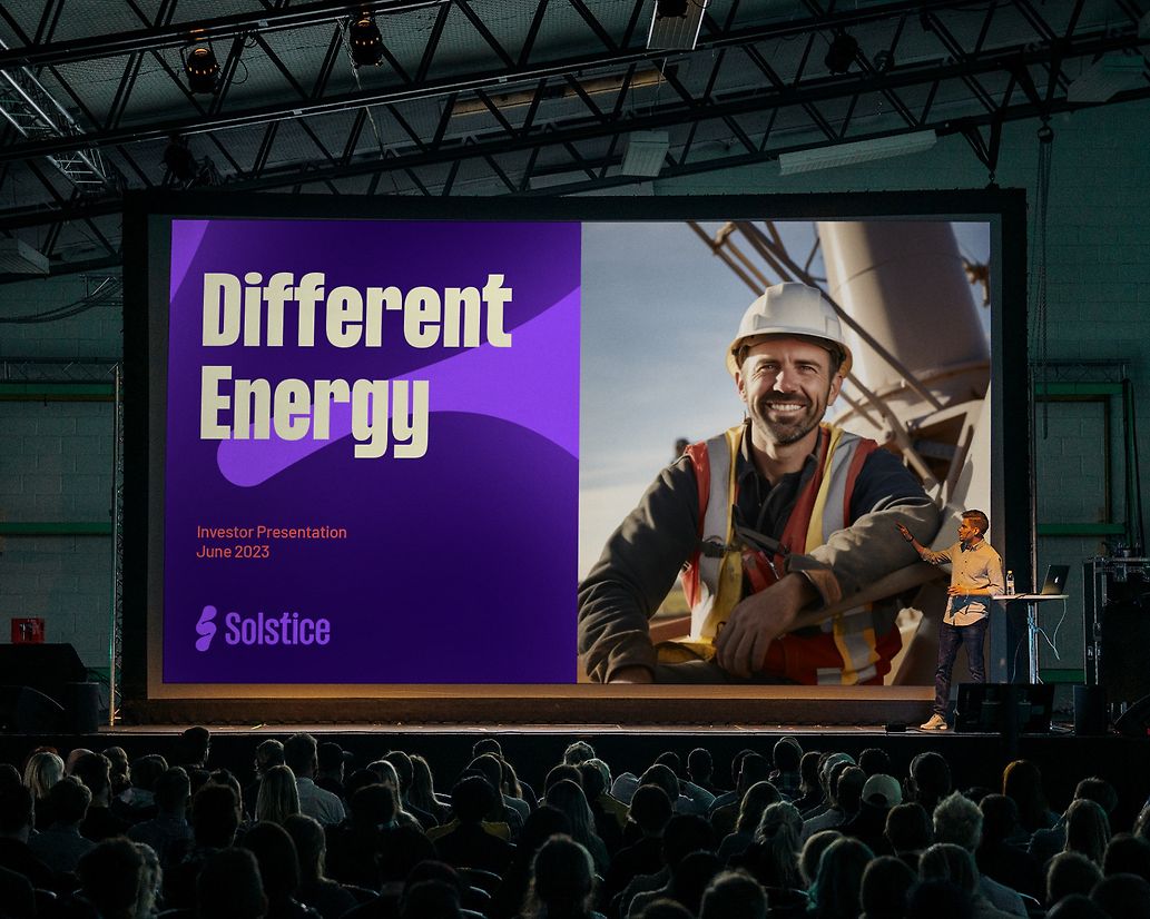
The brand idea ‘Different energy’ was born from Tasmania’s independent spirit and pride in shunning norms, defying expectations, and never settling for the expected. Embodying the Tasmanian difference.
The name Solstice is a reference to the shortest day of the year, when locals strip down and dive into the frigid waters. For Tasmanians this represents a new beginning. For us, the imminent arrival of something better.
An ambitious and exciting new brand in the Tasmanian market and a true challenger in the energy sector.
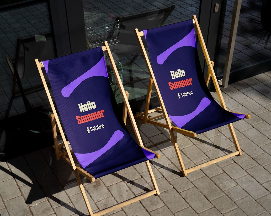
The brandmark reimagines the iconic symbol for energy, creating a shorthand ‘S’ informed by both the 23.45˚ angle of earth’s axis during Solstice and the rounded form of the sun.
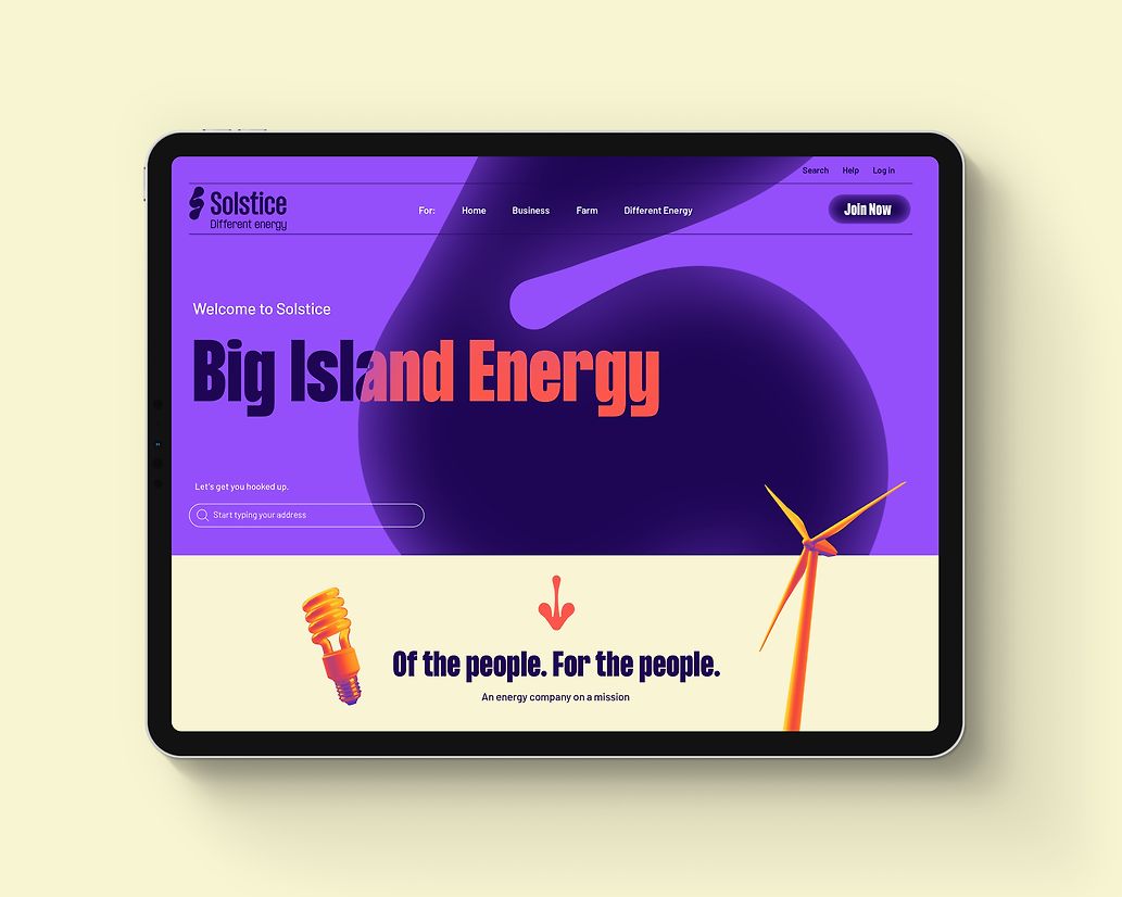
An analysis of competitors revealed purple as a clear opportunity to differentiate. Solstice’s purple is supported by a colour palette inspired by Dawn, Midday, Dusk and Midnight.
Typography brings boldness and confidence with distinctive flicks and flourishes adding character and cheek.
Navigational icons based on the rounded forms of the symbol and infographics hero simplicity and deliver on the proposition of ‘Refreshingly simple energy’ that puts people first.
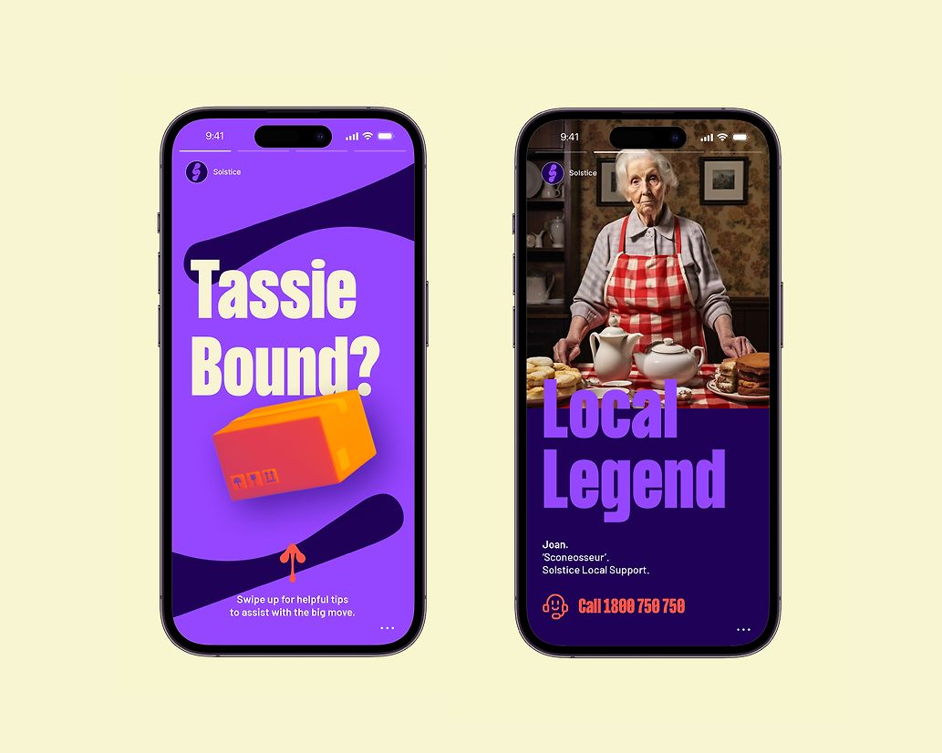
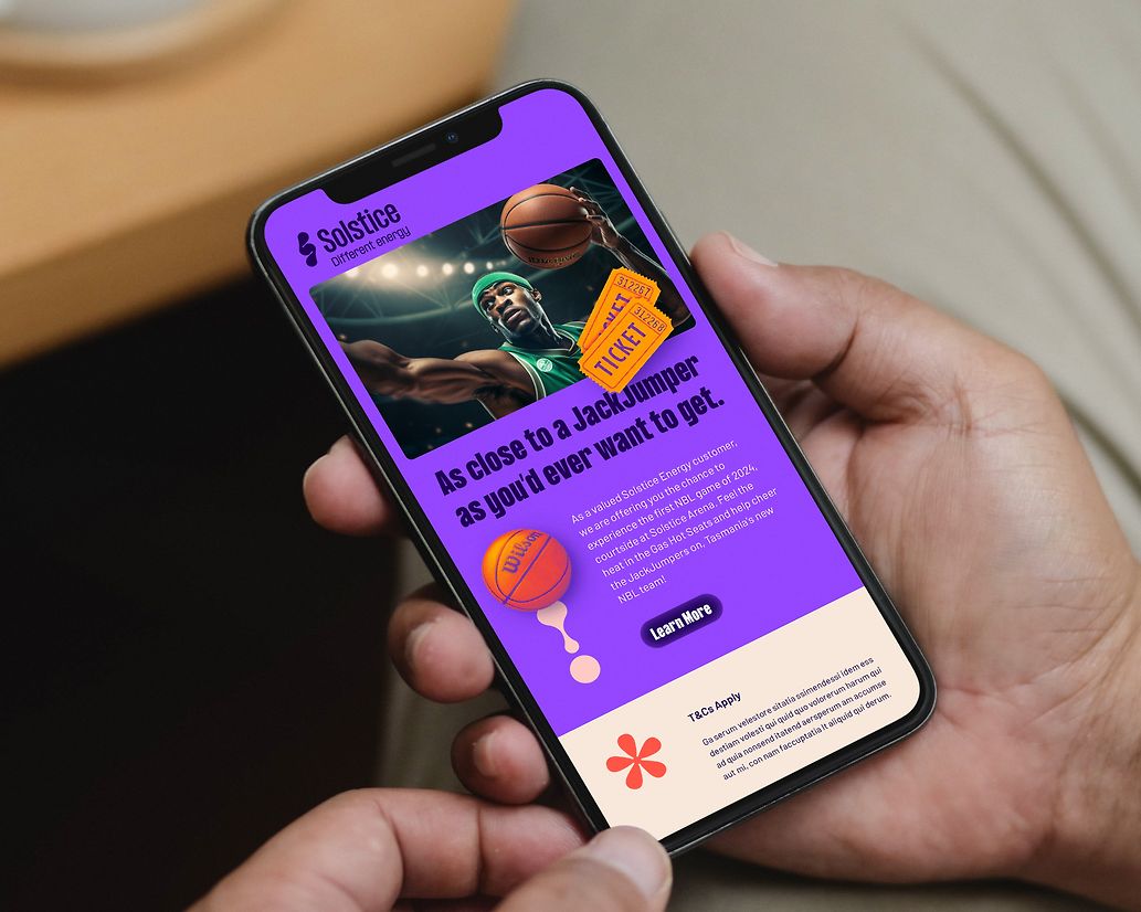
Central to the identity are character portraits celebrating the unmistakable characters of Tasmania. Solstice’s customers and employees. Graded to convey the warm light of the sun, and reflect the four seasons. Even object imagery is energised allowing us to talk to topics from retail to industry.
Typically, brand voice guidelines have clearly defined traits and rules. In line with ‘Different Energy’, we created Sol and Stace – characters based on real Tasmanians – as a new way of bringing the voice to life. Designed to work alone or together, Sol represents the caring/fun side of Solstice, while Stace represents the business/innovation side. Detailed descriptions of who they are, what they believe and how to bring them to life enabled Solstice’s writers to immediately understand these characters and importantly, how they talk.