Graphic
Onfire Design Ltd 19 Fakieh Poultry
-
Pou Auaha / Creative Director
Matt Grantham -
Pou Taketake / Cultural Leads
Tuba Terekli, Shadi Bogari
-
Ringatoi Matua / Design Director
Sam Allan
-
Ngā Kaimahi / Team Members
Natasha Alimova, Jamie Turnbull, Jade Sullivan, Simon Burton -
Kaitautoko / Contributors
Yuki Sato, Clare Buchanan, Shaun Cato-Symonds, Melanie Jenkins -
Client
Tuba Terekli


Description:
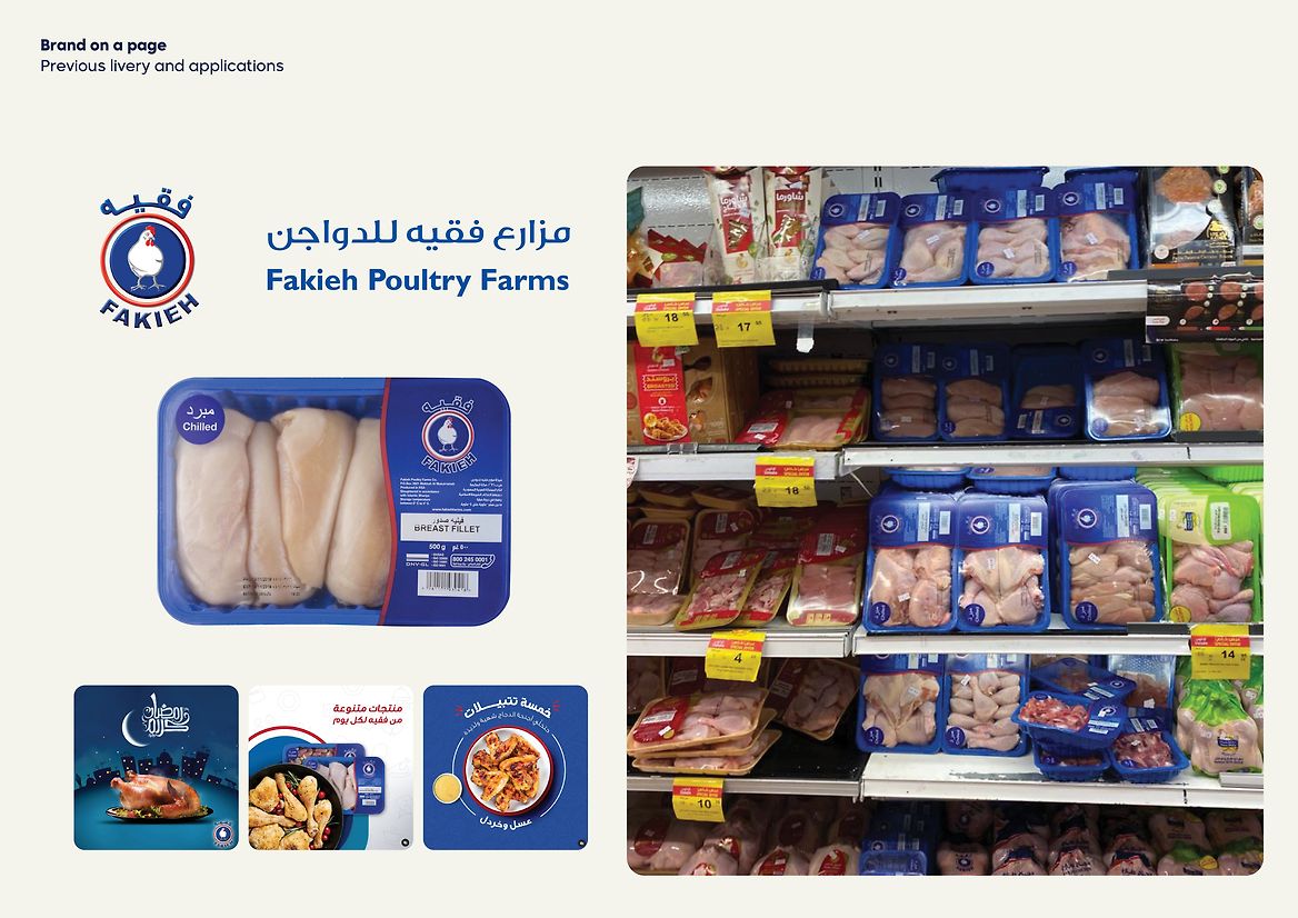
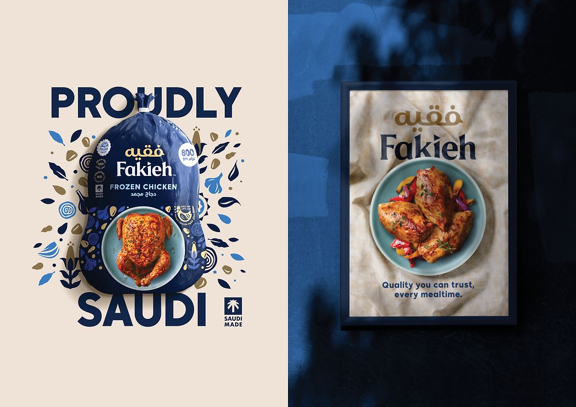
As one of the largest poultry manufacturers in Saudi Arabia, Fakieh is considered a much-loved heritage brand. Established in 1967 in Mecca, it is seen as the democratising brand and a true local hero. Previously premium-grade fresh poultry was only available to the higher socio-economic groups. Fakieh changed that, introducing a wider range of products priced for the mainstream customer. In market, there is a lot of goodwill for the brand and relevance, especially with the recent influx of big International brands and the growth of other local brands. But as a brand, Fakieh has lacked investment in brand, packaging and communications.
The Saudi government has established a countrywide strategic initiative for all local businesses. Called ‘Vision 2030’, it is a call-to-action for all commercial entities to grow and diversify the economy, strengthen Islamic national identity and offer a fulfilling and healthy life for the Saudi population. This, along with the current retail market, was the impetus for Fakieh to refresh its brand and positioning across all touch points.
Led by the ideas of innovation, fit for the future of the country, general health and pride in Saudi culture, we developed a new positioning of ‘We See Potential’. The rebrand was intended to make a life-long connection with modern Saudi’s, appreciating the brand history while fuelling them with nutritious food and support so they can reach their full potential.
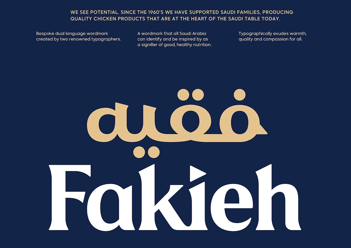
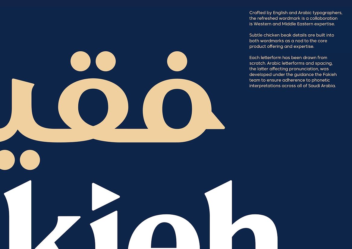
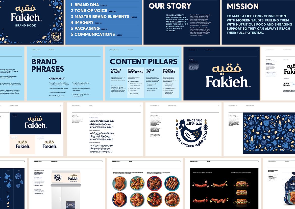
Working with the team at Fakieh, the new brand was treated as a revolution, with the previous brand incarnation devoid of relevant assets to build and evolve from. The new wordmark is a standard bearer; working with an English and Arabic typographer, we developed a dual language lockup that reflected its past while being the trustworthy, humble and compassionate brand to follow in the future. The traditional script was crafted to sit onto of Fakieh, mimicking a crown and the top ‘comb’ of a chicken. Subtle nods to chickens were built with beak-like shapes in both parts of the device.
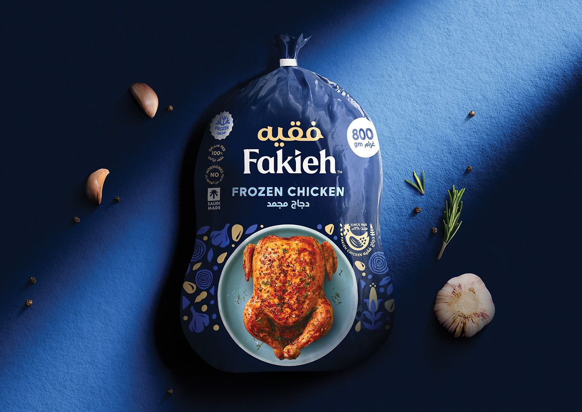
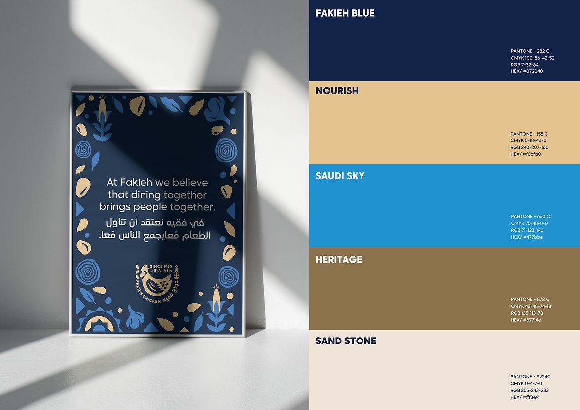
The new colour system is simple and iconic. Dominated by a deep rich blue which is inspired by architectural painting on doors and window framing while also used extensively in textiles and local fashion. Secondary colours give the brand a sense of ‘place’; hints of gold, sandstone and light blue are directly taken from the location and historical buildings. A brand pattern, inspired by historical mats and rugs with strong connections to family gatherings and food sharing, was developed using simple icons ranging from chicken feed grain to meal ingredients. This is designed to be flexible to be used across all consumer-facing touchpoints. The key visual asset is a new historical icon, with chicken at the centre. The importance of this is paramount for this heritage brand.
The result is a brand inspired by its heritage while looking to modern Saudi families' future health and diets.