Graphic
One Design 64 Scapegrace
-
Ringatoi Matua / Design Directors
David Macdonald, Rachel Doughty
-
Ngā Kaimahi / Team Members
David Macdonald, Casey King, Briar Mark, Patrick Hickley, Emma Armishaw -
Kaitautoko / Contributors
Josh Wong, James Hurman, Darryl Parsons -
Client
Scapegrace Distillery
Description:
Scapegrace launched 10 years ago. While this much celebrated and successful brand has remained largely untouched in that time, new offerings have meant the visual identity has had to evolve to fit.
The construction of the new Scapegrace distillery in Central Otago has marked a moment of maturation for the brand — and provided the opportunity to step back and revisit their brand and visual identity.
By taking a holistic approach towards all the touchpoints of the brand, we’ve been able to position Scapegrace for a new era of growth and success.
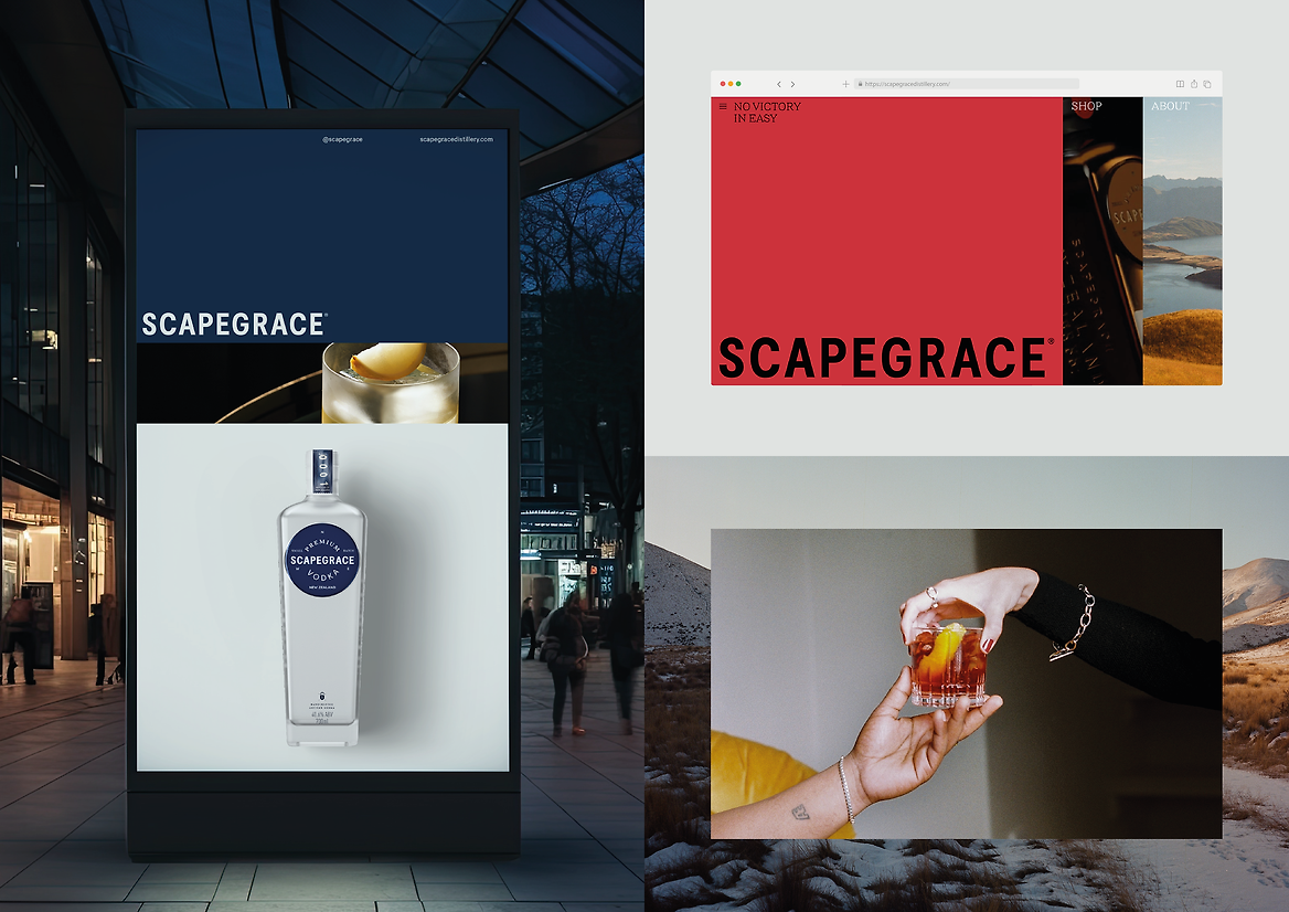
Our approach had one guiding principle: “There’s no victory in easy”. As a brand and a business, Scapegrace believes the merit of all things lies in their difficulty. They stand for taking the necessarily difficult path toward true, enduring quality.
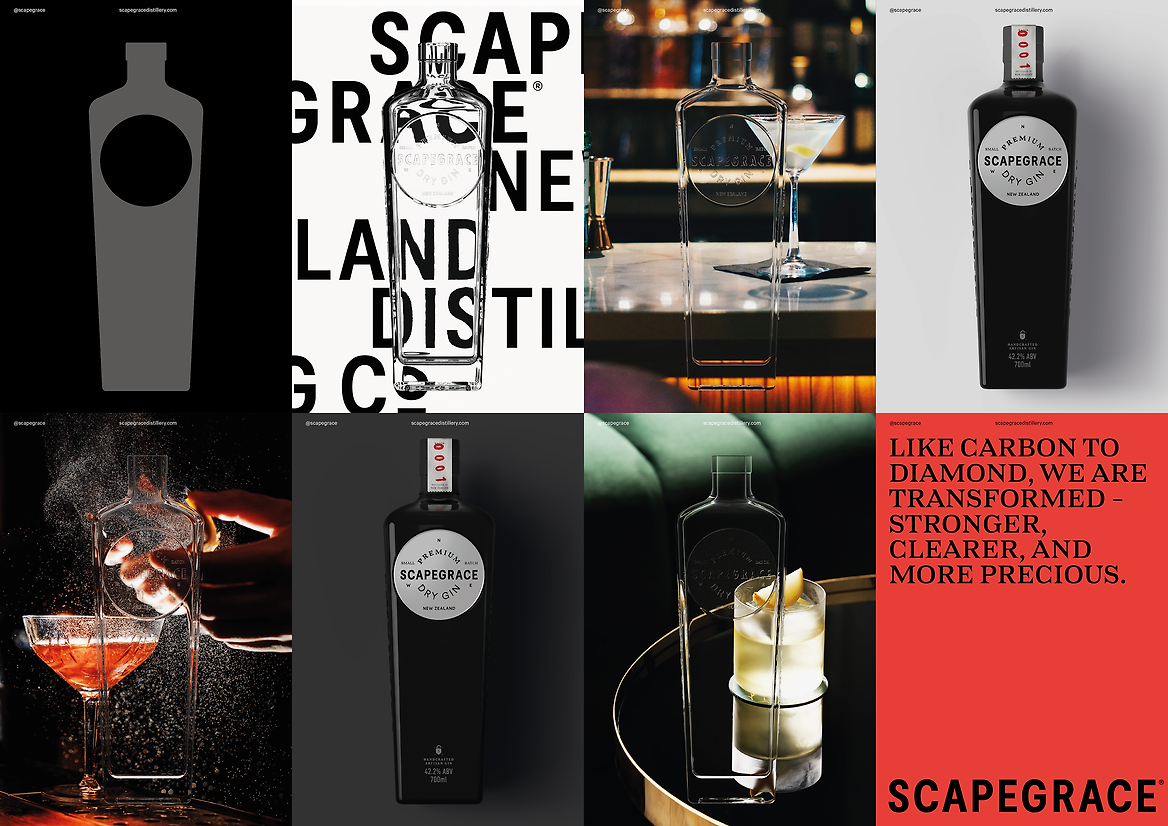
From a design perspective, this meant deep consideration of every detail. Details are difficult, but they are what makes something great. It’s difficult to craft a premium spirit. And it’s difficult to build a brand that reflects that obsessive focus. But the difficulty is the point — it communicates quality, commitment and authenticity.
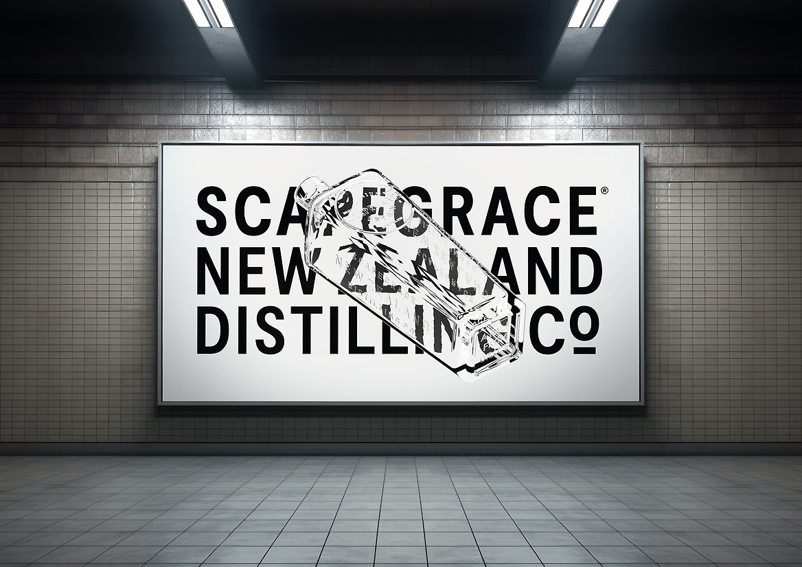
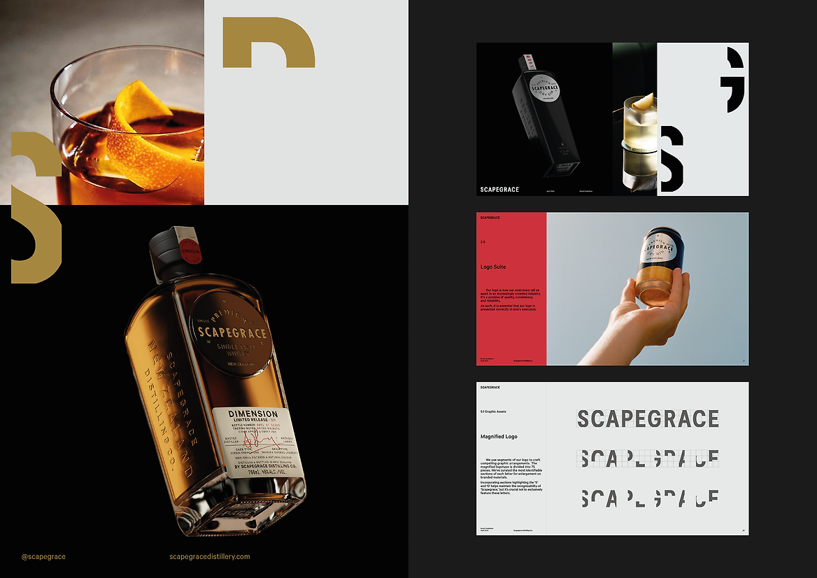
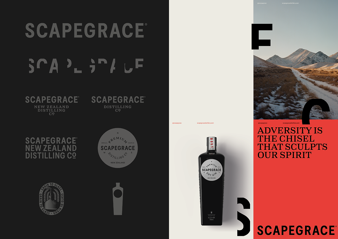
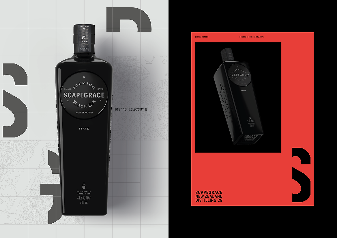
The revised design system for Scapegrace is all about detail. Small, subtle changes were made to the logotype and the signature disks that adorn the bottles, refreshing them through attention to detail.
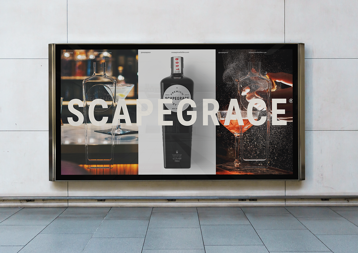
The brand identity builds on this, driving the idea that small details ultimately yield the greatest results. We played with scale, magnifying sections of the logo and imagery, to explore depth and disclosure, expressing the idea that there is nothing being hidden.
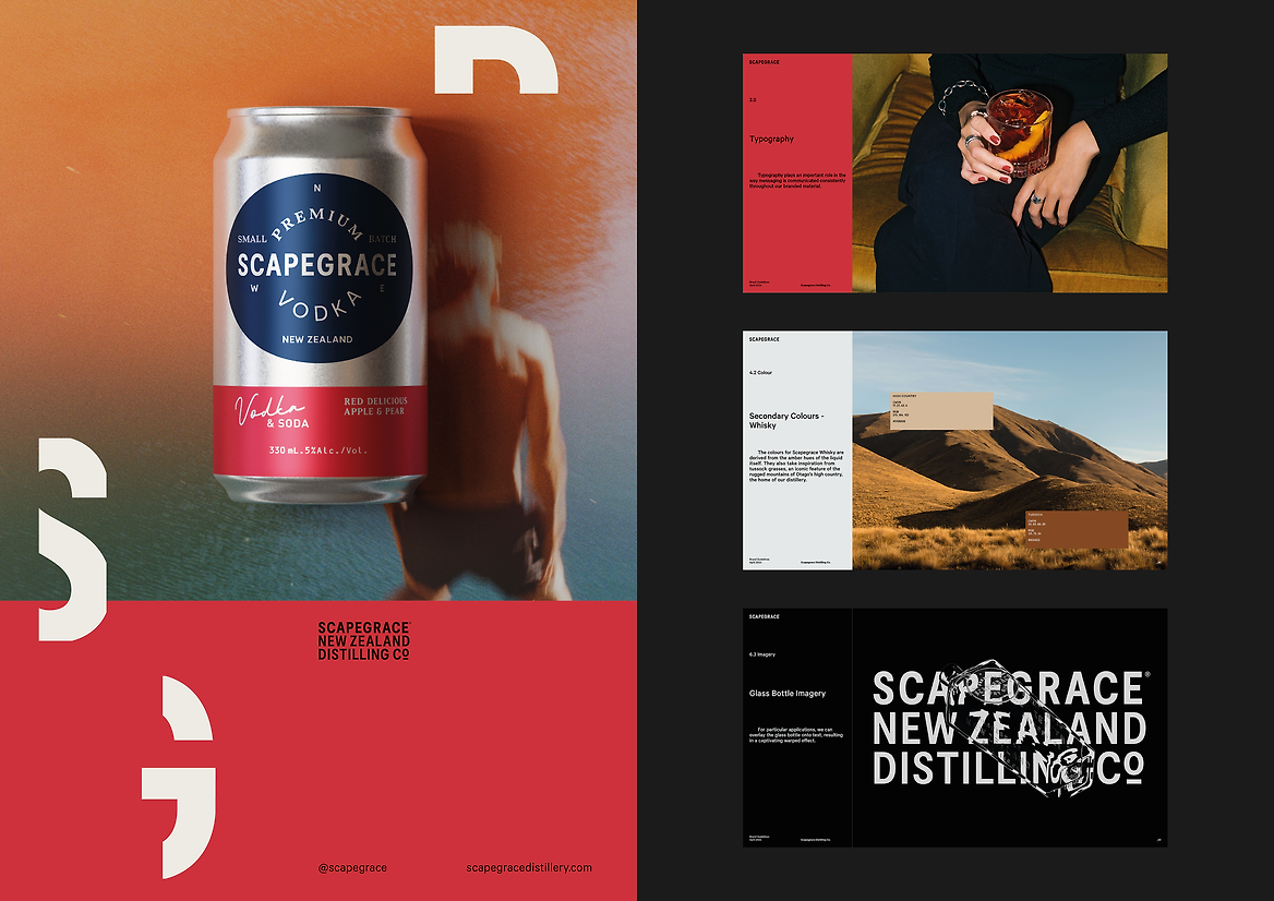
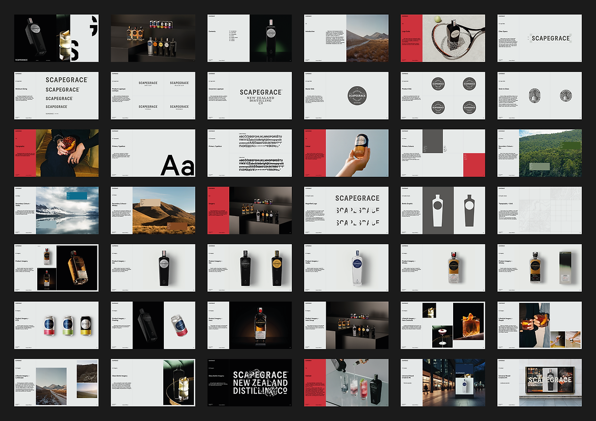
A comprehensive brand guideline document was created to detail how the brand should be used at every touchpoint. The location of the distillery, on the 45th parallel in Central Otago, became a core element of the brand story, with topographic drawings and map grids becoming brand assets.
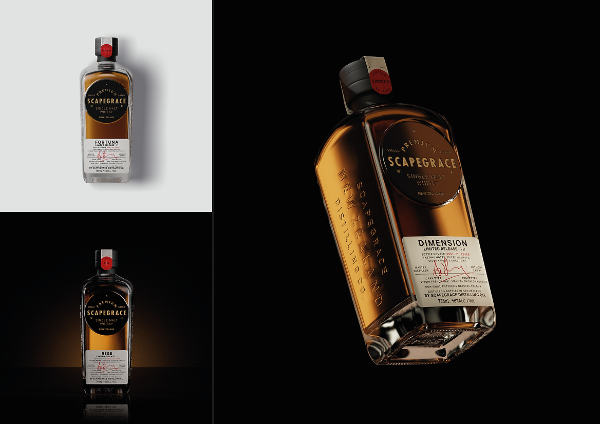
Colours for each spirit help to build a world around each of the offerings. Gin uses rich greens, reminiscent of the lush native New Zealand bush, the origin of some of our unique botanicals. Vodka uses crisp and fresh blues inspired by New Zealand’s crystal clear alpine lakes. Colours for whisky derive from the amber hues of the liquid itself, while also taking inspiration from Otago’s iconic high country tussock grasses.
The new Scapegrace brand is comprehensive, obsessively detailed, and authentically grounded in the place where our spirits are crafted.
The brand refresh has been instrumental in elevating their domestic and international market position, driving sales, and forming valuable partnerships. The new brand identity was instrumental in the selection of Scapegrace as part of the Air New Zealand inflight and lounges offering, exposing the brand to a wider, international audience, and enhancing its reputation and credibility. And it has opened new distribution channels, both domestically and internationally, driving significant distribution and sales growth — all proof that while there’s no victory in easy, there’s success to be found in embracing the difficult details.