Jonathan Cook, Elliot Maher, Sophie Hills, Scott Jowsey
Client
ArtMeta
Description:
THE BRIEF ArtMeta is a beautifully rendered 3D metaverse connecting leading galleries, critically acclaimed artists, curators, institutions, and collectors in an immersive digital experience. It’s a new paradigm for displaying and selling fine art.
The company approached us to craft a brand identity that would speak to the world of fine art, resonating with each of their target audiences. Because the recent influx of metaverses has crowded quickly and carries a lot of hype, ArtMeta’s brand identity needed to demonstrate the depth and visionary artistry of its metaverse.
CONCEPT CREATION The project began with researching the explosion of NFTs and metaverse businesses. We needed to understand and appreciate how the landscape was evolving within the industry.
Then followed several workshops with the client to define and distill their brand. From this exploration, we learned that the final concept needed to provoke trust from the audience.
The brand identity also needed to adapt across multiple mediums, from metaverse environments to real-world art galleries. This aspect was crucial in our concept development. We utilised ArtMeta’s highly engaged Discord community as an almost real-time feedback solution during this stage, which guided our design decisions.
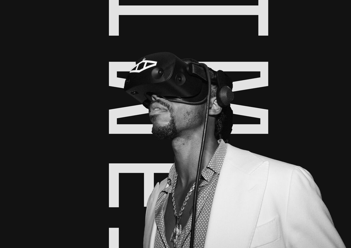
FINAL PRODUCT The final concept for ArtMeta’s brand identity converges fine art with digital. Incorporating the physicality of the fine art world into the digital sphere allows users to find a familiar, tangible connection. This notion is actualised in the brand guidelines, where we bring the two worlds together.
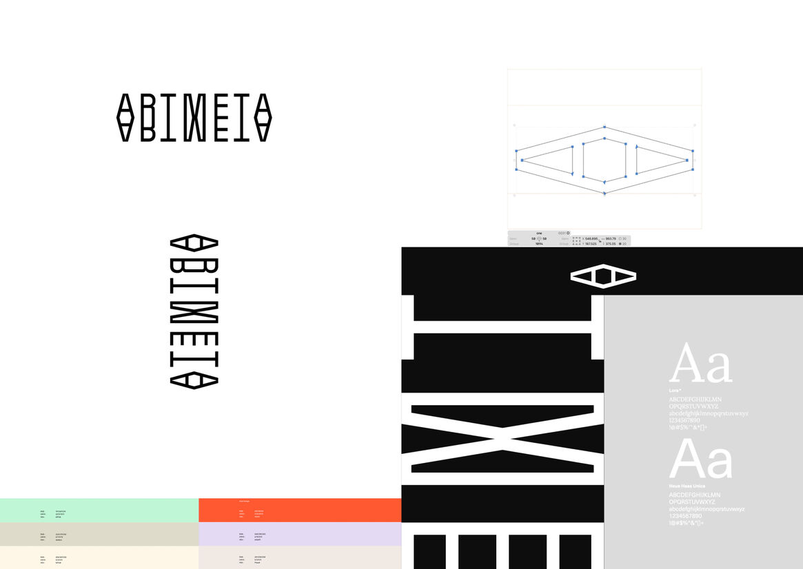
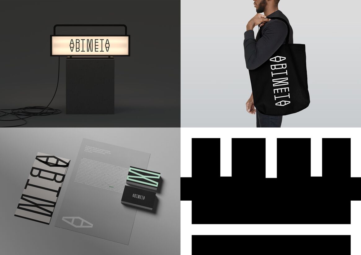
Four conceptual pillars form the foundation of the brand identity: <code>, Hypercube, Compass, and Cyclops. <code> signifies entering a new world. Hypercube represents the intersection of physical and digital. Compass indicates that ArtMeta is always in movement. Cyclops is the native of the metaverse's island.
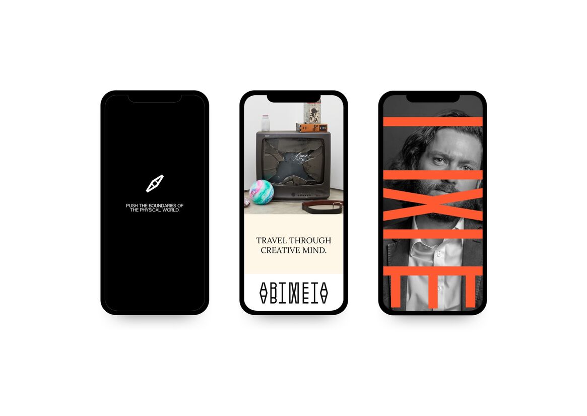
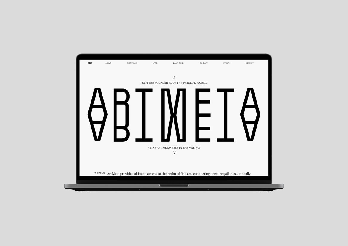
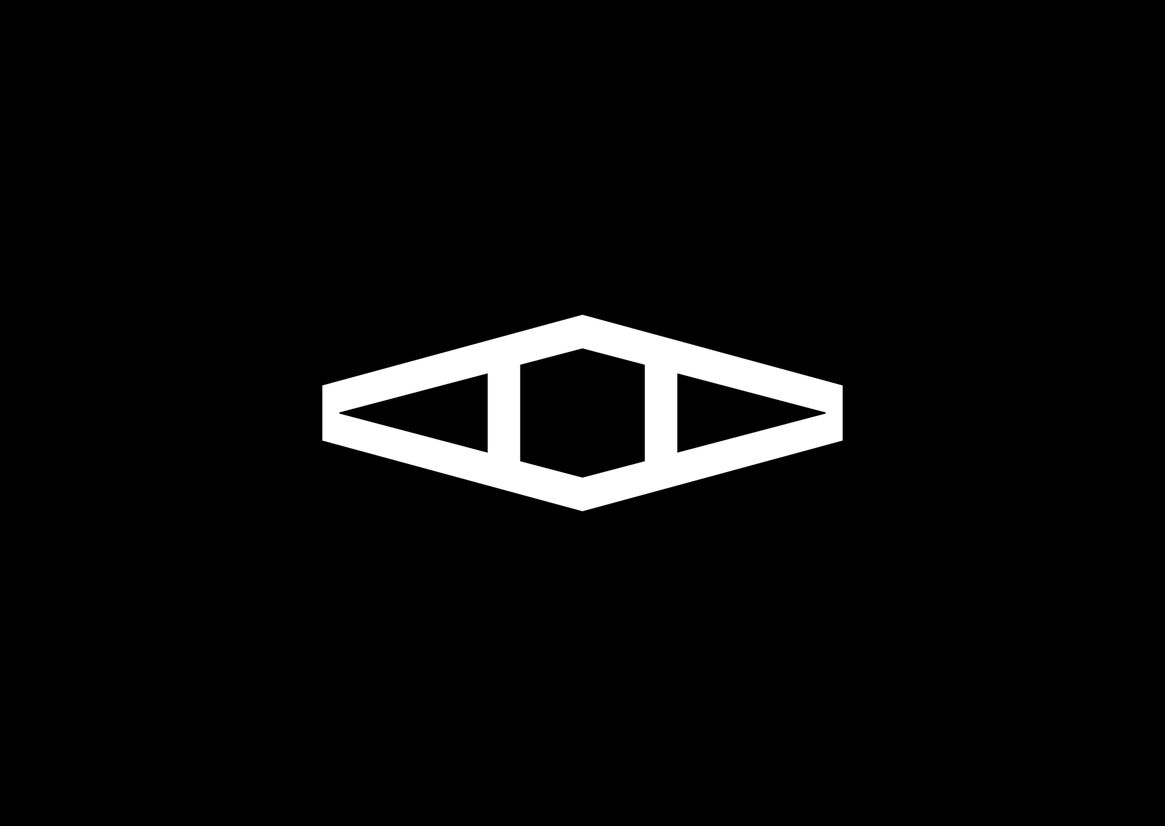
We combined these four pillars to define the logo and wordmark. Both use an angular typeface with a mirror effect accentuating the merging feeling. The bold lines and symmetry produce distinctive signatures. And while the logo has orientation constraints, the wordmark can be used vertically and horizontally.
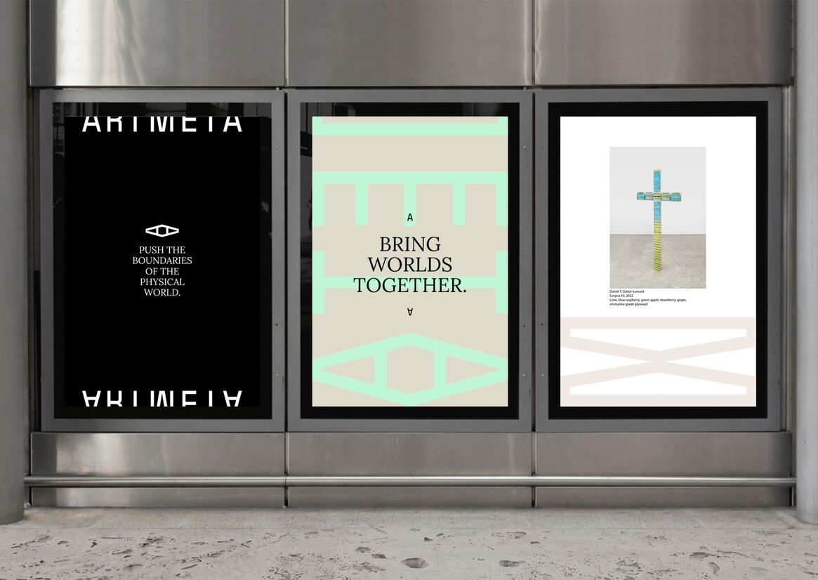
The tone of voice is dignified but not pretentious, giving language used in the art world a place in cyberspace. The colour palette appoints black and white as primary colours and provides two brighter schemes for secondary colours; one named Psychedelic Liquid Pastel & Green, the other Acid Sunset. Typography pairs the romantic Lora typeface with Neue Haas Unica, a revival of a 1980’s relic born at the time of electronic development.
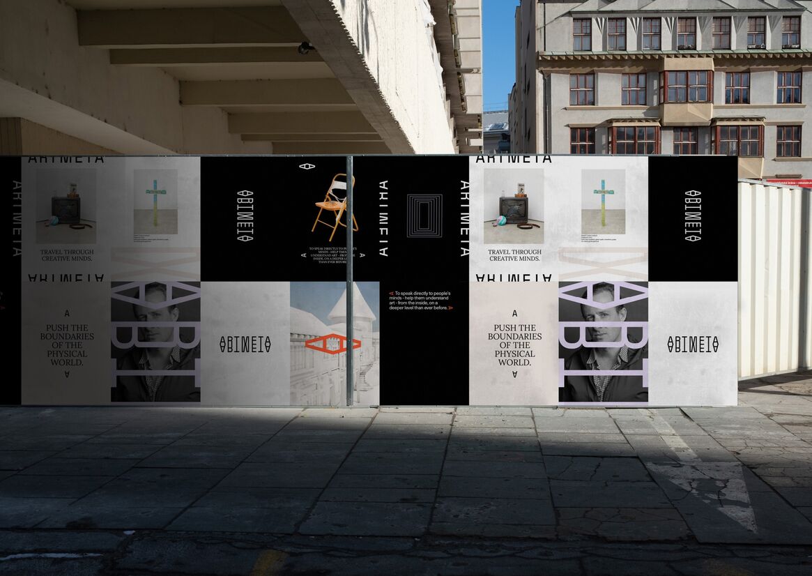
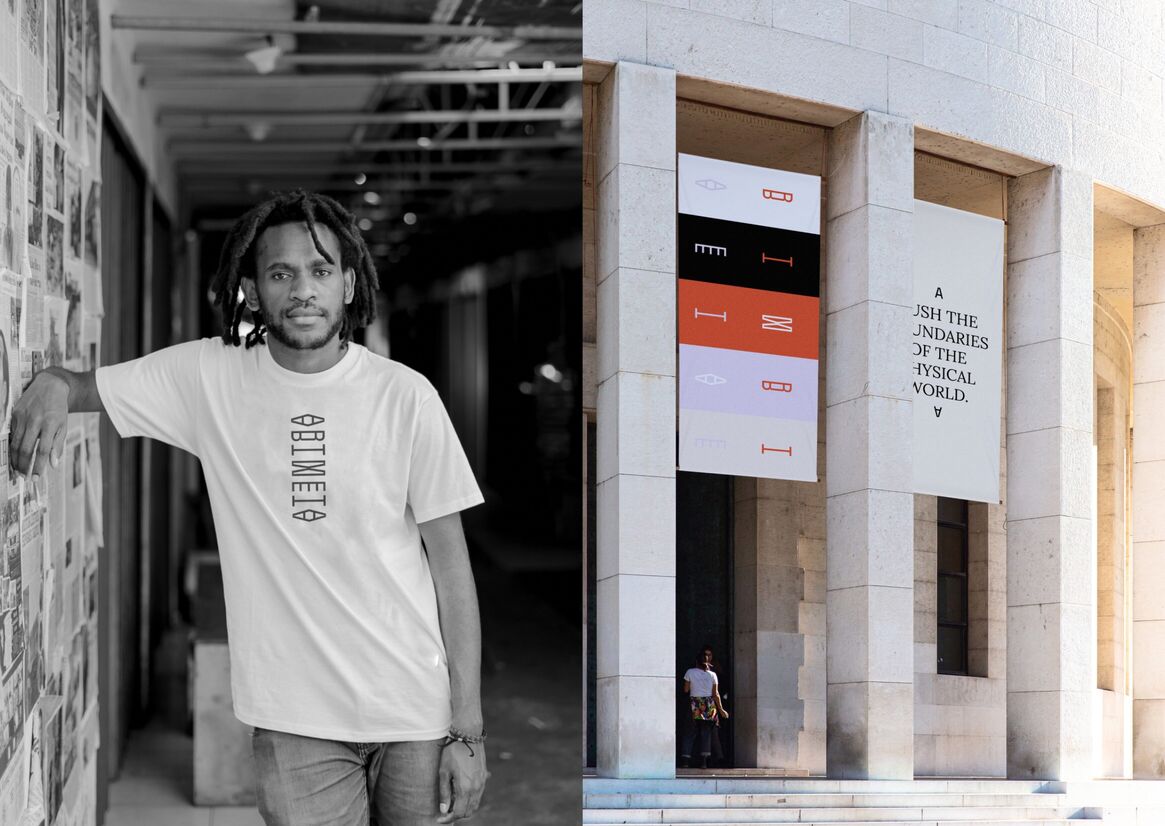
APPLICATION By experimenting with the four pillars and material brand components, the brand identity can be clean and iconic or bold and captivating in its application.
This flexibility enables ArtMeta’s brand identity to adapt across evolving physical and digital mediums. Still, it maintains the same look and feel no matter how it’s used; the branding consistently captures classical elegance through a digital lens.
Description:
THE BRIEF
ArtMeta is a beautifully rendered 3D metaverse connecting leading galleries, critically acclaimed artists, curators, institutions, and collectors in an immersive digital experience. It’s a new paradigm for displaying and selling fine art.
The company approached us to craft a brand identity that would speak to the world of fine art, resonating with each of their target audiences. Because the recent influx of metaverses has crowded quickly and carries a lot of hype, ArtMeta’s brand identity needed to demonstrate the depth and visionary artistry of its metaverse.
CONCEPT CREATION
The project began with researching the explosion of NFTs and metaverse businesses. We needed to understand and appreciate how the landscape was evolving within the industry.
Then followed several workshops with the client to define and distill their brand. From this exploration, we learned that the final concept needed to provoke trust from the audience.
The brand identity also needed to adapt across multiple mediums, from metaverse environments to real-world art galleries. This aspect was crucial in our concept development. We utilised ArtMeta’s highly engaged Discord community as an almost real-time feedback solution during this stage, which guided our design decisions.
FINAL PRODUCT
The final concept for ArtMeta’s brand identity converges fine art with digital. Incorporating the physicality of the fine art world into the digital sphere allows users to find a familiar, tangible connection. This notion is actualised in the brand guidelines, where we bring the two worlds together.
Four conceptual pillars form the foundation of the brand identity: <code>, Hypercube, Compass, and Cyclops. <code> signifies entering a new world. Hypercube represents the intersection of physical and digital. Compass indicates that ArtMeta is always in movement. Cyclops is the native of the metaverse's island.
We combined these four pillars to define the logo and wordmark. Both use an angular typeface with a mirror effect accentuating the merging feeling. The bold lines and symmetry produce distinctive signatures. And while the logo has orientation constraints, the wordmark can be used vertically and horizontally.
The tone of voice is dignified but not pretentious, giving language used in the art world a place in cyberspace. The colour palette appoints black and white as primary colours and provides two brighter schemes for secondary colours; one named Psychedelic Liquid Pastel & Green, the other Acid Sunset. Typography pairs the romantic Lora typeface with Neue Haas Unica, a revival of a 1980’s relic born at the time of electronic development.
APPLICATION
By experimenting with the four pillars and material brand components, the brand identity can be clean and iconic or bold and captivating in its application.
This flexibility enables ArtMeta’s brand identity to adapt across evolving physical and digital mediums. Still, it maintains the same look and feel no matter how it’s used; the branding consistently captures classical elegance through a digital lens.