Graphic
misterwolf 12 One New Zealand
-
Pou Auaha / Creative Director
Blake Enting -
Pou Rautaki / Strategic Leads
Derek Lockwood, Andrew Stone
-
Ringatoi Matua / Design Director
Kane McPherson
-
Ngā Kaimahi / Team Members
Tina Brooke, Amanda Gould -
Kaitautoko / Contributors
Jacki Parry, Joe Hunter -
Client
One New Zealand

Description:
In 2020, Vodafone New Zealand bought back the company from Vodafone Global with a clear new purpose: "Unlock the magic of technology to create an awesome Aotearoa."
This acquisition led, in 2022, to a new name, a new brand, and a new story.
The brief was to create a new brand focused on New Zealand, while respecting our Whakapapa – the connection to its 25-year heritage as Vodafone NZ (a brand they will continue to partner with in global markets). It had to be inclusive of all New Zealanders, avoid cultural tokenism, and reflect the drive to radically simplify all aspects of the business in order to deliver true transformation.
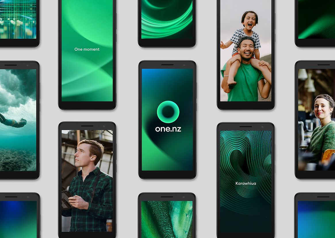
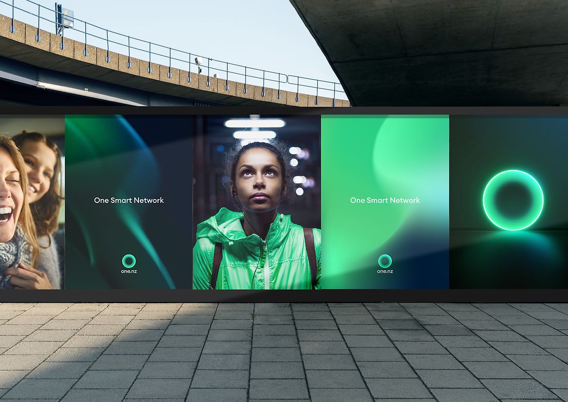
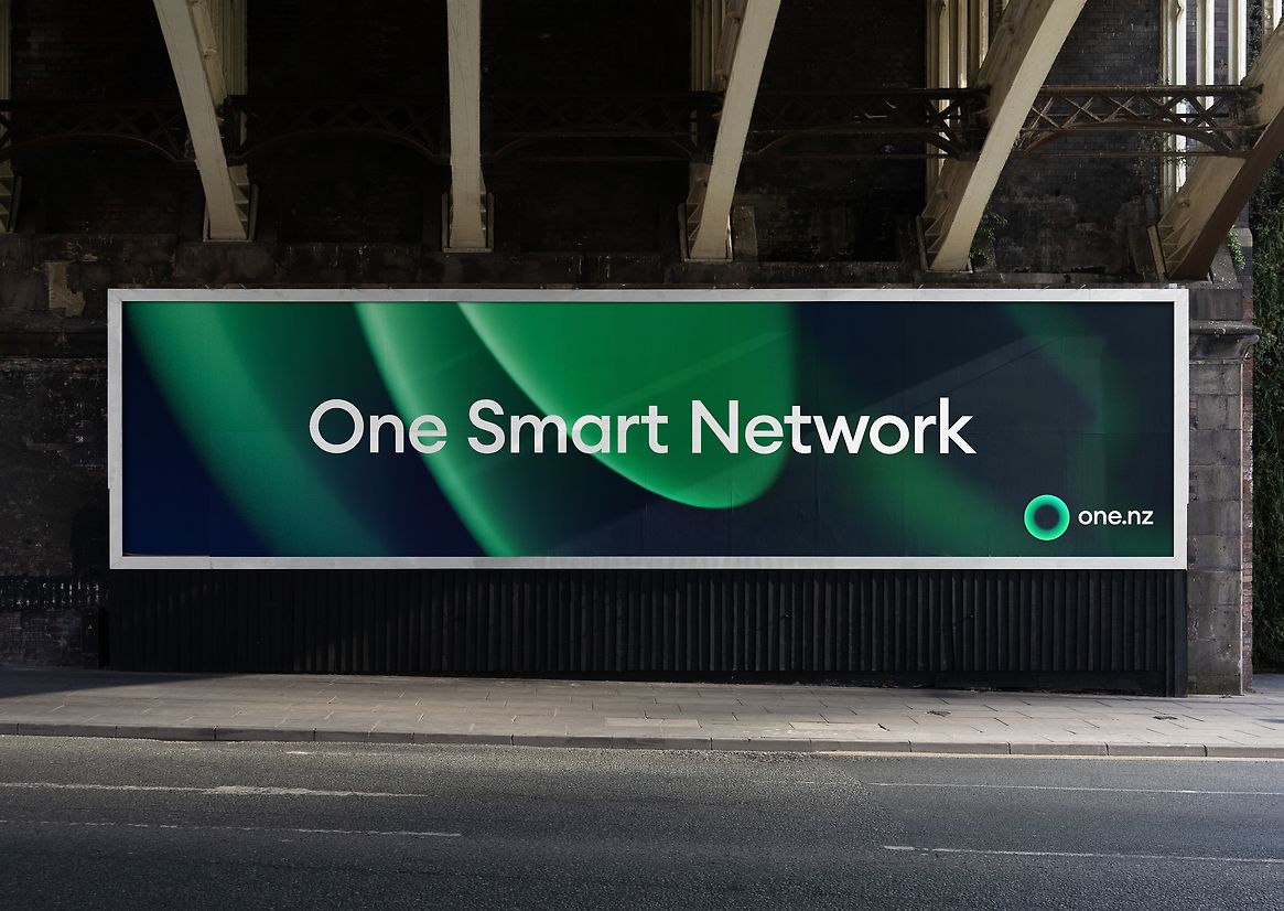
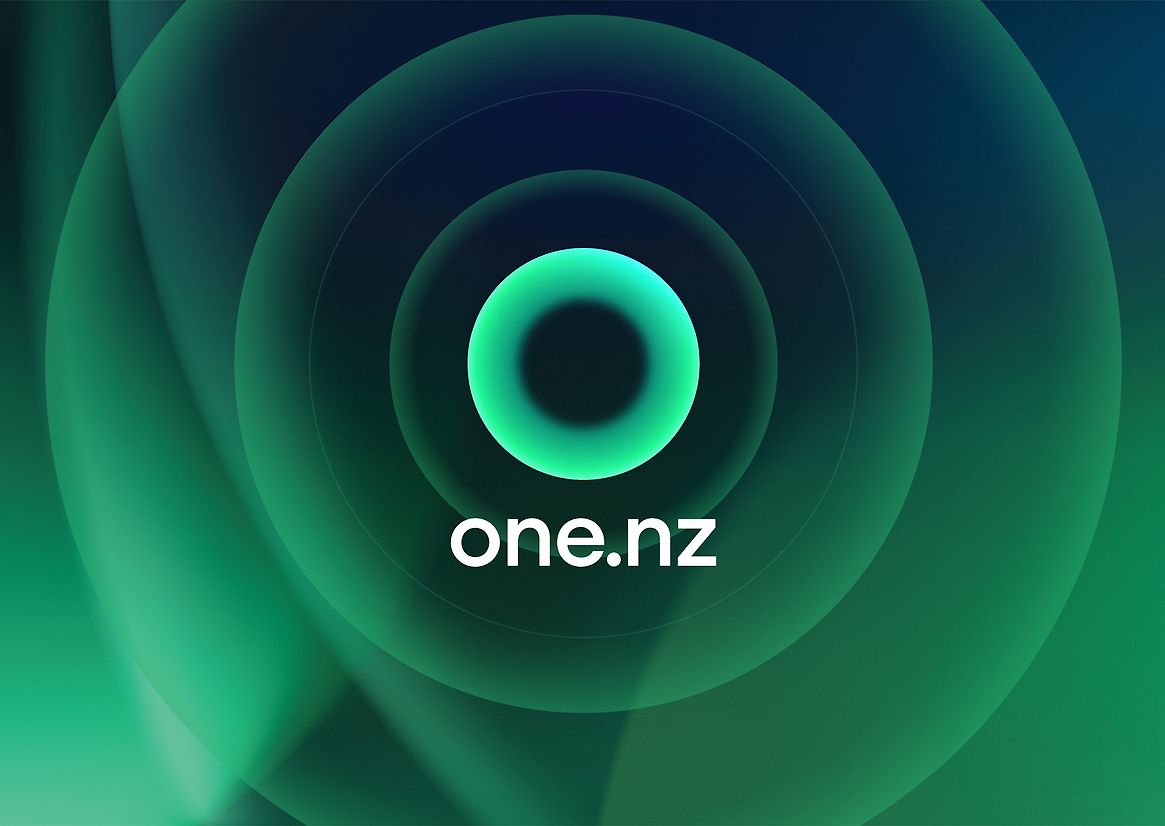
We found the name 'one' hidden in the last three letters of the Vodafone name. A name that spoke to our desire to empower all Kiwis. The brand Wordmark was written as a URL to enable simplification of brand communications.
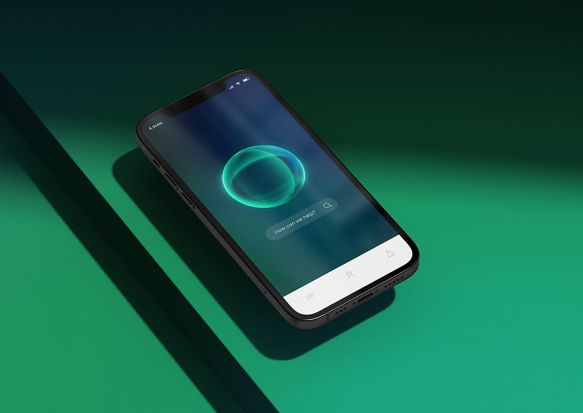
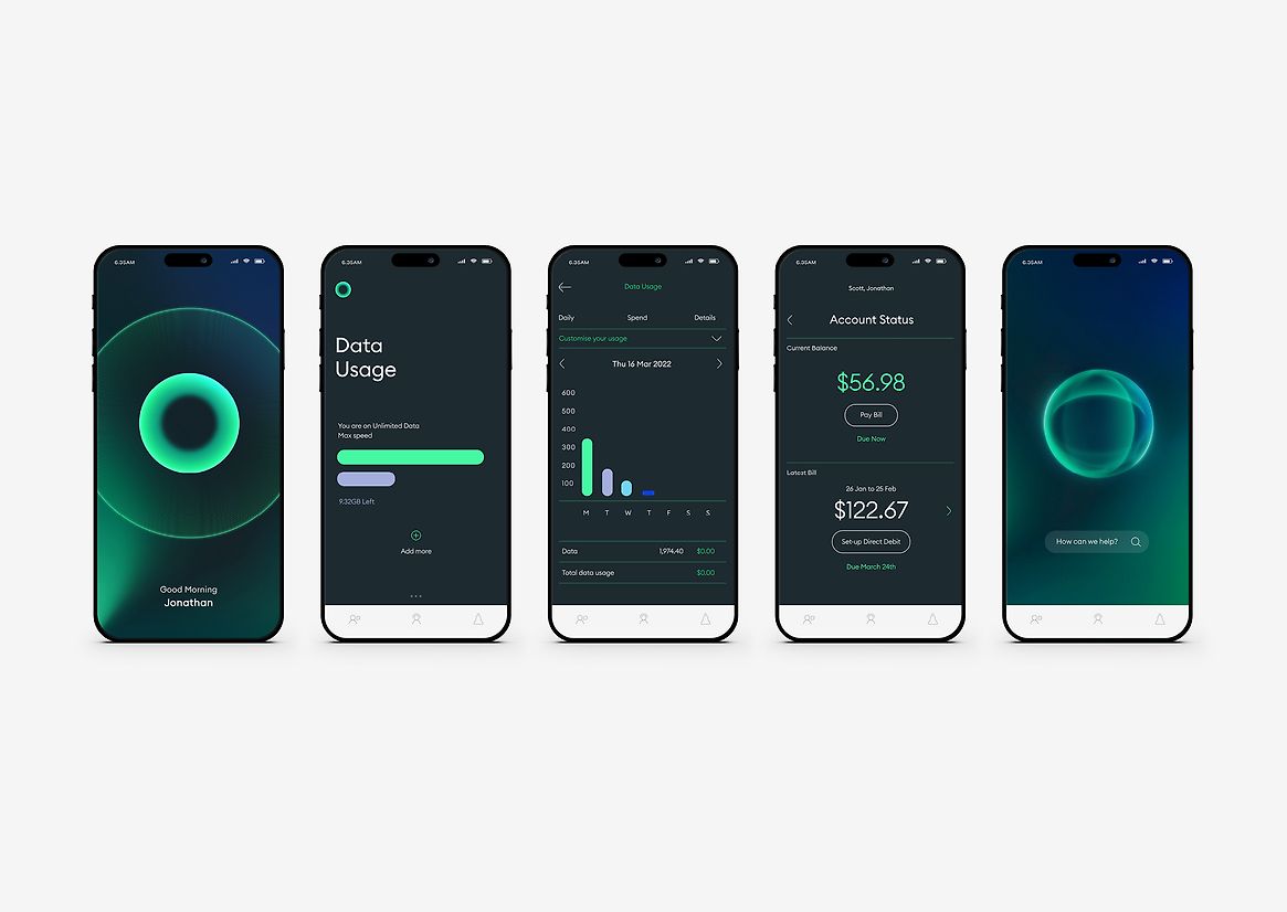
The logo needed to have a digital-first focus and allow for possible future use as an interactive AI personality that customers could directly engage with, either on devices or in retail environments.
We noticed that by rotating the Vodafone "speech mark" logo 90º degrees, it looked like a Kiwi, an idea that came to form the heart of our launch transformation story. But when spun fast, the logo turned into an energising O, a link to the name, and a symbol of both unity and glowing positive ‘activation’ – a visual shorthand for our brand purpose.
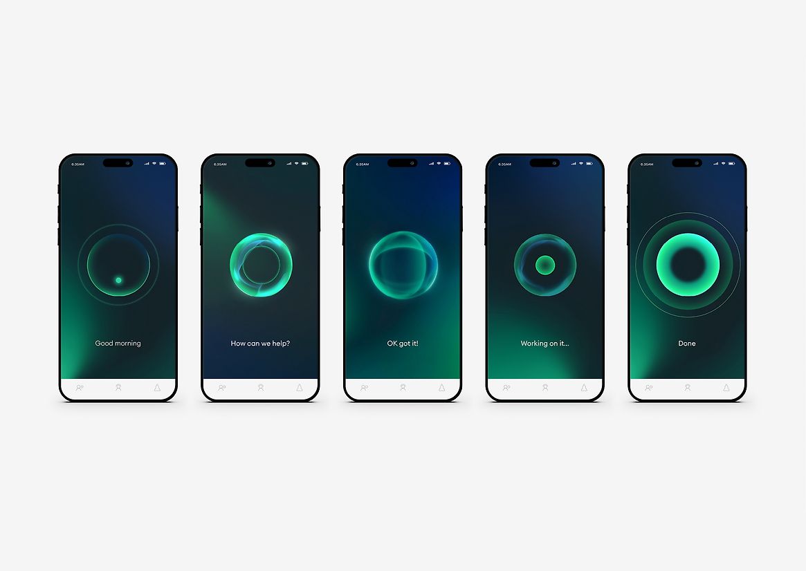
The logo was brought alive with different animated interactive user states: wake up, standby, listening, thinking, and action. Some of these were combined for launch into the brand's animated end frame, combined with our new unique brand mnemonic.
Inspiration for a new brand palette was drawn from our natural environment, the colours, textures, and light of our land (something common to all Kiwis). This inspiration was then reinterpreted with a digital skew in our colour palette and green energy patterns, while photography shifted from generic clearcut global Vodafone assets to images that reflect our cultural diversity and pride in place.
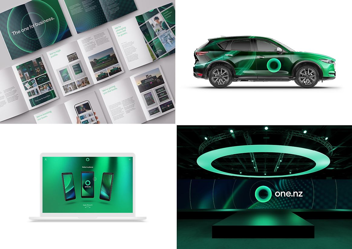
From red to green. From eight letters to three. From a global giant to a Kiwi champion. From a speech mark to a Kiwi, and on to a mark that symbolises unlocking awesome. Retaining everything we needed from Vodafone and nothing we didn’t.
Within a week of launch, 95% of the country had been reached, and every Vodafone mobile customer knew we were changing to One NZ. Following the announcement, the love for the new brand and identity was expressed by the people of New Zealand in record sales and new connections, sales that continue to grow and have eclipsed any previous sales recorded in Vodafone NZ's 25-year history.
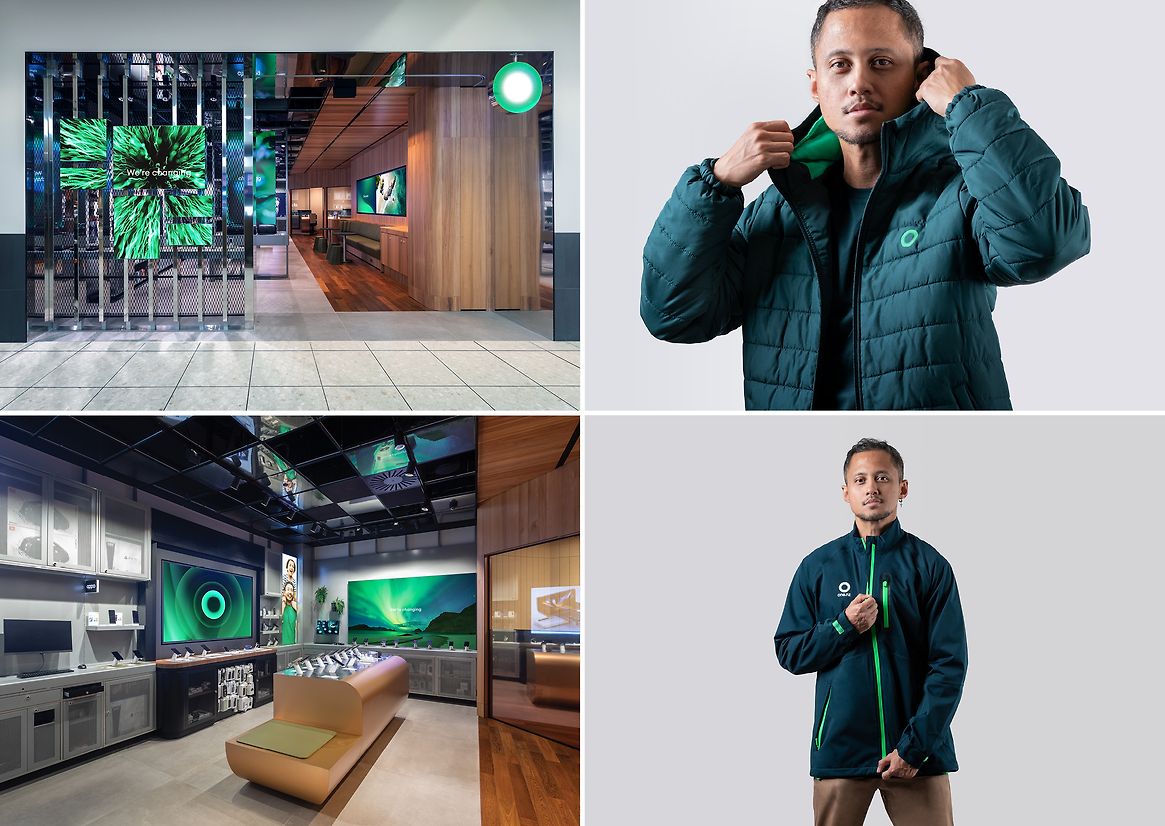
The brand application has extended from communications to corporate interiors, retail store reinvention, corporate and retail apparel, and digital tools. With the size and complexity of the business, rollout across these touchpoints will continue in phases for the next 24 months.