Graphic
Milk 75 Pivio
-
Pou Auaha / Creative Directors
Sarah Melrose, Ben Reid
-
Ringatoi Matua / Design Director
Anthony Hos
-
Ngā Kaimahi / Team Members
Kate Forsythe, Eden Harris, Gemma Scott, Adeline Chua -
Kaitautoko / Contributors
Michael Crampin, Tom Crampin -
Client
Sanitarium Health & Wellbeing Company
Description:
Pivio - a turning point for health empowerment in the US.
Sit down Covid, there’s a bigger pandemic in the building.
Chronic diseases. In the US, they affect 6 out of every 10 people, and 4 out of every 10 will have 2.
As the western world seeks to reverse the health epidemic commonly associated with our increasingly sedentary lifestyles, governments and health service providers are shifting their energies to prevention rather than cure.
Worth knowing that it's estimated more than 80% of chronic diseases - obesity, diabetes, vascular etc - can be avoided through simple, personal lifestyle choices before any medical intervention or treatment becomes necessary (did you exercise today?). So how do you empower people to make the right choices?
You give them back control.
Enter CHIP. AKA: The Complete Health Improvement Programme, an 80-year-old industry respected and research-based transformational lifestyle intervention programme – perhaps just a little too complex for consumers to understand...
Our task was to unpackage all the lexicon and reassemble it as an accessible, human, relevant and commercially distinctive proposition for the US market. We used key reference points in our methodology - a combination of category and cross-category analysis, consumer benefits and usability, and a restless curiosity for what is possible.
Say goodbye to CHIP, and hello to Pivio: a unique derivative of pivot (turning point) and internationally trademarked and protected (and we all know how difficult original naming can be).
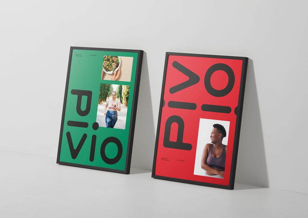
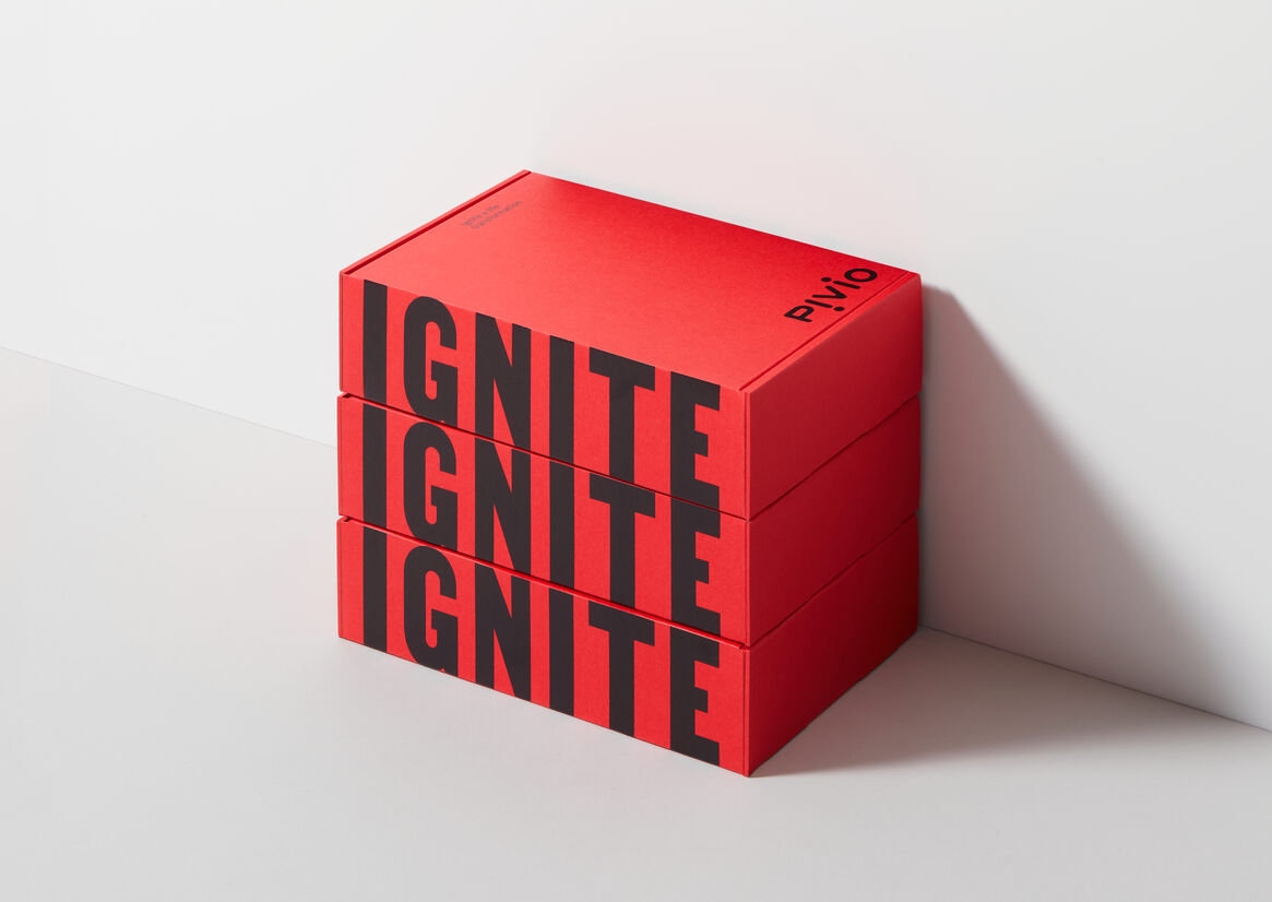
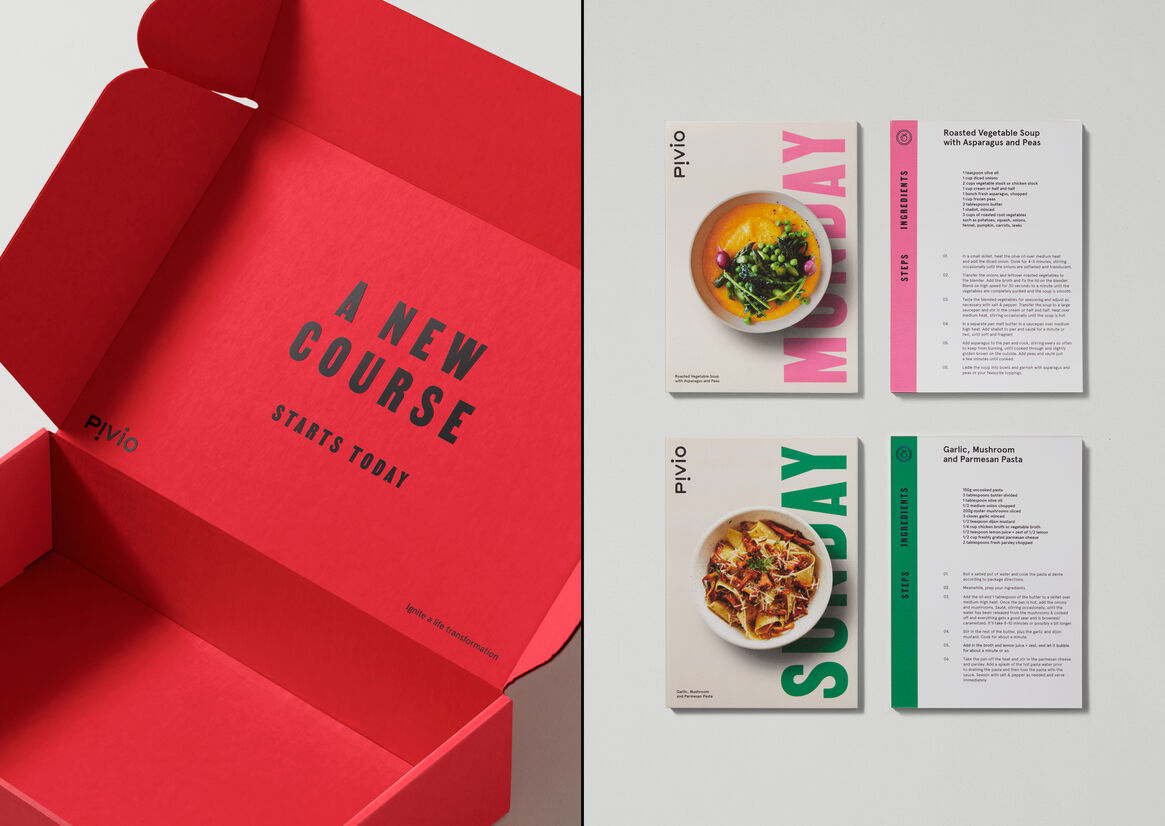
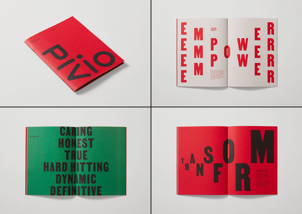
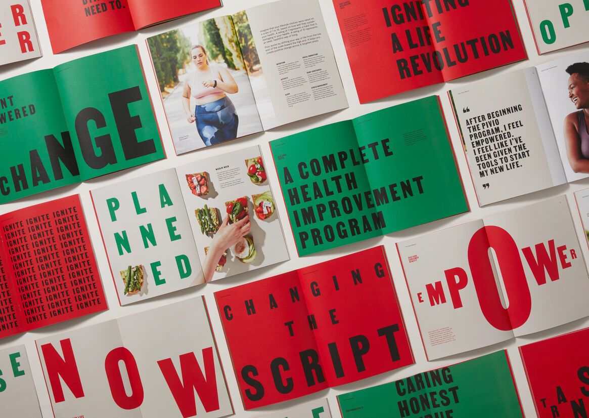
Pivio is life, bold and underlined. It doesn’t go quietly. Built on the very idea of igniting a life revolution, Pivio is a watershed moment in the journey to personal transformation. Gone are the ubiquitous medical blues and reassuring pastels so typically associated with therapeutic branding. Pivio is red and emphatic and now: all powered up, and all empowering.
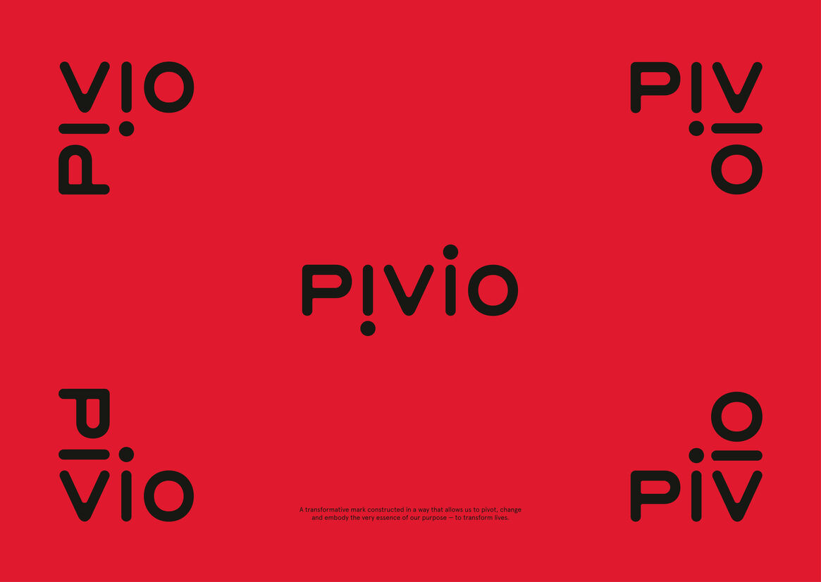
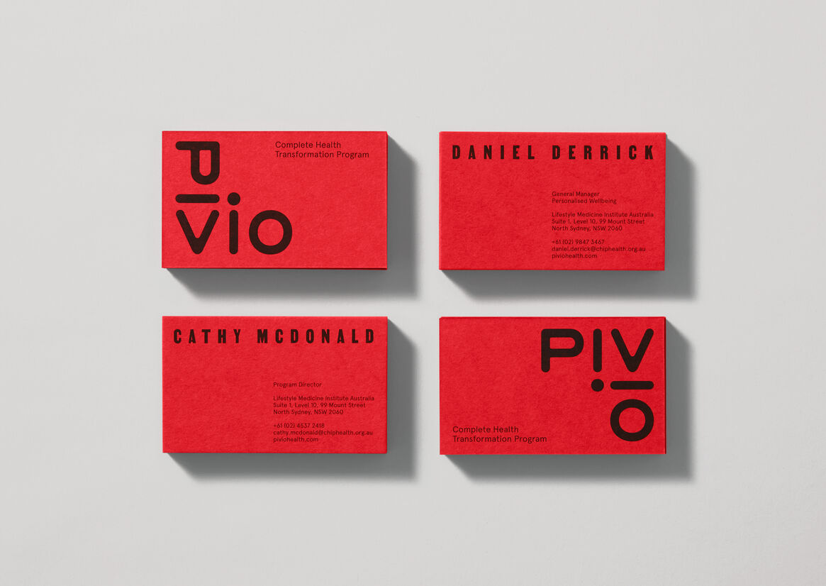
A custom wordmark is designed to practice what it preaches, pivoting in multiple versatile representations.
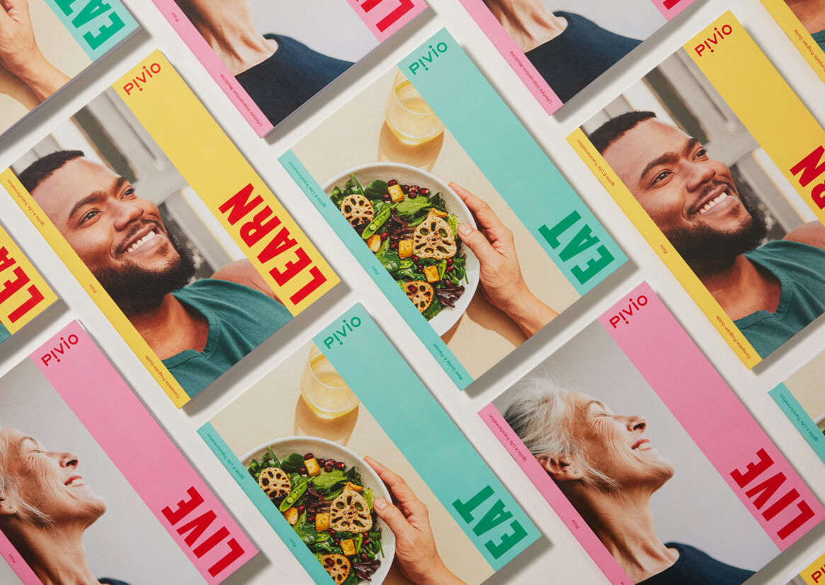
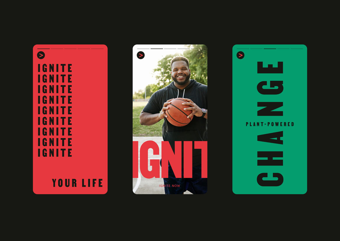
The design system - predominantly engineered for a digital experience - uses prescribed bold colours and strong, direct typography with jargon free storytelling for poster-like simplicity. Get the message, and get on with it.
Pivio seeks to ignite a life revolution. To empower personal change. To reduce the burden on curative medical systems the world over, and to enable individuals to make better lifestyle choices for longer, healthier lives.
And it says we're still allowed donuts.