Graphic
Milk 75 Honeysticks
-
Pou Auaha / Creative Directors
Anthony Hos, Sarah Melrose -
Pou Rautaki / Strategic Leads
Sarah Melrose, Ben Reid, Bron Williams
-
Ringatoi Matua / Design Director
Ethan Lowe -
Kaituhi Matua / Copywriter Leads
Judah Finnigan, Bronwyn Williams
-
Ngā Kaimahi / Team Members
Harriet Campbell, Alyssa Miller, Jemima Christie-Limbrick, Gemma Scott, Josh Daly, Adeline Chua, Jacinta Conza -
Client
Honeysticks
Description:
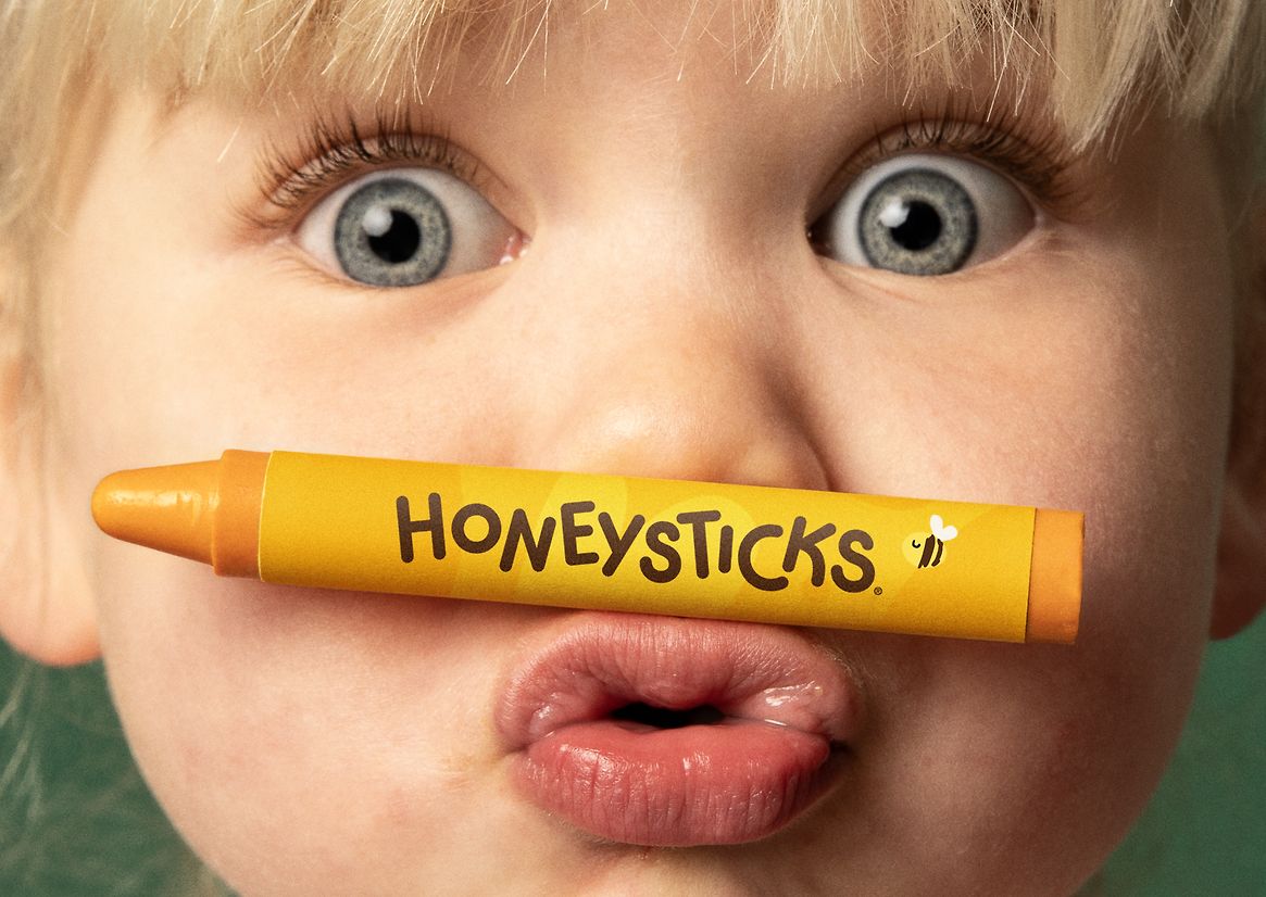
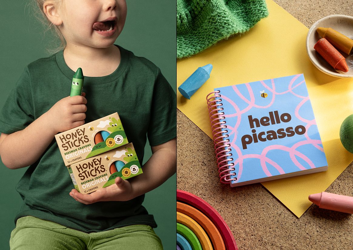
Formed in Aotearoa New Zealand, Honeysticks began with a simple goal: to make a safer, more sustainable crayon for a new generation of wee creators. Backed by NZTE, they’ve since become the #2 crayon brand in the world, second only to Crayola. Unlike their petroleum-based competition, Honeysticks are handmade from 100% beeswax, sustainably sourced and completely non-toxic – a truly forward-thinking product. But to challenge the giants, they needed a forward-thinking brand to match: global, modern, and buzzing with personality.
In a world where 30% of US children under 6 struggle to hold a pen, Honeysticks wanted to position themselves as not only a great crayon, but a movement for the greater good. To them, creative play is an essential building block of early development and wellbeing. To transcend their boutique roots and craft a vision that appealed to parents and children alike, Honeysticks needed more than a redesign. They needed a guiding idea, with the scale and substance of a global brand.
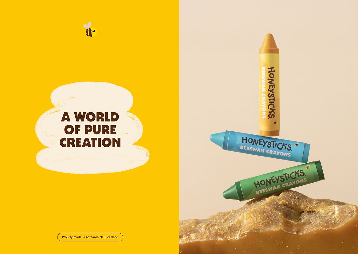
As a strategic platform, “A World of Pure Creation” was crafted to speak to every aspect of their purpose: their global ambition, their pure ingredients, their unwavering belief in the power of creative play. It embodies an entire ethos beyond the product: playing freely with imagination, playing it safe with ingredients, and playing for keeps with our planet.
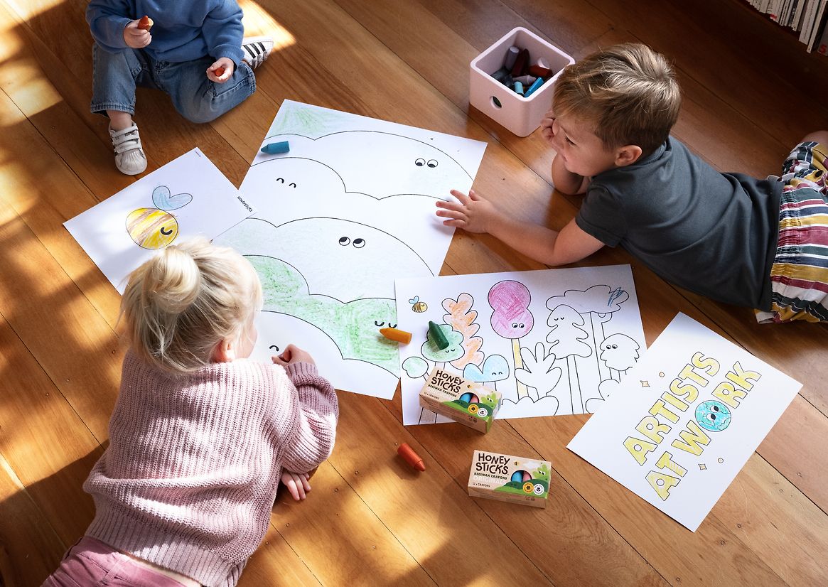
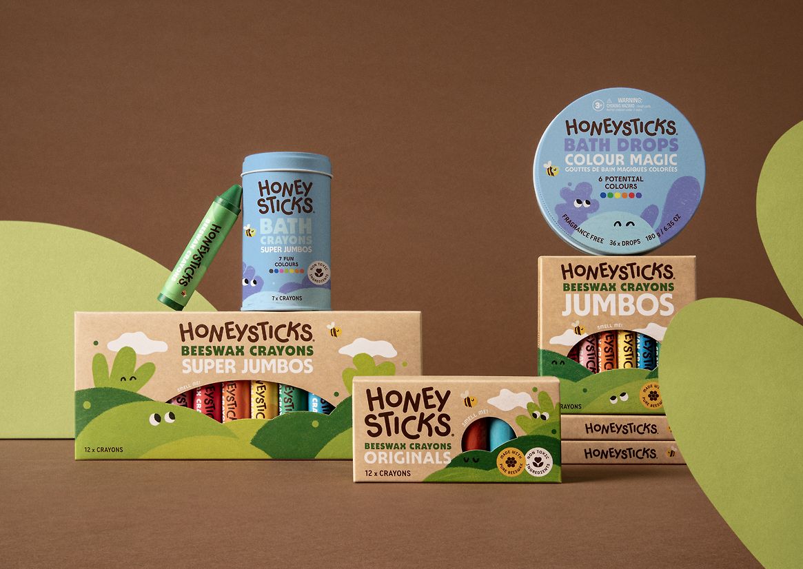
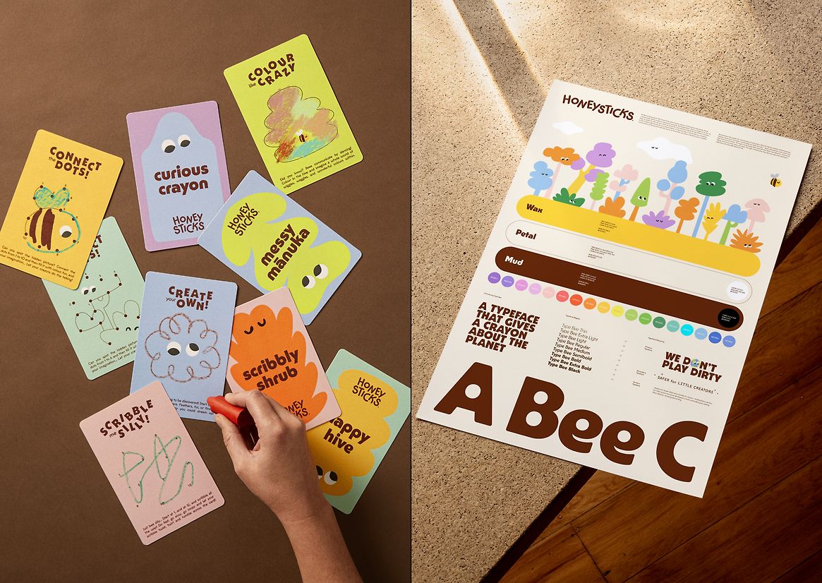
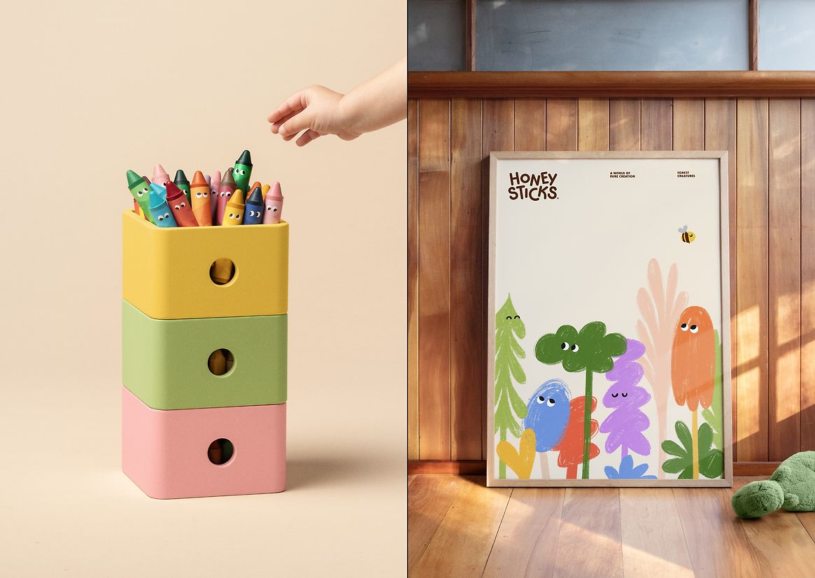
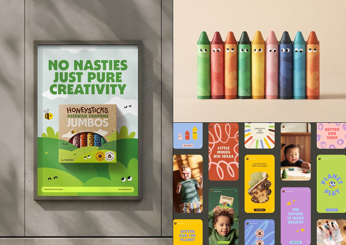
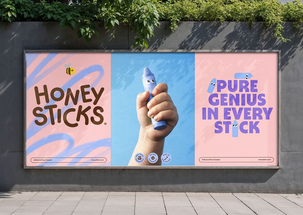
The new identity centres on the character of the Joyful Activist – a spirited personality that embodies creative freedom and positive change. The custom wordmark features bouncy letterforms that echo the spontaneity of a child’s imagination. A refreshed Scribble Bee, our pro-planet mascot, symbolises nature, purity, and the unexpected flight-paths of the creative process. Organic crayon textures and a cast of imaginative creatures invite children into a world of creativity.
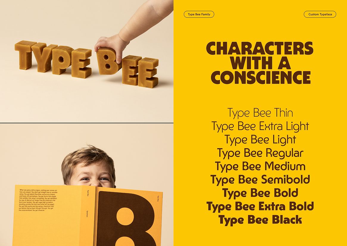
Now with a more purposeful and playful tone of voice, typography became essential in the Honeysticks personality. Type Bee, a custom type family of nine weights, has enough unconventional quirks to give it a rebellious, childlike character, all while preserving the functionality and versatility required to work hard across all brand-world touchpoints.
Colour brings even more joyful spirit to the brand, with Beeswax Yellow cast as our hero colour, paired with an earthy Brown (drawn from the crayons themselves). Around them is a vibrant spectrum of clashing brights, deployed in eclectic ways. The packaging uses eco-friendly materials, and peek windows to showcase the crayons’ natural beeswax, standing apart from their synthetic competitors by emphasising purity (without compromising playfulness).
Honeysticks is now more than a crayon – it’s a purpose-led brand that champions creativity, sustainability, and individuality. It encourages kids to create imaginary new worlds, all while protecting the actual world they’ll soon inherit. With purity and positivity, Honeysticks proves that design can be joyful, purposeful, and a catalyst for real change.
Judge's comments:
A New Zealand brand changing a category, globally. It perfectly balances evoking natural aspects of the brand without losing its playfulness.