Graphic
Milk 68 Finesse
-
Pou Auaha / Creative Director
Sarah Melrose
-
Ringatoi Matua / Design Director
Anthony Hos
-
Ngā Kaimahi / Team Members
Ben Reid, Kate Forsythe, Eden Harris, Gemma Scott, Adeline Chua, Michelle Burke, Josh Daly -
Kaitautoko / Contributors
Michael Crampin, Steve Grant, Luke Bell-Booth, Tom Crampin, Simon Wilson -
Client
Finesse Residential
Description:
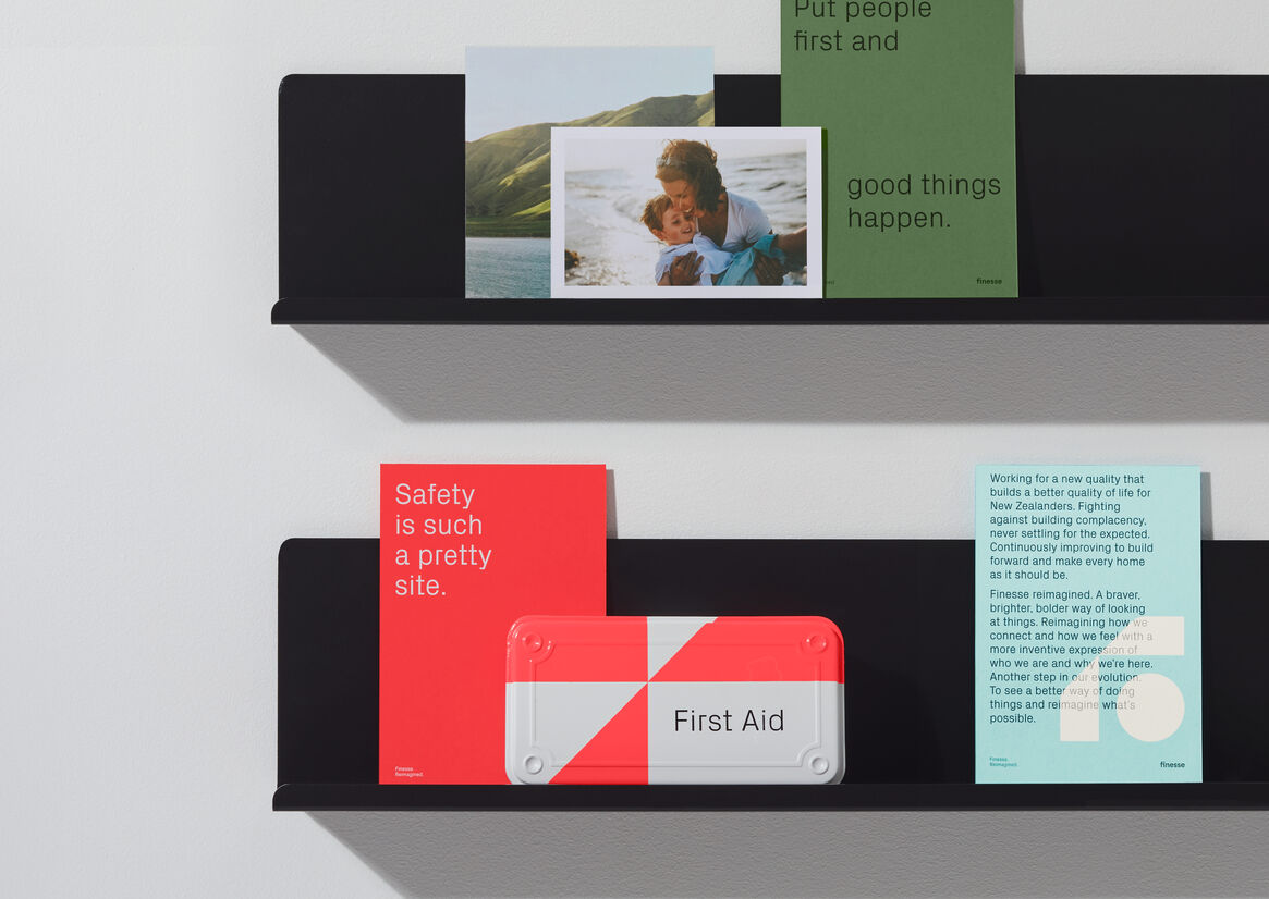
Finesse is a privately owned construction business, intent on building positive change to fight industry complacency.
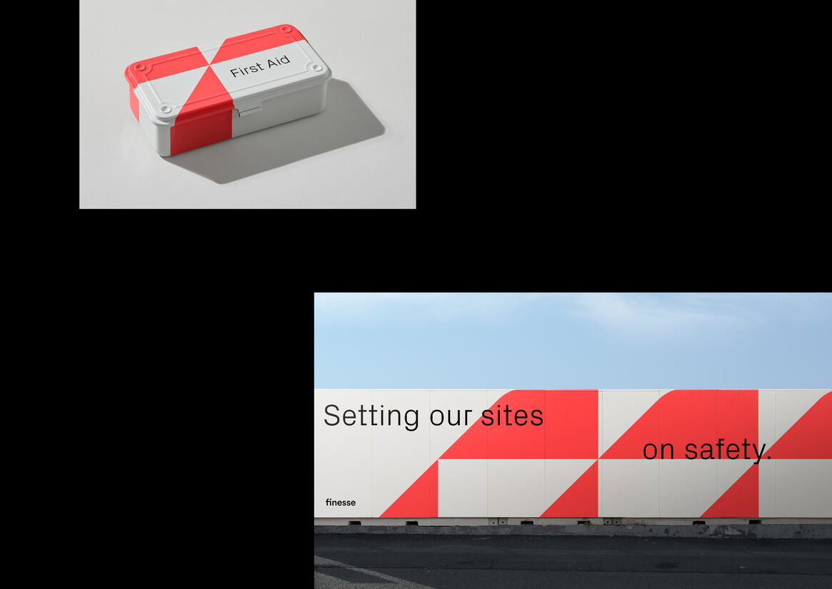
They're a business building at the front line of multiple cultural challenges - nationwide housing shortages, price rises and rental demand; while Māori face worse outcomes, with homelessness increasing and home ownership rates falling. To add to this there is a growing expectation for green building practices, material shortages, pressure to reduce waste and speed of build impacting worker safety. A challenging environment.
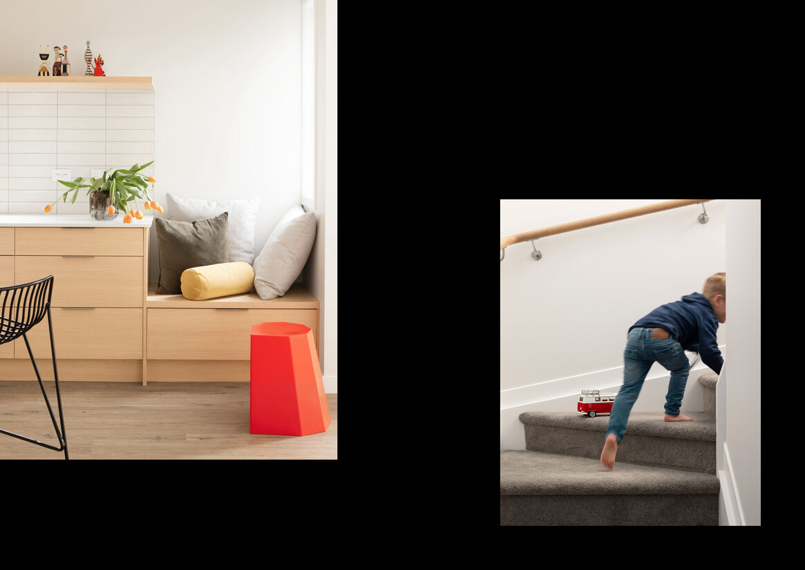
We needed to build a brand that represented an ambition for a better way, a people and community focus with ground-breaking modular thinking practices. A platform that they could build on and grow into.
We needed a concept that would represent change while connecting to an audience with diverse needs – from Iwi to Government, Funders to Consumers, to define a new quality for better in every aspect of build, process, safety and sustainability.
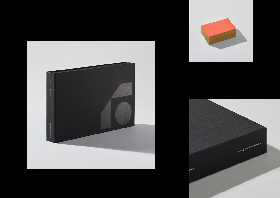
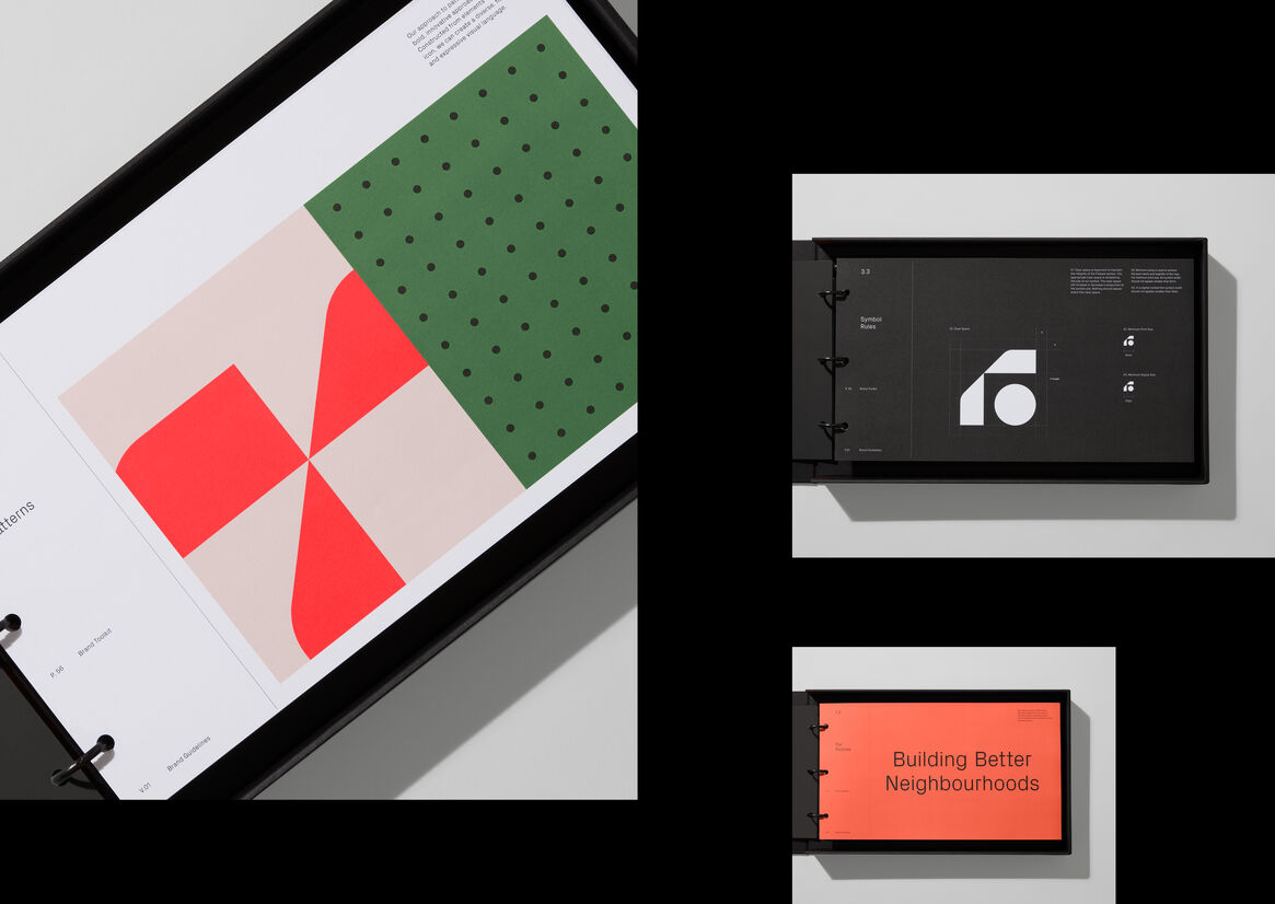
So we created Building Forward –a core brand proposition that represents a forward-thinking philosophy – people forward, forward-thinking, safety forward, paying it forward.
This was extended through an external brand idea – Finesse Reimagined. Reimagining how we live, how we connect and how we feel. A life reimagined that’s richer, braver, brighter, and always moving.
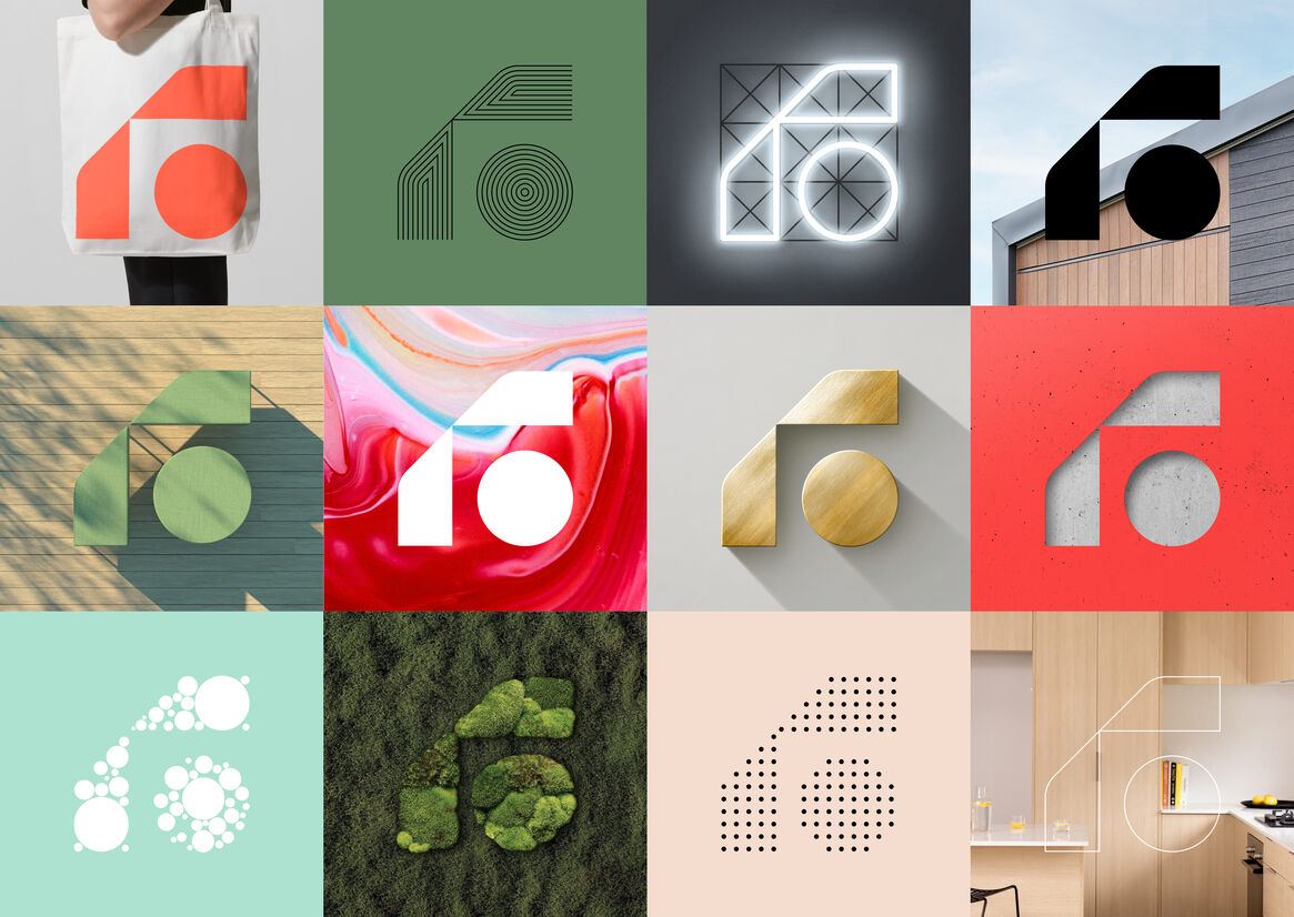
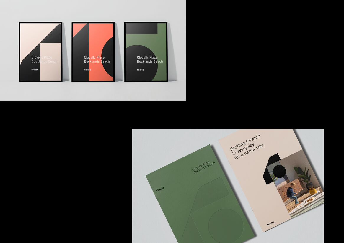
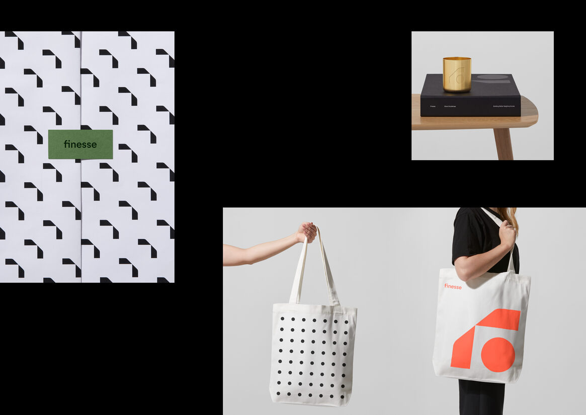
Finesse Reimagined the industry with an identity that could change perceptions. Moving and adapting to change, reflecting all sides of business. Creative, game changing, relentless, visionary, transparent, and caring. An identity system built on four core principles:
Freedom in a framework – guiding but allowing for freedom of expression.
Dial up or down – flexibility to adapt to different audiences.
A living identity – different stories for different needs.
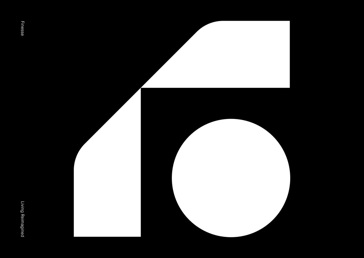
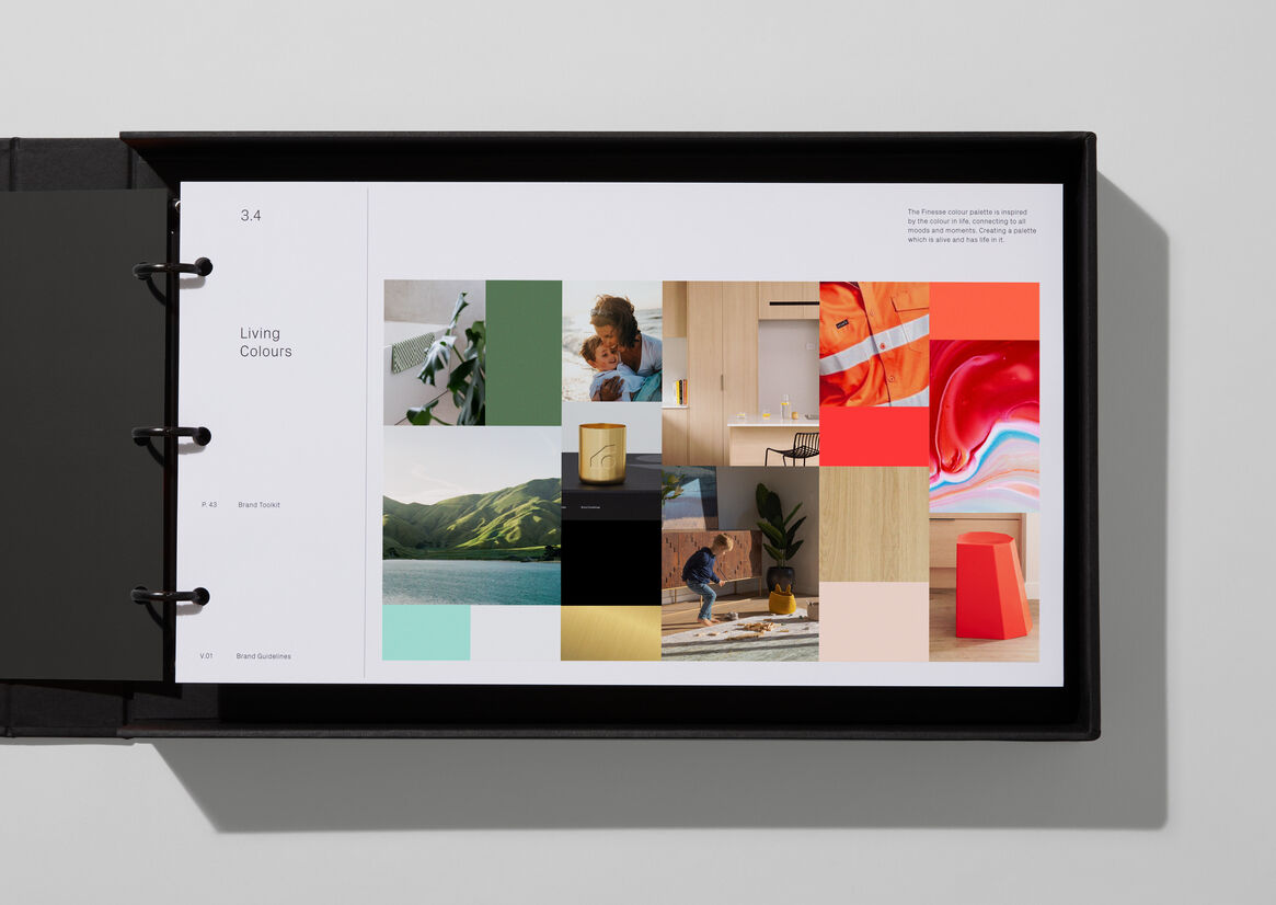
Inspired by the colour in life –many moods and moments, with a foundation colour that’s the glue.
At the core – the Finesse F symbol – for a diverse, flexible, and expressive visual language. The F has a careful balance of strength in values with the heart of people at the centre. The sides of the symbol are inspired by places that feel like home and reimagine how spaces and places can change. With colours of our place, and life, a voice that cuts through with a twist.
The result is an out-of-category identity that’s an antidote, that helps you see things differently and sets a new agenda. Building Forward… with Quality, Communities, Life, and Identity reimagined.