Graphic
Milk 75 Asona
-
Pou Auaha / Creative Directors
Sarah Melrose, Anthony Hos -
Pou Rautaki / Strategic Lead
Ben Reid
-
Ringatoi Matua / Design Director
Ethan Lowe -
Kaituhi Matua / Copywriter Lead
Judah Finnigan
-
Ngā Kaimahi / Team Members
Harriet Campbell, Gemma Scott, Adeline Chua, Josh Daly, Alyssa Miller, Jacinta Conza, Jemima Christie-Limbrick -
Kaitautoko / Contributor
WorkGroup -
Client
Asona Limited
Description:
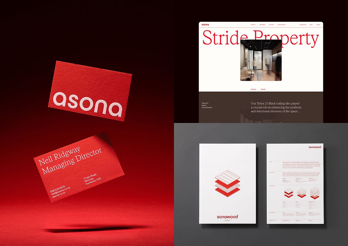
A refreshed brand identity that is all about helping Asona, an acoustics engineering company with a great story and a unique product range, bring its true quality and differentiation to life.
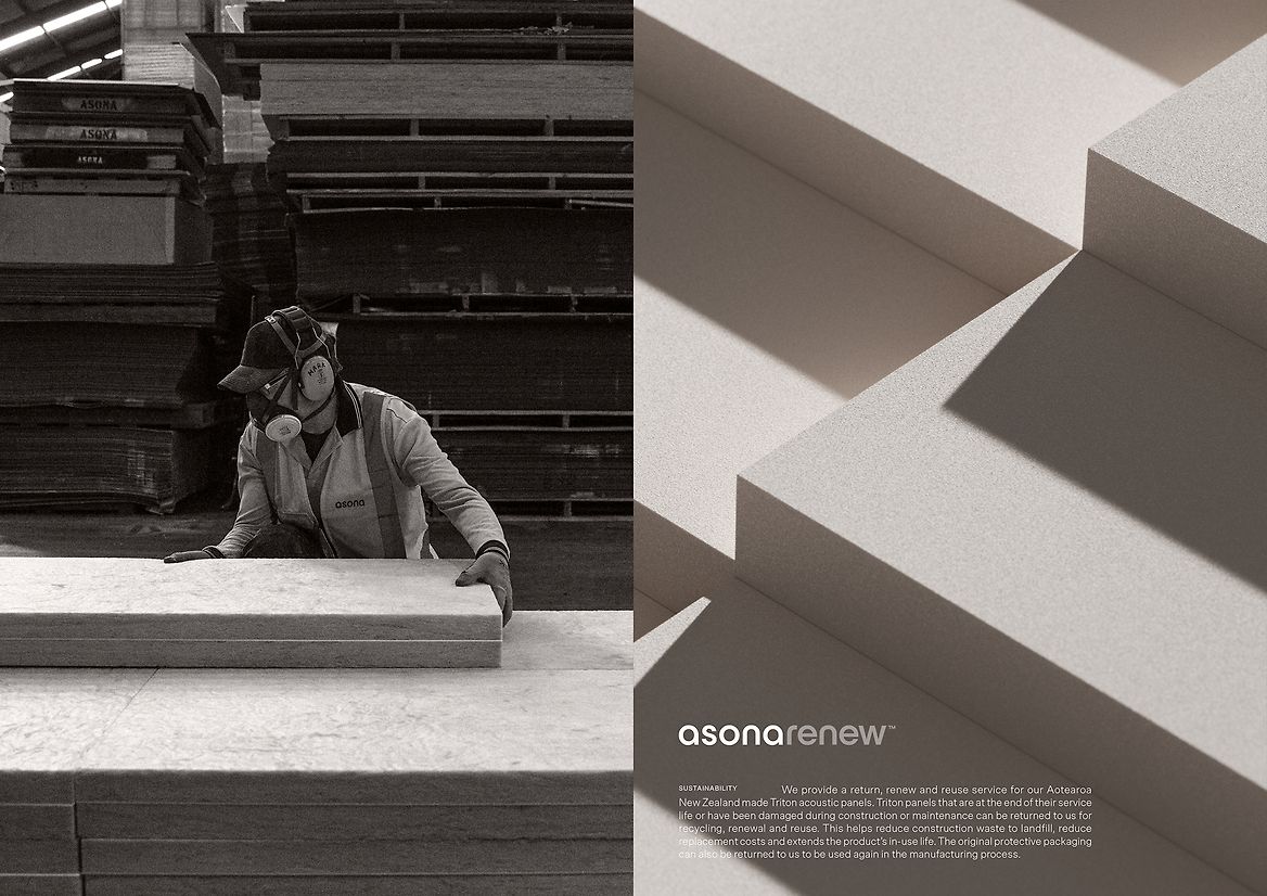
We wanted to tell a story not just of how Asona supplies the very best acoustic panels but also of expertise, innovation and imagination. This meant uncovering and amplifying the true care, quality, and excellence that the Asona team ensures at every step. Showing how they bring everything together to enhance human connection and wellbeing through aesthetic and acoustic design.
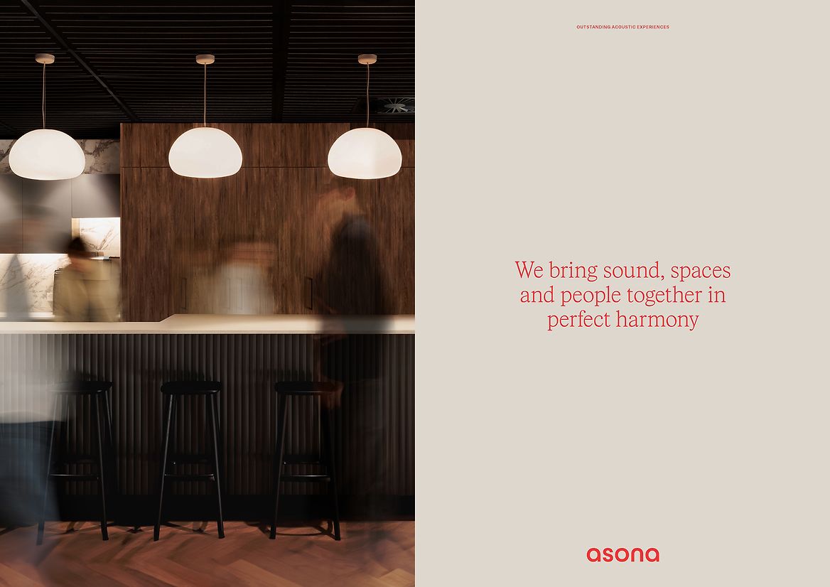
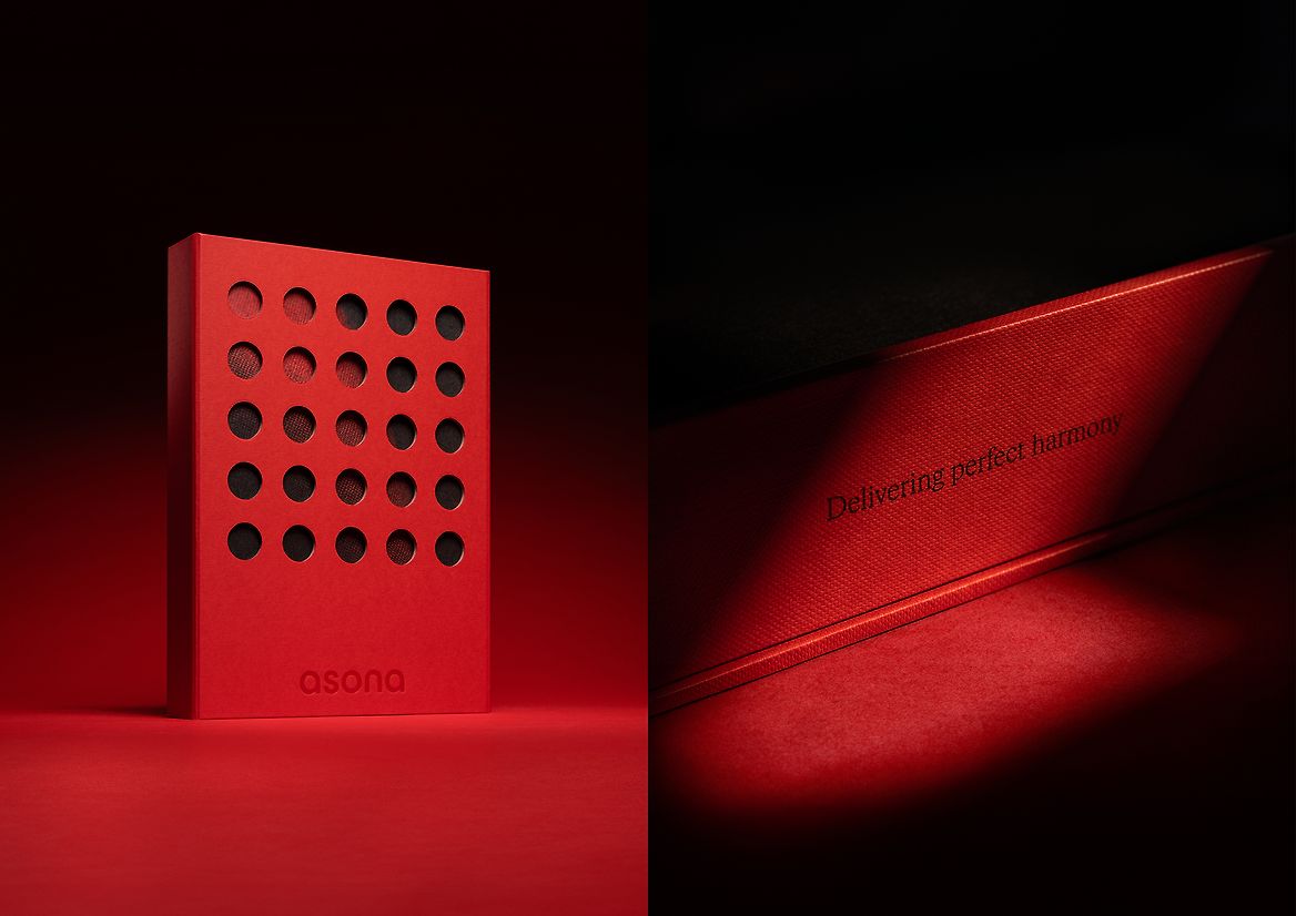
The culmination of these ideas was Perfect Harmony: balance, connection, and creating spaces that ground and unite us.
Building from the core idea, the system we developed was all about connecting people to spaces, connecting people to each other, and connecting the creators to the listeners. A balance of perfect harmony.
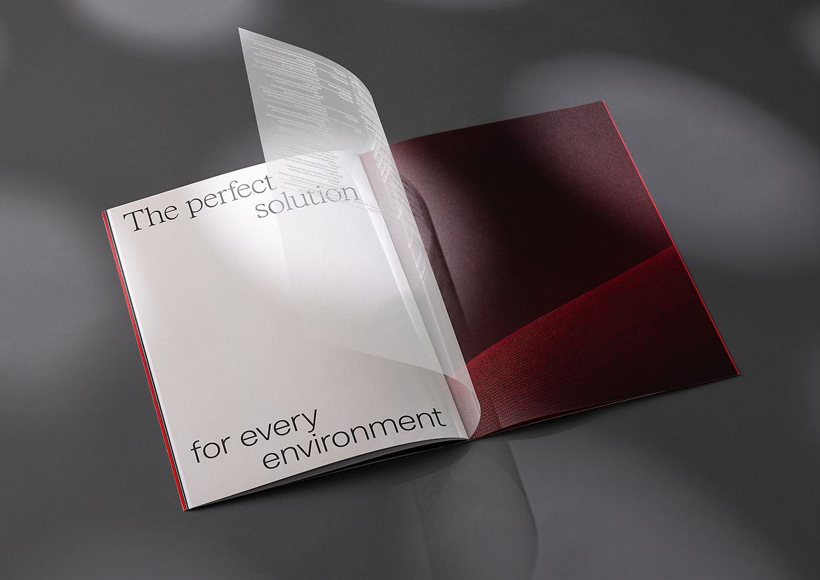
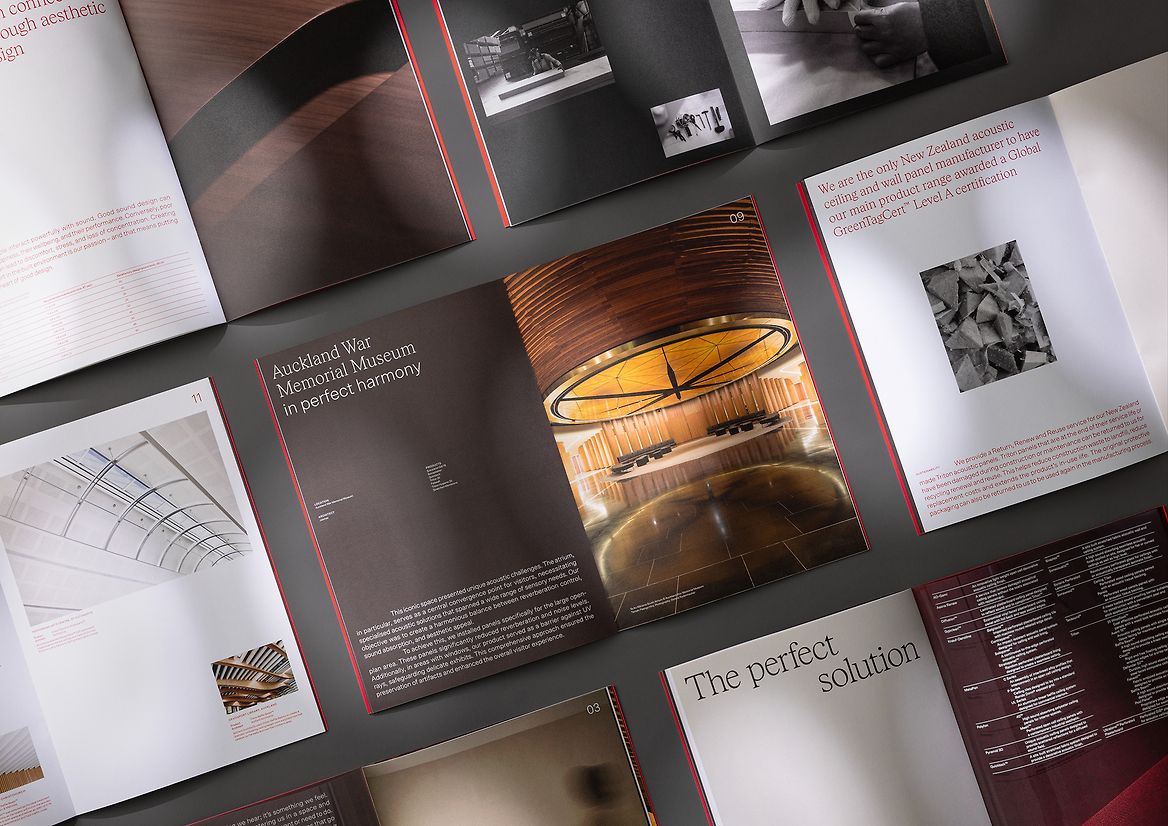
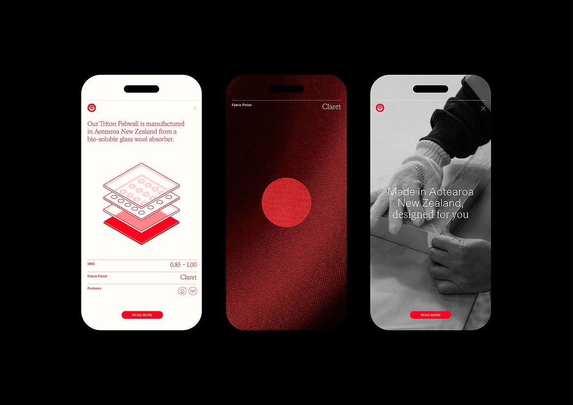
The design shift focuses on appealing to the core demographic of project decision-makers – architects. With an extensive product range, the brand needed to shift to deliver the complex, technical information in a way that felt both inspiring and easy to navigate.
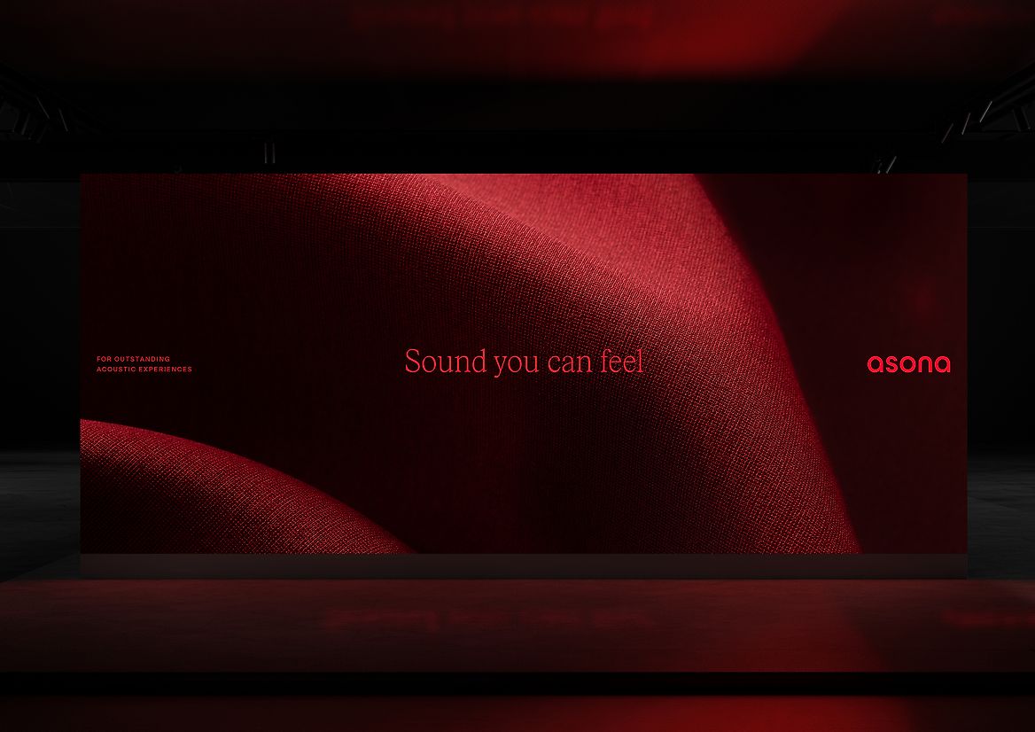
Colour palette, typography and brand elements were designed to reflect both expertise and connection. A distinctive image treatment that reflects the harmony of an environment perfectly in tune. Utilising the movement and interaction of people as a textural element with the room itself as the main character. Putting focus on the things that go unnoticed.
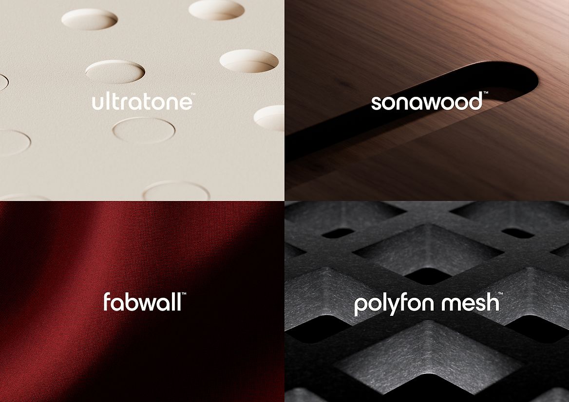
Visual metaphors are applied through 3D renders which demonstrate both the flexibility and possibility of what can be achieved with Asona’s unique range. Elevating products beyond purely their composition, and more to a study of what can be achieved aesthetically.
We created a crafted wordmark, maintaining the history of their past. It features refined forms that feel balanced, ergonomic, and flow. The engineered forms mirror the techniques and precision applied to product perforations.
The result is a brand that is more refined, balanced and authentic: altogether a better fit for the client’s fundamental desire to find economic, social and sustainable outcomes that shift the needle for the industry.
It is also helping the client market in more effective and authentic ways. Holding its strong New Zealand market position and leveraging that strength to support export growth into Australia, Asona is pioneering new benchmarks for how acoustics can sound, look, and feel.