Graphic
Meridian Energy Lovework Studio 3 Powershop Visual Identity evolution
-
Pou Auaha / Creative Director
Campbell Butler -
Pou Rautaki / Strategic Leads
Elise Santangelo-Rous, Philippa Dawe, Kate Smith
-
Kaituhi Matua / Copywriter Lead
Liam Hill
-
Ngā Kaimahi / Team Members
Robin Butler, Wilson Leung, Jennifer Wen, Lucinda Clark, Ashleigh Mackenzie, Rick Shearman, Rebecca Goodwin, Richard Coldicott, Mansur Amiri -
Kaitautoko / Contributor
David Geard
Description:
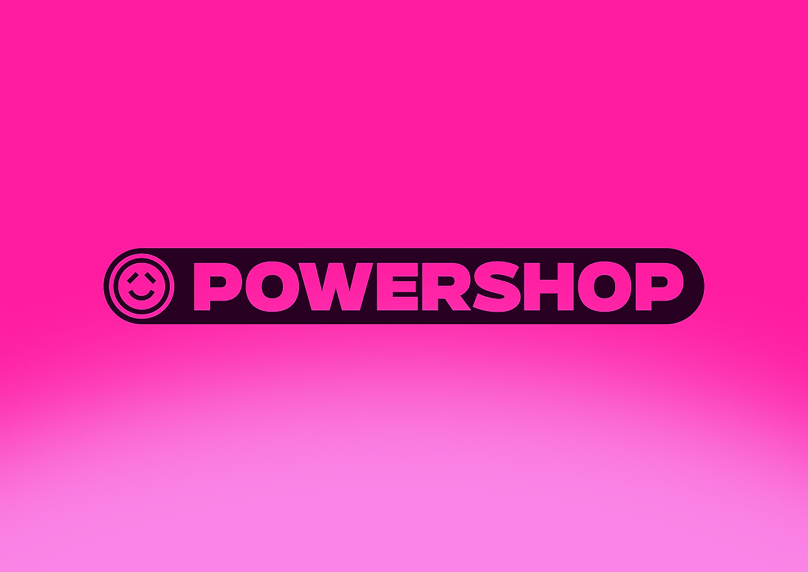
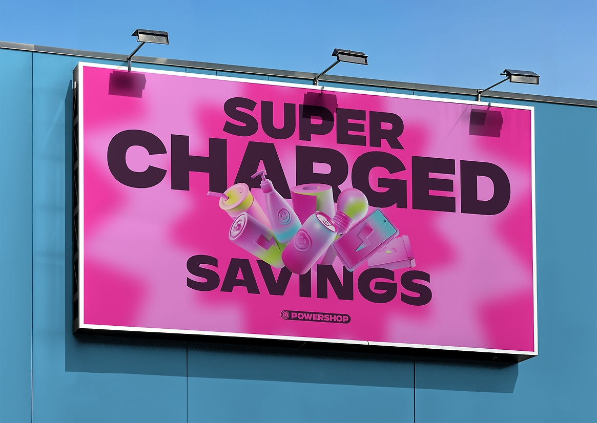
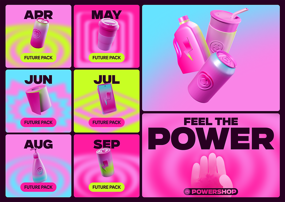
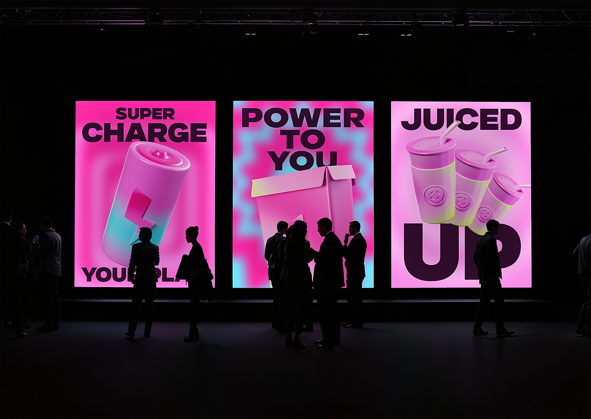
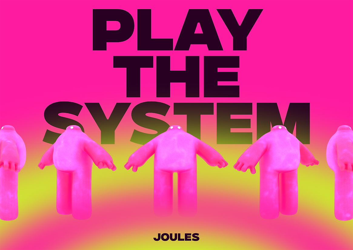
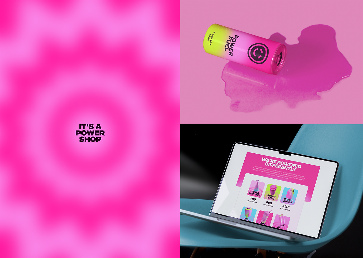
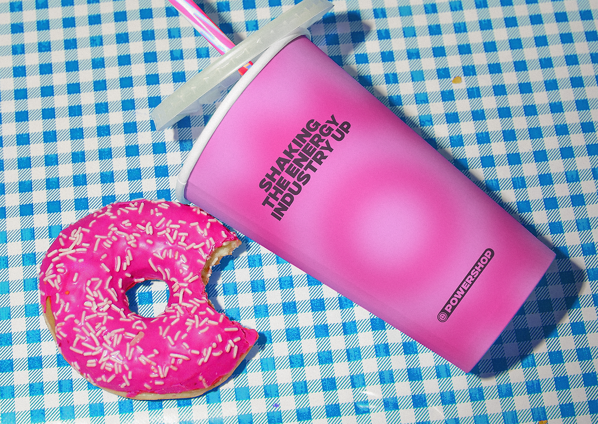
Powershop are an energy retailing business in New Zealand. They do things differently and always have. As the name suggests they are a power shop. They sell power to customers at great value rates in ‘Power Packs’ that they purchase in advance. Saving money and giving customers the power. Recently there have been lots of power ‘disrupters’ entering and exiting the NZ energy market, which has been challenging their challenger position. So it was time to change the game. The role Powershop now plays in the world is ‘Game Changer’ – encouraging customers to ‘Play the system’ and make the most of their power. We’ve gone simpler. We’ve gone bolder. We’ve got more. More shop. More power. More Jules (their friendly mascot). The shockingly bright identity borrows cues from computer games, value stickers and the grocery store. A delightful and unexpected mashup that celebrates how thousands of power shoppers shop for power in the power shop.
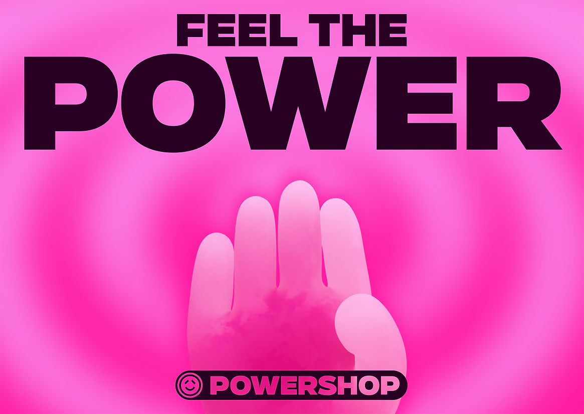
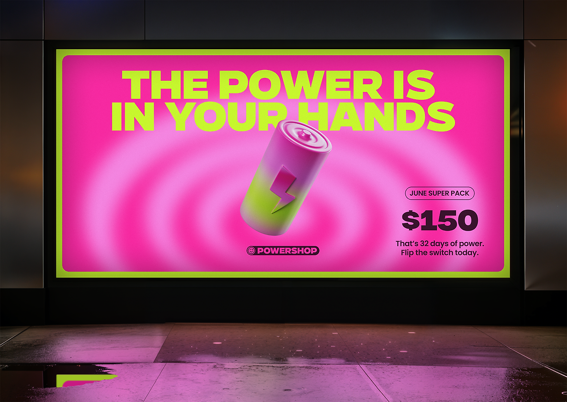
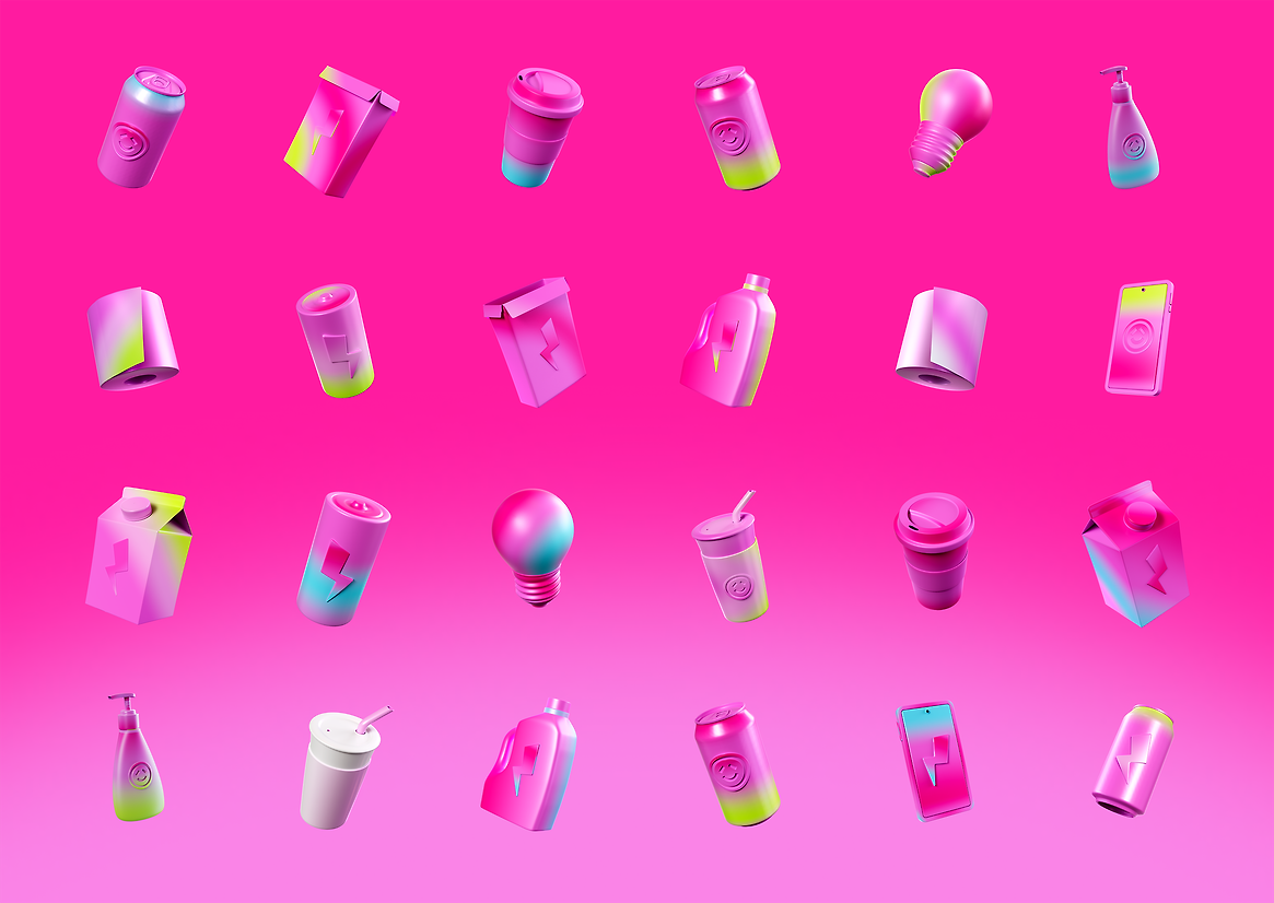
Building on the ‘Game Changer’ role that Meridian plays in customers lives – the identity gamifies the power shopping experience enabling customers to buy power in new and unexpected ways. ‘Power Packs’ now take the form of common grocery items—now packed with power. Joules the mascot has been rebuilt and rigged so that it is easy to move and interact with customers in digital shopping aisles and across the socials. Joules is the shop assistant encouraging customers to buy stuff and making them smile whenever possible
The design system created a range of grocery items and different emoji hands (pink of course) to interact and celebrate good things. Rippling power patterns flow from the bright pink background providing the perfect backdrop for Joules and pulling focus onto the Power Packs. It’s louder than ever and simpler too – creating stronger levels of consistency across every touchpoint. To make the pink pinker we introduced shock yellow and bolt cyan. Type vibrates and ripples as if being zapped with volts of electricity. The logo has been crafted so that it is simpler, cleaner and works at almost any size. It comes with a new range of behaviours and helps the wordmark ‘Powershop’ to punch out more on a lozenge button – further reinforcing the ‘buy now’ attitude of the brand. Everything is light hearted, fun and puts power into the hands of the customer – making energy cheaper.