Graphic
Marx Design 65 Autex Industries 9 Autex Acoustics
-
Pou Auaha / Creative Director
Tristan O'Shannessy
-
Ringatoi Matua / Design Directors
Ryan Marx, Manuel Payan
-
Ngā Kaimahi / Team Members
Janine Bickerton, Anushka Harrison, Danielle Robinson, Shay Bruce, Autex Marketing Team, Nicola Kearns, Lydia Harden Bull -
Kaitautoko / Contributors
Kate Phillips, Yuki Sato, Brad Brown -
Client
Autex Acoustics


Description:
Autex is a large-scale manufacturer - the largest producer and market leader in interior acoustic products in New Zealand. They have healthy export volumes with manufacturing and sales teams in Australia, the UK and the USA.
Their acoustic products are chosen by leading architects around the globe and used in cutting edge commercial and residential spaces to drastically reduce the amount of atmospheric noise within a building. We were tasked with developing a new customer facing brand specifically for the interior acoustic products, previously branded with their corporate identity.
Autex’s acoustic products are expertly designed and highly innovative yet the corporate brand was rooted in manufacturing history, failing to adequately appeal to today’s designers and architects. We needed to shift brand perception from functional manufacturers to design-led innovators.
To get to the crux of the functional requirements of the brand, we began with an extensive audit of their product portfolio and conducted in-depth interviews with installers and architects to understand needs and perceptions.
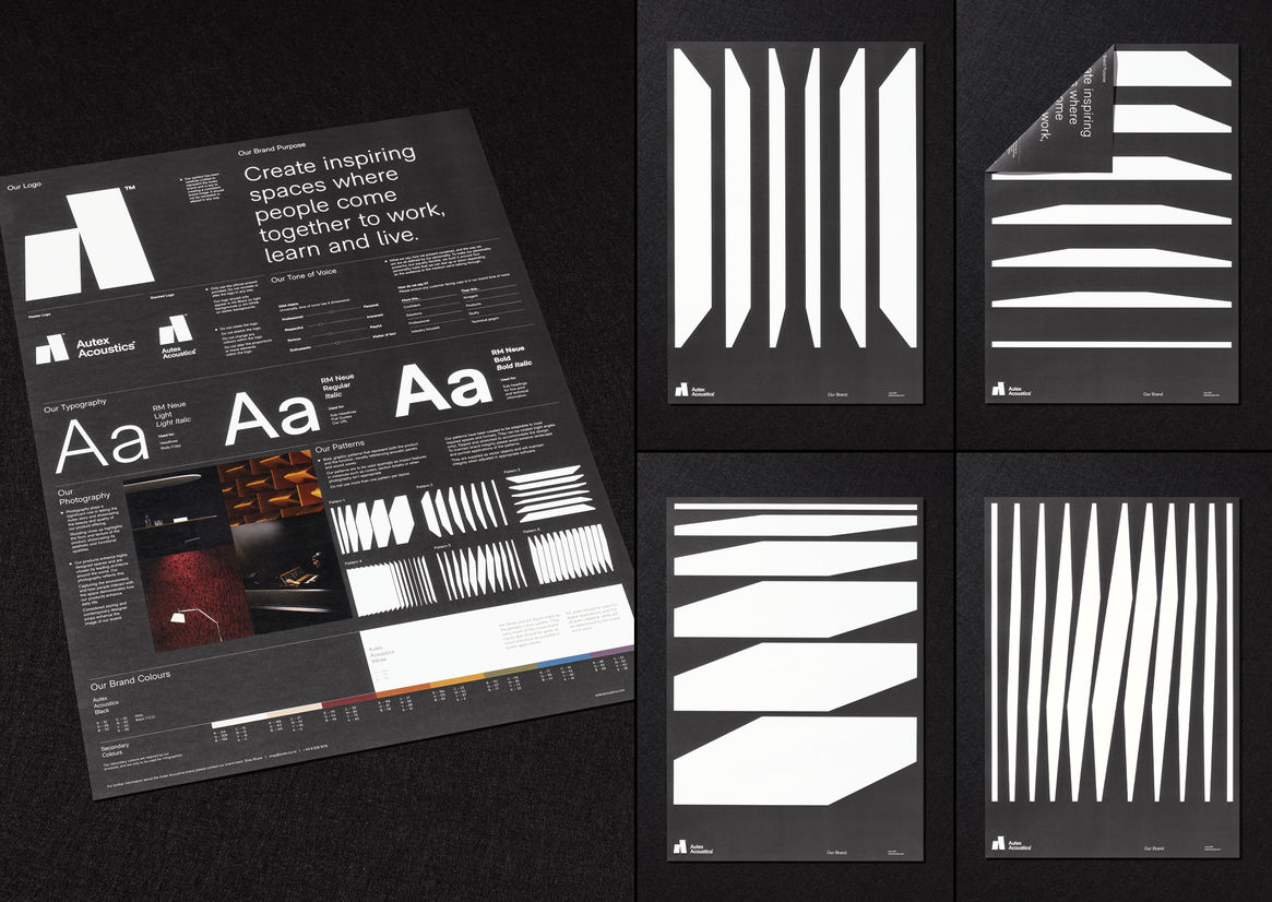
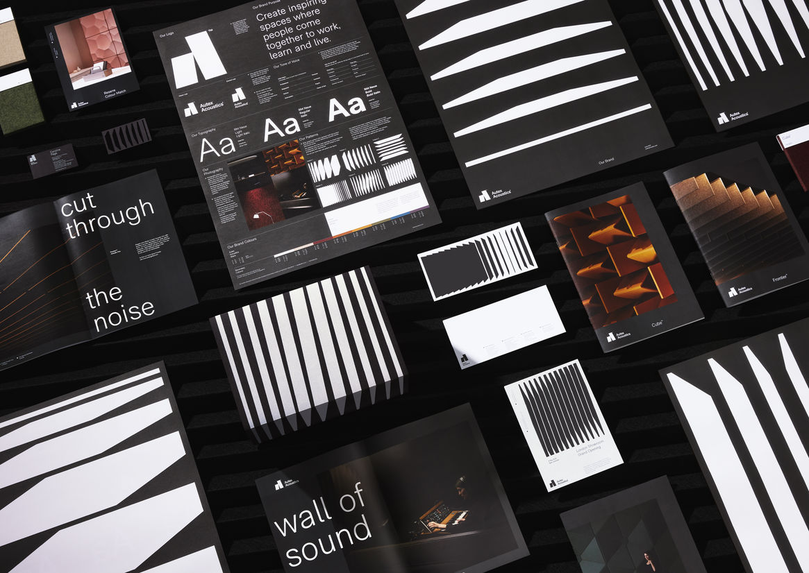
With the functional requirements of the brand organised, we next determined how we would present to the design savvy audience. A demonstration of timeless design principals, equally engaging and distinctive whilst also understated and considered – allowing the product shine was the intent.
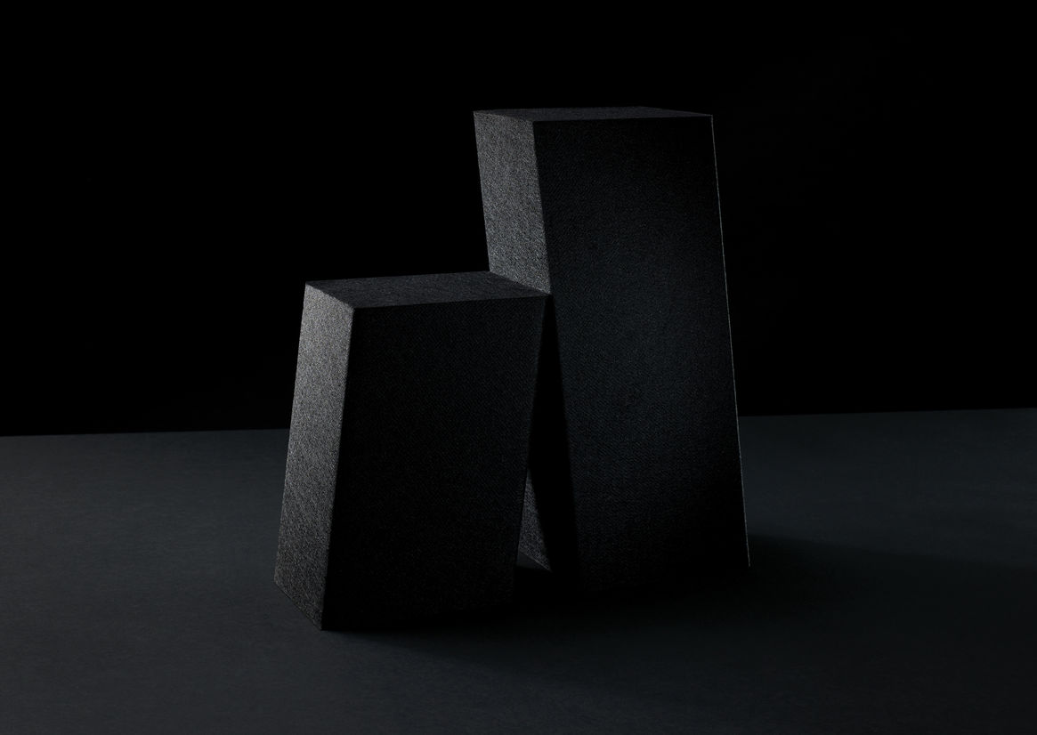
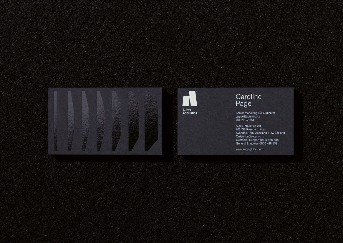
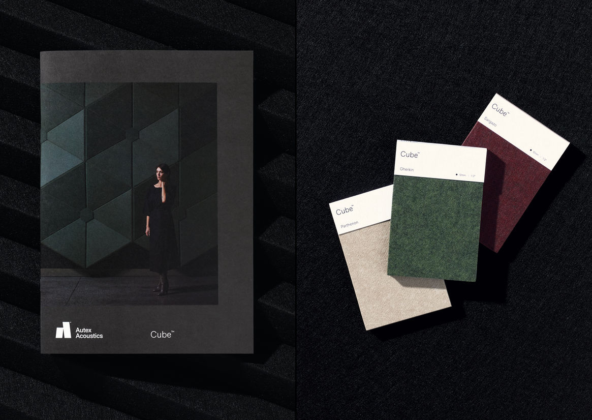
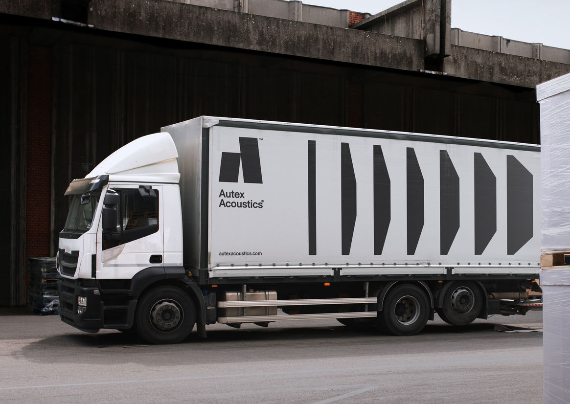
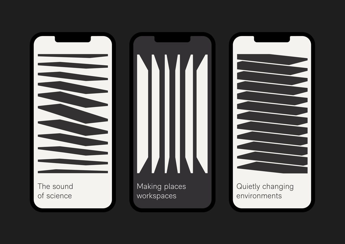
Taking inspiration from both the product and its function, we developed a suite of graphic patterns based on product panels and the quietening of soundwaves. These architectural, dimensional forms have been created to be adaptable to all touch points and serve as an ownable brand asset.
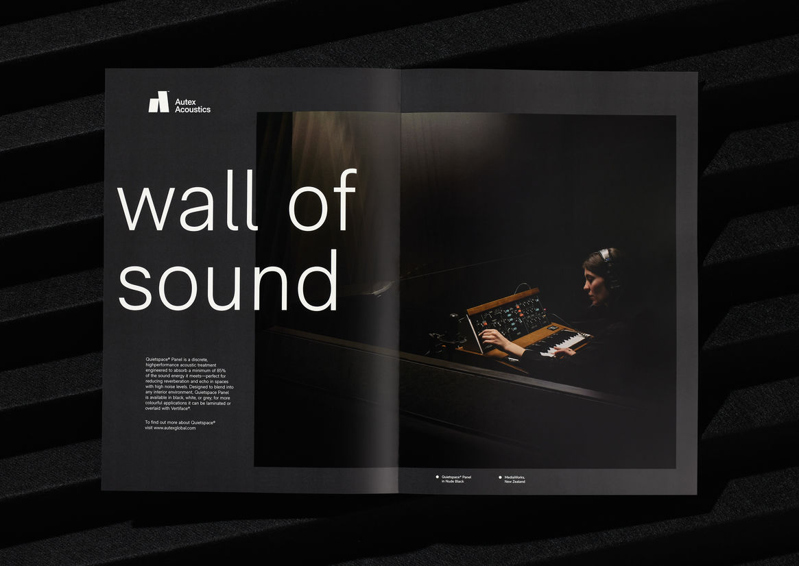
We reduced the palette to black and white, allowing for the myriad of product colours (a key selling point) to take centre stage in photography. A secondary colour palette was derived from their products specifically for infographics.
A personable, yet professional tone-of-voice was developed with engaging headlines making full use of the ‘sound’ subject matter.
Judge's comments:
A brave & bold execution of sound. The graphic interpretation of the product is beautiful and timeless. A large-scale brand identity that will stand the test of time.