Graphic
Lovework Studio Griffith University
-
Pou Auaha / Creative Directors
Campbell Butler, Robyn Butler
-
Ngā Kaimahi / Team Members
Ashleigh Mackenzie, Lucinda Clark, Jason Wood, Wilson Leung, Mansur Amiri, Richard Caldicott, Sam Vacquier, Briton Smith, Rick Shearman, Michail Kowal -
Client
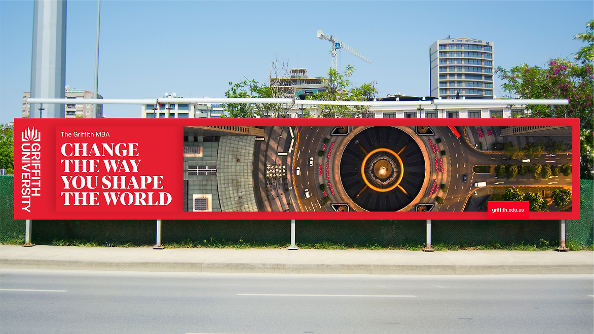
Griffith University

Description:
‘Make it Matter’
Griffith University is a Queensland based university, known internationally for environmental action, academic excellence, sporting achievement, creative culture and community engagement. They have five campuses in Nathan, Mt Gravatt, Southbank, Logan and Gold Coast. In close partnership with the marketing, digital and brand teams, Lovework Studio helped to refresh the brand.
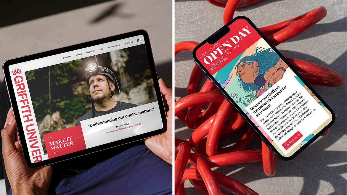
Complicated rules and dated guidelines made the identity difficult to work with for internal teams. The book symbol and Griffith red were recognisable locally but many elements lacked craft and consistency. It was time to evolve the brand to make a more contemporary identity that reflected their values. The refresh would enhance the digital experience and enable a sustainable rollout over time, avoiding waste and large implementation costs.
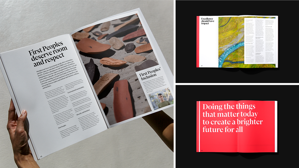
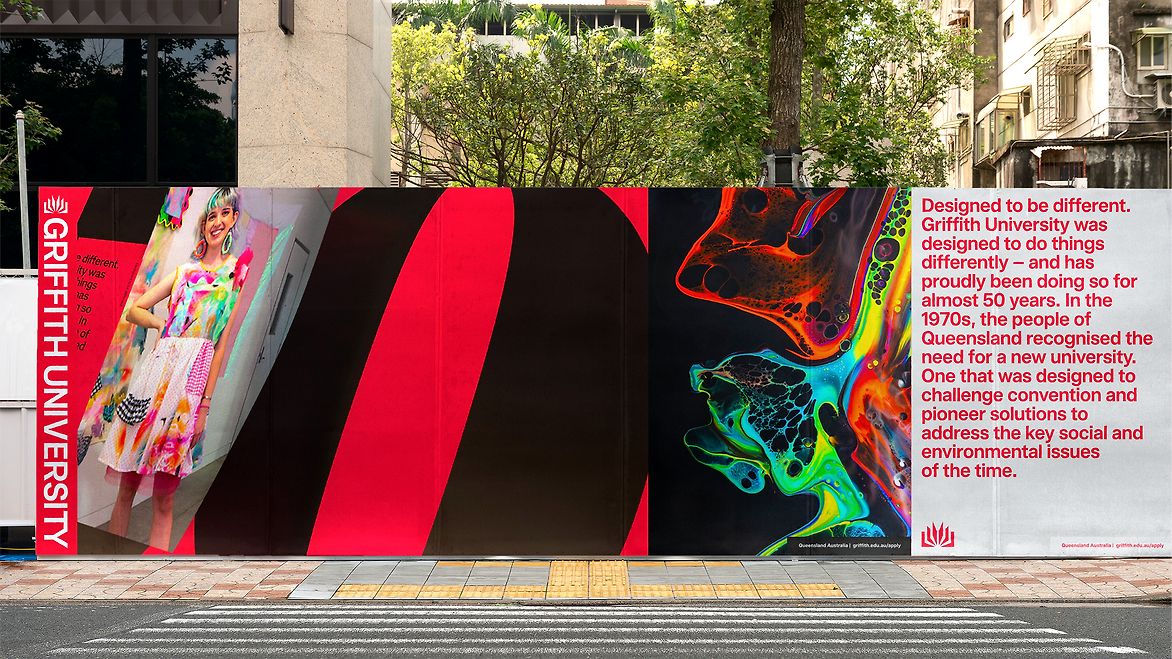
The new identity is bold, flexible and contemporary with carefully considered design elements that work together holistically. The values of the university are expressed through striking imagery, illustration and messaging.
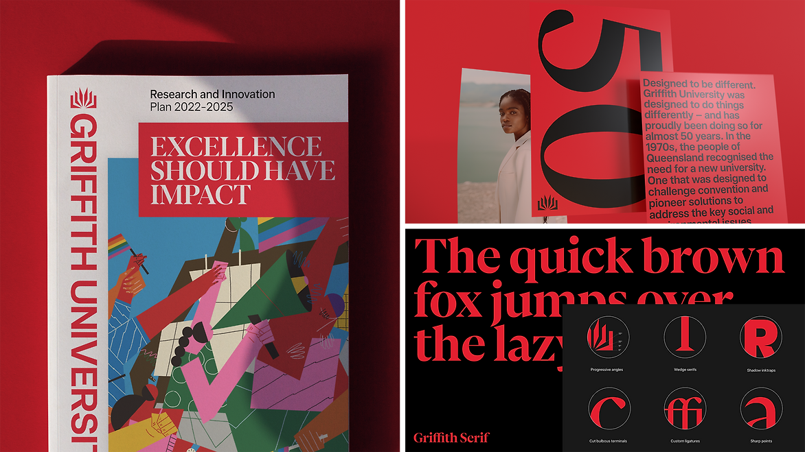
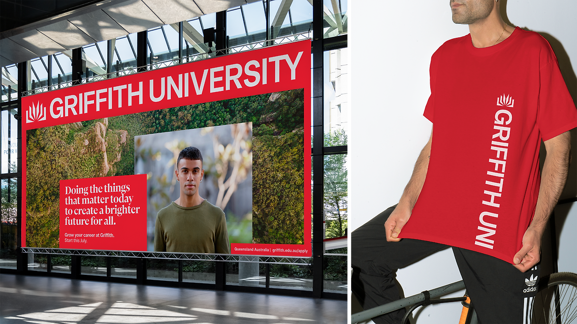
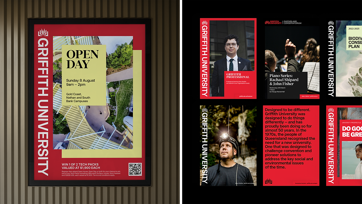
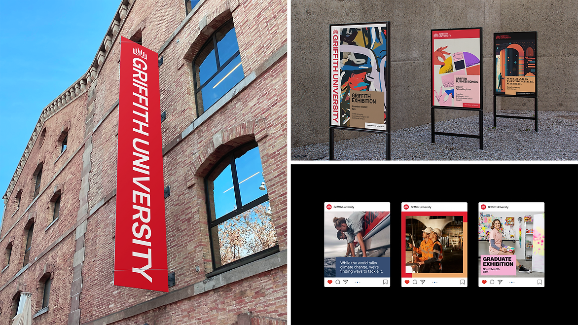
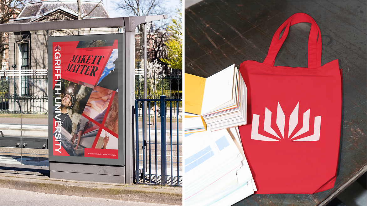
The previous logo always included ‘Griffith University Queensland Australia’ and often had several sub-brand variations. The symbol can now be used on its own, giving it more power and freedom. The wordmark can be stacked playfully in different configurations to make it more versatile and iconic for layout – where it runs vertically down the edge of the page.
A family of variable typefaces were developed in partnership with Family Type. The typefaces are highly legible and built to last. The sans and serif families have been crafted to work together. They share angles, points and elements from the symbol to create a subtle relationship between the typefaces and the logo. There are alternate characters and beautifully crafted ligatures that are a crucial part of the design given that ‘Griffith’ uses a ‘ffi’ ligature. The four families cover every requirement of the university, with weights and spacing set to maximise functionality for digital and printed applications.
Red, black and white are the leading colours of the uni. Colours are now accessible and a set of natural secondary colours reflect the natural Australian bushland that surrounds the university campuses.
The 'leaves' of the book are used as the layout device. The leaves layer on top of one another to form various layout configurations. Layouts are driven by margins and grids to keep everything organised and beautiful.
Brand elements and layouts have been designed for animation. The leaves of the book flick through portraits and environmental textures, representing the stories that make up Griffith University.
Every element has been crafted as an attractive set, sharing angles, forms and elements from the logo. Comprehensive guidelines keep everything in place and cover additional topics including sub-branding, partnership, campaign components and animation.