Graphic
Insight Creative 59 Argosy Brand Refresh
-
Pou Auaha / Creative Director
Brian Slade -
Pou Rautaki / Strategic Lead
Steven Giannoulis
-
Ngā Kaimahi / Team Members
Josephine Ross, Steven Giannoulis, Claire Evans, Joanne Otto, Emma Thompson -
Kaitautoko / Contributor
Chris Davidson -
Client
Argosy Property Limited

Description:
The brief
Argosy’s story has evolved in recent years, so we were asked to help them define who they are and what they stand for and to build awareness and understanding of their story. Specifically they wanted to tell their story in a cohesive and compelling way, differentiating them from competitors, to engage their core audiences.
We started by reviewing research on what investors and tenants value, conducting a competitor analysis, and running a workshop with senior leadership to better understand how they saw themselves, their sector, their audiences and success.
The solution
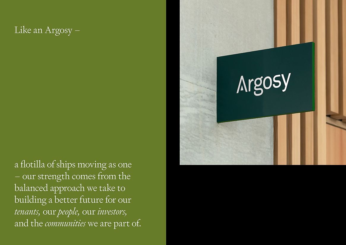
Our starting point was the development of a compelling single-minded brand story. Our core positioning idea ‘Building a Better Future’ connect their property, tenant and community activities and creates a reason to care for their audiences. Building a better future speaks to supporting tenants growth, growing investors’ money, while also taking a sustainable approach to community and environment.
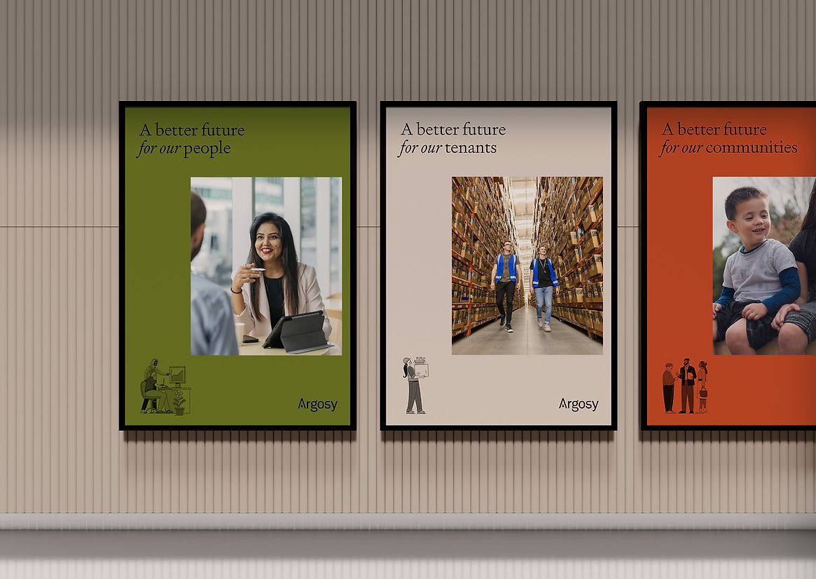
A number of internal and external discussions allowed us to refine the story, build a unique and compelling green narrative and define the tone of voice. From there, the story was turned into a message house, tailoring key messages to audience needs, while always tying back to the unifying positioning.
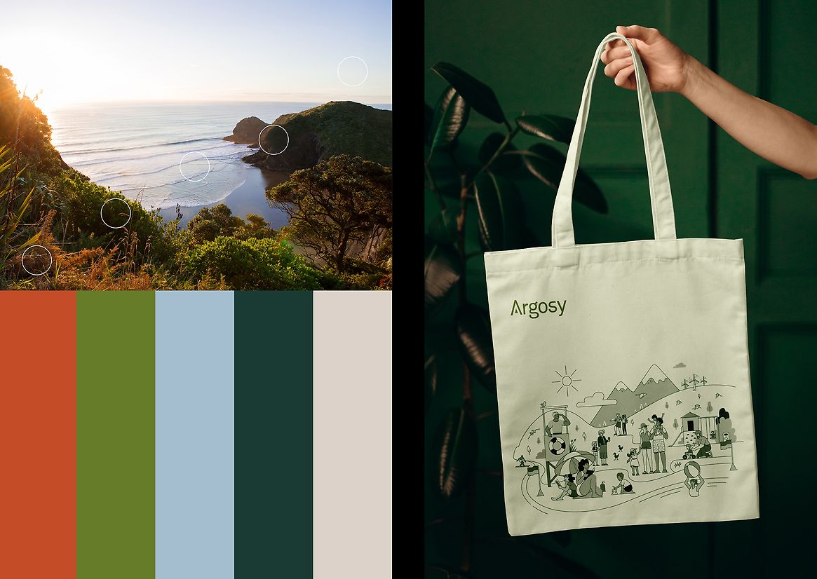
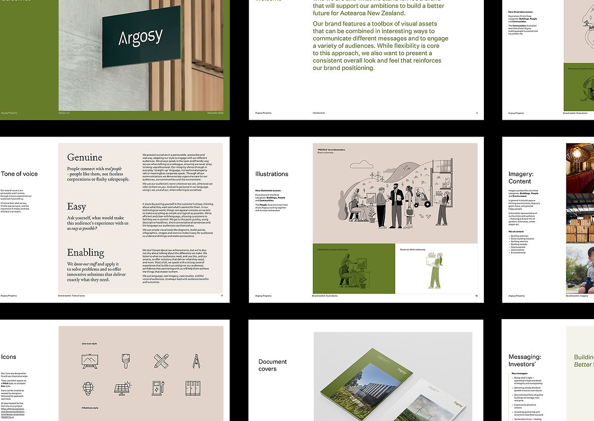
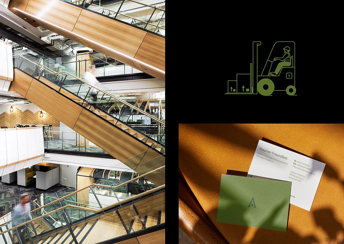
With their story defined, we turned to considering the evolution to the visual identity needed to best tell their story. We started with a fresher, more dynamic colour palette that built on their existing colours and incorporated a greener, New Zealand community perspective. Photography evolved from featuring just the buildings, to focusing on the people and activities within, and surrounding, them. Icons were made softer and simpler and typography was advanced to reflect the strength and structure of their properties, while also having a strong human element.
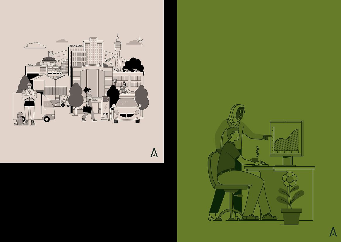
An illustrative language was added, providing a strong storytelling device that connects their activities. It’s modular approach allows each illustration to be used as a whole or for elements to be pulled out, and combined with others, to tell more targeted stories.
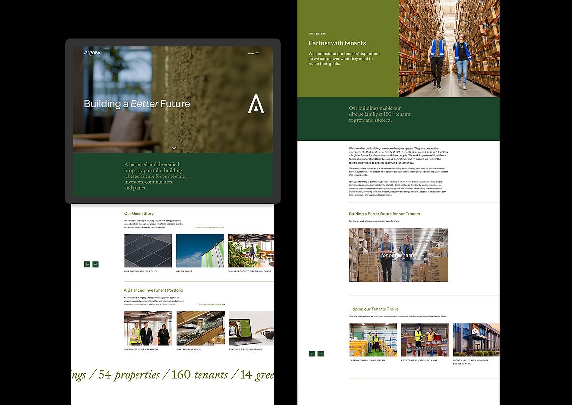
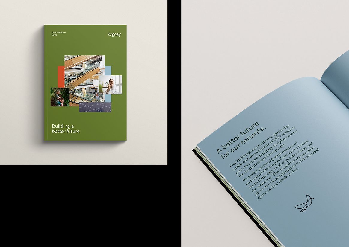
The next step was to launch and roll-out the new story and identity. Brochures, merchandising, templates, reports and other collateral were all developed. The most significant work was designing a new website to bring in a stronger storytelling element that reflected the voice of both Argosy and its audiences. Re-writing the copy in the new tone of voice, introducing high-impact photography, videos and case studies allowed us to showcase, in an engaging way, how a better future was being delivered. A comprehensive marketing programme, using existing channels, publications and targeted advertising followed.
The result
The work delivers a strong and cohesive message, across all of Argosy’s activities, speaking to their outcomes and impact, providing compelling reasons for stakeholders to engage with them. A more sophisticated design and tenant-led focus, has repositioned them away from competitors, and allowed them to own the green narrative. The work has been noticed by competitors, media and target audiences, allowing Argosy to experience a level of awareness and understanding they’ve never reached before.