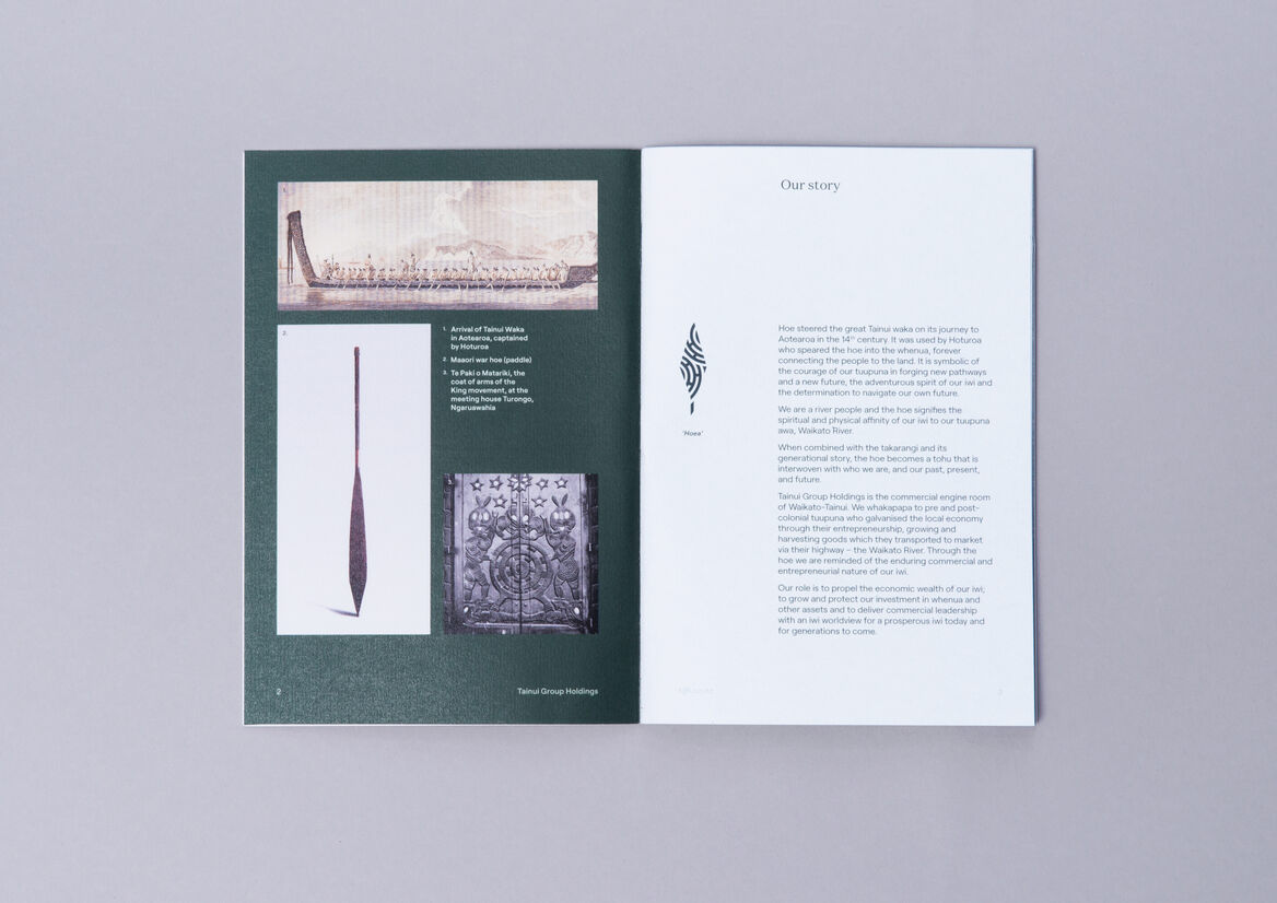
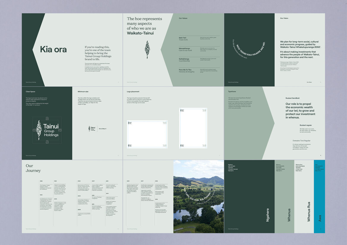
Tainui Group Holdings is the corporate arm of Waikato Tainui. It manages and develops iwi-owned assets for the benefit of the 70,000 tribal members.
The organisation has undergone a massive internal cultural shift since the previous identity was created. A new identity was required with more nuance and symbolism to represent the organisation’s ambitions and its close relationship with Waikato Tainui.
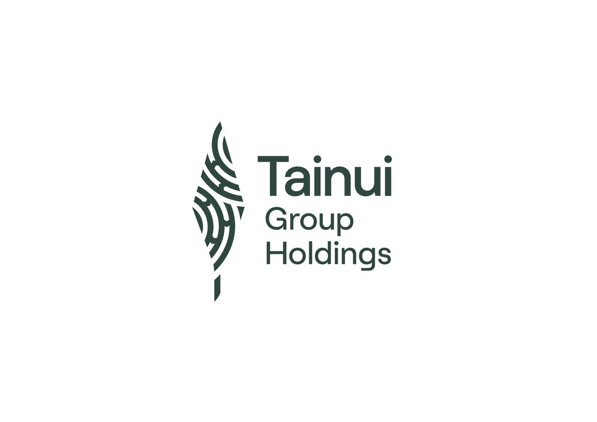
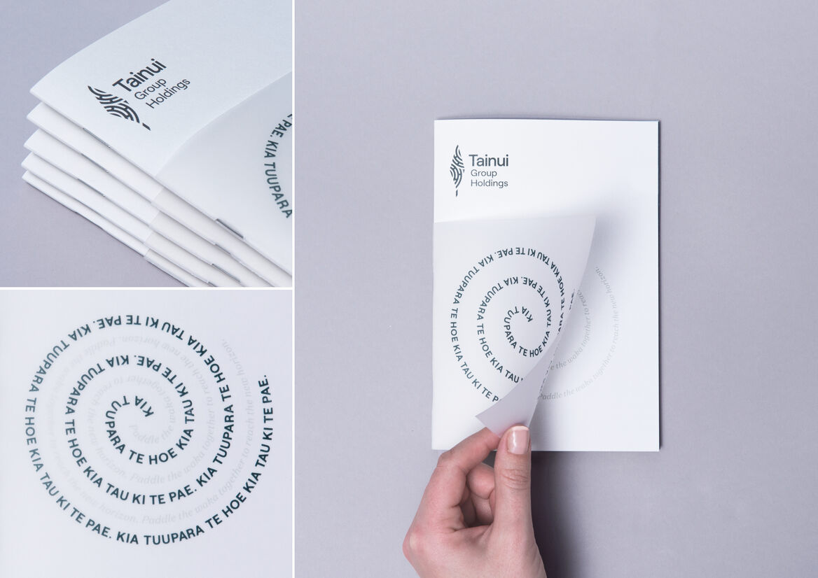
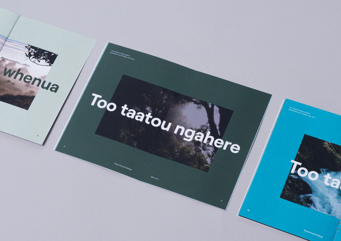
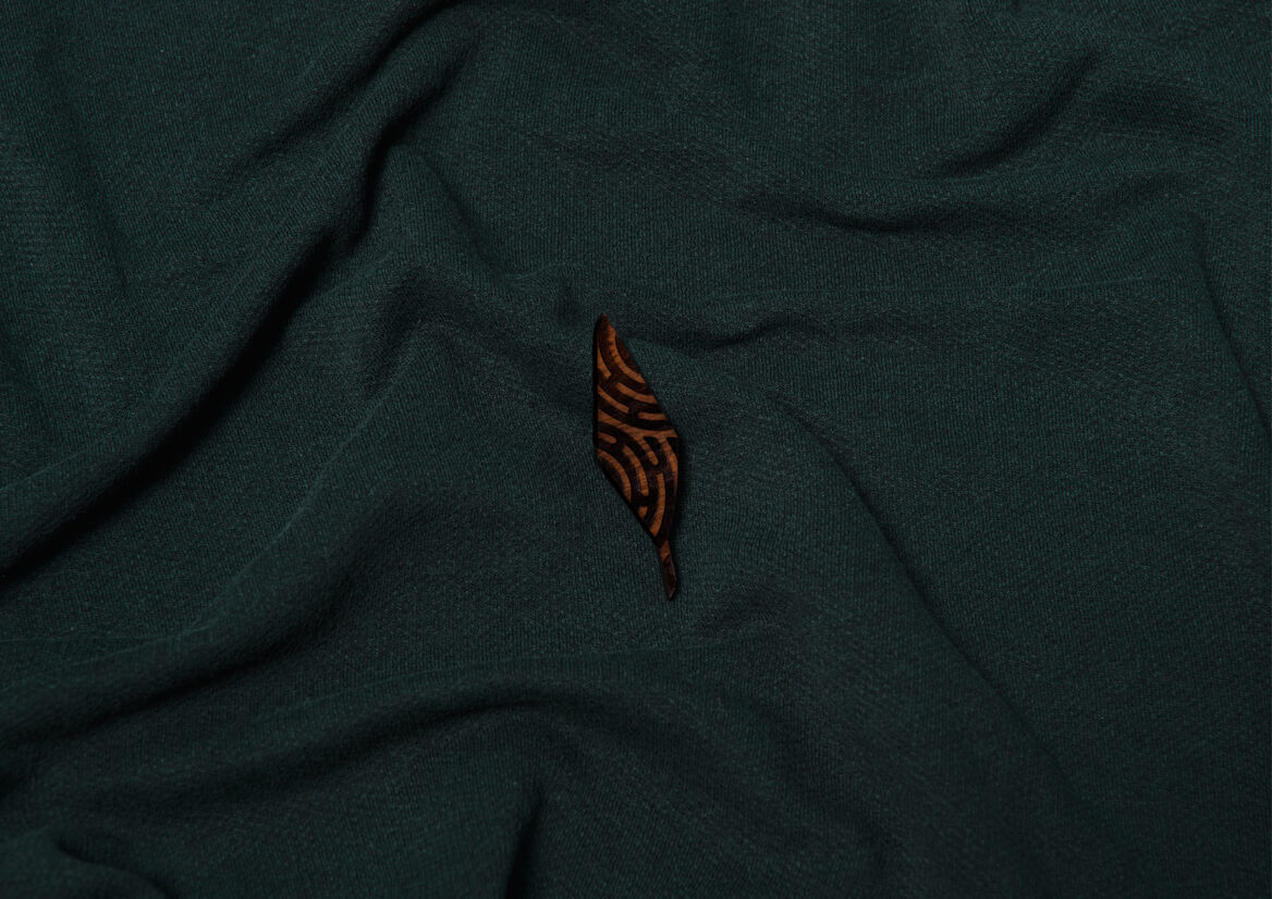
Our response was a design that straddles the commercial and Māori worlds. Typography and colour is appropriate for a contemporary corporate brand but the symbol of Tainui Group Holdings, the tohu, represents the DNA and whakapapa of Waikato Tainui.
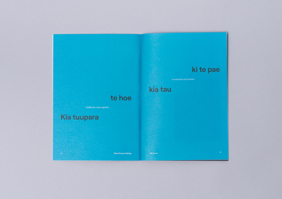
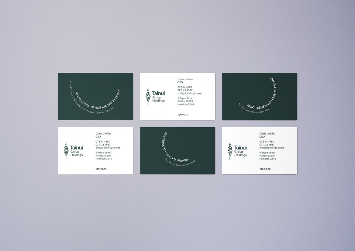
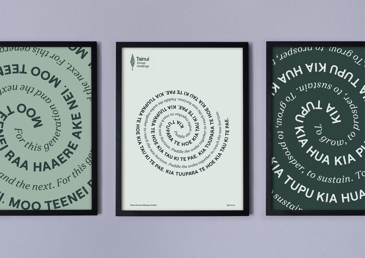
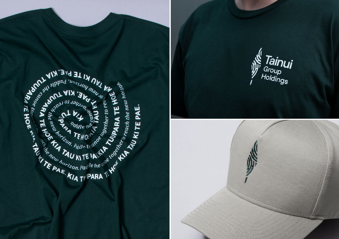
Waikato Tainui iwi are often referred to as “river people”, so the tohu is in the shape of a paddle (hoe), upright in ceremonial position. Within the shape are two linked takarangi patterns, derived from Te Paki o Matariki; the coat of arms of the King movement. It represents the connection from iwi ancestors into the future; an embodiment of the new tongikura (proverb) created for the brand; “Kia Tuupara a te hoe kia tau ki te pae” – Paddle the waka together to reach the new horizon.
Description:
Tainui Group Holdings is the corporate arm of Waikato Tainui. It manages and develops iwi-owned assets for the benefit of the 70,000 tribal members.
The organisation has undergone a massive internal cultural shift since the previous identity was created. A new identity was required with more nuance and symbolism to represent the organisation’s ambitions and its close relationship with Waikato Tainui.
Our response was a design that straddles the commercial and Māori worlds. Typography and colour is appropriate for a contemporary corporate brand but the symbol of Tainui Group Holdings, the tohu, represents the DNA and whakapapa of Waikato Tainui.
Waikato Tainui iwi are often referred to as “river people”, so the tohu is in the shape of a paddle (hoe), upright in ceremonial position. Within the shape are two linked takarangi patterns, derived from Te Paki o Matariki; the coat of arms of the King movement. It represents the connection from iwi ancestors into the future; an embodiment of the new tongikura (proverb) created for the brand; “Kia Tuupara a te hoe kia tau ki te pae” – Paddle the waka together to reach the new horizon.