Graphic
Howatson+Company 8 Familytype.co Rejenerated
-
Pou Auaha / Creative Directors
Scott Zuliani, Jared Wicker, Gavin Chimes -
Pou Rautaki / Strategic Lead
Dom Hickey
-
Ringatoi Matua / Design Directors
Trent Michael, Ellena Mills -
Kaituhi Matua / Copywriter Lead
Phoebe Gribble
-
Ngā Kaimahi / Team Members
Chris Howatson, Hoang Nguyen, Rebecca Robertson, Holly Alexander, Jason Nguyen, Gabriella Dudman, Phil Reyestan, Olive Jones-Evans, Simon Merrifield, Patrick Rivera, King Yong, Belle Simmonds, Maddy Phillips, Bao Luong, Beth Nokes -
Kaitautoko / Contributor
Briton Smith -
Client
ABC (Australian Broadcasting Corporation)
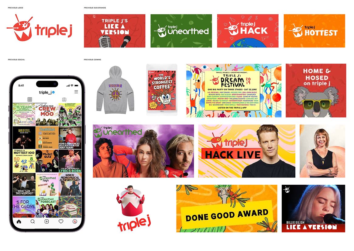
Description:
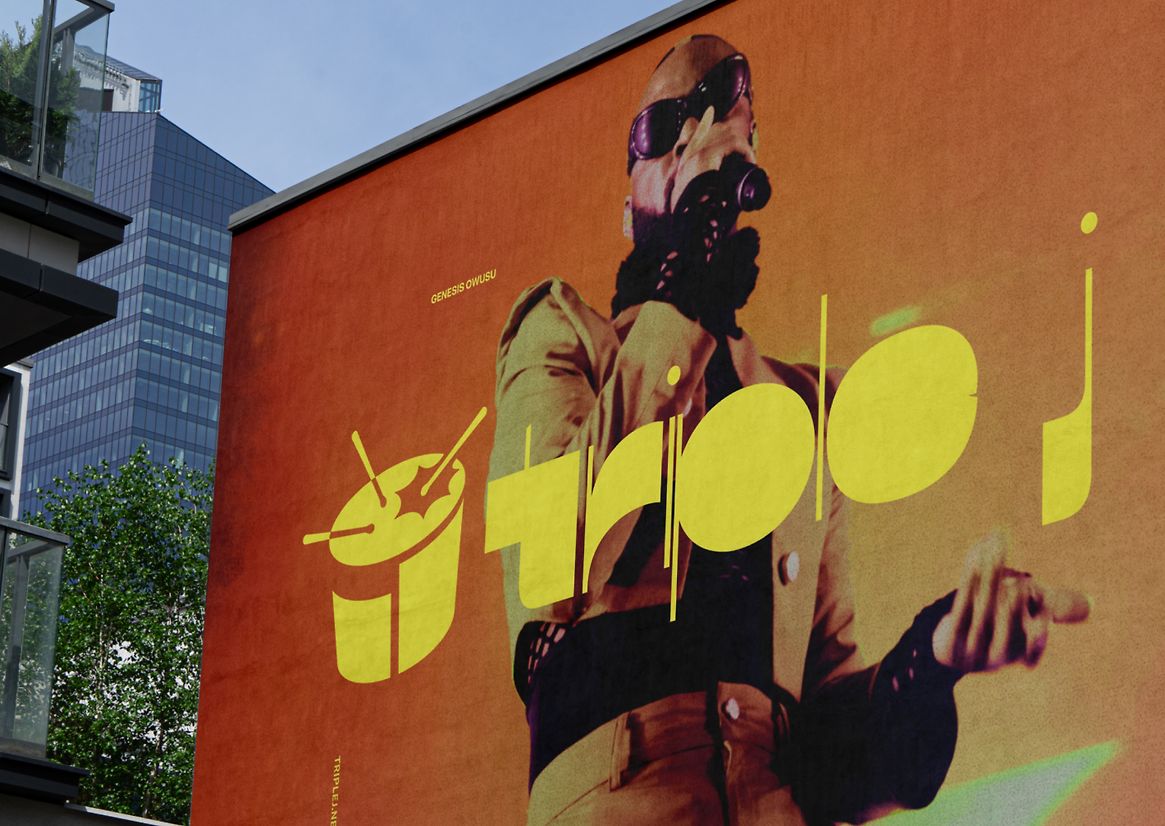
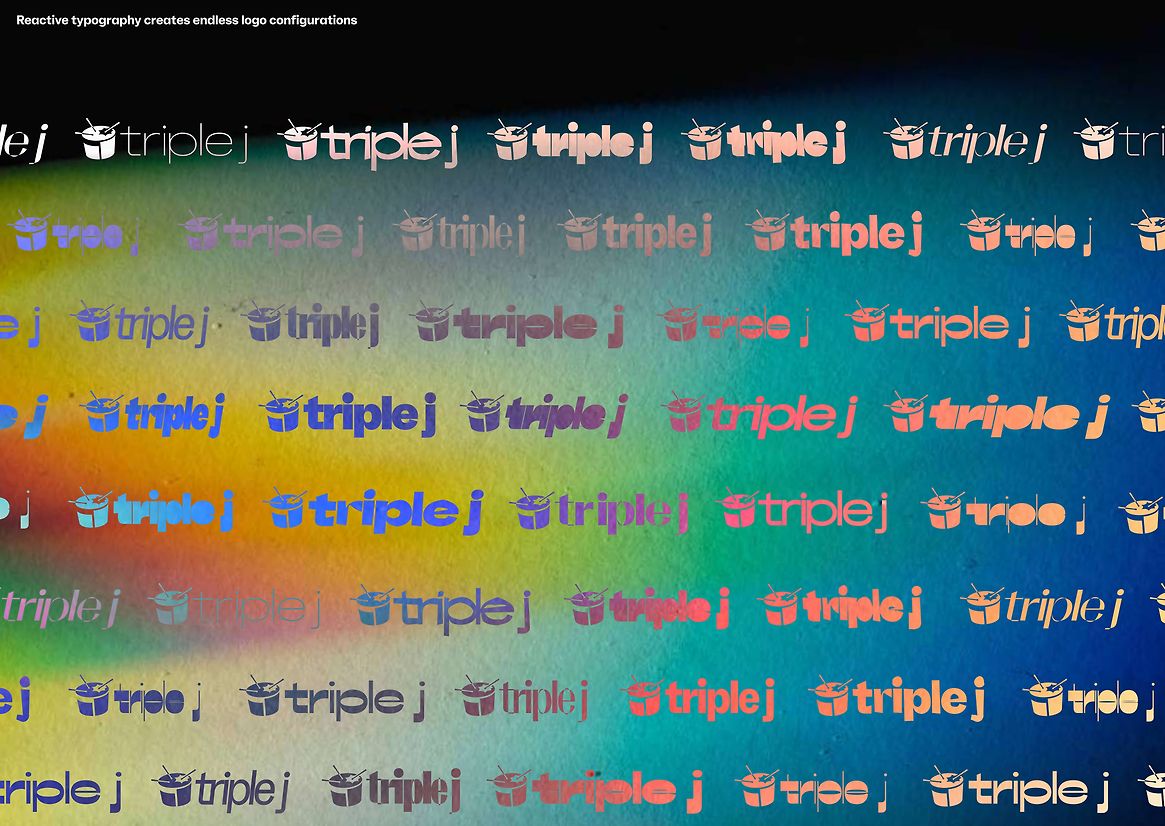
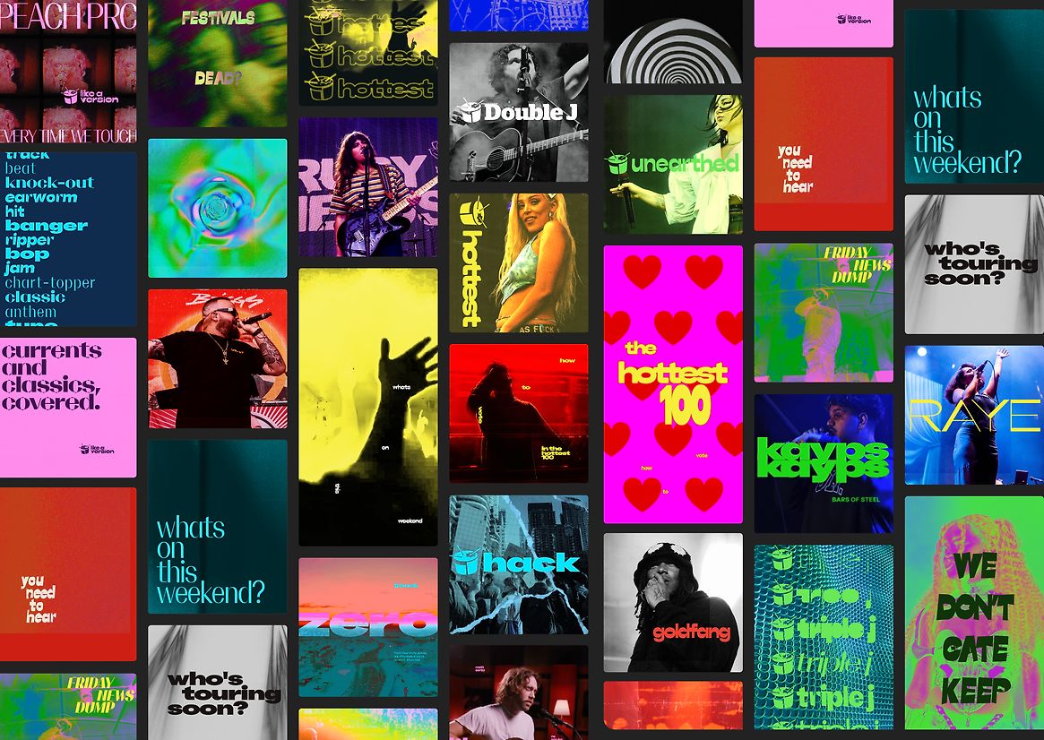
triple j isn't just a national radio station, it's the thudding heart of Australian youth culture. Yet despite having great content, the brand was outdated, static and didn't appeal to young people today. Introducing 'Rejenerated', an ever-changing brand identity made from triple j's ever-changing sounds.
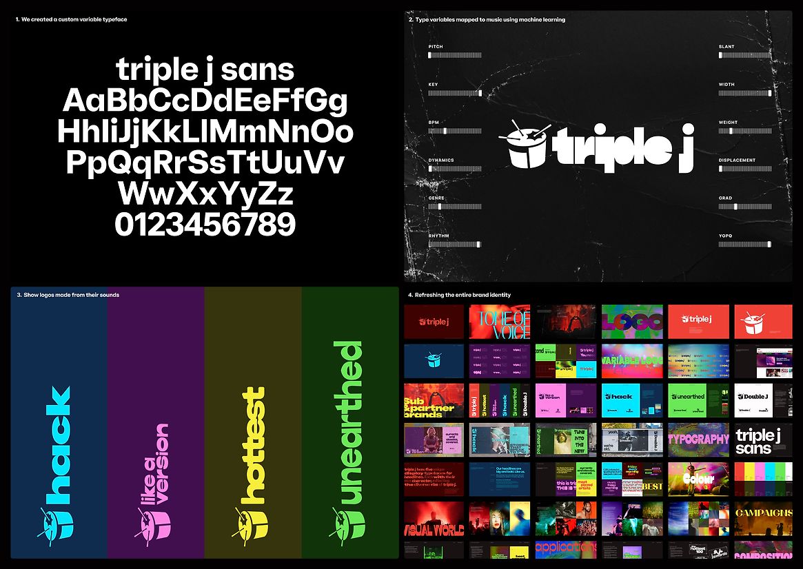
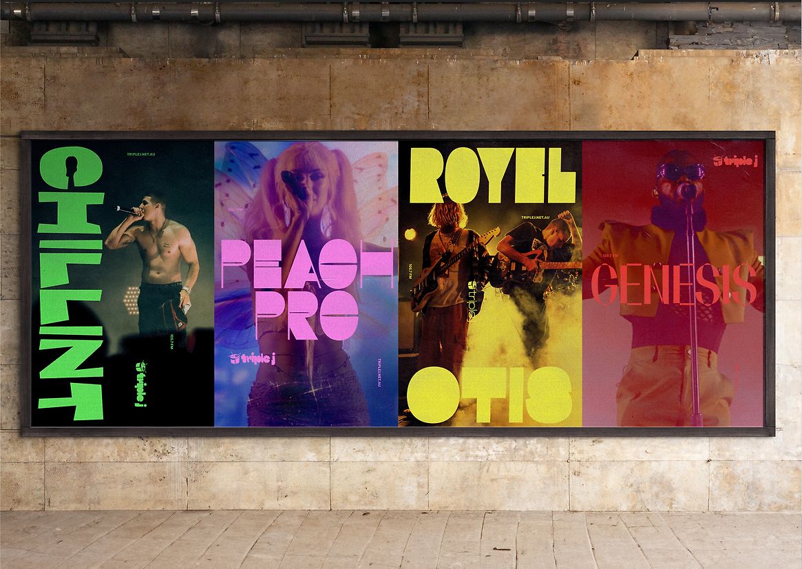
First, we created a custom typeface called 'triple j sans'. We then linked six type variables—Slant, Width, Weight, Displacement, Grad, and YOPQ—to musical traits like BPM, Pitch, Dynamics, Key, Genre, and Rhythm. A responsive algorithm adapted the type to audio input, generating a dynamic, sound-driven typographic system.
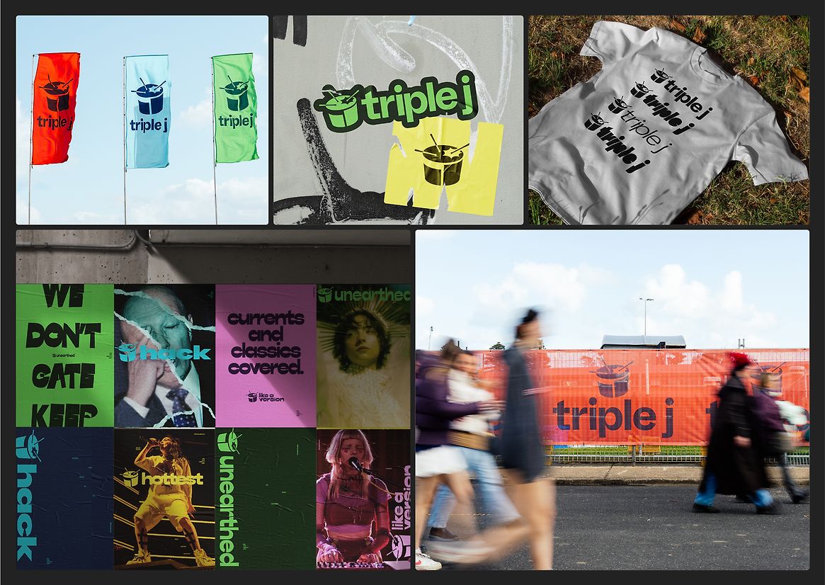
This enabled us to craft an ever-changing master logo for the triple j brand, directly from its sounds. Through this visual expression, we authentically captured the sound and spirit of triple j, applying the same methodology across all its sub-brands and programmes. The 'Hottest 100' title was generated from the top songs of the past decade, 'Like A Version' was formed from its biggest hits, and 'Hack' was crafted from its most provocative episodes.
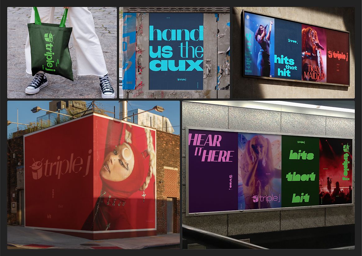
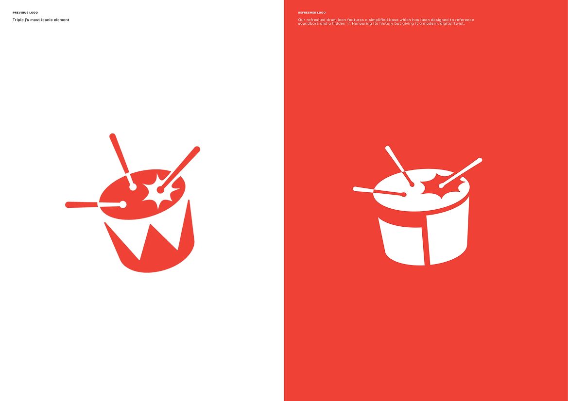
While the type is dynamic, the triple j brand and its sub-brands are unified through the presence of the iconic drum – which was updated to feature a modern soundbar-inspired base and incorporate a hidden 'j'. Despite these updates, we deliberately maintained the legacy drum logo as it carries significant heritage within the brand and has become an iconic symbol that audiences instantly recognise and connect with.
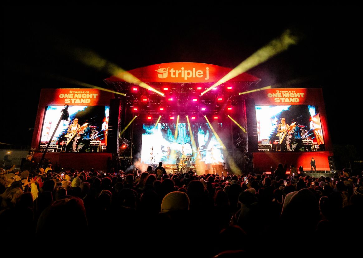
Defying the static rules of brand consistency, we developed a dynamic approach to brand expressions that allowed us to evolve the identity alongside culture. Built for online platforms, the identity is vibrant, with an arresting colour palette, textures, photography and soundboard inspired dynamic grid system.
The result is a brand identity that visually embodies triple j's sound—forever evolving with music and youth culture.
Judge's comments:
A fresh and relevant take on radio. Proof that radio is evolving from audio to an immersive audio-visual experience.