Graphic
Houston 36 QT Hotel Singapore
-
Pou Auaha / Creative Director
Alex Toohey -
Pou Rautaki / Strategic Leads
Stuart O'Brien, Daye Moffit
-
Ngā Kaimahi / Team Members
Cate Patterson, Ticky Lan, Dana Rogers, Stacey Saunders -
Kaitautoko / Contributors
Jill Tran, Stephen Grace -
Client
QT Hotels & Resorts

Description:
When the lines blur, things get interesting.
This is the essence at the heart of the QT Hotels brand. A spirit of freedom and expression that allows every new hotel to feel both intrinsically QT and entirely unique.
QT has long been a brand defined by its bold, playful identity – but as the boutique hotel market became more crowded, it needed to evolve. The challenge was to balance a sense of irreverence with one of sophistication, to be enticing rather than outrageous. The opening of QT Singapore, the brand’s first international hotel, offered the chance to redefine this balance. Building upon QT’s strong strategic and stylistic foundation to apply its positioning of ‘Quriosity’ to a context that felt authentically, unpredictably Singapore.
Our creative exploration began with curiosity and embraced personalisation. Each QT hotel needed to tell its own story, rooted deeply in its location and connected to its people, culture and heritage – all while steel feeling unique and unexpected. This approach defined which lines would be blurred and which would anchor the brand, making space for individuality within a larger QT identity.
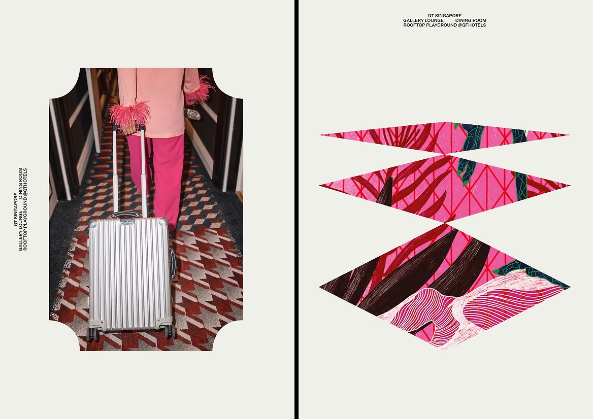
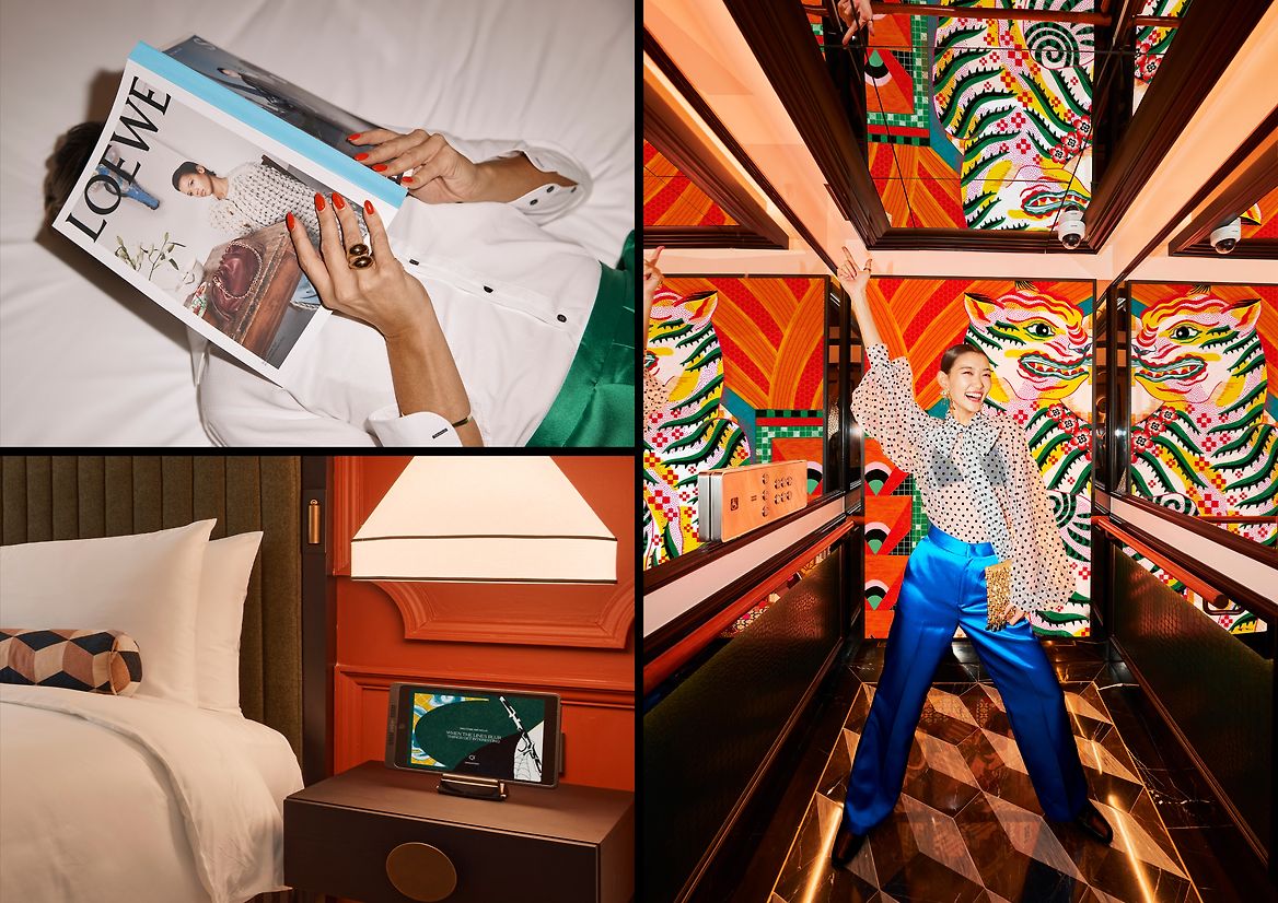
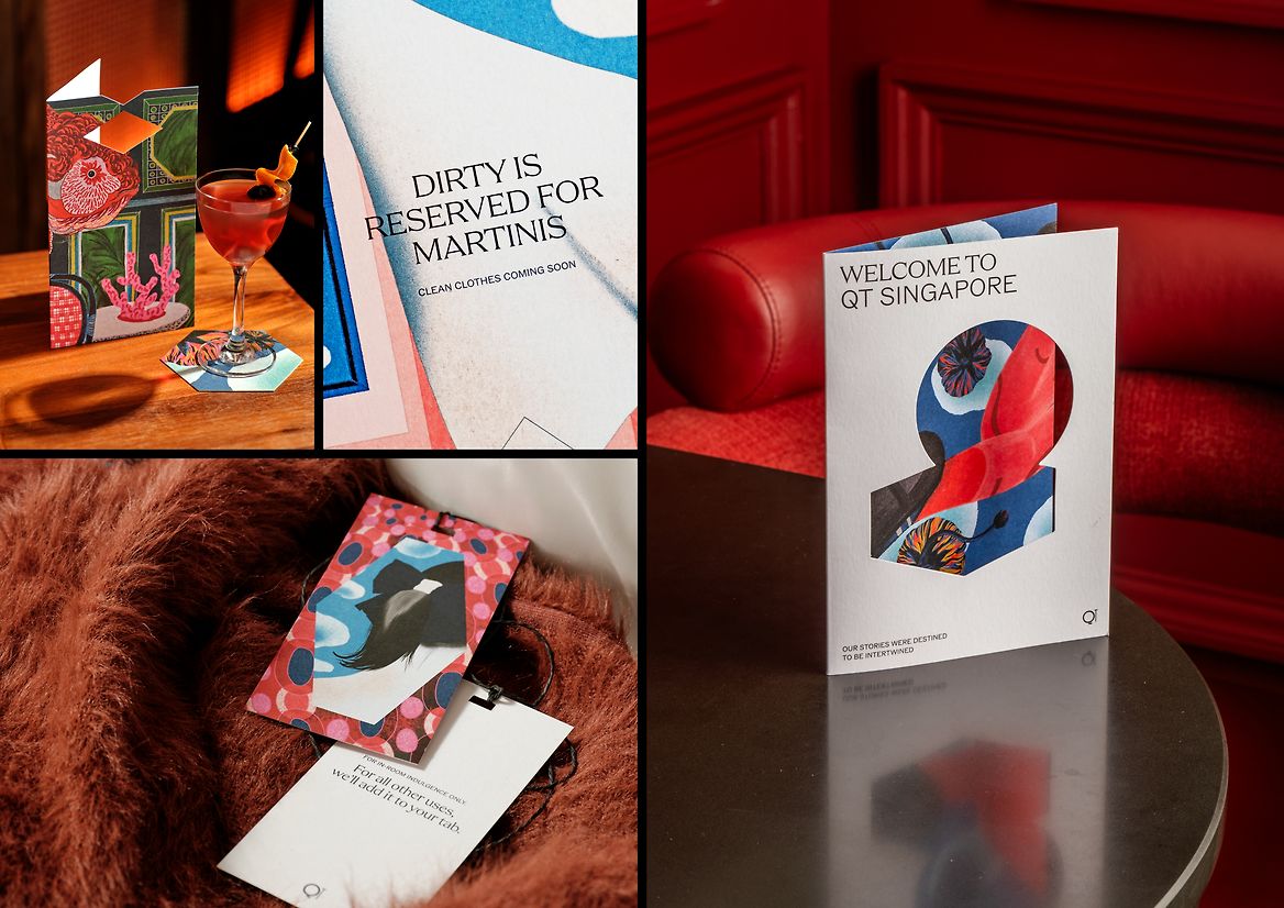
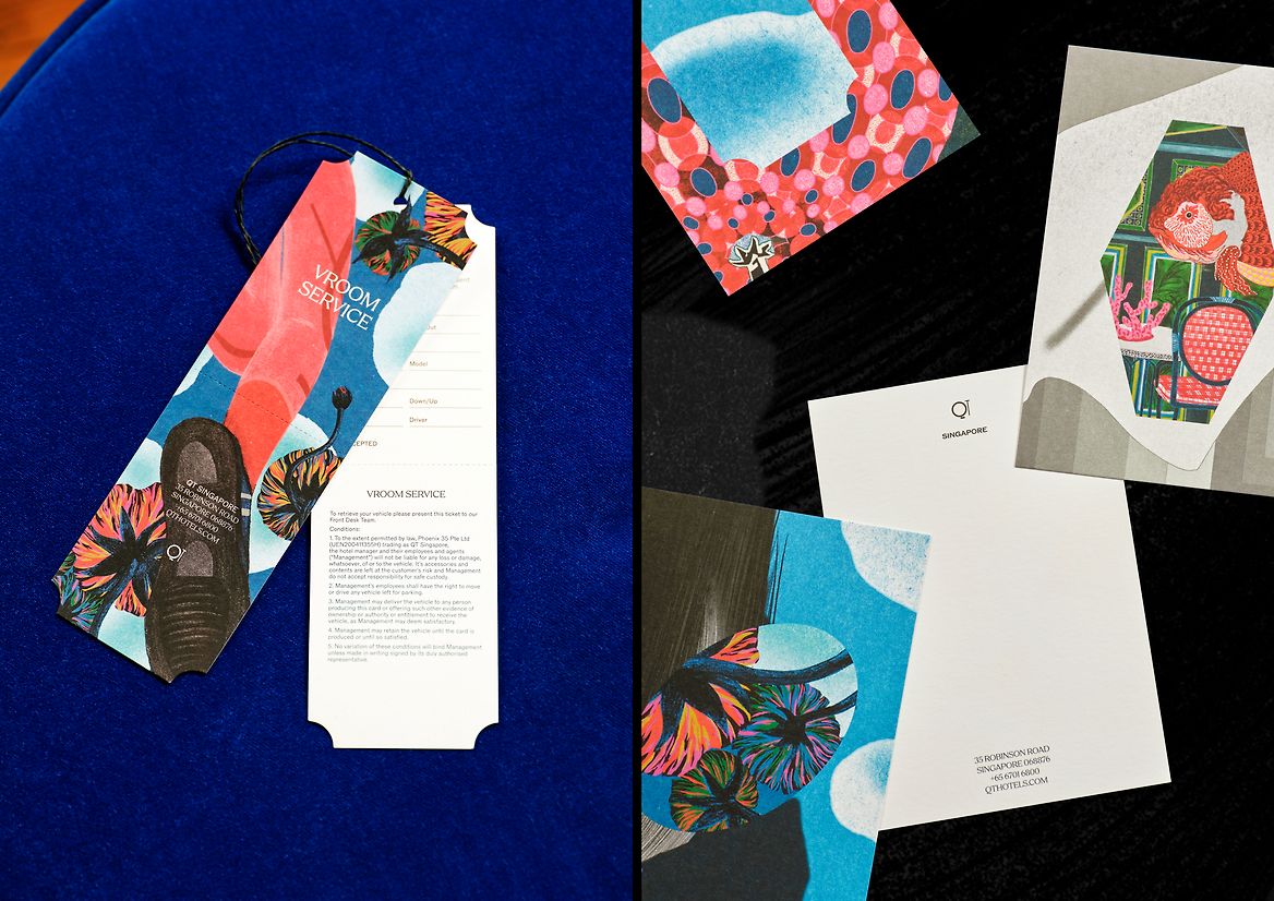
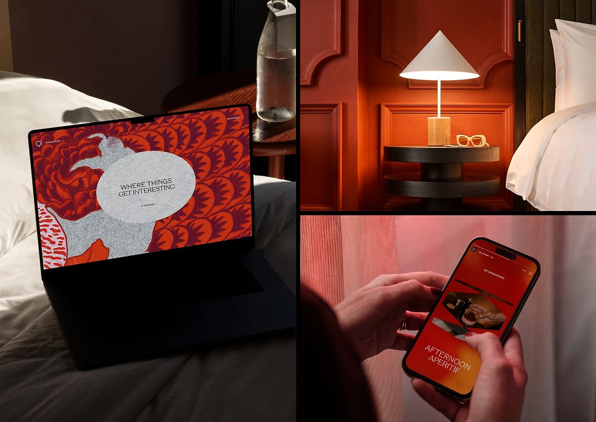
Two opportunities emerged to bring this to life. The first was a bespoke graphic language, built around a framing device that was inspired by the architecture, culture and heritage of Singapore. These frames serve as a lens through which the story of QT Singapore can be told – providing structure while still being infused with the character and vibrancy of its surroundings.
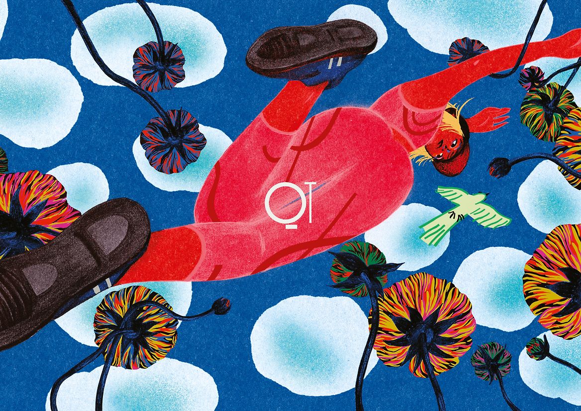
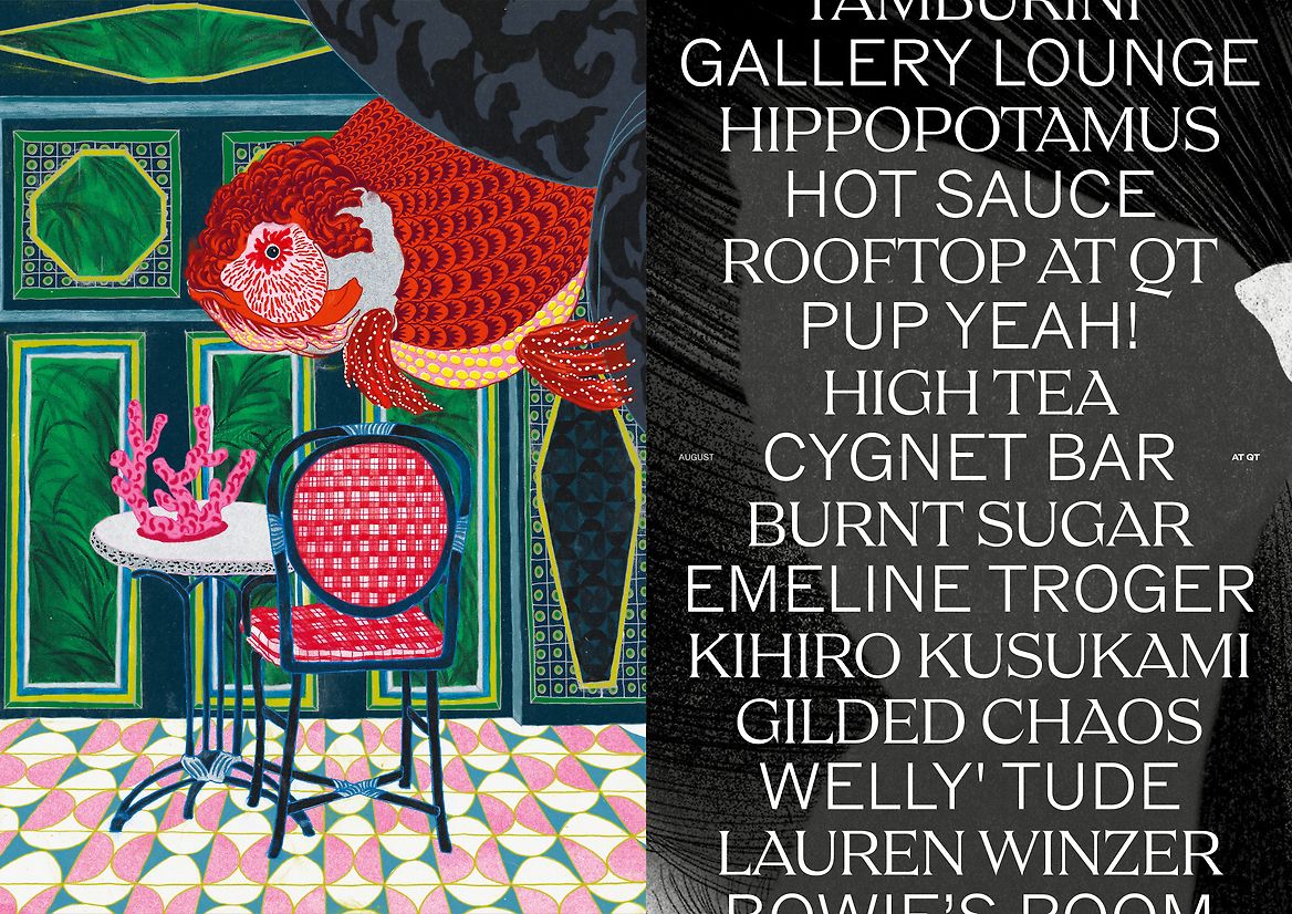
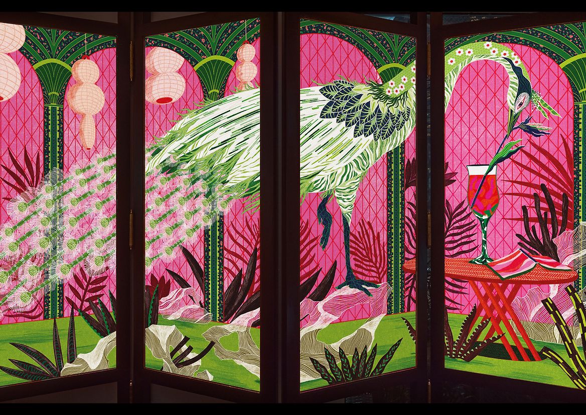
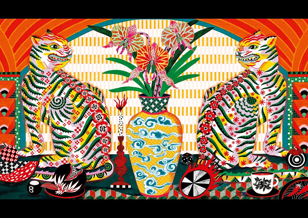
The second was a collaboration with a local artist, Jill Tran, whose lived experience shaped a bold, captivating interpretation of the city’s unique character. Jill’s illustrations celebrated Singapore as a melting pot where east meets west, old meets new, man‑made meets nature and straight lines meet organic forms. Her surrealist, dreamlike motifs captured moments that felt intrinsically Singaporean, like a peacock perched in a shophouse, or tigers sharing tea – framed by palm trees and archways that spoke to the hotel’s heritage and surroundings.
A striking black-and-white colour palette of black‑and‑white, combined with crisp photography by Terence Chin and a mix of sans and serif typefaces, helped shape an identity that felt both timeless and distinct. Together, these elements created a brand language that felt deeply connected to its place – allowing QT Singapore to invite guests and locals alike to connect their own sense of curiosity to the hotel.
By making personalisation central to its identity, QT Hotels didn’t just arrive in Singapore; it embraced the city’s character and celebrated its creative charm. This approach became a lens for future QT properties too, spotlighting heritage, architecture and culture with genuine warmth and authenticity. The result is a hotel that feels alive, inviting, and unmistakably QT – no matter where the lines blur next.