Graphic
Extended Whānau 63 Te Whare o Rehua Sarjeant Gallery
-
Ngā Kaimahi / Team Members
Tyrone Ohia, Eva Charlton, Aleisha Marinkovich, Aitken Hawkins -
Kaitautoko / Contributor
Cecelia Kumeroa -
Client
Te Whare o Rehua Sarjeant Gallery

Description:
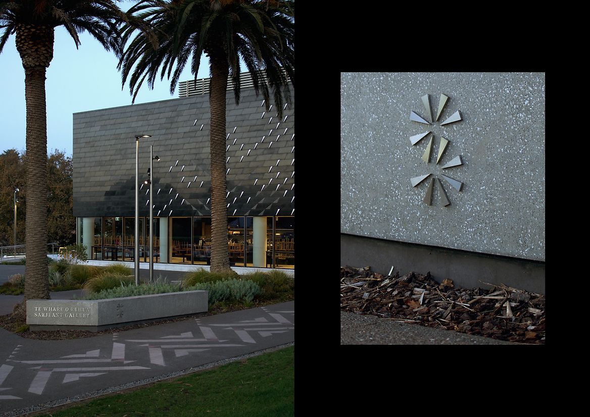
Te Whare o Rehua Sarjeant Gallery is one of the oldest galleries in Aotearoa. After being closed for an extensive decade-long redevelopment, it reopened to the public in November 2024. The new architecture acknowledges the history of the existing building, while adding an entirely new building; Te Pātaka o Tā Te Atawhai Archie John Taiaroa, that acknowledges iwi and Māori narratives of the site and the awa (river) — a building that speaks to our bicultural past, present and future.
We were commissioned to design a new identity to reflect this.
Our approach was to embrace the gallery's Māori name (Te Whare o Rehua), and build on the overarching architectural concepts.
The name 'Te Whare o Rehua' was gifted to the Sarjeant Gallery in 1995 during Māori language week. We wanted to centre it within the brand to shine a light on its rich meaning. The name can be interpreted as 'The house of inspiration'. Rehua is said to reside in the higher realms of the Māori heavens, which are associated with excellence and the pinnacle of potential. He is often personified in the sky through Antares, one of the largest and brightest known stars.
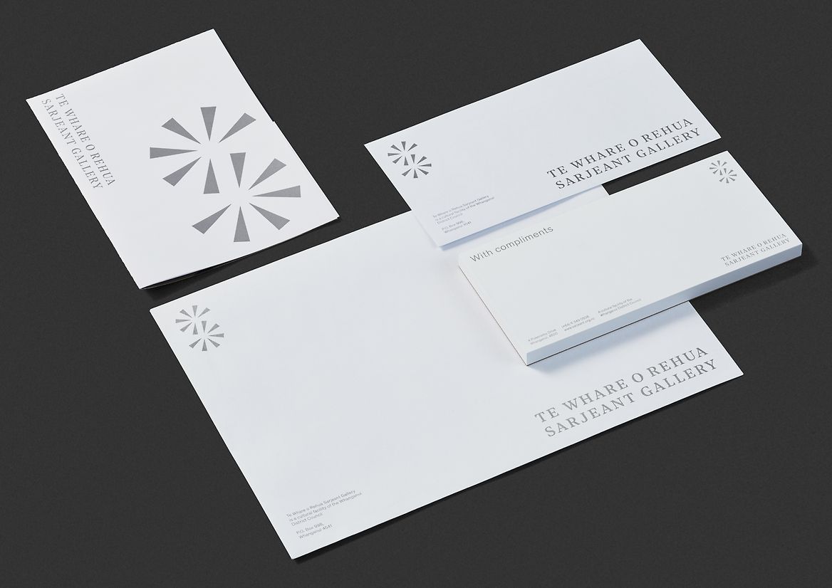
Starting with the wordmark, we developed a framework that let Te Whare o Rehua sit above Sarjeant Gallery. It made sense for the stars to be oriented upwards, and for Sargent Gallery to sit below, grounding us in the history of the heritage building.
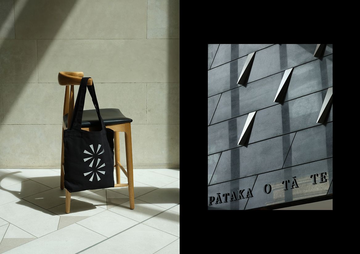
From there we created a tohu (logo) that acknowledges Rehua, becoming the galleries star of inspiration. The tohu also acknowledges the metal tioata shards on the new building's facade. Tioata describes the effect of light shimmering on the surface of the awa. In this way, we are connected to the sky, as well as the awa, through concepts of light and enlightenment.
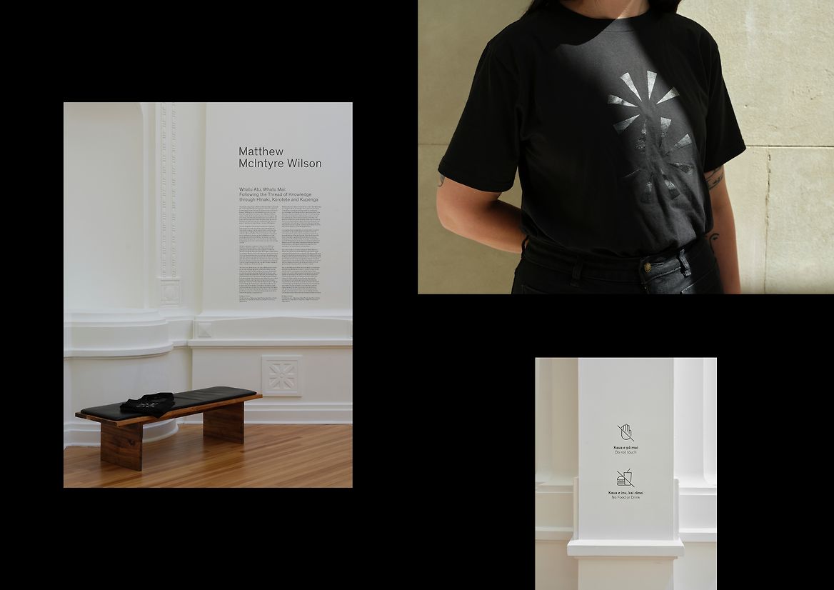
As you explore the gallery, the tohu continues to connect in new ways. In the heritage building 105 year-old surface ornamentation on the walls and in the observatory dome carry similar forms and geometry. And from above, the tohu mimics the coming together of the old and new building, in a bicultural relationship. It could even be the winding path of the awa itself.
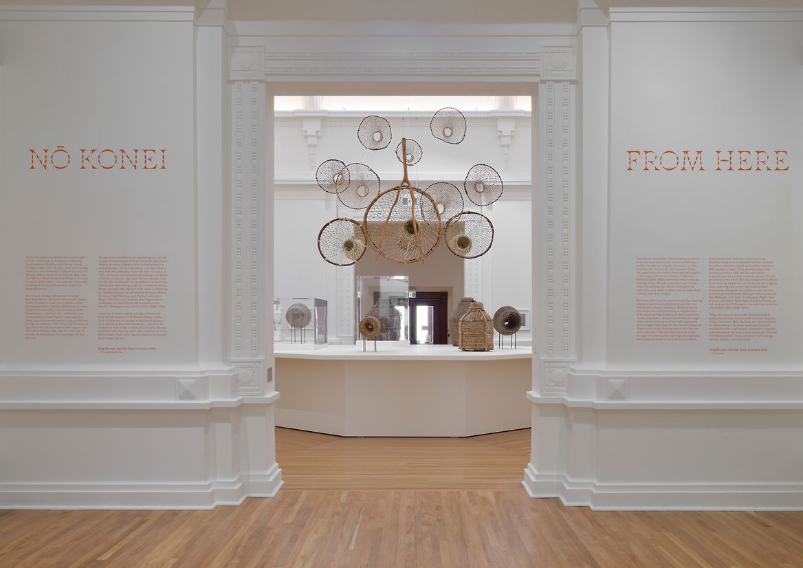
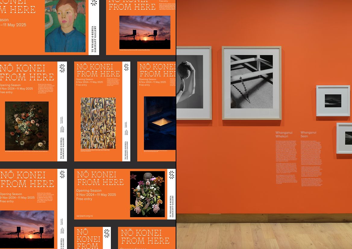
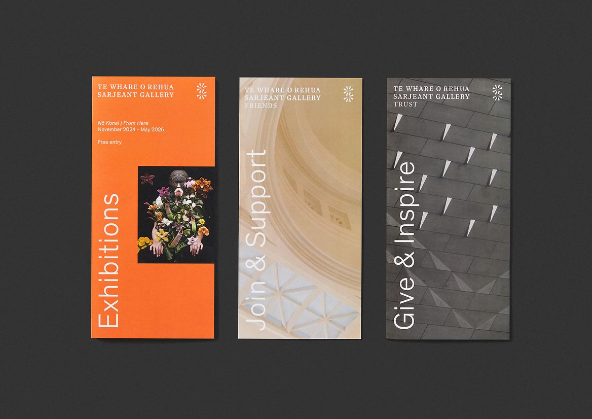
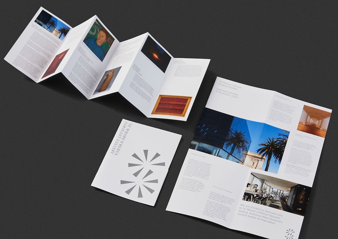
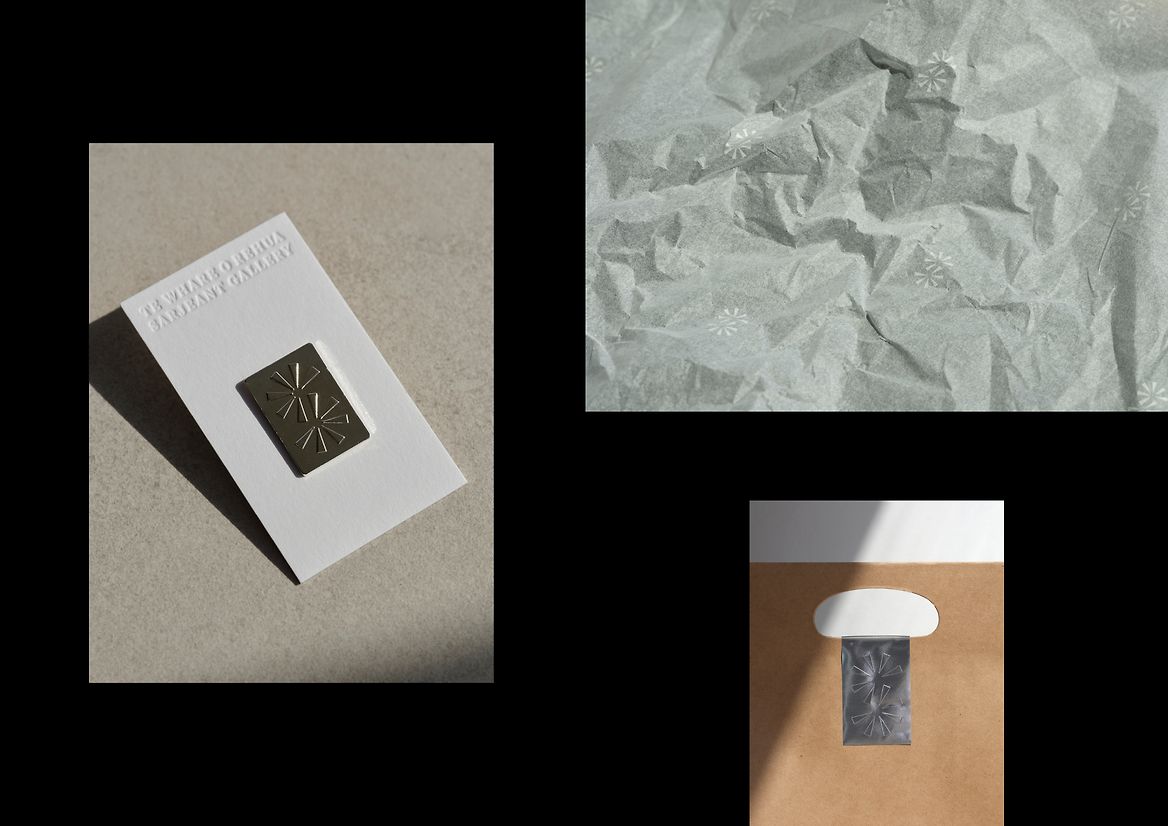
On the back of these foundational moves, we turned our heads to developing an extensive brand architecture for the gallery. Creating systems and styles for core institution collateral, including brochures, stationery, uniforms and merchandise. A template system was also developed for exhibition identities and programmed events. A wayfinding system was developed with custom signage blades that reference the tioata shards, and extensive sponsors and patron walls. Exhibition signage was developed in line with the exhibition identity. And lastly, the gift shop packaging system was created for a consistent shop experience.
Judge's comments:
A beautifully crafted mark that is simultaneously typographic and abstract. Speaks to place, purpose and the architecture. Deceptively simple in its restraint while also surprising with playful flexibility.