Graphic
Extended Whānau 63 Kia Puāwai
-
Pou Auaha / Creative Director
Tyrone Ohia -
Pou Taketake / Cultural Leads
Pita Te Ngaru, Mark Manaia
-
Ngā Kaimahi / Team Members
Raphael Roake, Max Quinn-Tapara, Eva Charlton, Viv Teo, Kaye Reihana -
Kaitautoko / Contributor
Zico O’Neill-Rutene -
Client
Kia Puāwai
Description:
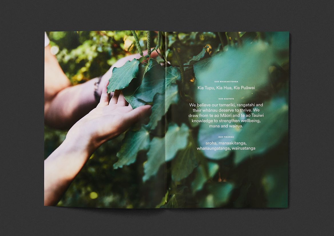
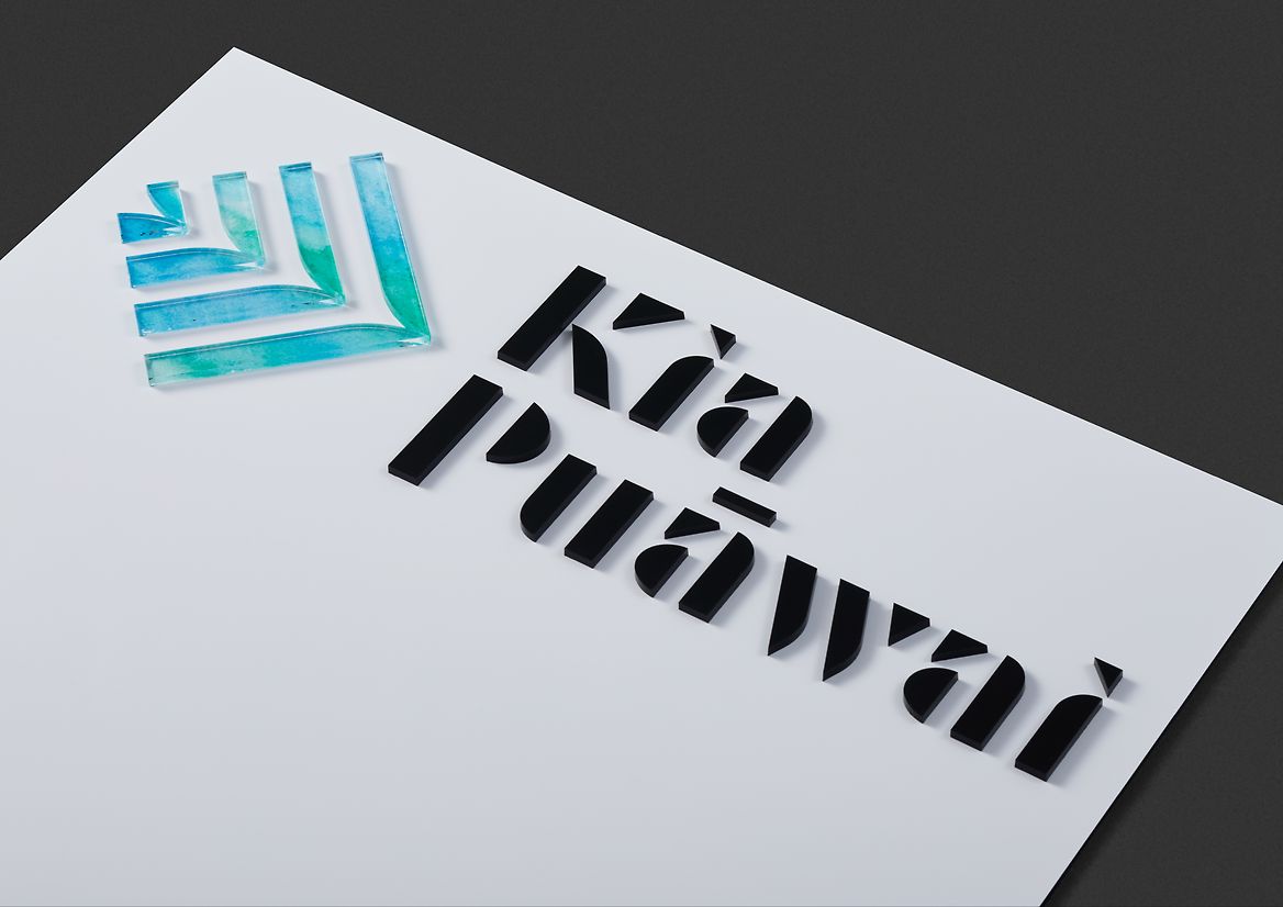
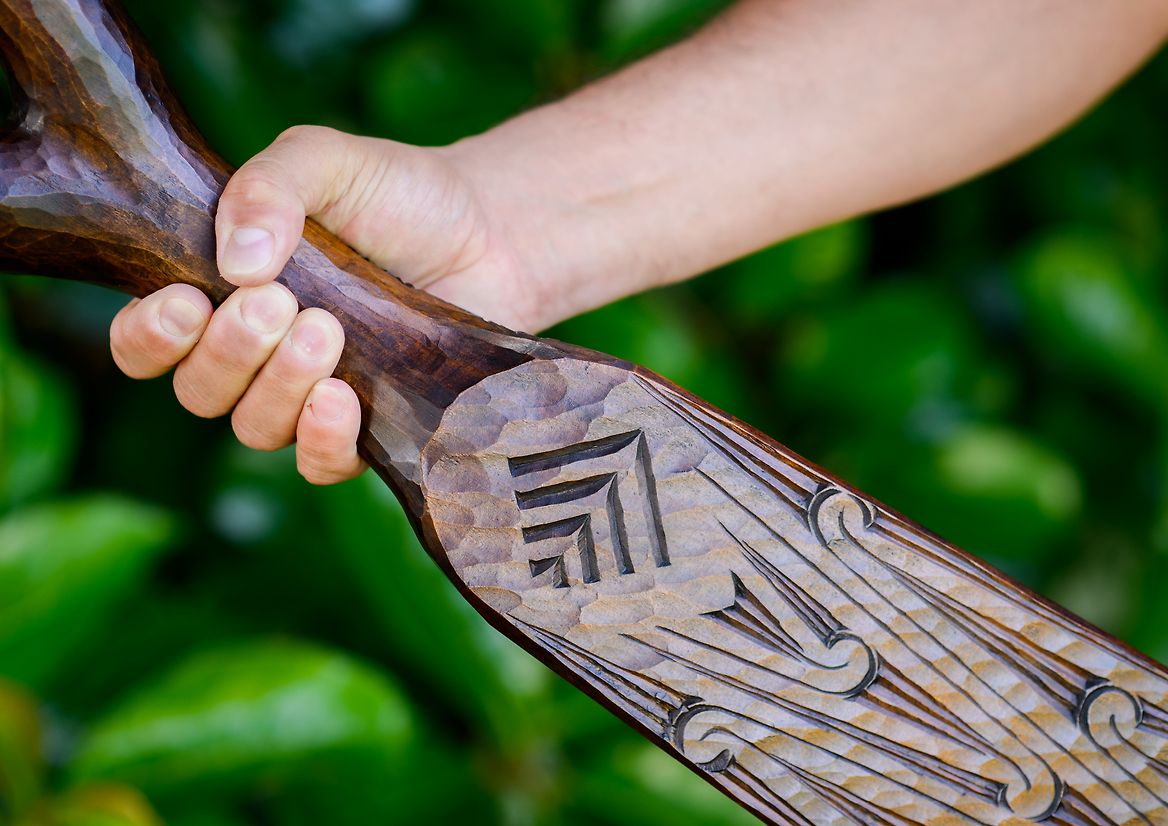
Kia Puāwai (formerly Youth Horizons Trust) is a national charitable trust working to improve the lives of tamariki and rangatahi who are dealing with extreme behavioural, emotional and mental health issues. Their work merges Western research with mātauranga Māori to more holistically benefit young people in Aotearoa. To reflect this, a new Waka Hourua Strategic Framework had been developed, in which the two hulls of a waka symbolise two worlds of knowledge steering in unison towards a brighter future. Alongside this, a new vision was developed: Kia tupu, kia hua, kia puāwai (To grow, to flourish, to prosper). Furthermore, they also wanted to embrace their Māori name – Kia Puāwai which means to bloom. With all of these changes and an overwhelming desire to humanise and naturalise their look and feel, we were approached to develop a suitable identity.
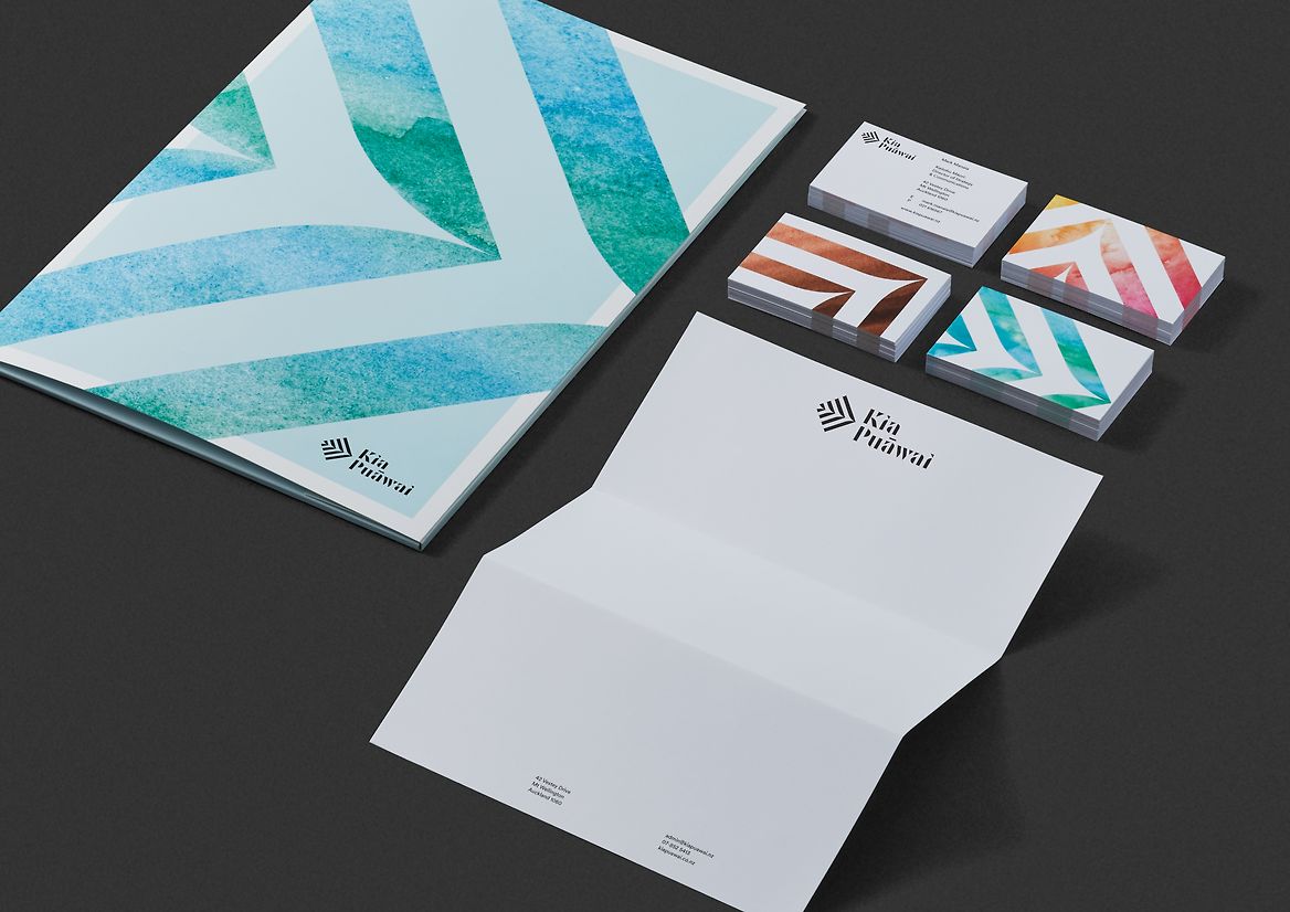
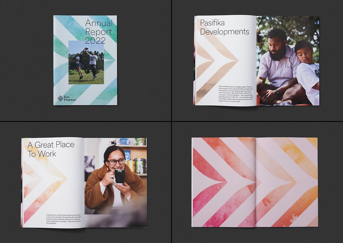
The Waka Hourua Framework sits at the centre of the trust, symbolising the ability to navigate towards an outcome. It is the vessel, but it exists within a wider environment. That wider environment includes wai (water), which flows through all things. Wai connects land through oceans and rivers. It connects sky and earth through rain. It connects us to each other and to our inner emotions. Our approach was to harness wai to connect the Waka Hourua to the living world it operates in.
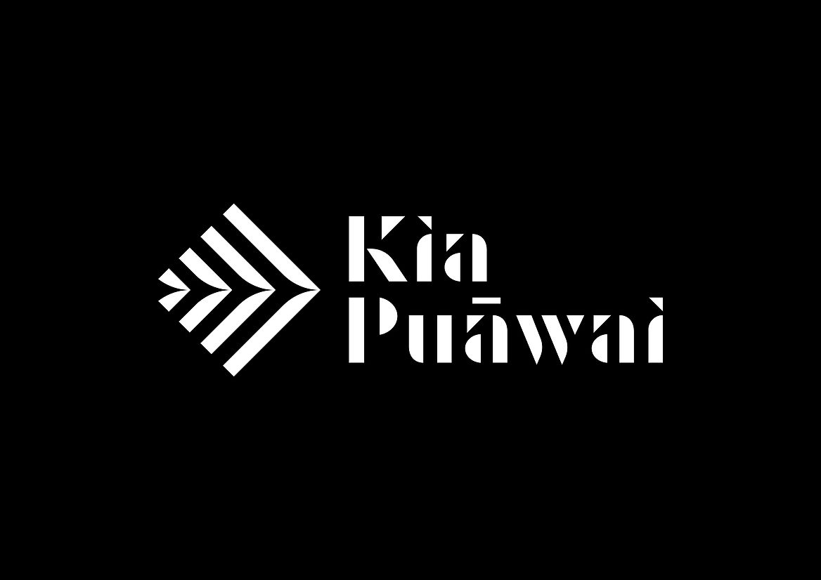
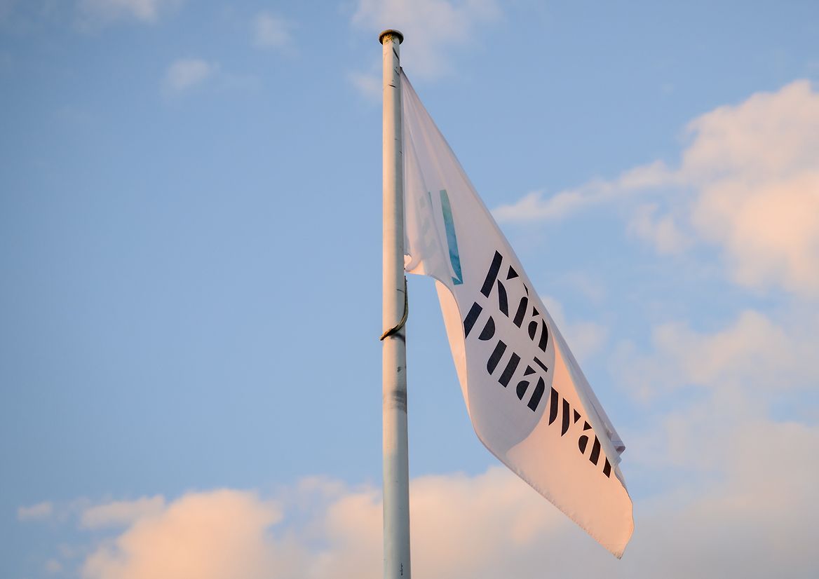
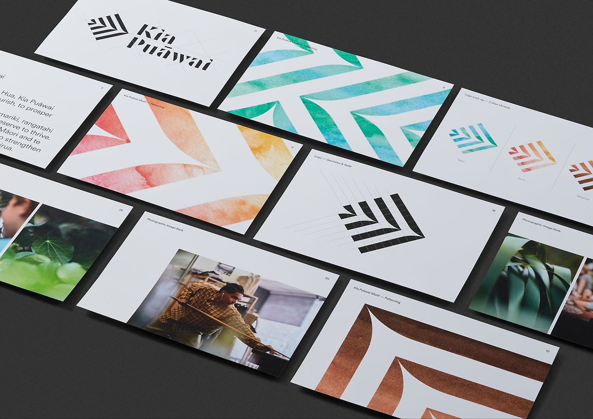
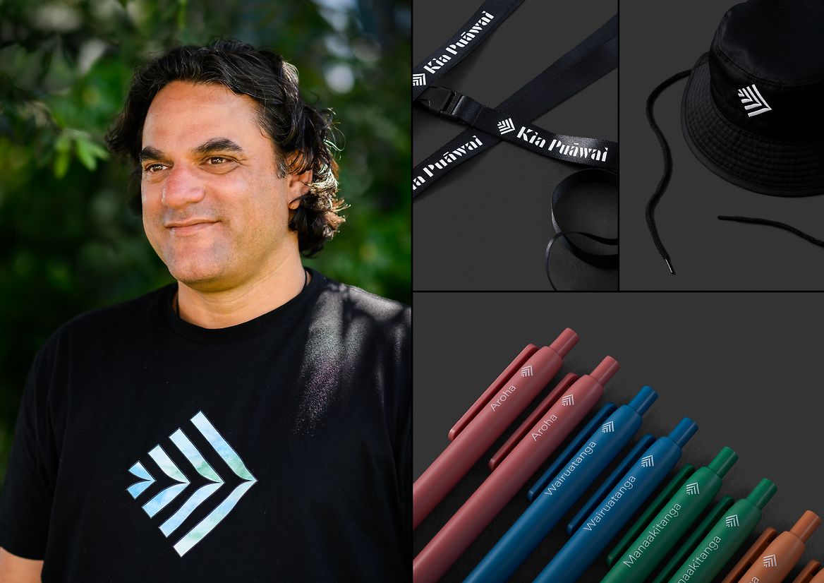
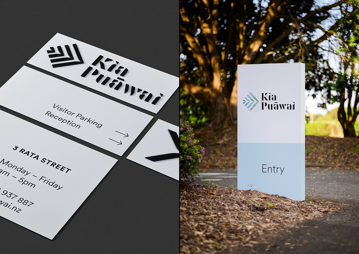
When a Waka Hourua glides through the water, the intersecting wake from the two hulls is often likened to strands of knowledge being woven together. Inspired by this idea, we created our tohu (logo). It symbolises our waka in motion, weaving in strands of knowledge, moving with intent towards a better tomorrow. It blooms, ripples and grows to reflect our name and our Vision. The tohu expands out into an endless combination of graphic patterns. A range of textural colour palettes based on wai, whenua (land) and human emotion were developed. And finally, a large photographic image bank was also created to build out the wider environment of Kia Puāwai. Capturing staff and whānau genuine human moments, as well as capturing all elements of our natural environment from coasts, forests, to suburban life. These brand elements were then rolled out nationally across office signage systems, uniforms, merch, stationery, reports, brochures and other items, carrying the story of Kia Puāwai out into the world.