Kanda is the new face of care in Australia. Born from the merger of Southern Cross Support Services and Programmed Care, it brings together a national workforce of support professionals across aged care, disability services, veteran care, community nursing, and supported independent living. The goal is ambitious: to become Australia’s most valuable support provider by 2030.
Brand Council led the strategic development of the name, brand positioning, and architecture. Their work laid the foundation for a brand that unites people and services under a single, confident identity. Informed by deep sector insight, the strategy was clear and future-focused - a brand built to scale nationally while maintaining trust at every personal touchpoint.
As creative partners, our role was to bring that strategy to life. We translated Brand Council’s thinking into a distinctive identity system that expresses both care and capability. From colour and typography to photography and tone of voice, every element is designed to reflect the dual strengths of the organisation: professionalism and humanity.
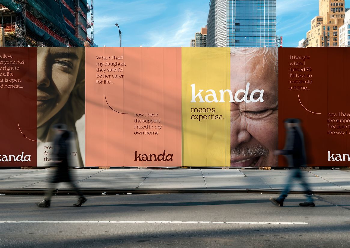
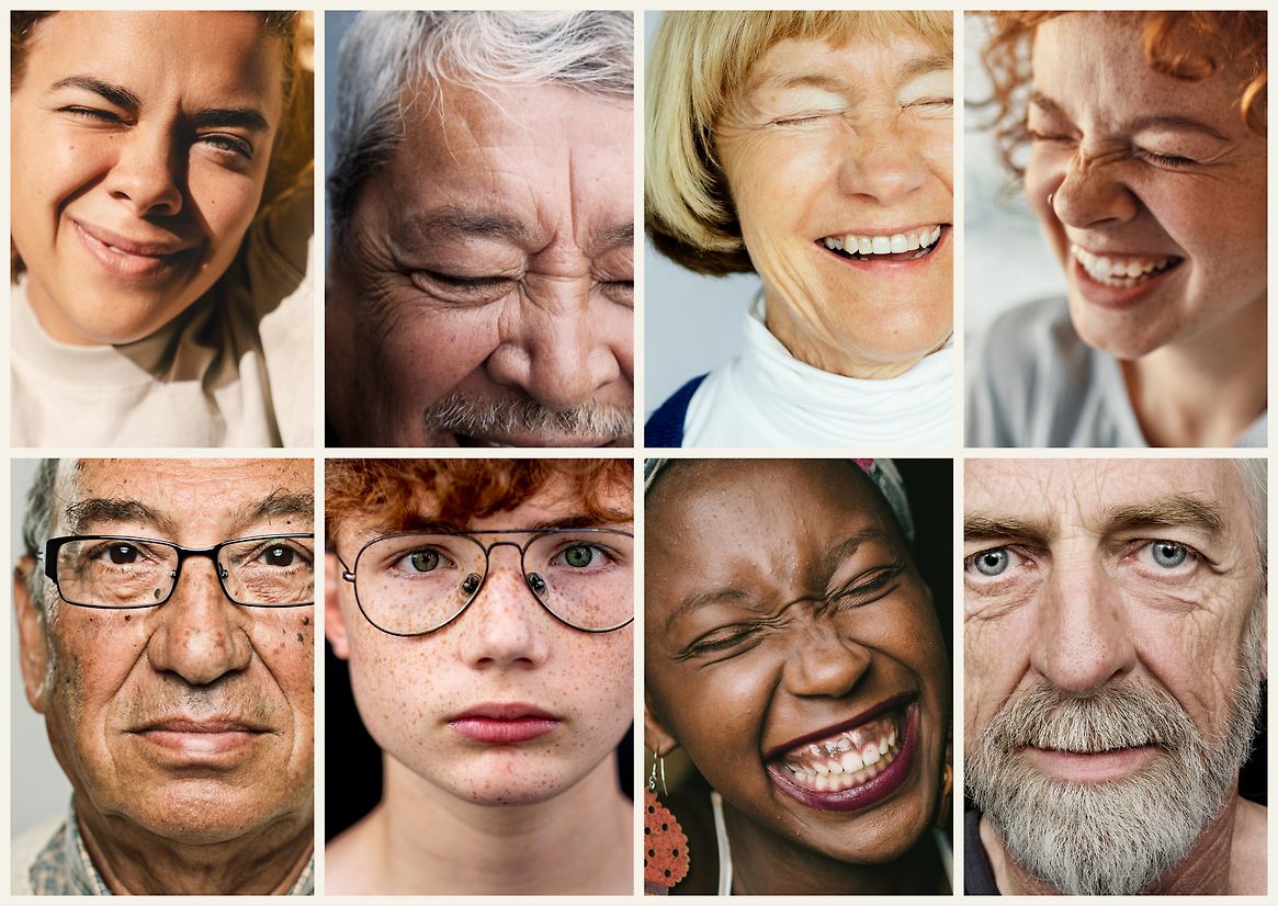
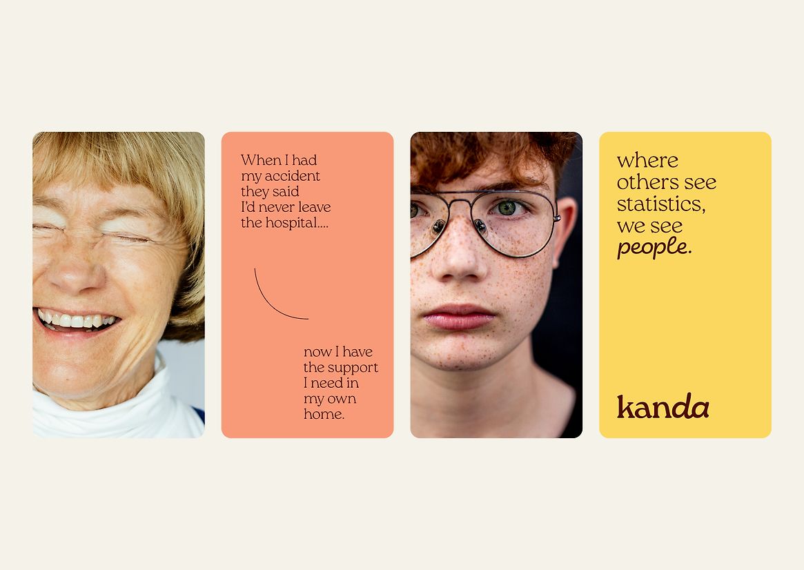
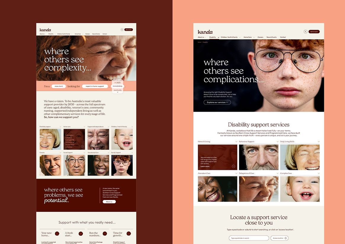
The name Kanda, created by Brand Council, is short, grounded, and memorable. It signals strength, trust, and clarity in a sector often overwhelmed by complexity. Visually, the identity builds on that confidence. Bold type, precise layouts, and vibrant colour create a sense of presence and polish. Expressive graphic elements and warm, portrait-led imagery ensure the brand feels human and real. Our verbal identity is direct, respectful, and empowering, and champions language that supports dignity and cuts through noise.
Kanda now stands out in a saturated care landscape. It reassures existing clients while attracting new ones. It inspires confidence among carers, staff, and families. It simplifies the experience of seeking and receiving support.
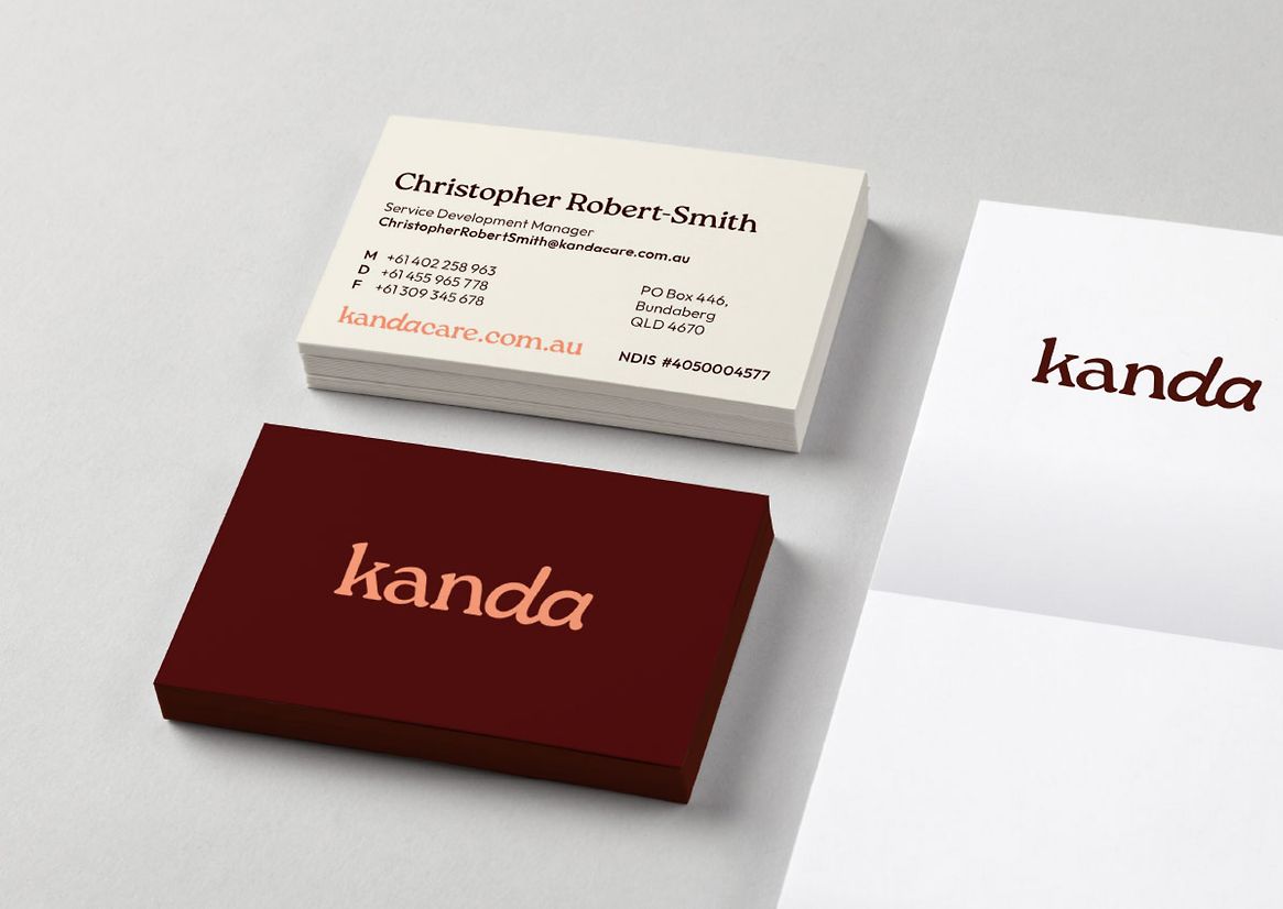
The brand has rolled out across every touchpoint, including uniforms, signage, vehicles, digital platforms, and communications. The internal launch built strong cultural momentum, with staff embracing the change and the vision it represents.
Kanda gives care a new face. Positive, dynamic, and above all, human. Together with Brand Council, we built an identity that supports care at every stage of life - and sets a new standard for the sector.


Description:
Kanda is the new face of care in Australia. Born from the merger of Southern Cross Support Services and Programmed Care, it brings together a national workforce of support professionals across aged care, disability services, veteran care, community nursing, and supported independent living. The goal is ambitious: to become Australia’s most valuable support provider by 2030.
Brand Council led the strategic development of the name, brand positioning, and architecture. Their work laid the foundation for a brand that unites people and services under a single, confident identity. Informed by deep sector insight, the strategy was clear and future-focused - a brand built to scale nationally while maintaining trust at every personal touchpoint.
As creative partners, our role was to bring that strategy to life. We translated Brand Council’s thinking into a distinctive identity system that expresses both care and capability. From colour and typography to photography and tone of voice, every element is designed to reflect the dual strengths of the organisation: professionalism and humanity.
The name Kanda, created by Brand Council, is short, grounded, and memorable. It signals strength, trust, and clarity in a sector often overwhelmed by complexity. Visually, the identity builds on that confidence. Bold type, precise layouts, and vibrant colour create a sense of presence and polish. Expressive graphic elements and warm, portrait-led imagery ensure the brand feels human and real. Our verbal identity is direct, respectful, and empowering, and champions language that supports dignity and cuts through noise.
Kanda now stands out in a saturated care landscape. It reassures existing clients while attracting new ones. It inspires confidence among carers, staff, and families. It simplifies the experience of seeking and receiving support.
The brand has rolled out across every touchpoint, including uniforms, signage, vehicles, digital platforms, and communications. The internal launch built strong cultural momentum, with staff embracing the change and the vision it represents.
Kanda gives care a new face. Positive, dynamic, and above all, human. Together with Brand Council, we built an identity that supports care at every stage of life - and sets a new standard for the sector.