Graphic
Designworks 183 Ōtākou Whakaihu Waka
-
Pou Auaha / Creative Directors
Anzac Tasker, Jef Wong -
Pou Rautaki / Strategic Lead
Mike Pepper -
Pou Taketake / Cultural Leads
Ephraim Russell, Edward Ellison, Paulette Tamati-Elliffe, Megan Pōtiki, Komene Cassidy, Te Rūnaka o Ōtākou, Kati Huirapa Rūnaka ki Puketeraki
-
Kaituhi Matua / Copywriter Lead
Sam O'Flaherty
-
Ngā Kaimahi / Team Members
Kathryn Cunningham, Chloé Griveaud, Nicky Lloyd, Tim Long, Philip Kim, Jade Sullivan, Liam Ooi, Caitlin Rassie, Luke Guilford -
Kaitautoko / Contributors
Shelley Winsor, Hone Paul, Tony Ballantyne, Suzanne Ellison, Todd Gordon, Alistair Mcready, Bailey Hancox, Tor White, Bethany Ryan, Lucy Bell, Chas Carroll, Hannah Beede, Madison Henry Ryan, Anthony Hos, Māui Studios, Jason Low -
Client
Ōtākou Whakaihu Waka
Description:
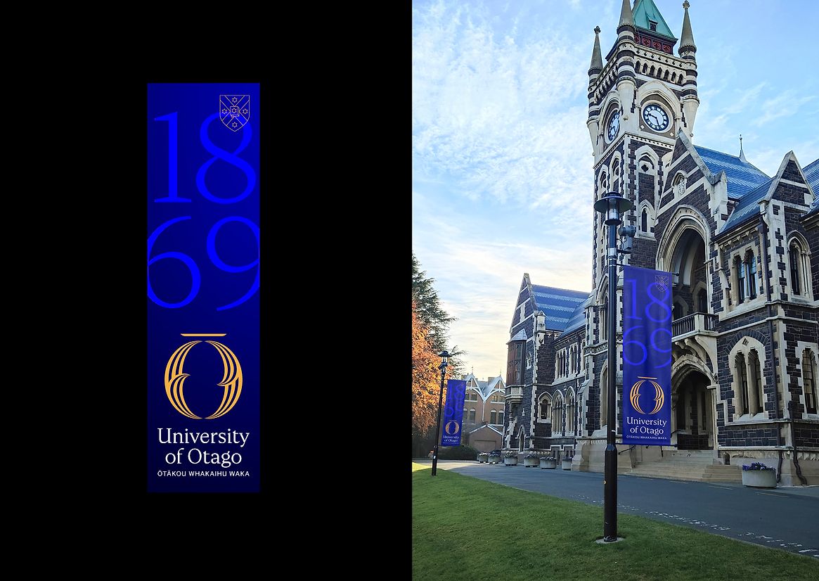
The University of Otago was the first university established in New Zealand. It has an incredibly rich and proud history. But its brand and identity was no longer a genuine reflection of who they had become and what they aspired to be.
After 154 years, it was time for change. To signal a new direction for the University as a leader in Aotearoa me Te Waipounamu New Zealand and the world, embody its vision of becoming a truly Te Tiriti-centric institution, and better reflect the future makeup of staff and students.
Alongside mana whenua and the university, we set out to co-design an identity and brand that would speak to the present, be sensitive to and honour the true past, and provide clear momentum to navigate a path into the future.
Acknowledging the University’s rich heritage, while amplifying their unique place in the Pacific. Helping recorrect colonial distortion and taking a future-forward outlook. As one stakeholder so succinctly described it, “Scottish bones with a Māori heart”.
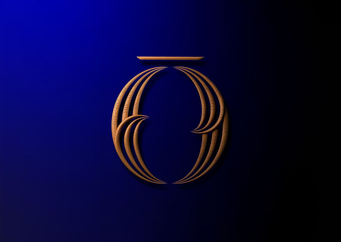
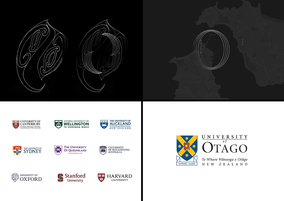
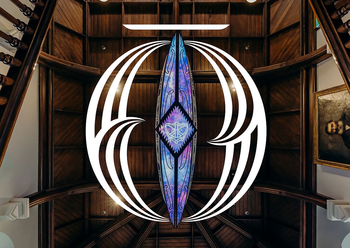
Inspired by the richness in the original name Ōtākou and its connection to the channel of the region, we leaned into the idea of a two-way current. Acknowledging the connected duality of past and future. Referencing the sharing and exchange of ideas that has long been facilitated by the channel.
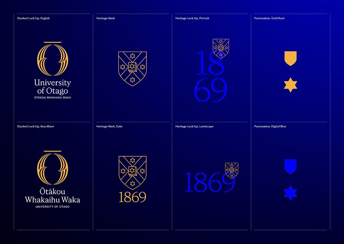
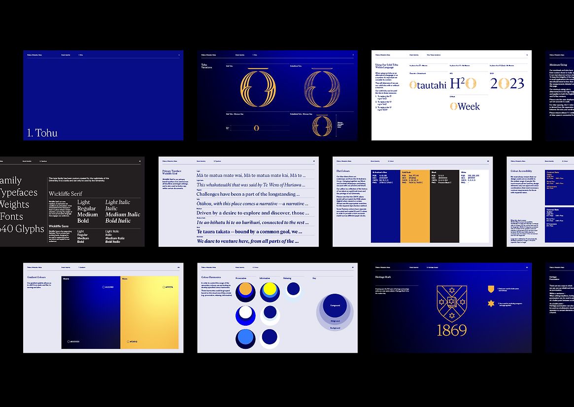
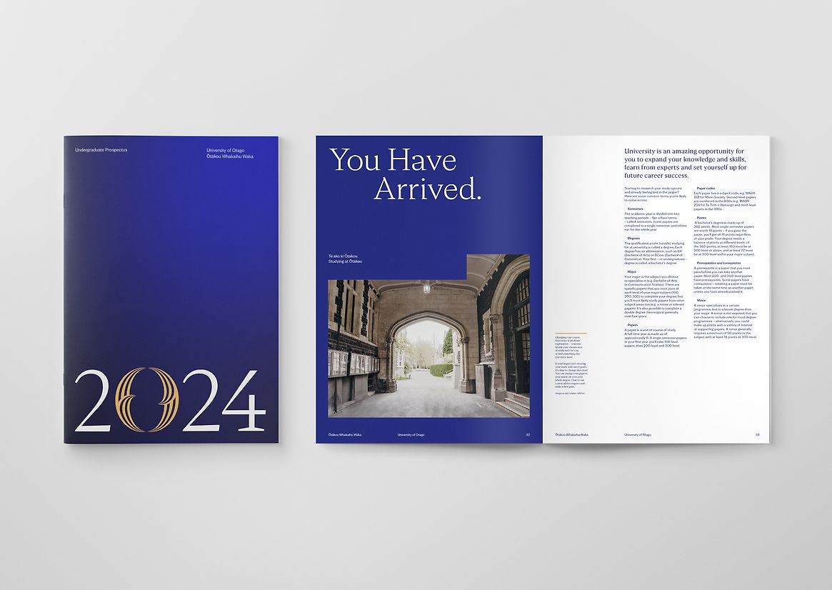
Beyond a logo, this was a comprehensive identity transformation spanning strategy and positioning, tone of voice and comms, name and wordmark, colour and typography and everything in between.
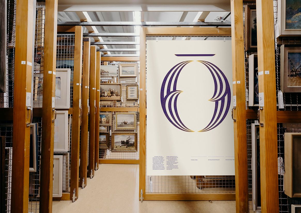
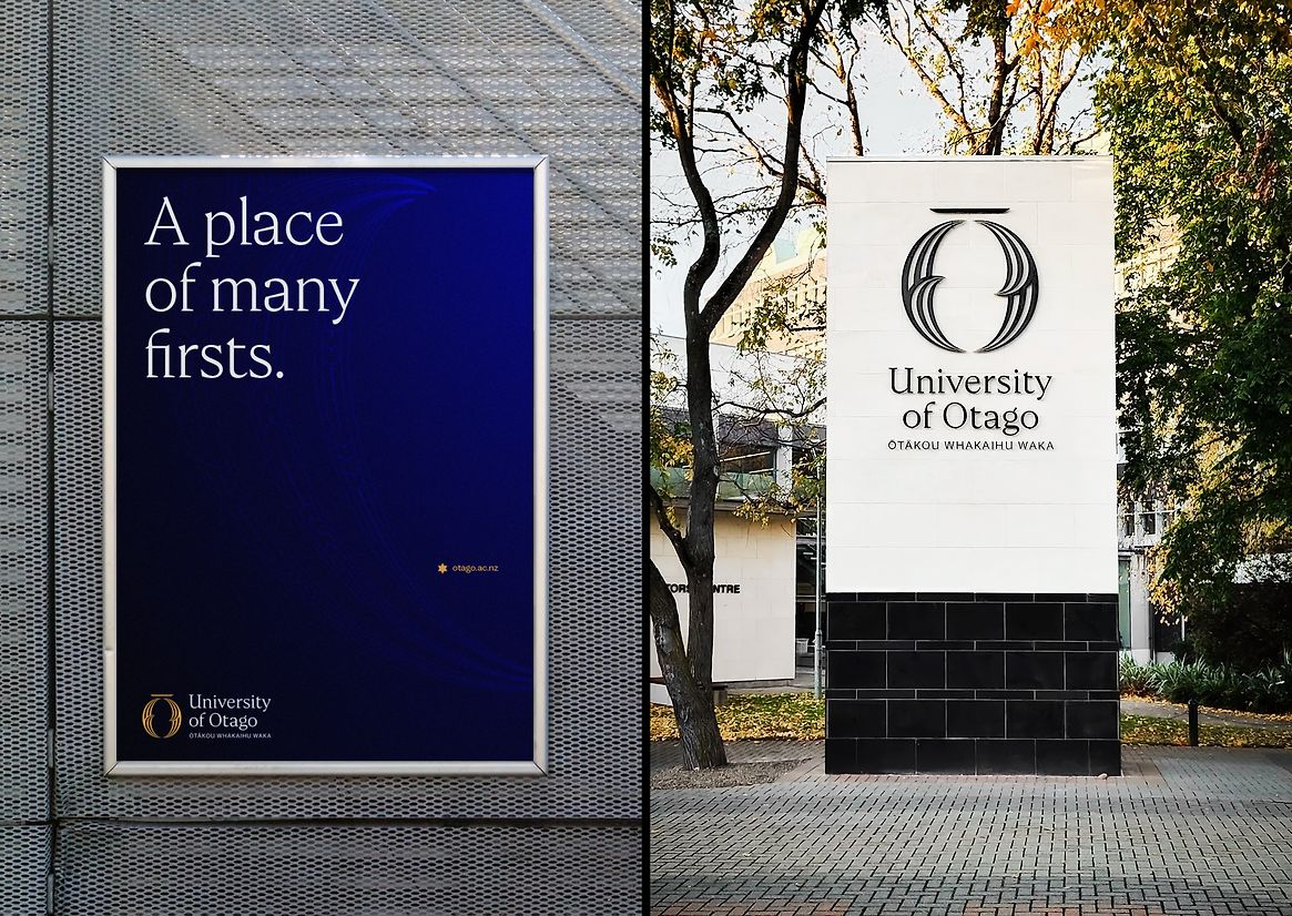
The name Ōtākou and the idea of a two-way current was a core driver in shaping the new mark at the heart of the identity. The waka that sits above the new mark recognises the first waka and endeavour to enter through the channel.
The name Ōtākou Whakaihu Waka was composed by mana whenua, meaning ‘a place of many firsts’. This acts as a commitment to continue to be leaders and inspire future generations of student thinking.
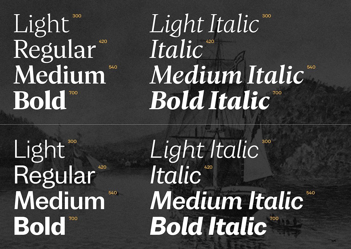
The bespoke type family was not inspired by te ao Māori, as type alphabet was originally an imported tool from foreign lands. Instead, drawing inspiration from the technical typographic hand scripture of the first surveyor of the region, Charles Henry Kettle.
This project is the culmination of five years of creative collaboration and engagement with alumni, current students, staff past and present, mana whenua, academic expertise within and around the region.
Judge's comments:
An execptional example of retaining heritage while modernising and embracing Te Tiriti. Conceptually grounded in the region, and brought to life with gravitas and flare. A model for university brand sin Aotearoa and one that sits comfortably against international examples.