Graphic
Designworks 183 LyLo
-
Pou Auaha / Creative Director
Jef Wong -
Pou Rautaki / Strategic Leads
Mike Pepper, Sam O'Flaherty, Tor White
-
Ngā Kaimahi / Team Members
Liam Ooi (Senior Designer), Oscar Thomas, Jeannie Burnside, Kathryn Cunningham, Dave Black, Tim Long -
Kaitautoko / Contributors
Big Ideas, Ross Hall, Sophie Scott, Devan Narsai, Emily Moon, Loupe Agency, Flox, Jane Hastings, Tim Alpe, Angela Hallberg, Alexandra Holden, Joseph Ancora, Arran Dempsey, CTRL Space, CPRW -
Client
EVT LyLo


Description:
The COVID-19 pandemic decimated the travel industry.
But it also created an opportunity. It changed attitudes to travel accommodation. People didn’t want the usual compromises and complications any more. There was a whole generation of digital-savvy millennials who wanted to travel but didn’t want to pay for stuff they didn’t need. Hostels had an image problem. And at the same time hotels were seen as overdone and often unnecessary. In short: the category was ripe for disruption and reinvention.
With this in mind, we needed to create a brand for a new pod-style accommodation offering from Jucy. Not an extension of the wider Jucy campervan offering, but an iconic, stand-alone brand that would redefine the value-based travel accommodation market. Helping ignite and engage the spirit of a broad range of travellers in a new world of travel, and ultimately helping the client stand out as the leader in value-based pod-style accommodation across Australasia.
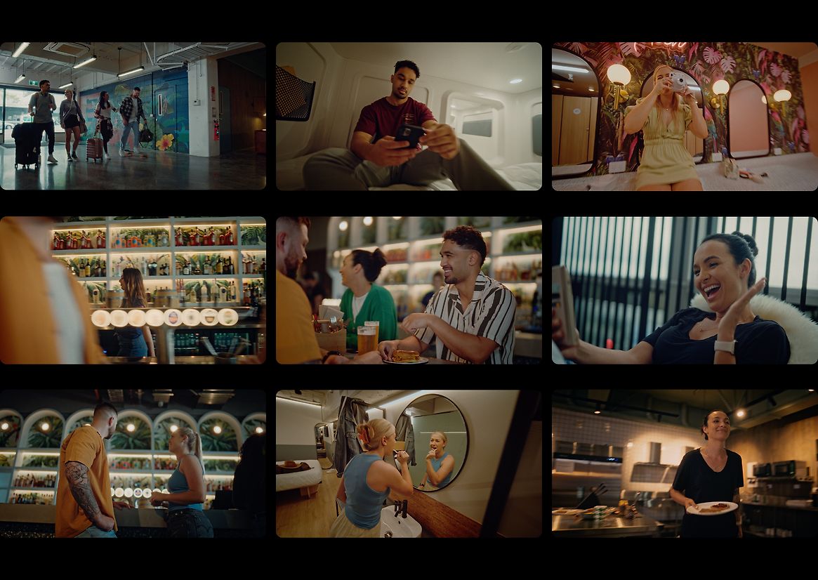
So we built a brand around the idea of helping everyone – local and international, from backpackers to young independents to neo-digital-nomads to families – to enjoy the simple joys of travel. Broadening the appeal of ‘pods’ and better reflecting the way people want to travel now. Reflecting a new way to stay that’s got everything you need — and then some. Democratising quality in travel accommodation.
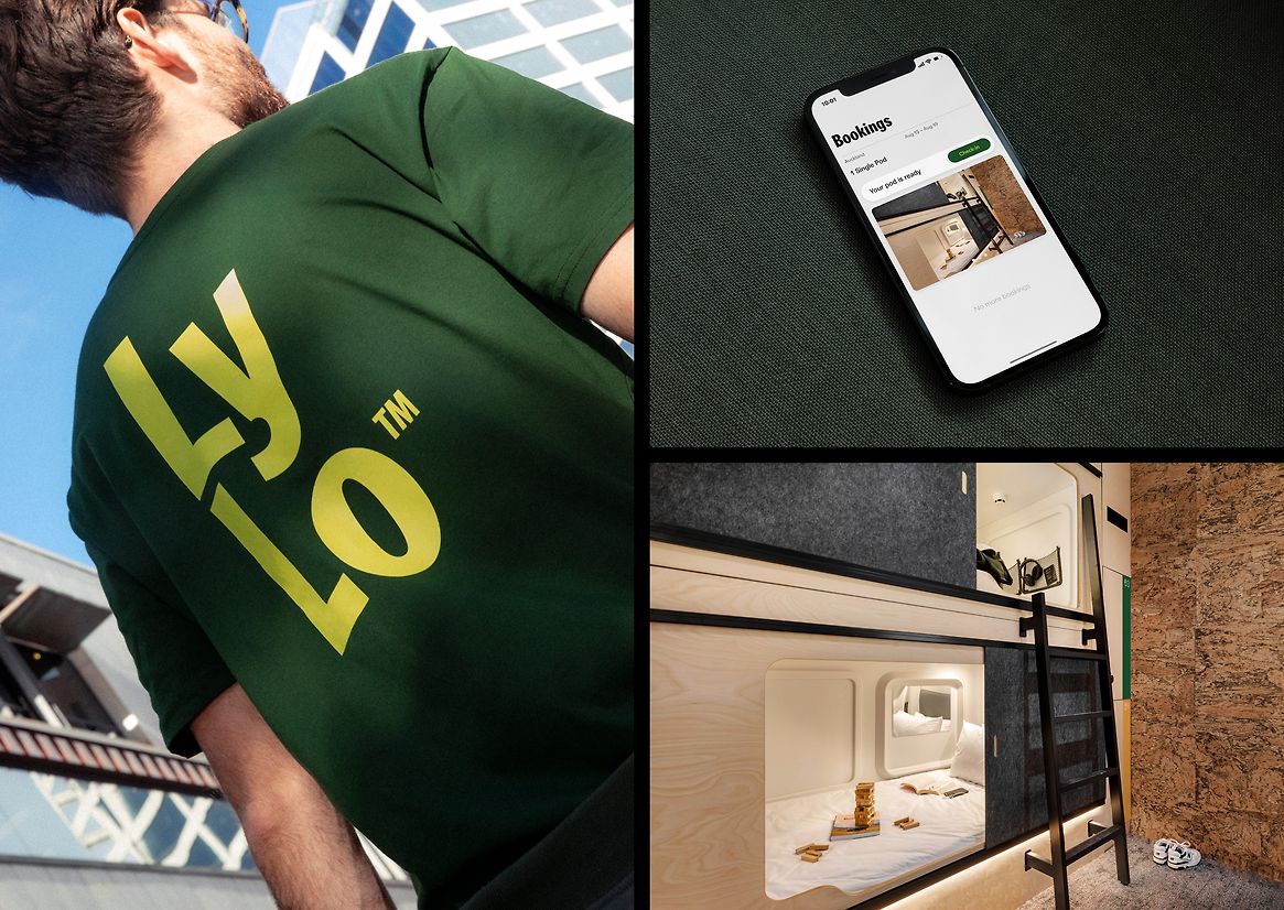
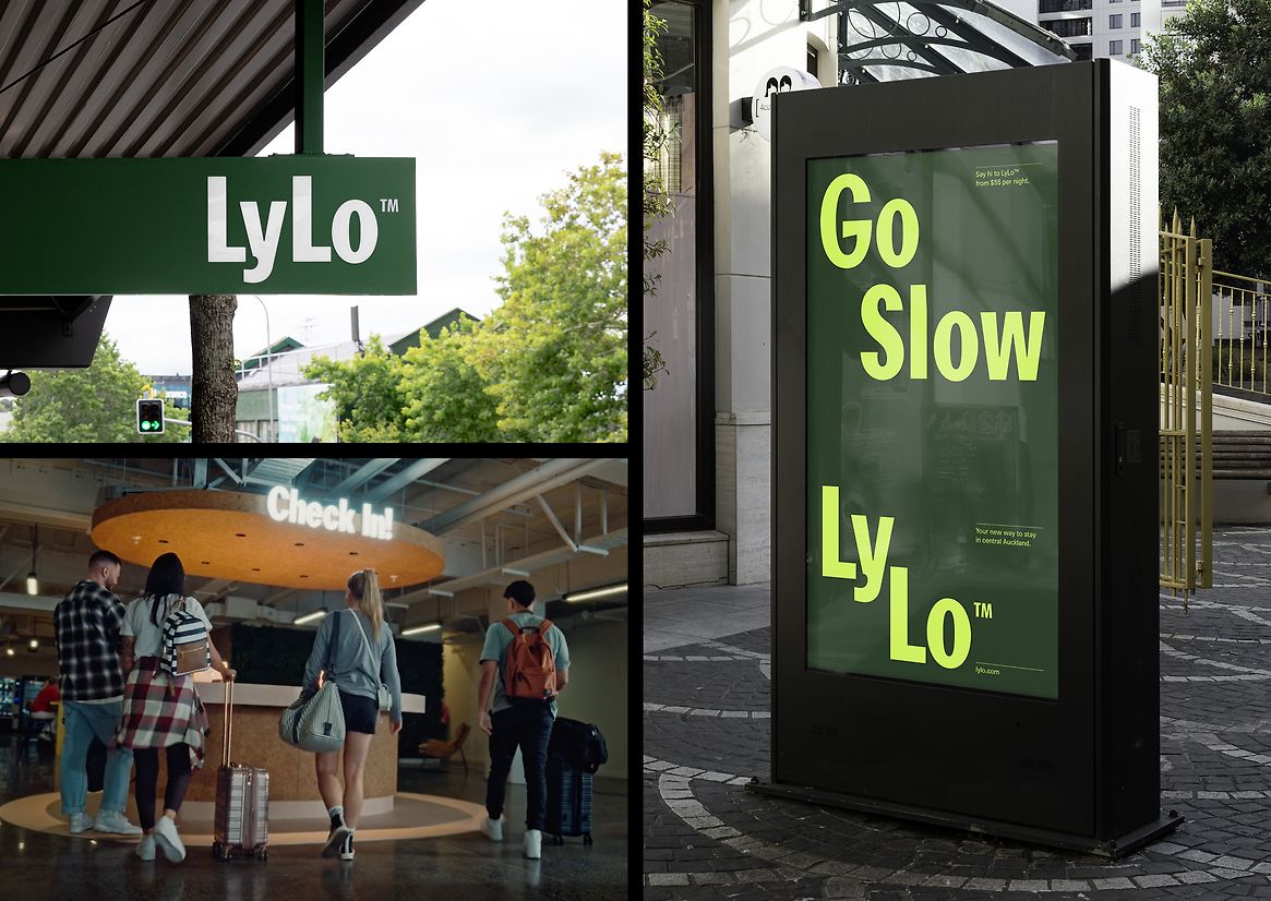
The name Lylo gives a sense of fun and simplicity – with soul. A place where everything’s easy and life’s good. Where you can let loose or lounge around. Lie back or live it up. Work or play or do absolutely nada. Whatever your vibe, Lylo’s the place.
The brand is all about simple with soul. Affordable and sustainable and stylish. Safe and central and connected. Full of heart and fun.
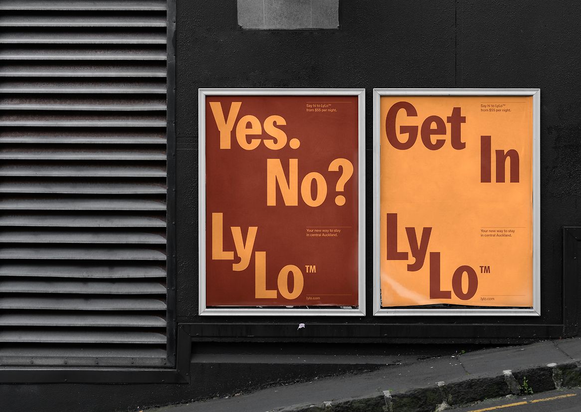
The personality is defined and driven by the name. Bright and fun and full of character, colour and contrast. Called out through language that is rhythmic, simple, punchy and catchy.
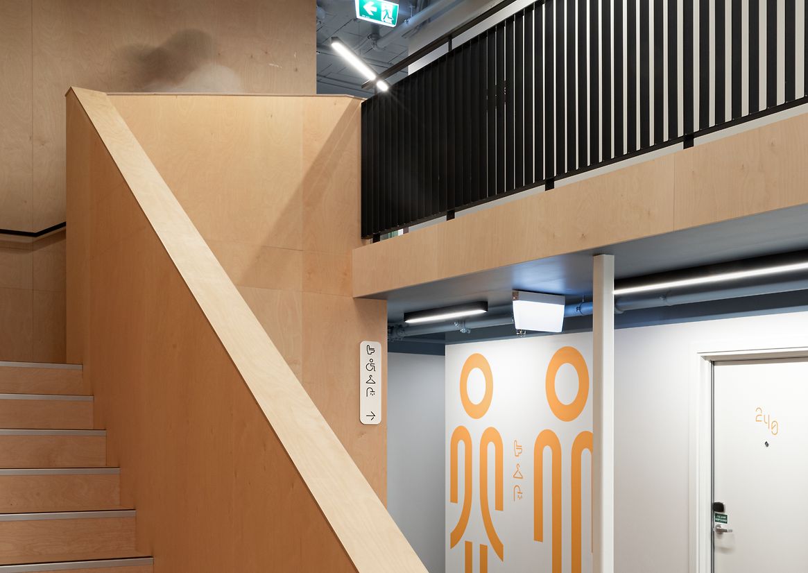
The wordmark is fun and ingenious and flexible, just like the pod-style accommodation and physical space it represents.
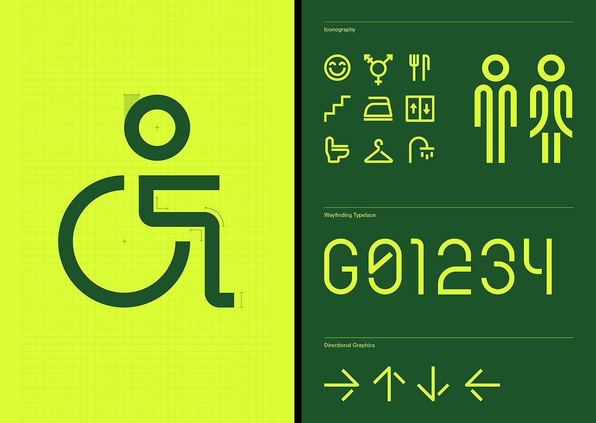
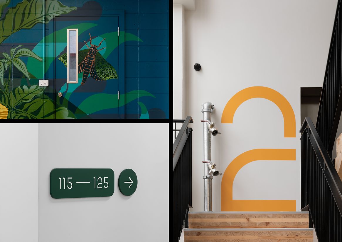
The iconography system and numerals are interconnected and custom drawn for the environmental signage system.
The colour palette is fun and playful, warm and inviting. Welcoming you in and providing a refreshing energy once you’re inside.