Graphic
Brand Matter 3 Thames
-
Pou Auaha / Creative Director
Brent Courtney -
Pou Rautaki / Strategic Lead
Brent Courtney -
Pou Taketake / Cultural Leads
Brent Courtney, Craig Solomon
-
Ringatoi Matua / Design Director
Brent Courtney -
Kaituhi Matua / Copywriter Lead
Brent Courtney
-
Kaitautoko / Contributor
Alistair McCready @ Monolith -
Client
Thames Coromandel District Council

Description:
Thames. Can a brand feel like a town?
The Why
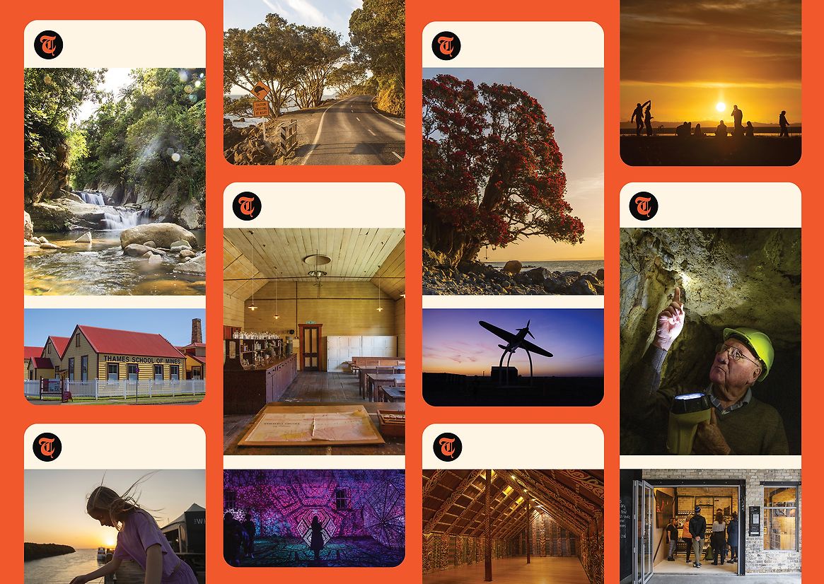
Thames had an image problem. Once the beating heart of the Coromandel, it had become overlooked – often seen as a tired town to pass through. Online, its presence was minimal and outdated. But locals knew Thames was layered with history, creativity, adventure, and charm – from wild bush trails to quirky main street shops, rivers and beaches to gold-mining relics, and a proud, artistic community.
The goal wasn’t just to increase visitation, but to change perception – and reignite local pride. We needed to uncover Thames’ real identity and reintroduce it to New Zealanders. Through a strategic place-branding project, we set out to build awareness, grow tourism, support local business, and reconnect people to Thames’ layered past and present.
The Idea
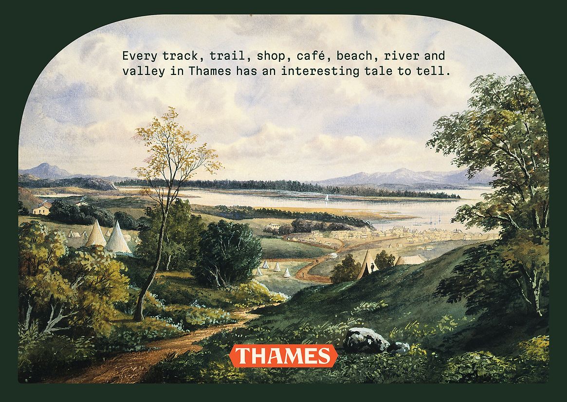
Thames didn’t need a logo – it needed a story. One that could unify past and present, locals and visitors, business and community. So we asked a bigger question: Can a brand feel like a town?The idea: Explore Interesting – where every track, trail, shop, café, beach, river and valley in Thames has an interesting tale to tell. We mined its rich history to shape a fresh narrative, from pre-European Māori origins to Victorian gold fever and today’s creative community spirit.
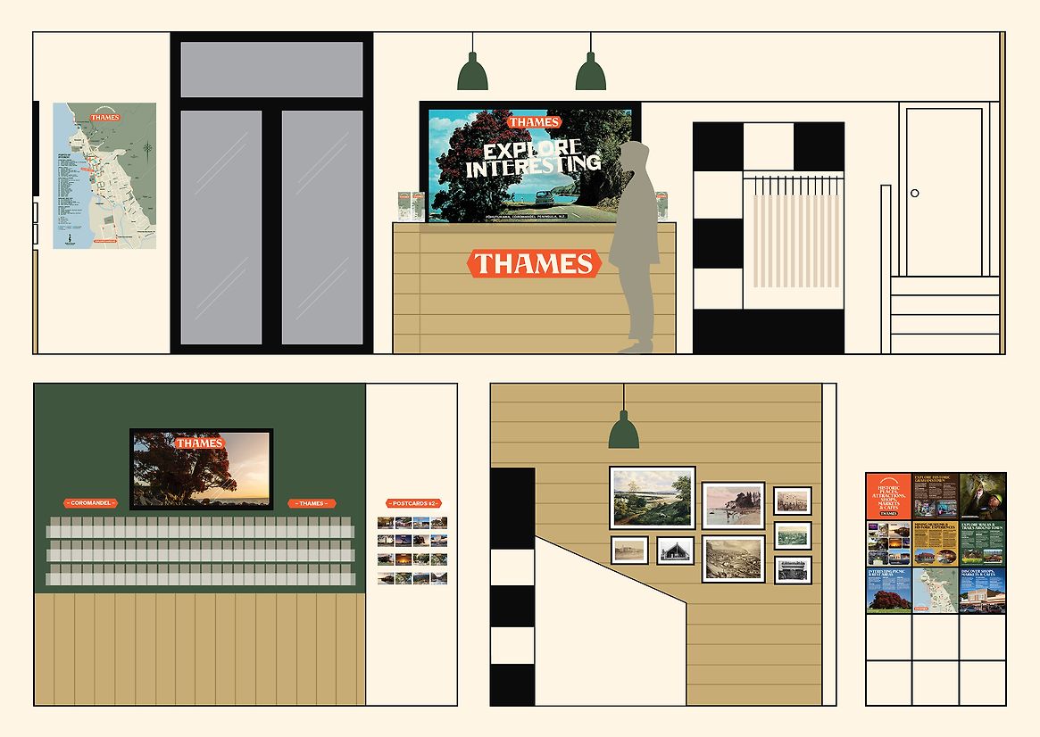
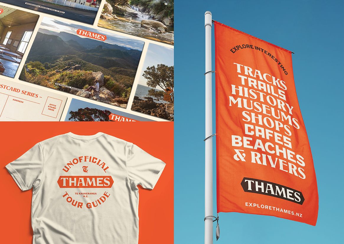
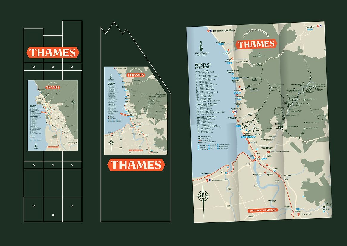
Instead of nostalgia, we focused on tension - heritage in today's world. The brand needed to feel real and alive, not stuck in the past. Our strategy was to create a modular design system through type, frames, image and colour that expressed Thames' many dimensions, and could scale across signage, social, visitor information, and events.
The Design
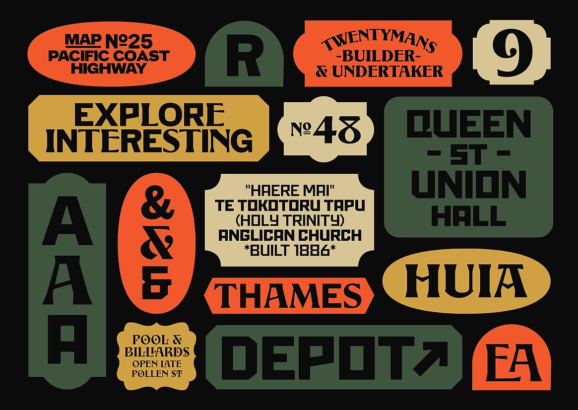
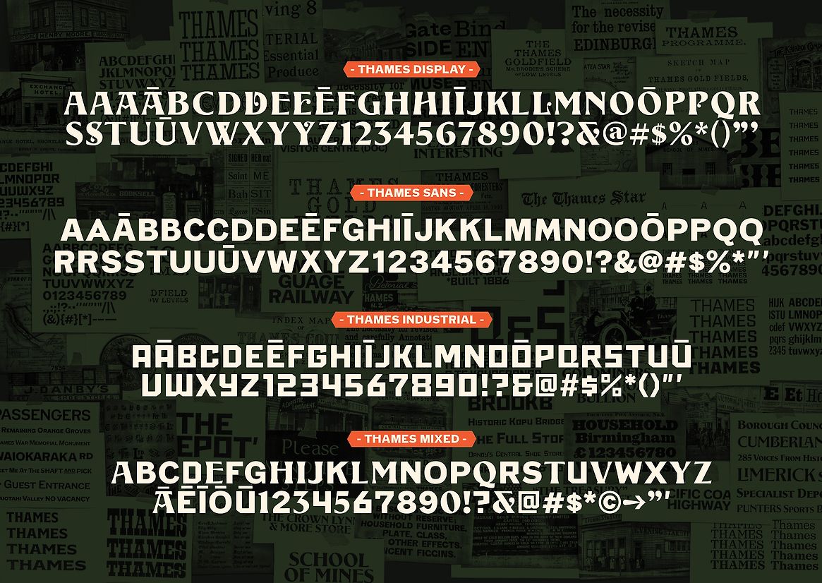
We designed a typographic system inspired by original hand-painted signs and local ephemera, crafting three bespoke typefaces:
Thames Display – ornamental and carved, echoing Victorian grandeur
Thames Sans – warm and honest, inspired by grocers and butchers
Thames Industrial – bold and utilitarian, reflecting working-class roots
Used alone or combined, they form a flexible visual language that feels both contemporary and unmistakably Thames.
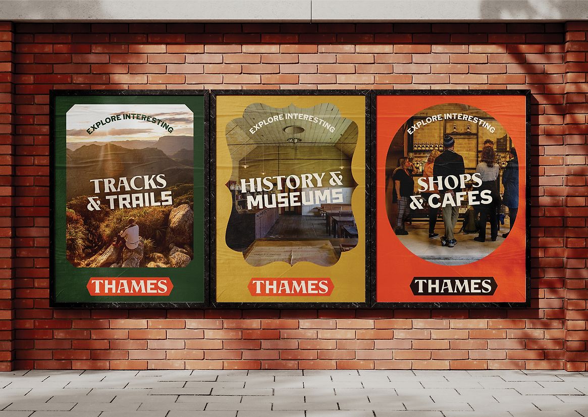
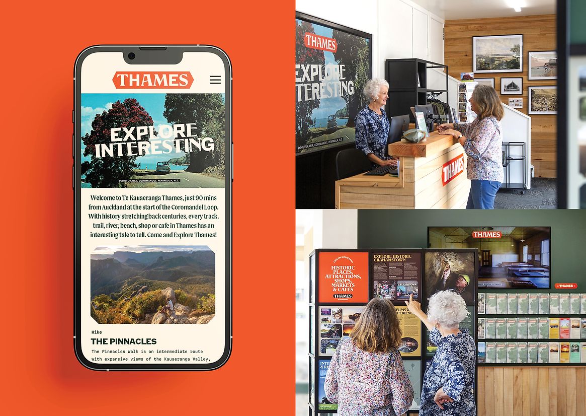
Photography became central to storytelling. We built a library capturing Thames’ textures and personalities – locals, trails, sunsets, shops, rivers, and historic detail. Archival photo frames became a device across print and digital, paired with a rich, unexpected colour palette that avoided clichés.
These elements live across core touchpoints – the Explore Thames website, social channels, town signage, visitor maps, and a reimagined info centre.
What Elevates the Work
This wasn’t just a rebrand – it was a community catalyst. Co-created with iwi, historians, artists, shop owners and more, the project blended pride of place with economic opportunity. Social channels have since reached 1 in 7 Kiwis in the past year, while the visual identity has become a local source of pride.
With a small budget and deep collaboration, design reshaped perception, attracted new visitors, and reconnected Thames with its sense of self. Proof that a brand can feel like a town – and that design, done well, can spark meaningful place-based change.