Graphic
For The People 14 Launceston
-
Pou Auaha / Creative Directors
Jason Little, Jo Roca, Mel Baillache -
Pou Rautaki / Strategic Leads
Damian Borchok, Sammy Page
-
Ringatoi Matua / Design Directors
Nicola Ferry, Liv King -
Kaituhi Matua / Copywriter Lead
Daniel St Vincent
-
Ngā Kaimahi / Team Members
Georgia Urie, Dash O’Brien-Georgeson, Kimberly Luo, Emma Turney, Atsaya Gabiryalpillai -
Kaitautoko / Contributor
Mathieu Reguer -
Client
City of Launceston Council

Description:
Once you step foot in Launceston, you sense there’s more to the city than meets the eye. Behind the historic architecture and industry, weathered landscapes and heritage-listed gorges, rolling farmlands and waterways, 40,000 year old Indigenous culture and close-knit communities, you will discover a city where locals won’t just stop to show you the way — they’ll stop to show you around.
Long considered Tasmania’s second city, or “the gateway to the north”, Launnie’s identity has been forged by its remoteness. Despite this proud independence and resourcefulness and reverence for the environment, the city knew it needed a new place brand to overcome perceived (and dated) stereotypes and re-write historical challenges (including reintegrating the palawa people, Tasmania’s last remaining Indigenous community), to transform the way Launnie saw itself — and the way the world saw Launceston.
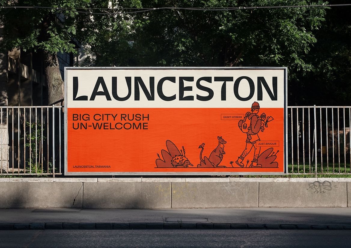
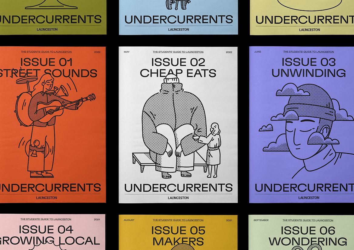
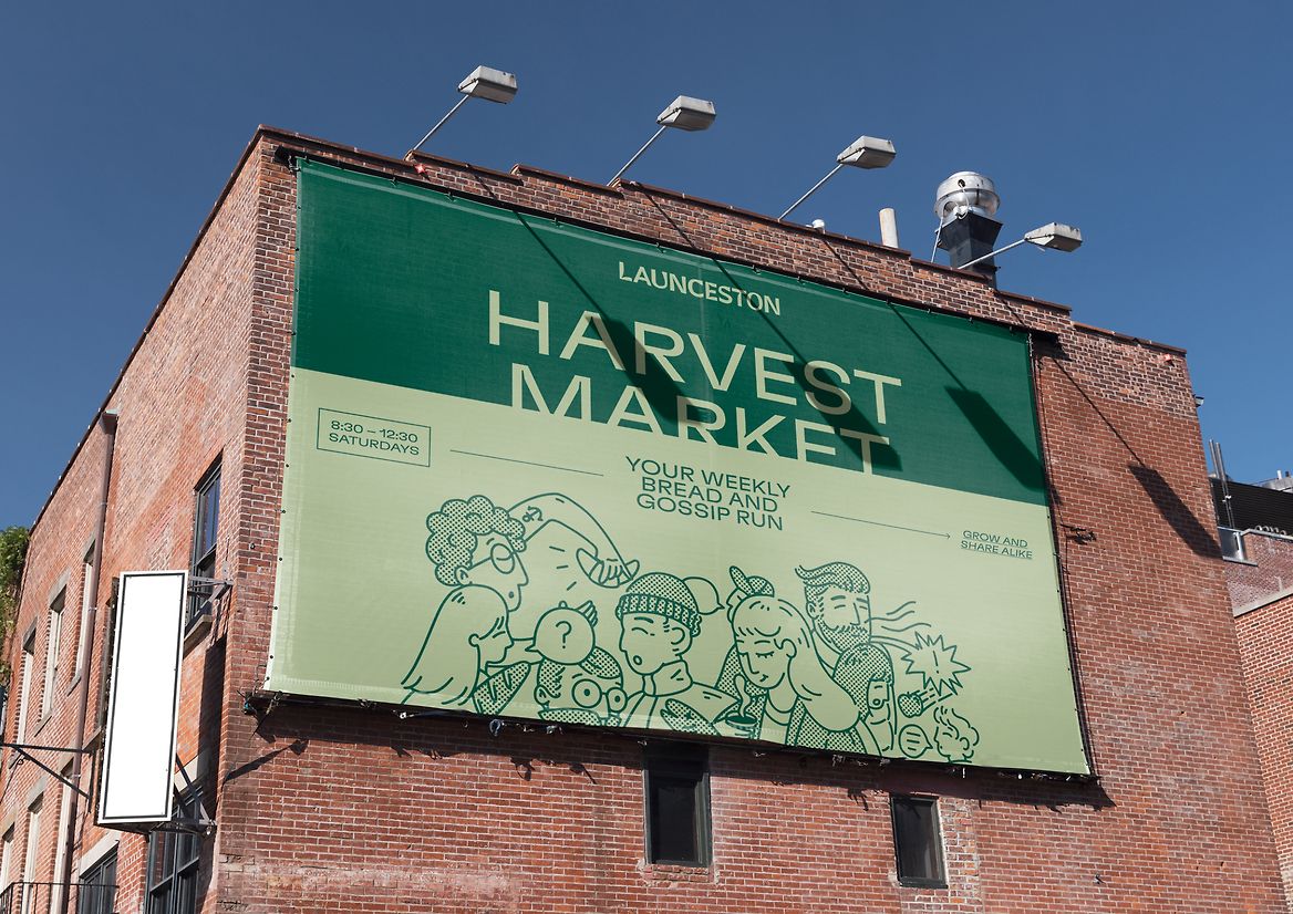
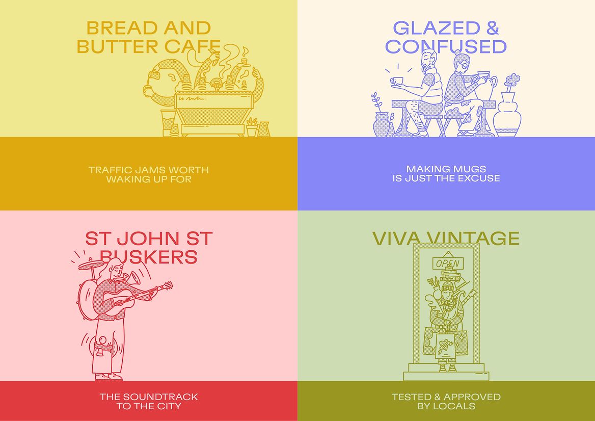
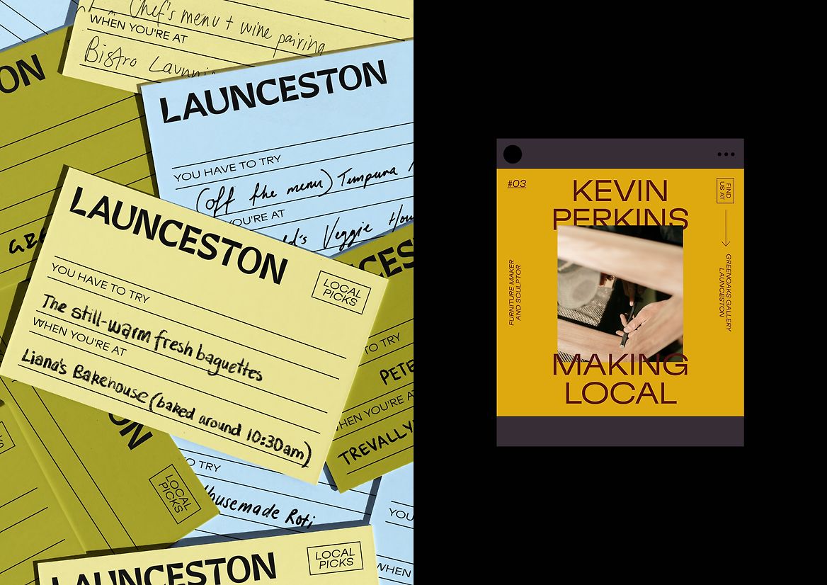
To do this, we invited audiences in to discover and experience the city in the best way possible — like a local. The brand idea, ‘The Undercurrent’, transforms the laid-back locals into storytellers and guides, going beneath the surface to reveal the secret “goings on” that often go unseen. What we unearth is a city that does things in its own way, at its own pace — a poster city for the slow-city movement, where a traffic jam is lining up for a coffee at the farmers’ markets on a Saturday morning, and big city pressures are trying to wrap up chats on the street.
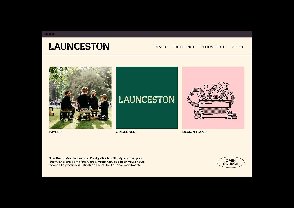
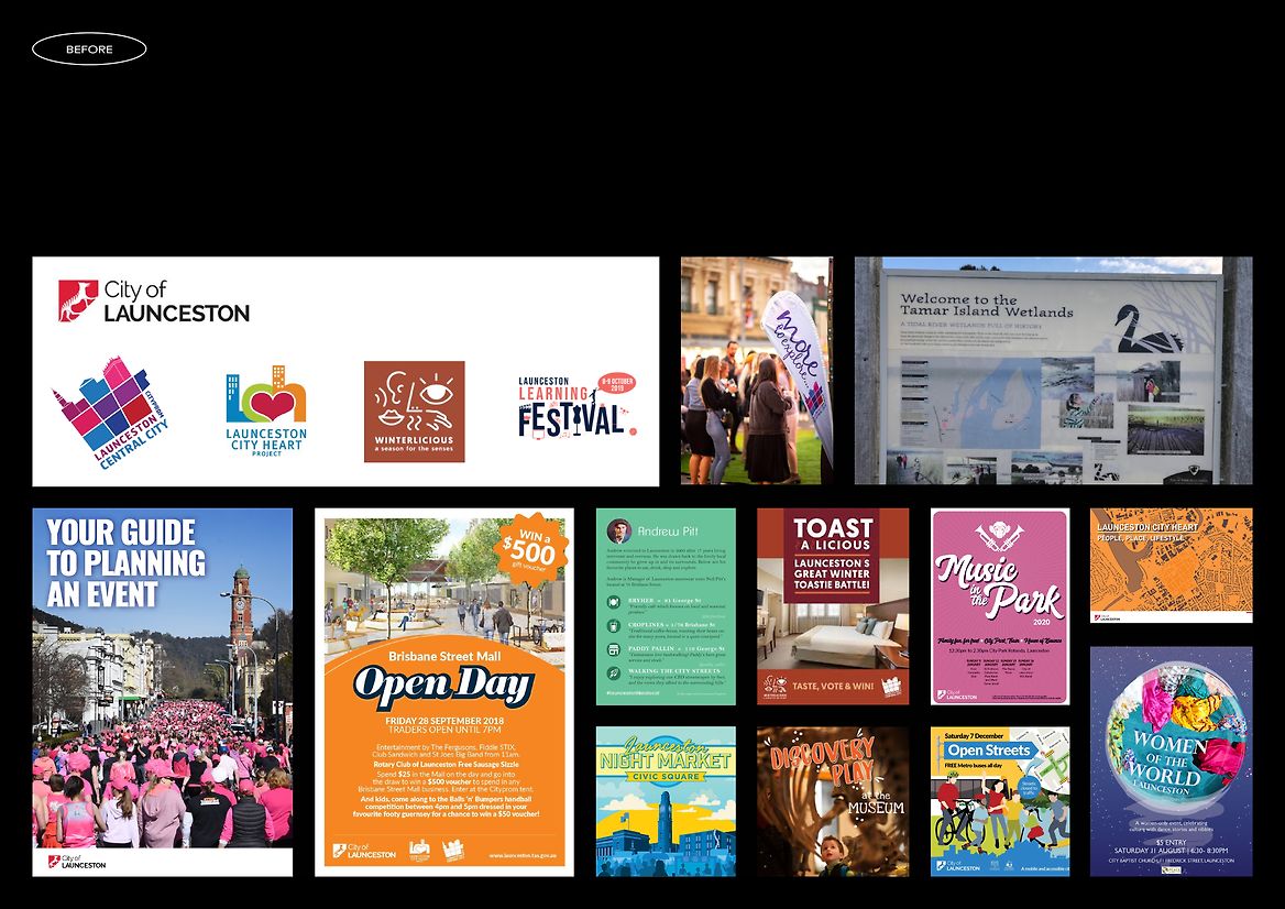
To put the brand in the hands of (and instill ownership from) the community, all the assets were chosen with accessibility in mind, and were made available free of cost. The brand also set out to integrate palawa language and culture into the identity, working closely with local Indigenous groups.
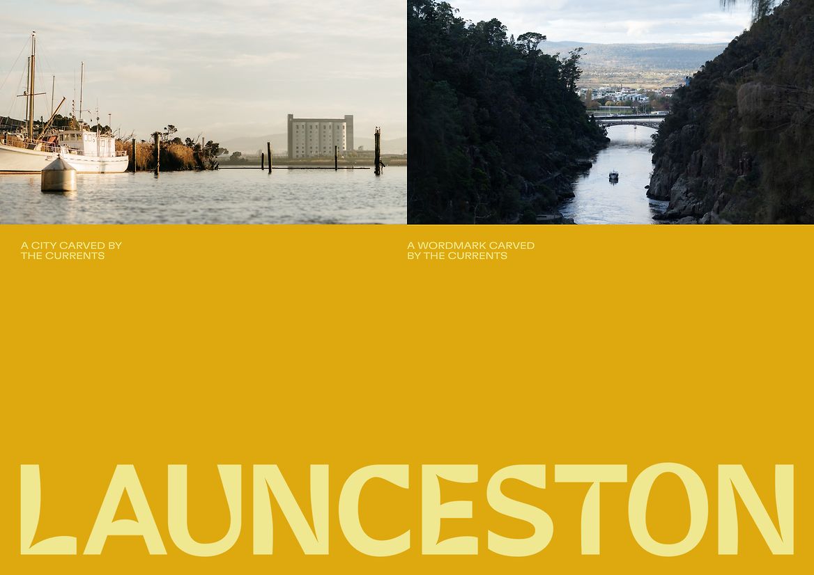
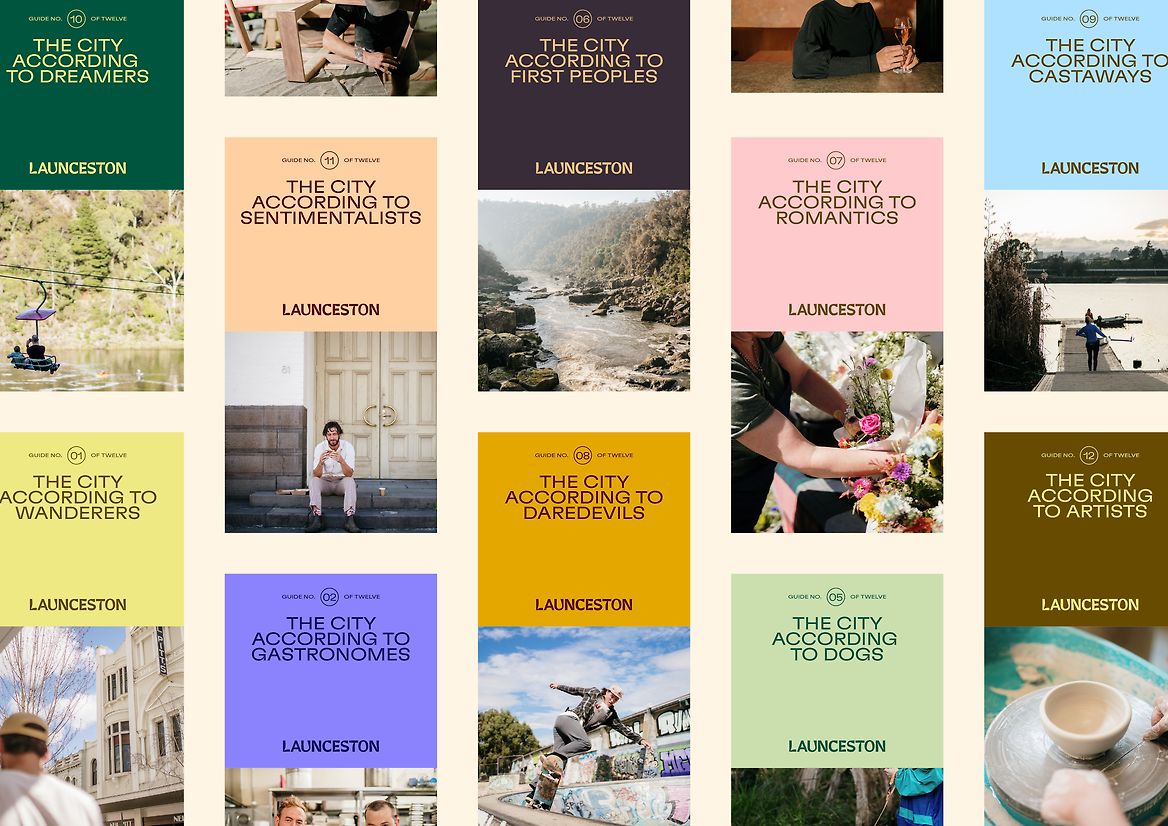
The new identity captures the quirks and hints at the eclectic, laid-back nature of the city. The wordmark reflects the estuary and the banks of the two rivers; colours are inspired by the changing environment; the contemporary typeface was chosen for its suitability in palawa language; illustrations show offbeat characters navigating scenes; photography chronicles real moments from human perspectives; and language channels the local voice—playfully juxtaposing big-city expectations with the unexpected stories from the undercurrent.
As a result, the brand has been embraced by locals and utilised by business and the city council. In fact, the new brand was instrumental in Launceston being recognised as a UNESCO City of Gastronomy in 2022.