Graphic
For The People 14 Be Equitable
-
Pou Auaha / Creative Directors
Alexis Waller, Jo Roca -
Pou Rautaki / Strategic Leads
Damian Borchok, Matt Pearce, Claudia Henderson
-
Kaituhi Matua / Copywriter Leads
Arielle Bodenstein, Mat Groom
-
Ngā Kaimahi / Team Members
Atsaya Gabiryalpillai, Georgia Urie, Emma Turney, Mabel Tu, Sonia Uznadze -
Kaitautoko / Contributors
Edward Ubiera – Illustrator, Tré Seals -
Client
Be Equitable
Description:
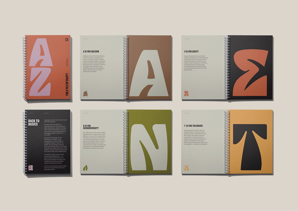
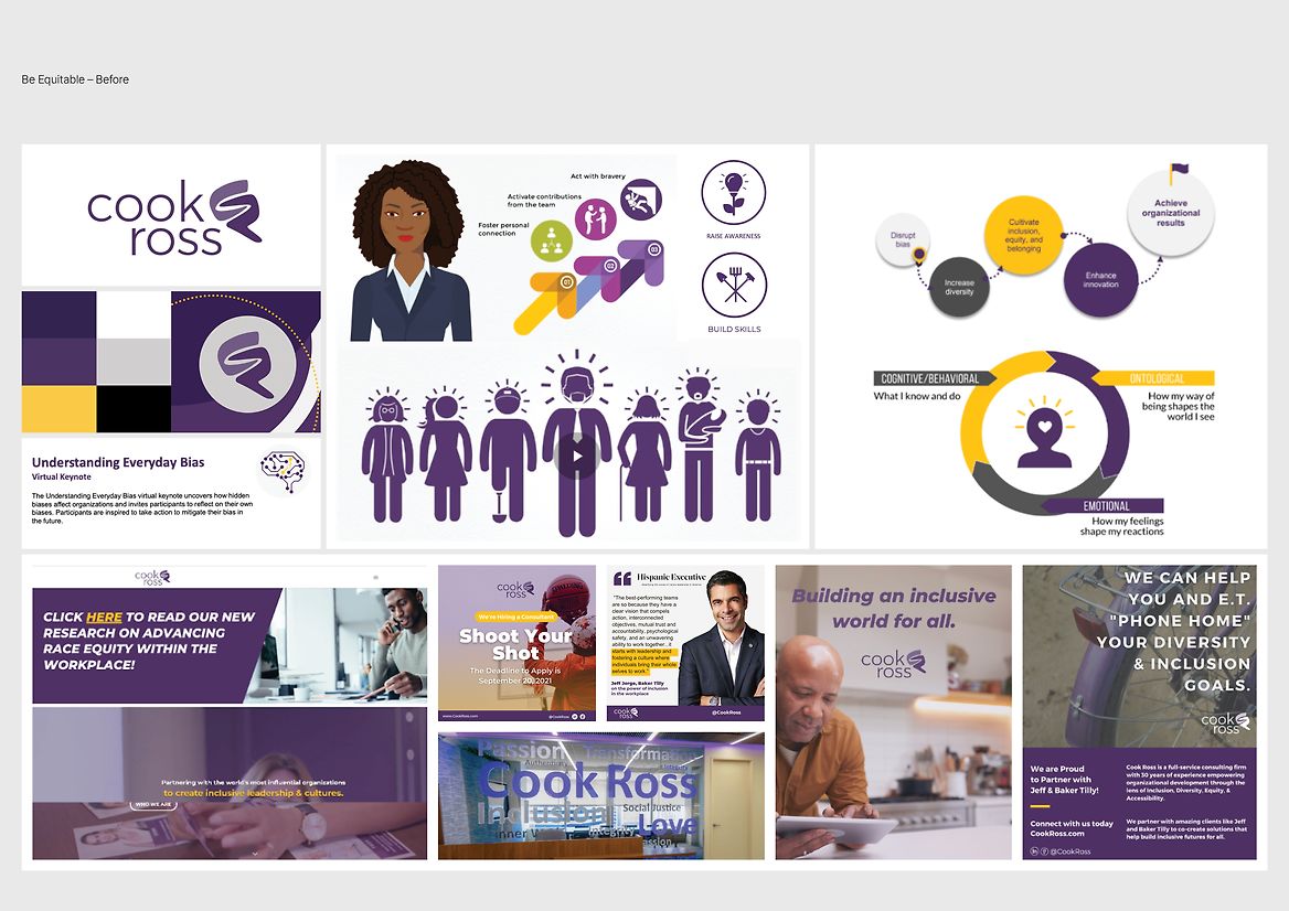
Be Equitable (formerly, ‘Cook Ross’) is on a mission to cultivate a more inclusive, diverse, equitable and accessible world of work. Over the past thirty years, they’ve developed a reputation as leaders in Unconscious Bias Training and provided services to clients like NASA, Nintendo, and Verizon. But during the Black Lives Matter movement, Be Equitable was driven to do more. Guided by a new Afro-Latina CEO/owner, Be Equitable knew that centuries of injustice would take more than a session to undo. They were ready to evolve from a company known for Unconscious Bias Training, to one that helped create systemic, organisational change through long-term, strategic partnerships. With a new name, new leader, and a new mission – Be Equitable needed a new way of representing themselves.
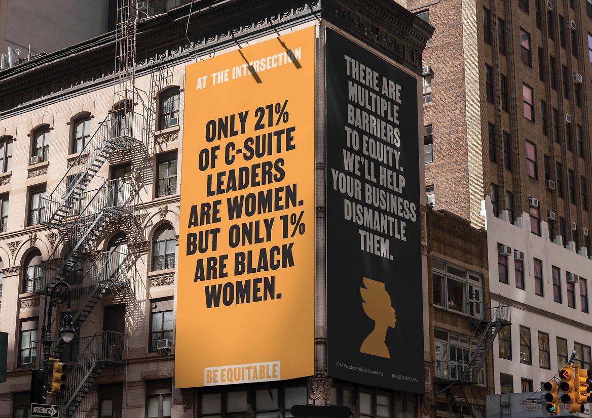
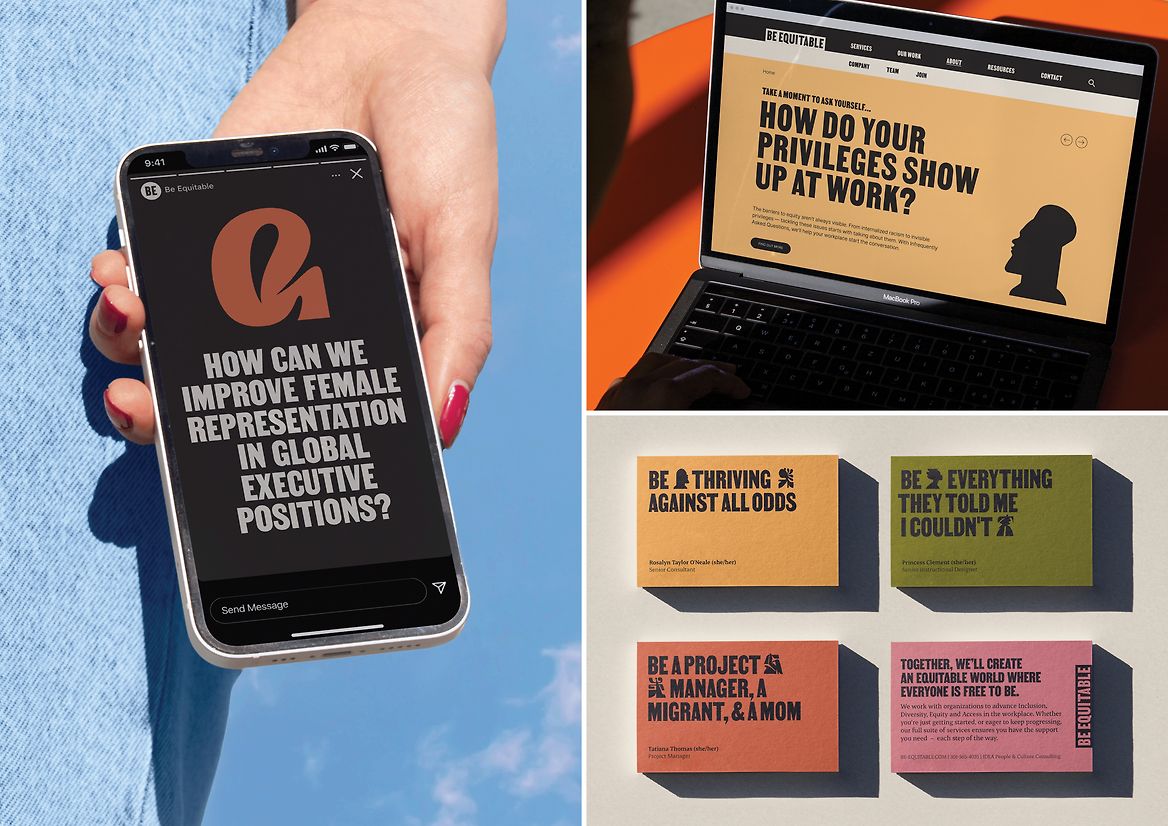
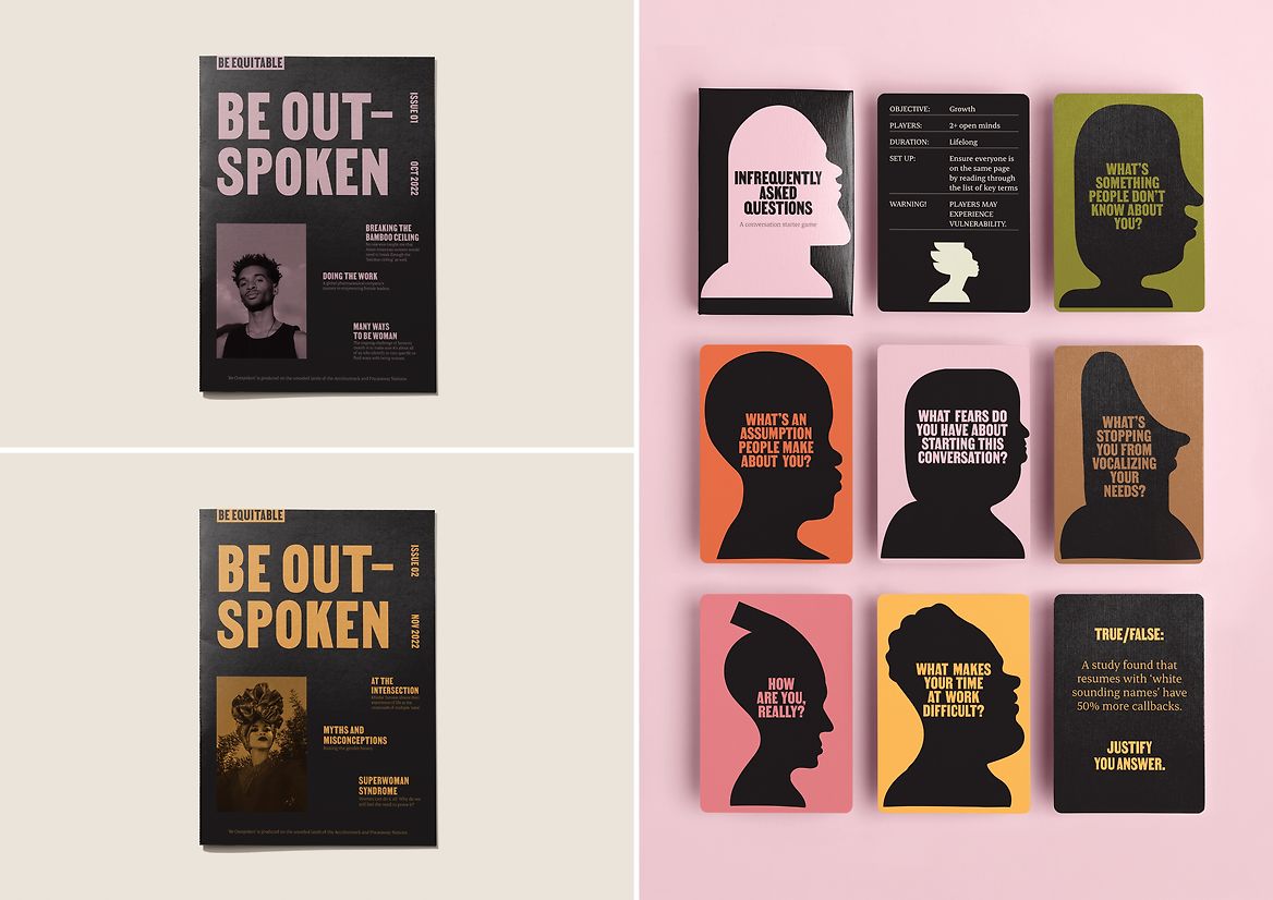
In a category where cliched imagery and indirect language reinforced clients’ belief in a quick fix, Be Equitable needed to accurately convey the complex journey of change. The identity needed to challenge businesses accustomed to buzzwords, spark difficult conversations, and motivate clients to commit to long-term transformations. In an industry often overwhelmed by the problems, it was equally important for the new identity to bring a spirit of positivity to the space – celebrating the outcomes and opportunities of an equitable world.
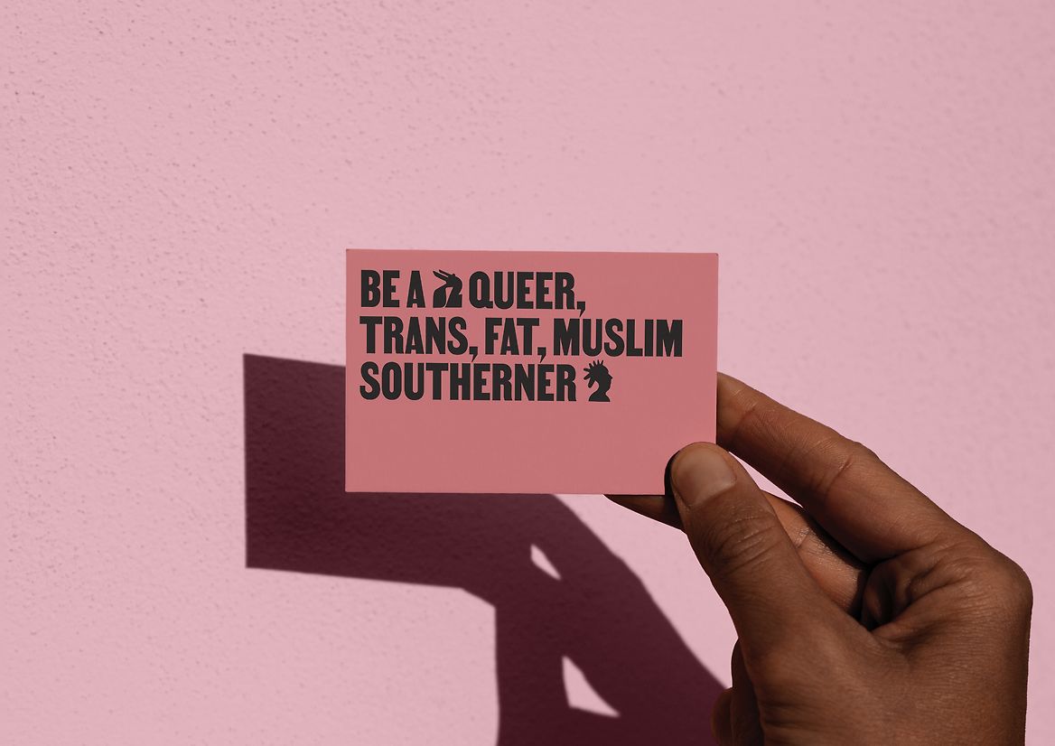
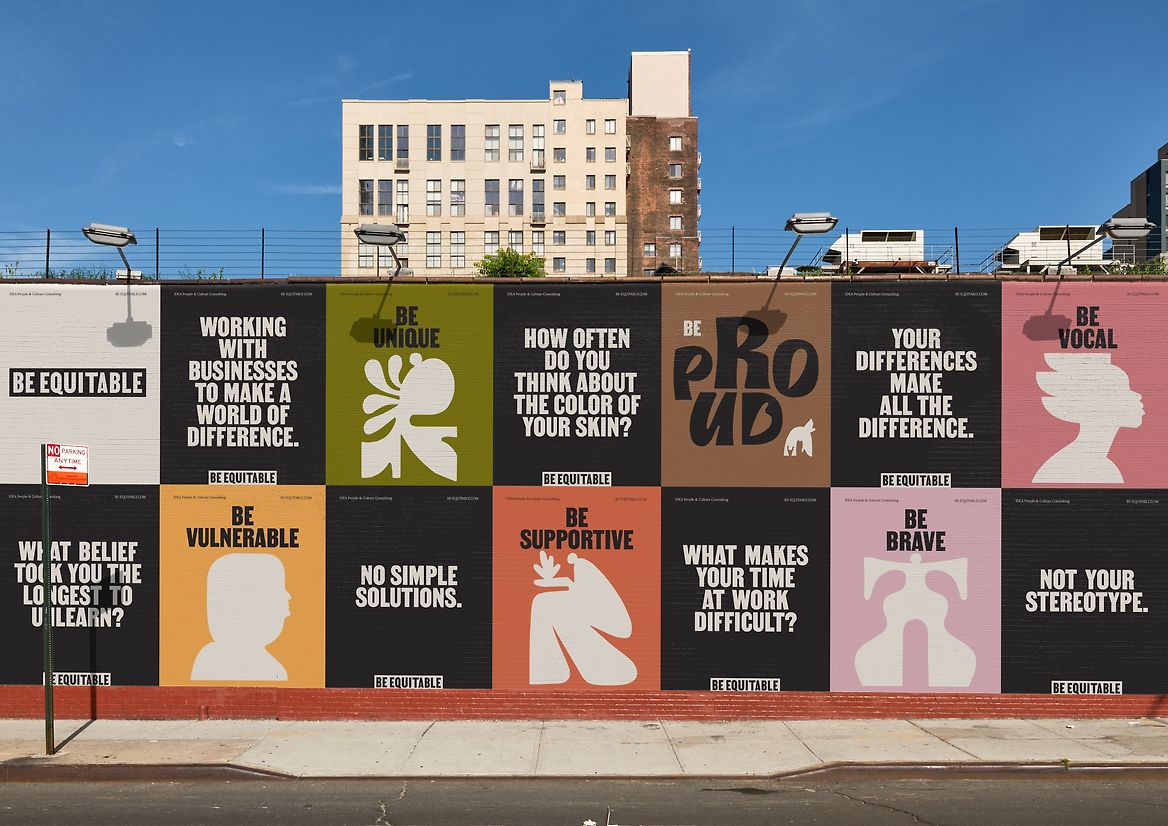
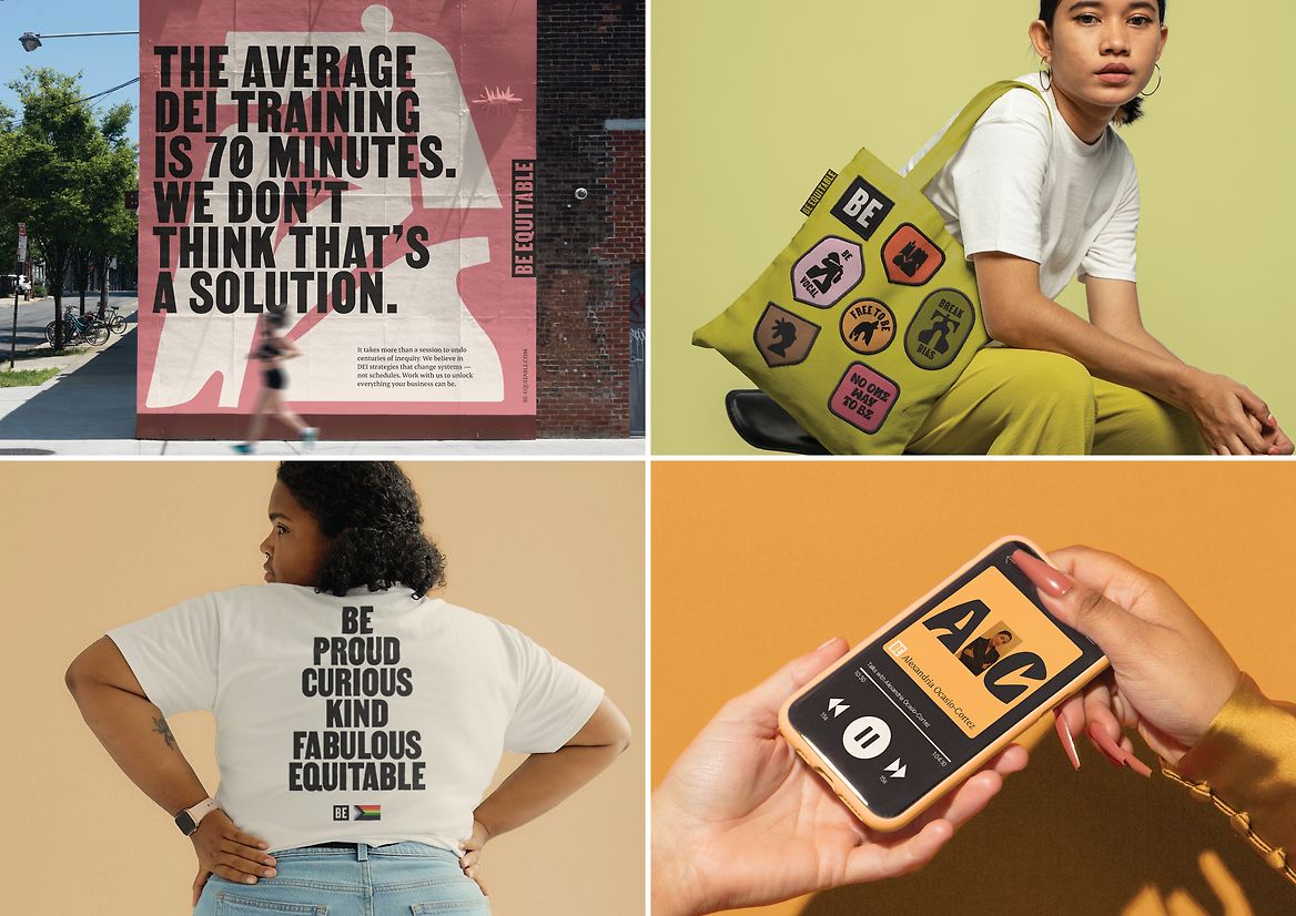
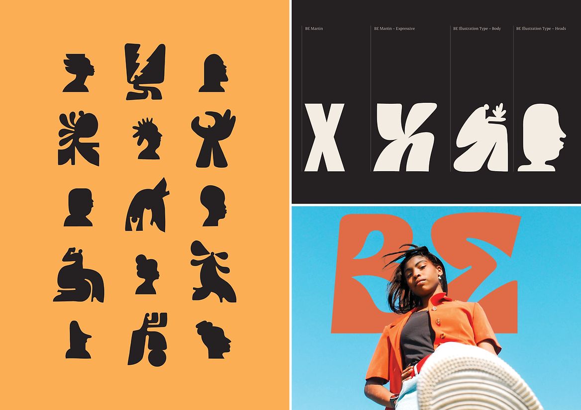
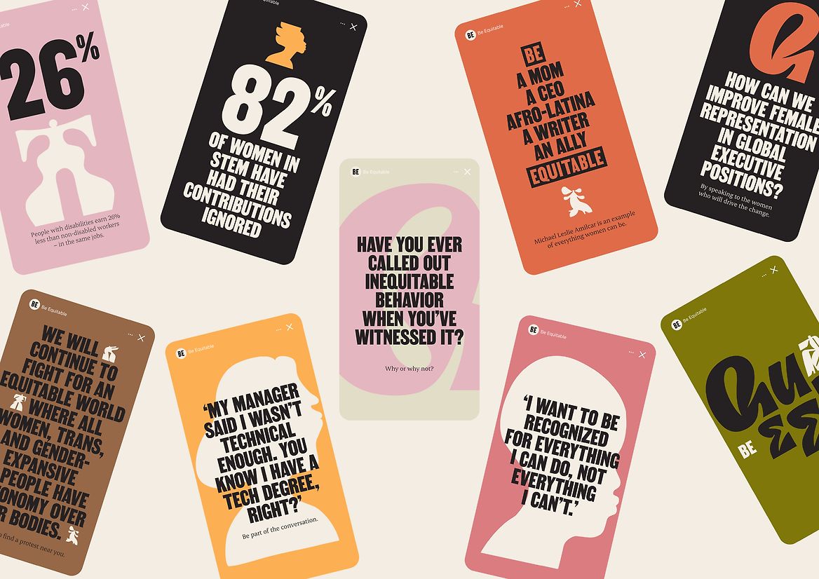
Drawing upon the history of activism, the identity takes cues from protest posters and grassroots publications to create bold, impactful designs. But with an earthy colour palette, expressive typeface and joyful illustrations, Be Equitable’s new brand is both challenging and uplifting. It delves into difficult conversations, balancing an outspoken voice with visuals that defy stereotypes and redefine the category’s view of diversity. Through illustration, the brand provides a glimpse into a truly equitable future – one where difference is the norm and everyone is free to be.
From a typeface inspired by non-violent protesting, to the creatives we collaborated with – each element of the toolkit is intended to support Be Equitable’s mission and ensure the new identity is a step towards inclusivity in itself. With illustrations embedded into a typeable format and a system that invites imperfection, Be Equitable’s new identity can be easily implemented by designers and non-designers alike. The outcome is a brand that captures their enthusiasm, challenges their audiences and confidently demonstrates what it means Be Equitable.