Graphic
THERE 4 Afterpay Melbourne Workplace
-
Pou Auaha / Creative Director
Charlie Bromley
-
Ngā Kaimahi / Team Members
Jon Zhu, Kaitland Burrows, Sophia Noh -
Kaitautoko / Contributors
The Studio* Collaborative (Interiors), CWF (Fabrication), Graham Jepson (Photography) -
Client
Afterpay
Description:
Afterpay, best known for its buy now, pay later service, has moved into a new workplace in Melbourne’s CBD. The site in the Queen & Collins development - an unconventional commercial setting - houses 5000sqm metres of workplace and is a new regional hub for the global fin-tech company.
Across 4 floors, the new office environment is designed to reflect Afterpay’s innovative approach to their industry. As disruptors in the financial sector, their purpose is to empower customers to achieve financial freedom, and to help achieve this they have built a brand framework that encourages self-expression and communicates with youthful vibrancy.
The brief for placemaking within the new workplace was to create a space that reflects the brand attitudes, accompanied by a wayfinding system that would support an agile workplace model. The post-COVID office aims to help foster an innovative global workforce, whilst remaining connected to the brand’s Australian heritage and the immediate local context of its Melbourne setting.
The project scope was split into 2 groups of deliverables - a wayfinding system designed to become a global framework for all future Afterpay sites, and a range of placemaking pieces that would celebrate the company’s brand and their Melbourne location.
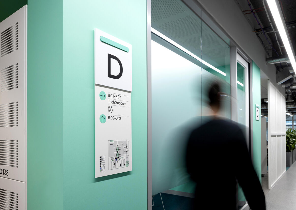
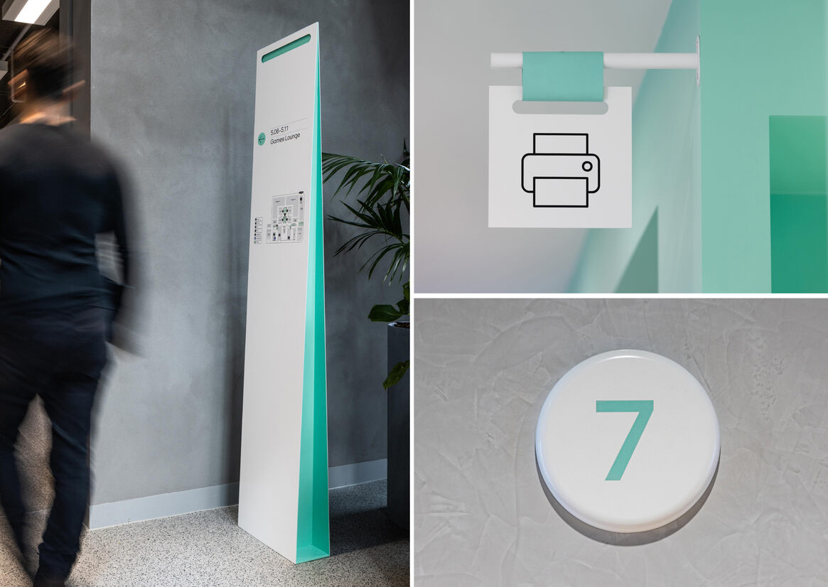
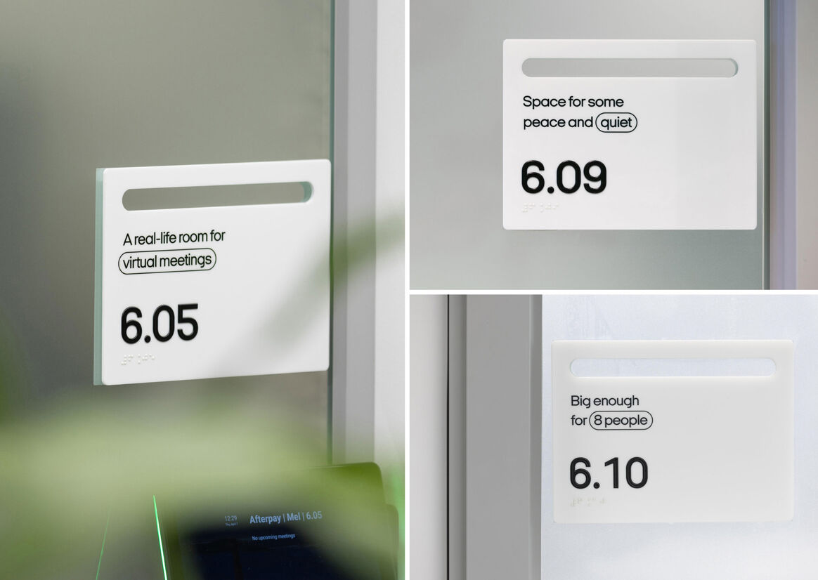
The wayfinding takes its cues from the recently refreshed brand identity, establishing a family of sign-types that are instantly recognisable. Key elements of the brand language - typography, iconography and the distinct “Bondi Mint” colour - are used to create a suite of signage that feels inherently Afterpay. The brand’s strong connection to fashion merchants and the retail sector is also celebrated through subtle design details, like the freestanding totems inspired by the form of shopping bags or the flag signs that resemble the swing-tags found in clothes stores.
The signage is rolled out across all floors of the workplace, creative a cohesive system that helps to orientate people within the vertical campus, whilst importantly encouraging mobility and movement throughout.
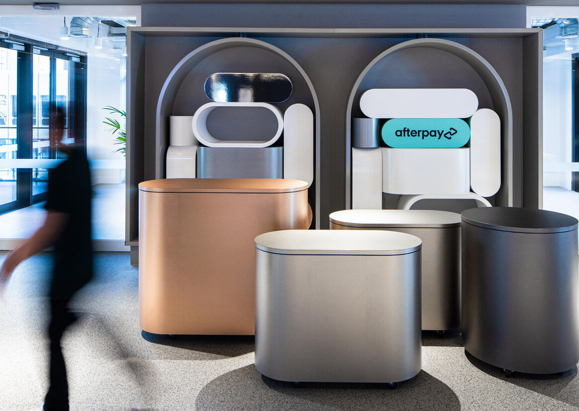
In contrast to the unifying wayfinding approach, the placemaking elements are designed to be one-off moments of discovery – referencing the hidden laneways of Melbourne’s retail scene. Within the entry space, a reimagined shop window provides a flexible display for trading partners to showcase their products. The installation echoes the archway forms found throughout Melbourne’s famed laneways and sets up a series of bespoke installations that activate the workplace.
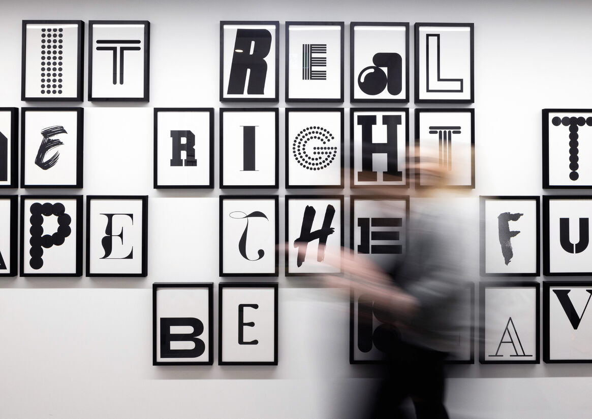
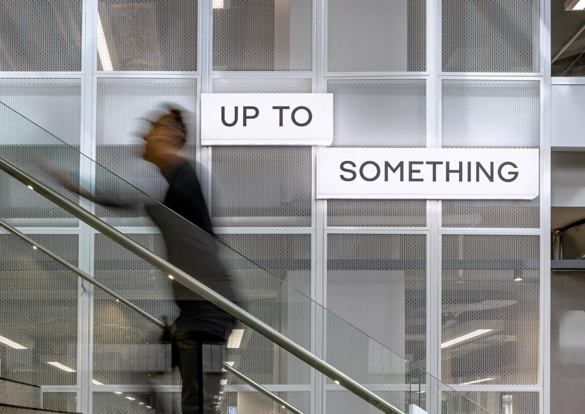
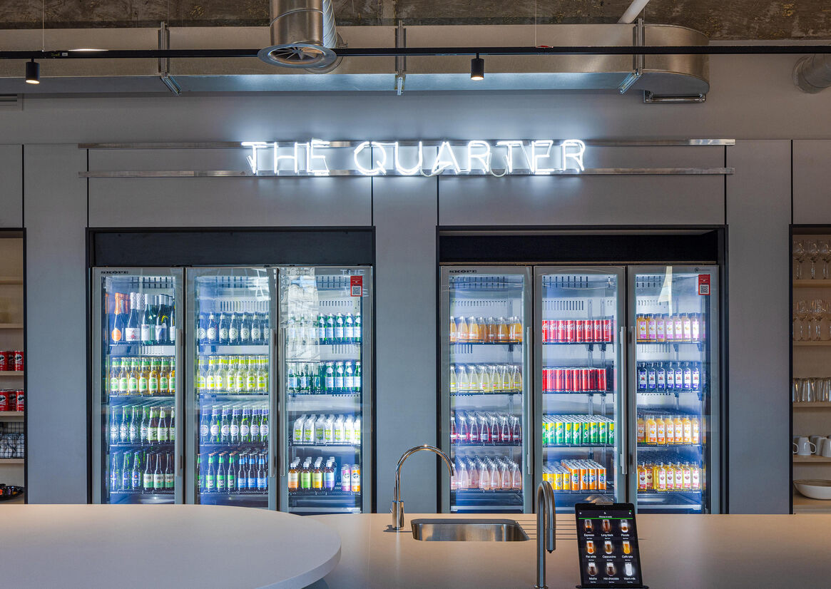
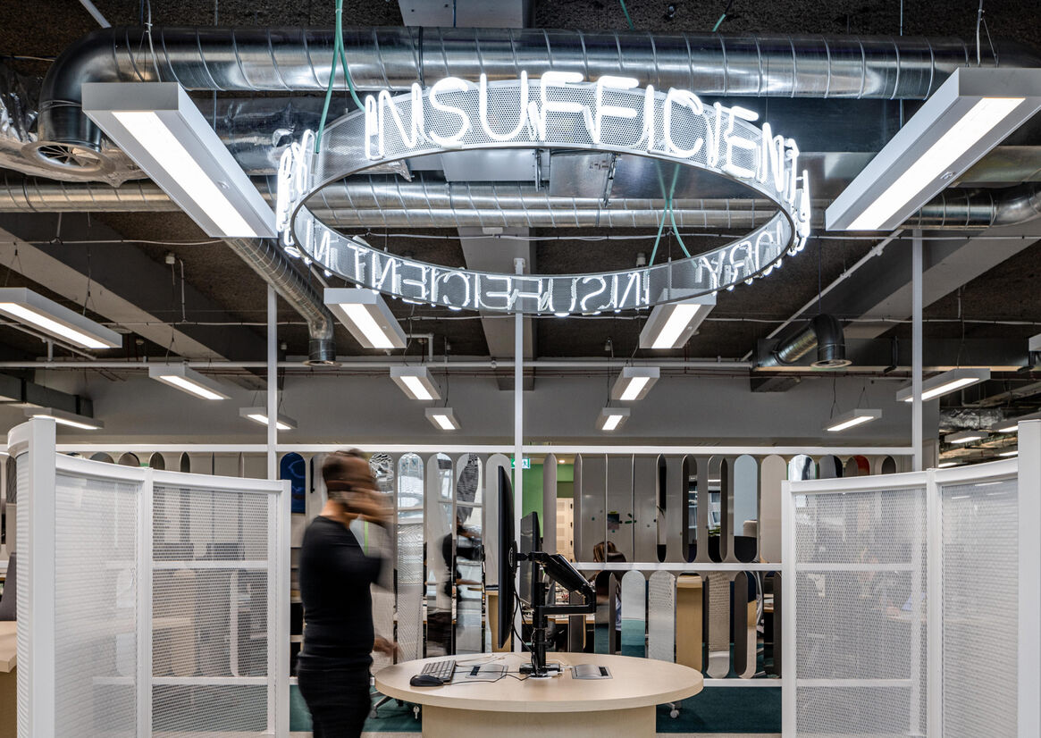
The brand’s confident tone-of-voice is also celebrated here, with a range of typographic statements layered through the space in neon light features and sculptural installations. The aim was to use language in a deliberate way to activate key areas of the space, even filtering down to small touchpoints like meeting room signage. This optimistic, thoughtful - and sometimes sassy - approach helps to embed the ethos of the brand into the workplace and inspire the Afterpay workforce to be just as vibrant as their new surroundings.