Graphic
Milk 68 Blunt
-
Pou Auaha / Creative Director
Sarah Melrose -
Pou Rautaki / Strategic Lead
Ben Reid
-
Ringatoi Matua / Design Director
Anthony Hos
-
Ngā Kaimahi / Team Members
Kate Forsythe, Eden Harris, Ethan Lowe, Harriet Campbell, Gemma Scott, Josh Daly, Adeline Chua -
Kaitautoko / Contributors
Greig Brebner, Blunt Umbrellas NZ, WorkGroup -
Client
Blunt Umbrellas NZ


Description:
As part of a wider Blunt rebrand project aimed at driving expansion into additional markets to achieve new global growth targets, we were tasked with transforming the in-store experience in a way that brought the new brand to life and helped them stand out from competitors in overseas markets.
The existing in-store stand wasn’t functioning - it was messy, hard to shop, and didn’t clearly identify the product. Furthermore, it lacked the joy, creativity and style of the new brand. This lack of emotional appeal and design functionality meant consumers and retailers, particularly those in new markets, were unsure about what exactly set Blunt apart - let alone what it was.
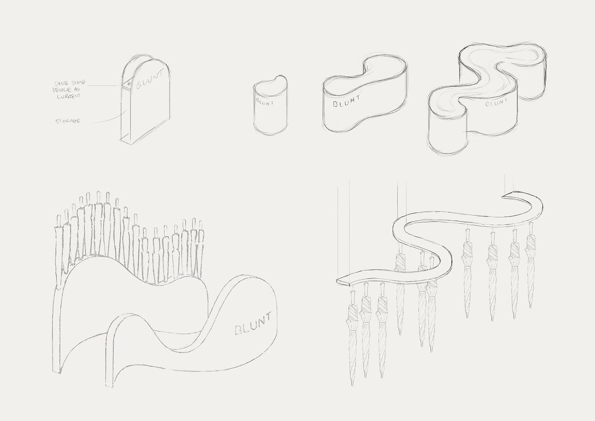
We began by understanding the market, and embarking on a comprehensive research process. We leveraged insights from Blunt’s successful presence in NZ and AU markets and engaged with various retailers worldwide.
In designing the stand, we wanted to create talkability and bring some joy to the retail experience. We wanted consumers to experience the beauty, simplicity and intuitiveness of everything Blunt is and does.
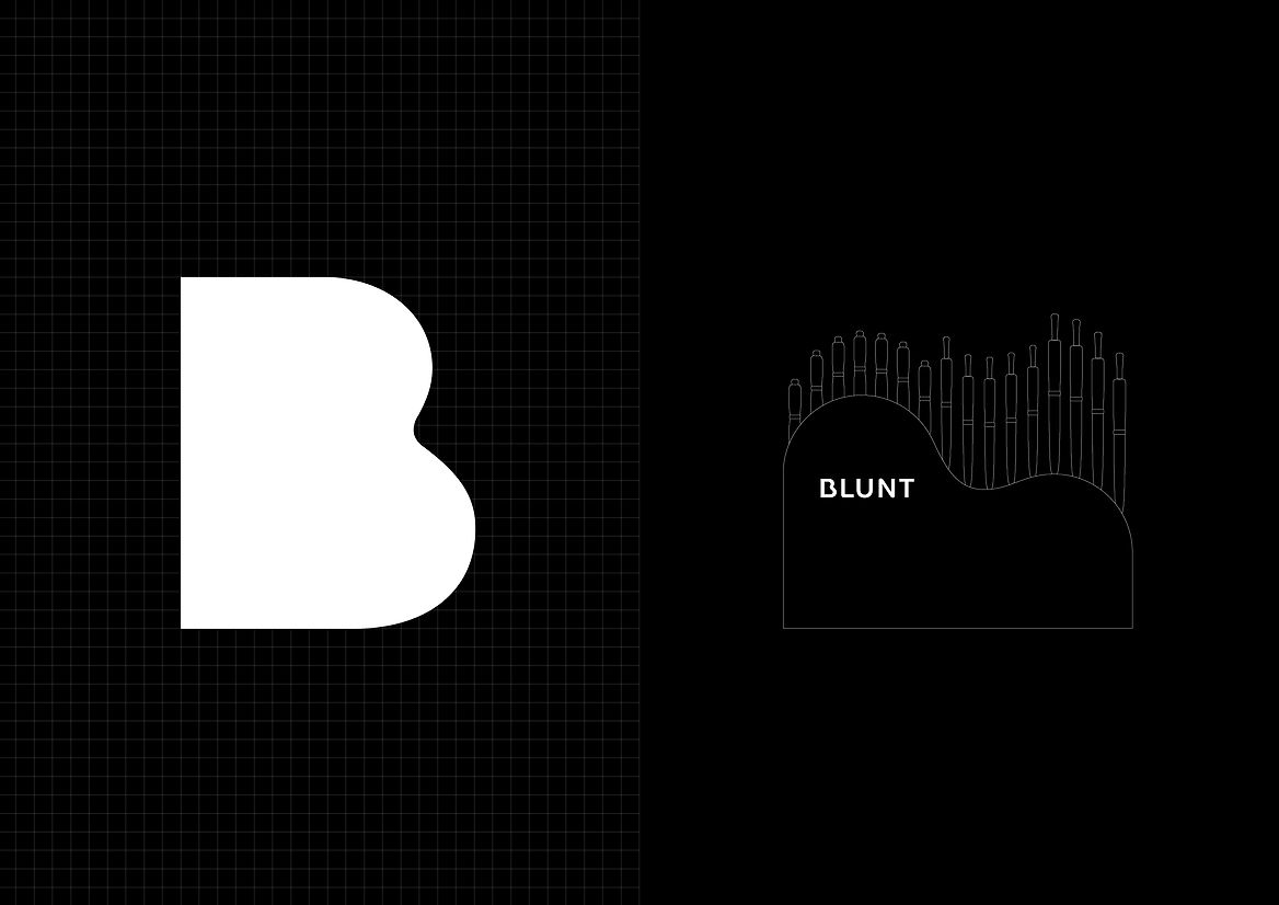
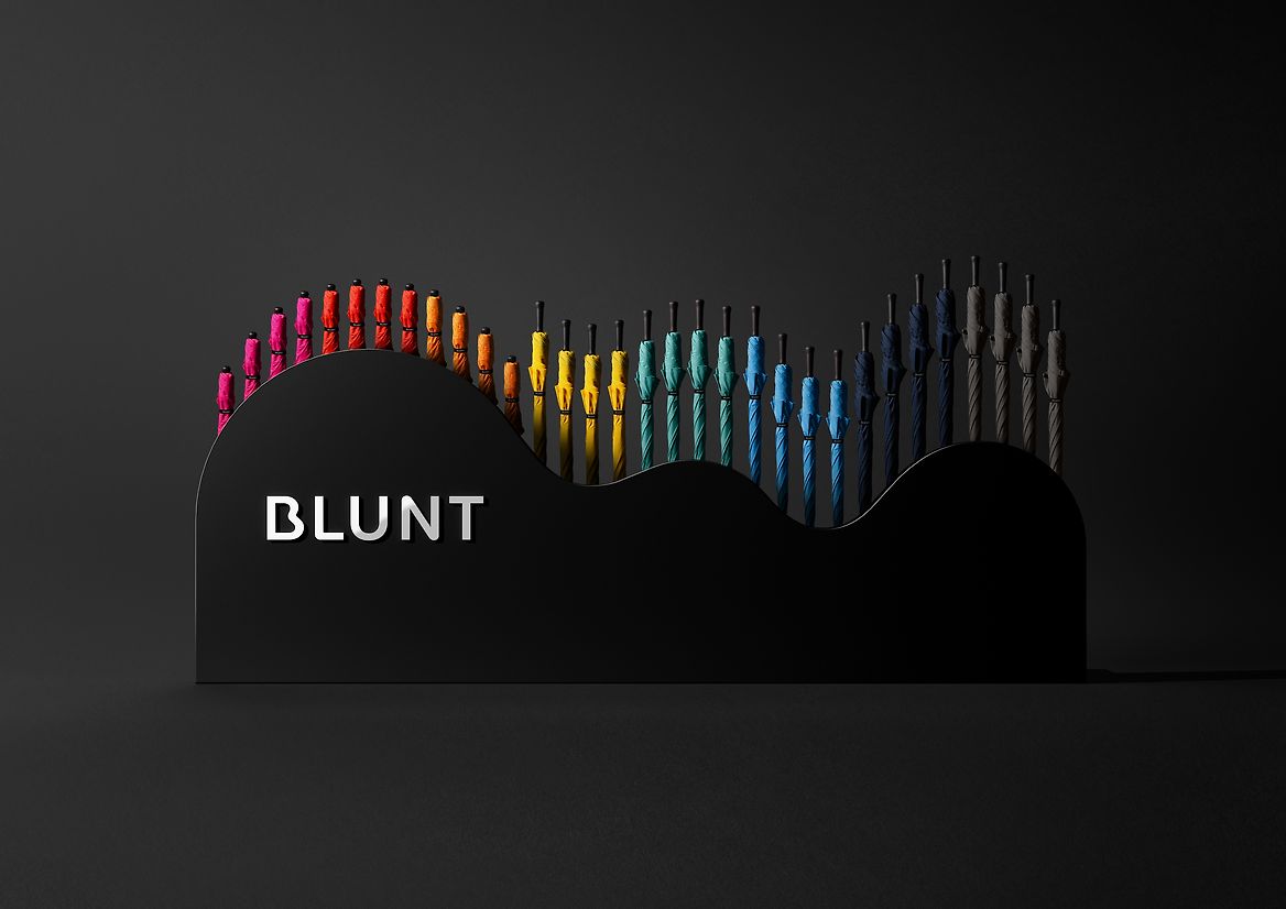
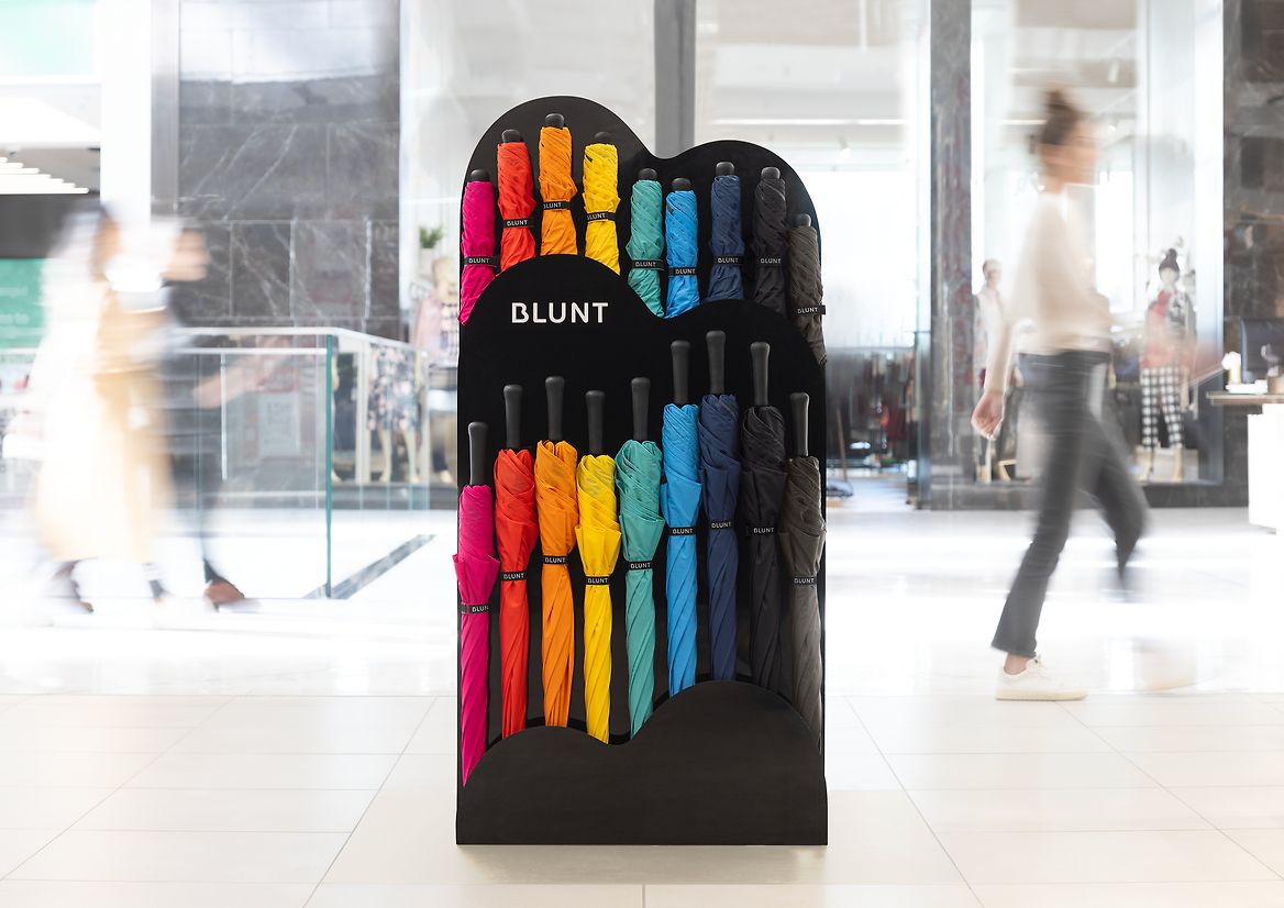
The solution we created: The Cloud.
A reflection of the Blunt umbrellas themselves, The Cloud is a harmony of artistic design and functionality. Embodying the core Blunt design principles of confidence, joy, reduction and beauty. Capturing the essence of the rebrand, the shape is derived directly from the new B wordmark.
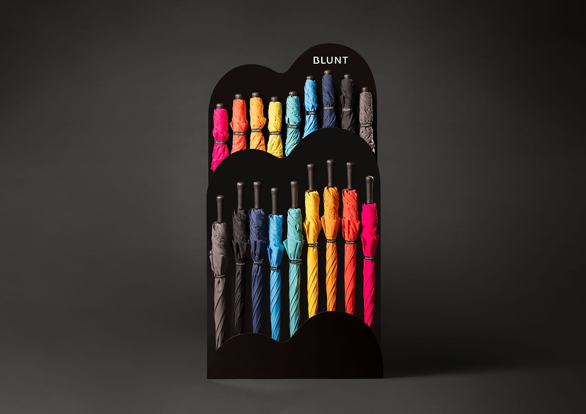
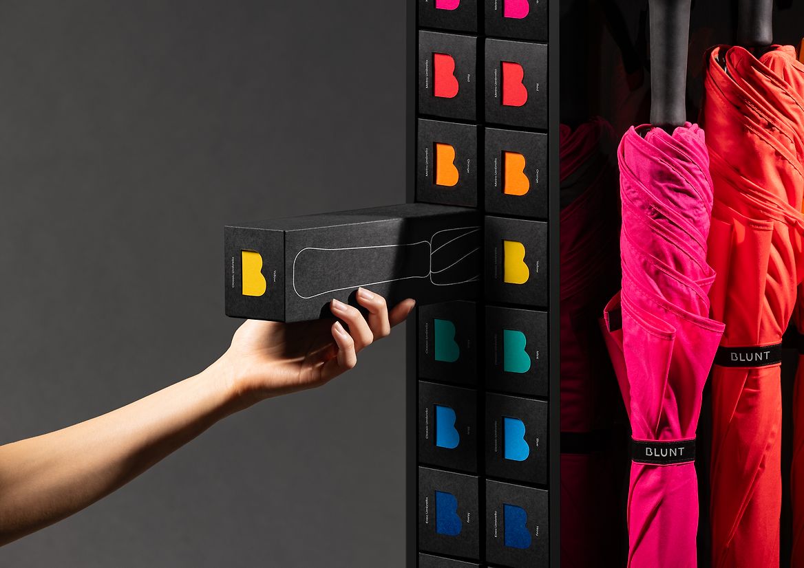
For impact, we purposefully kept the umbrellas out on display creating a rainbow and encouraging consumers to see and experience Blunt in a more tactile, sensorial way. But we purposefully crafted the system in alignment with the packaging to be stored inside the stand, where consumers and retail staff can easily reach from the ends of the merchandising system. The end of the packaging gives consumers the perfect way to identify and select the colour and model, and gives Blunt the ability to have a lot more stock on the shop floor.
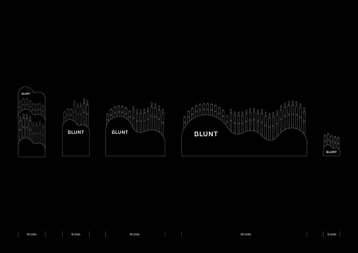
The simplicity of The Cloud system makes it sustainable and easy to manufacture in different countries, while its flexibility and modularity allows it to fit seamlessly into various store sizes and layouts.
By giving the stand a name, The Cloud, we sparked a new narrative and elevated it to more than just a shelf. It became an integral part of the product experience, a conversation starter the sales teams so desperately needed.
The Cloud successfully brings Blunt’s brand idea ‘Engineering Joy’ to life. Simple, helpful and delightful to engage with. Ownable, iconic and truly stand-out. Successfully simplifying the path to purchase while making it fun, engaging and easy to shop.
Judge's comments:
It’s raining again! The idea of using a distinctive asset of the brand “the cloud” as an in-store stand made the rebrand even more iconic, and demonstrates how the “Engineering Joy” strategy is so powerful. Loved how functionality was at the forefront of the idea. Could imagine this being an easy sell-in for retailers as it is so charming.